

When people think of luxury homes, they often focus on expensive furniture, designer lighting, or premium finishes. However, one of the most powerful design decisions is something far simpler: colour.
The right colour can make an ordinary home look elegant, timeless, and high-end. The wrong colour can make even an expensive renovation feel dated or visually cluttered.
In Singapore, colour choices often have an even greater impact because HDB flats, condominiums, and landed homes are increasingly designed around open-concept layouts where walls, flooring, cabinetry, and natural light all interact. The right palette can make a space feel brighter, larger, and more luxurious without significantly increasing the renovation budget.
So, what colour makes a house look expensive?
There isn't one single answer. Luxury homes tend to use carefully selected colour palettes that create a sense of sophistication, balance, and permanence. The most expensive-looking homes typically rely on warm neutrals, soft whites, earthy tones, deep greens, charcoal greys, and muted blues rather than bright or highly saturated colours. Design experts consistently highlight warm whites, taupes, greiges, sage greens, olive tones, navy blues, and charcoal shades as colours that create a refined, premium appearance.
The Psychology Behind Luxury Colours
Luxury design is often associated with restraint.
High-end homes rarely use colours that compete for attention. Instead, they create visual harmony through subtle contrasts, natural tones, and timeless combinations.
Expensive-looking colours typically share three characteristics:
- They have depth without being overwhelming.
- They complement natural materials such as wood, marble, stone, and metal.
- They remain stylish for years rather than following short-term trends.
This is why many luxury properties avoid extremely bright reds, oranges, or neon colours and instead favour sophisticated, nature-inspired palettes. Designers increasingly recommend earthy greens, warm neutrals, and muted tones that feel timeless rather than trend-driven.
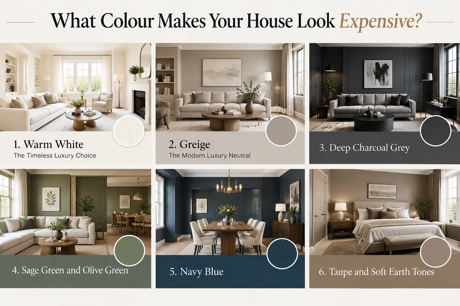
1. Warm White: The Timeless Luxury Choice
If there is one colour that consistently appears in luxury homes worldwide, it is warm white.
Unlike stark clinical white, warm white contains subtle cream, beige, or taupe undertones that create softness and elegance.
Warm white works because it:
- Reflects natural light beautifully.
- Makes spaces feel larger.
- Creates a clean architectural appearance.
- Allows furniture and decorative elements to stand out.
We've found warm white remains one of the most requested choices among homeowners renovating HDB flats, condominiums, and landed properties in Singapore. It creates a bright, timeless backdrop that allows other design features, such as custom carpentry, stone surfaces, and feature lighting, to take centre stage.
Best paired with:
- Natural oak timber
- Marble surfaces
- Black accents
- Soft beige furnishings
2. Greige: The Modern Luxury Neutral
Greige is a blend of grey and beige and has become one of the most popular luxury interior colours.
In our renovation projects across Singapore, many homeowners who initially consider cooler grey interiors eventually move towards greige because it offers a softer and more welcoming feel while still maintaining a modern appearance.
It offers more warmth than traditional grey while maintaining a contemporary appearance.
Why homeowners love greige:
- Works with almost every design style.
- Creates a calm and sophisticated atmosphere.
- Pairs effortlessly with wood, stone, and metal finishes.
- Ages better than cool grey interiors.
Many premium homes use greige as a foundation colour because it provides flexibility without feeling boring. Experts continue to identify greige and taupe-based palettes as some of the most sophisticated and enduring luxury choices.
3. Deep Charcoal Grey
Charcoal grey is often associated with modern luxury architecture.
It creates strong visual contrast while maintaining elegance.
Used correctly, charcoal grey can:
- Highlight architectural features.
- Create a dramatic premium appearance.
- Make white details stand out.
- Add visual depth to interiors and exteriors.
The key is balance. Too much dark grey can feel heavy, while carefully placed charcoal elements create a striking designer look.
4. Sage Green and Olive Green
Luxury design is moving closer to nature.
Sage and olive greens have become popular because they introduce colour without overwhelming a space.
We've also noticed these shades becoming increasingly popular for feature walls, study areas, and bedroom spaces where homeowners want to introduce personality while maintaining a calm and sophisticated atmosphere.
These tones feel:
- Relaxing
- Sophisticated
- Organic
- Timeless
They pair beautifully with:
- Natural wood
- Stone textures
- Brass fixtures
- Soft neutral fabrics
Design experts have noted a growing preference for greens because they provide colour while remaining grounded and elegant.
5. Navy Blue
Navy blue has long been associated with prestige and sophistication.
It offers the richness of black while feeling more approachable.
A well-designed navy feature wall, kitchen cabinetry, or entrance door can instantly elevate a home's appearance.
Why navy works:
- Creates visual depth.
- Looks expensive without feeling trendy.
- Works with gold, brass, white, and timber finishes.
- Adds character to modern and classic interiors alike.
Luxury designers frequently recommend deep navy as an alternative neutral because of its timeless appeal.
6. Taupe and Soft Earth Tones
Taupe remains one of the most underrated luxury colours.
It sits between beige and grey and provides warmth without appearing dated.
Luxury homes often use taupe because it:
- Creates a welcoming atmosphere.
- Softens contemporary interiors.
- Enhances natural lighting.
- Pairs well with premium materials.
Warm earthy tones are increasingly replacing colder greys as homeowners seek more inviting spaces.
Colours That Can Make a Home Look Less Expensive
While colour preferences are personal, certain choices can make a home feel less refined when overused:
- Neon colours
- Extremely bright primary colours
- Multiple competing accent colours
- Cool, flat greys without texture
- Very glossy finishes
Luxury design is usually achieved through balance, cohesion, and thoughtful contrast rather than bold colour experimentation.
Luxury Is More Than Colour
An expensive-looking home is never created by paint alone.
The most successful interiors combine colour with:
- Quality lighting
- Natural materials
- Functional layouts
- Custom cabinetry
- Textured finishes
- Consistent design language
Even the perfect colour can look ordinary if the surrounding design elements do not support it.
What Colour Should Singapore Homeowners Choose?
For most homes in Singapore, the safest luxury palette combines:
- Warm white walls
- Greige or taupe accents
- Natural wood textures
- Soft stone finishes
- Sage green or navy feature elements
This combination creates a timeless aesthetic that feels elegant today and will continue to feel relevant years from now.
What We Often Recommend During Renovation Planning
One of the biggest misconceptions we encounter is that luxury comes from choosing a specific paint colour. In reality, the most expensive-looking homes are usually the result of a carefully planned combination of colours, materials, lighting, and finishes.
During renovation consultations in Singapore, we often encourage homeowners to look beyond paint samples and consider how colours will interact with flooring, cabinetry, countertops, feature walls, and natural light throughout the day.
In many cases, a simple warm neutral palette paired with quality materials creates a far more premium result than a bold colour scheme that dominates the space.
A Colour Choice Is Only Part of the Story
Over the years, we've seen trends come and go, from all-grey interiors to bold statement colours. While trends can be inspiring, the homes that continue to look elegant years after completion typically share one thing in common: a timeless foundation.
Neutral palettes, natural materials, and thoughtful contrasts tend to age more gracefully and offer homeowners greater flexibility when updating furniture and décor in the future.
Final Thoughts
If you're trying to make your house look more expensive, start with colours that feel timeless rather than trendy.
Warm whites, greige, taupe, sage green, olive green, charcoal grey, and navy blue consistently appear in luxury homes because they create depth, balance, and sophistication. These colours work with natural materials, complement modern lifestyles, and provide the kind of understated elegance that defines high-end design.
Ultimately, the most expensive-looking colour is the one that complements your home's architecture, lighting, and materials while creating a cohesive and intentional design story.




















Sign in to leave a comment.