You upload a great photo. Instagram crops the edges. LinkedIn squeezes it. Your profile picture looks like you stood too far from the camera. Most of the time the problem is not the photo itself—it is the shape.
Square images (1:1) are still the default for feeds, avatars, and a lot of product thumbnails. Platforms love them because they look consistent in the grid. Creators hate them when the only fix is a hard crop that cuts off hands, text, or the background you cared about.
Here is what actually helps in day-to-day work.
Start with the platform size, not the crop tool
Before you edit anything, know the target pixels. For many feeds, 1080×1080 is the safe baseline. LinkedIn posts often look best around 1200×1200. Profile photos are usually displayed as a circle, but you still upload a square file—keep the face in the center third so nothing important gets clipped.
A quick reference:
- Instagram feed: 1080×1080
- LinkedIn post: 1200×1200
- Facebook post: 1080×1080
- General avatar: 512×512 or 1024×1024
If you export bigger than you need, you are just giving the platform more pixels to compress. If you export smaller, edges get soft fast.
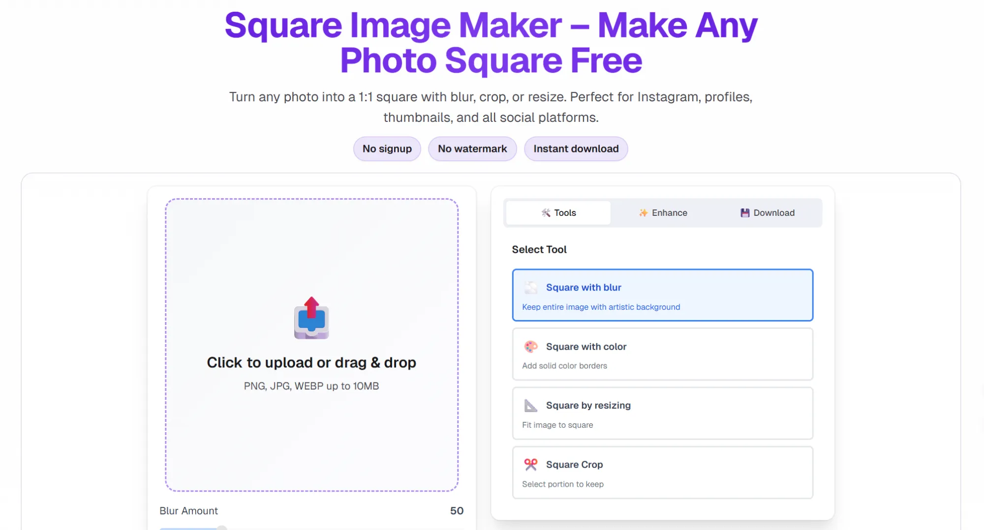
Three ways to go square (and when to use each)
1. Crop
Best when the subject is already centered and you are fine losing the sides. Fast, but brutal for landscapes, group shots, or screenshots with UI chrome.
2. Blur or color fill
Best when you need the full frame. The photo stays intact; empty space becomes a soft blur or a solid border. This is the usual fix for “I can’t crop this” assets—slides, product shots with labels, travel photos with a wide horizon.
3. Resize to fit
Best for diagrams, logos, or images that already have breathing room. The whole image scales down inside the square. Simple, but can look small if the original aspect ratio is very wide.
Most people default to crop because every phone app does it. Blur or padding is slower to find in native editors, which is why a lot of good photos still get hacked up in the feed.
Common mistakes
- Cropping after the platform already auto-cropped (you lose quality twice).
- Putting text or logos near the corners on a profile image (the circle mask will eat them).
- Exporting JPEG with heavy compression on graphics or screenshots (use PNG when you need sharp edges).
- Forgetting that “square” does not mean “tiny”—1080px wide is still worth aiming for on main posts.
A simple workflow that saves time
- Pick the platform and size first.
- Decide crop vs blur vs resize before you touch sliders.
- Export once at the final pixel size.
- Keep the original rectangular file in a folder—you will reuse it for Stories or banners later.
For quick browser-side work—no install, no account—I use a square image tool when I need blur background or a clean crop in one pass. It is not magic; it just keeps the “don’t crop my photo” option next to the obvious crop button, which is rarer than it should be in free tools.
Bottom line
Square format is not going away. The win is not fighting the ratio; it is choosing the least destructive way to get there. Crop when the composition allows it. Blur or pad when it does not. Export at the right pixels once, and stop letting the app do a second crop for you.
If your grid looks inconsistent, fix the shape before you fix the filter. Your future self (and your analytics) will thank you.


Sign in to leave a comment.