

I made this mistake myself the first time I ordered a photobook — I picked glossy because it was the default option, without really thinking about it. When the book arrived, every page under our living room lights had this glare that made it hard to actually look at the photos straight on. It wasn't a bad photobook. It was just the wrong paper for the room it lived in.
Paper finish is one of those details people skip past to get to the "fun" part of designing a photobook, but it changes how the book looks and feels more than almost any layout choice. Here's how the three main finishes actually differ, and which one tends to suit which kind of photos — especially useful if you're printing in Singapore's climate, which is its own consideration.
Glossy Paper
Glossy has a shiny, reflective surface, and it makes colours pop — reds look redder, blues look richer, and contrast feels punchier than the other two finishes.
Where it works well:
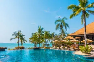
- Travel photobooks with bright, saturated scenery
- Food photography, where you want that appetizing, vivid look
- Photos taken in bright daylight with strong colour already
Where it struggles:
- Fingerprints and smudges show up more easily on glossy pages, which matters if the book's going to be handled a lot
- Glare under indoor lighting can make photos hard to view straight-on, especially under Singapore's common ceiling downlights or fluorescent lighting
- In humid conditions, glossy pages can occasionally feel slightly tackier over time compared to matte
Matte Paper
Matte has a flat, non-reflective finish. Colours are more muted and softer compared to glossy, but the trade-off is a more elegant, no-glare viewing experience from any angle.
Where it works well:
- Wedding photobooks, especially documentary or candid-style shoots, where a softer tone feels more timeless
- Black-and-white photography, which tends to look more refined on matte
- Books that will sit out on a coffee table and get picked up often, since there's no glare and fingerprints are far less visible
Where it struggles:
- Colours can look slightly flat if your photos rely heavily on bold, vivid tones
- Not the best choice if the entire book is built around punchy, saturated travel or food shots
Lustre Paper
Lustre sits between the two — a subtle sheen with a slightly textured surface, sometimes called a satin finish. It's a popular middle ground for people who can't decide between the other two.
Where it works well:
- Portrait and family photobooks, where skin tones need to look natural without the flatness of matte or the punch of glossy
- Mixed-content books with a variety of photo types — some bright, some muted — since lustre handles both reasonably well without leaning too far either way
- Humid environments generally, since lustre tends to resist fingerprints and glare better than pure glossy while still holding a bit more vibrancy than matte
Where it struggles:
- It's a compromise finish, so it won't outperform glossy on vibrancy or matte on that fully flat, elegant look — it's the "does most things well" option rather than the best at any one thing
A quick way to decide
If your photobook is mostly bright travel or food shots — lean glossy. If it's a wedding, black-and-white project, or something that'll be handled often and sit out on display — lean matte. If you're not sure, or the book has a mix of photo styles, lustre is the safer middle-ground choice.
Singapore's humidity is also worth factoring in if the book will be stored somewhere without regular air conditioning — matte and lustre finishes generally hold up a little better over time in sticky conditions than a fully glossy finish does.
If you're deciding between finishes for a wedding project specifically, a hardcover photo book in matte or lustre tends to suit the softer, documentary style most 2026 couples are going for, while a softcover photo book in glossy works nicely for a lighter, travel-style keepsake.
There's no universally "correct" paper — it depends entirely on the photos and how the book will actually be used. Picking the finish on purpose, instead of defaulting to whatever's pre-selected, is a small decision that ends up mattering a lot more than people expect.
On-page notes for publishing (Photojaanic Singapore)
- Suggested title tag: Best Photobook Paper Types Explained: Matte vs Glossy vs Lustre (Singapore Guide)
- Suggested meta description: A clear breakdown of matte, glossy, and lustre photobook paper — which finish suits weddings, travel, and family albums, plus notes on Singapore's humidity.
- Internal links used: 2 (hardcover photo book — SG domain, softcover photo book), each with distinct anchor text
- Schema suggestion: BlogPosting schema with author, datePublished, publisher (Photojaanic SG)
- Image alt text suggestions:
- "matte finish photobook page example"
- "glossy photobook travel photos Singapore"
- "lustre finish family photo album"
- E-E-A-T note: consider attributing this to a real team member with hands-on printing/production experience — a named author with production expertise strengthens topical authority for a technical/product-comparison post like this one, which Google's 2026 core update weights more heavily than unattributed content
- Local relevance: the humidity/climate angle is a genuine differentiator for the SG audience versus a generic global version of this post — worth keeping even if repurposed for other regional sites
















Sign in to leave a comment.