
In Ecommerce platforms, first impressions make or break the deal. A clumsy user interface, confusing navigation, or slow-loading pages are often known to chase away a potential customer. To successfully stand out in a crowded digital marketplace, businesses must prioritize user-friendliness above all else.
A user-friendly Ecommerce site doesn’t just look good but also offers user-centric guides, reassurances, and conversions. It removes friction from every step of the journey and leaves visitors with a sense of ease and satisfaction.
The following article blog outlines the key elements and best practices involved in building Ecommerce website designs that deliver exceptional user experiences and stronger business results.
Why User-Friendliness Matters in E-Commerce
Simply put, a smooth and intuitive shopping experience translates into real, measurable revenue. When users can easily navigate the site, discover products, and complete their purchases without confusion or delays, the result is higher engagement and more conversions. On the other hand, if customers struggle to find what they need or encounter friction, especially during checkout, they’re more likely to abandon the process and turn to a competitor.
Building with user experience in mind isn’t just good design. It’s good business. User-friendliness directly impacts some of the most critical KPIs in online retail:
- Lower bounce rates
- Higher conversion rates
- Increased average session duration
- Better customer retention
Ecommerce Development Trends for User-friendly Websites
Clear, Structured and Intuitive Navigation
Intuitive navigation is the backbone of a usable enterprise Ecommerce solution. When visitors land on a site, they rely on meaningful navigation to understand how the content is structured and where to go next. Whether users are casually browsing or searching for something quite specific, they should be able to instantly identify product categories, locate the search function, and access key pages like the checkout, cart or account.
If navigation is confusing, cluttered, or inconsistent, it not only creates frustration but also increases the likelihood of drop-offs. A clear and well-organized navigation structure is proven to empower users to move through the site effortlessly, ultimately contributing to higher conversion rates and customer satisfaction.
Best practices for a clear navigation include:
- A clean top-level menu
- Clearly labeled categories
- A well-structured mega menu for larger catalogs
- Consistent header navigation
- Breadcrumbs on product/category pages
- Auto-suggestions and filter-rich search bar
Mobile-first Design Approach
Did you know that more than 50% of all online purchases are made through mobile devices?
With mobile commerce gaining increasing traction, mobile-first designs have become a basic requirement for all Ecommerce development companies. The fast-paced users now expect nothing less than a fast, intuitive, interactive and fully functional Ecommerce experience on their mobile devices, whether they’re browsing, comparing products, or completing a purchase on the go.
A truly user-friendly e-commerce site must adapt to all screen sizes and devices seamlessly and ensure that navigation, layout, images, and interactions are all optimized for smaller viewports without compromising functionality.
Key mobile UX considerations include:
- Responsive layouts
- Easy-to-tap buttons and spacing
- Collapsible menus and sticky navigation
- Optimized loading speed
- Touch-friendly filters, carousels, and form fields
Prioritize Page Speed and Performance
It does not matter how elegant and visually appealing an Ecommerce site may be, unoptimized Ecommerce site performance and sluggish speed can break the deal. In the digital landscape, where speed equals convenience, users expect lightning-fast page loads and online experience.
Even a one-second delay can prove to be responsible for reduced satisfaction, increased bounce rates, and a higher likelihood of cart abandonment.
Beyond user frustration, slow page load times also hamper the search engine rankings. Conversely, fast-loading pages signal reliability and professionalism, encouraging users to stay longer, browse more, and complete purchases.
More than just a technical upgrade and a method to capture a new audience, prioritizing site speed is a critical driver of SEO, user trust, and conversion performance.
To improve page speeds, Ecommerce developers can:
- Use compressed and optimized images
- Minimize HTTP requests and third-party scripts
- Use lazy loading
- Enable caching
- Leverage a CDN
- Implement site speed audit with Google PageSpeed Insights or GTmetrix
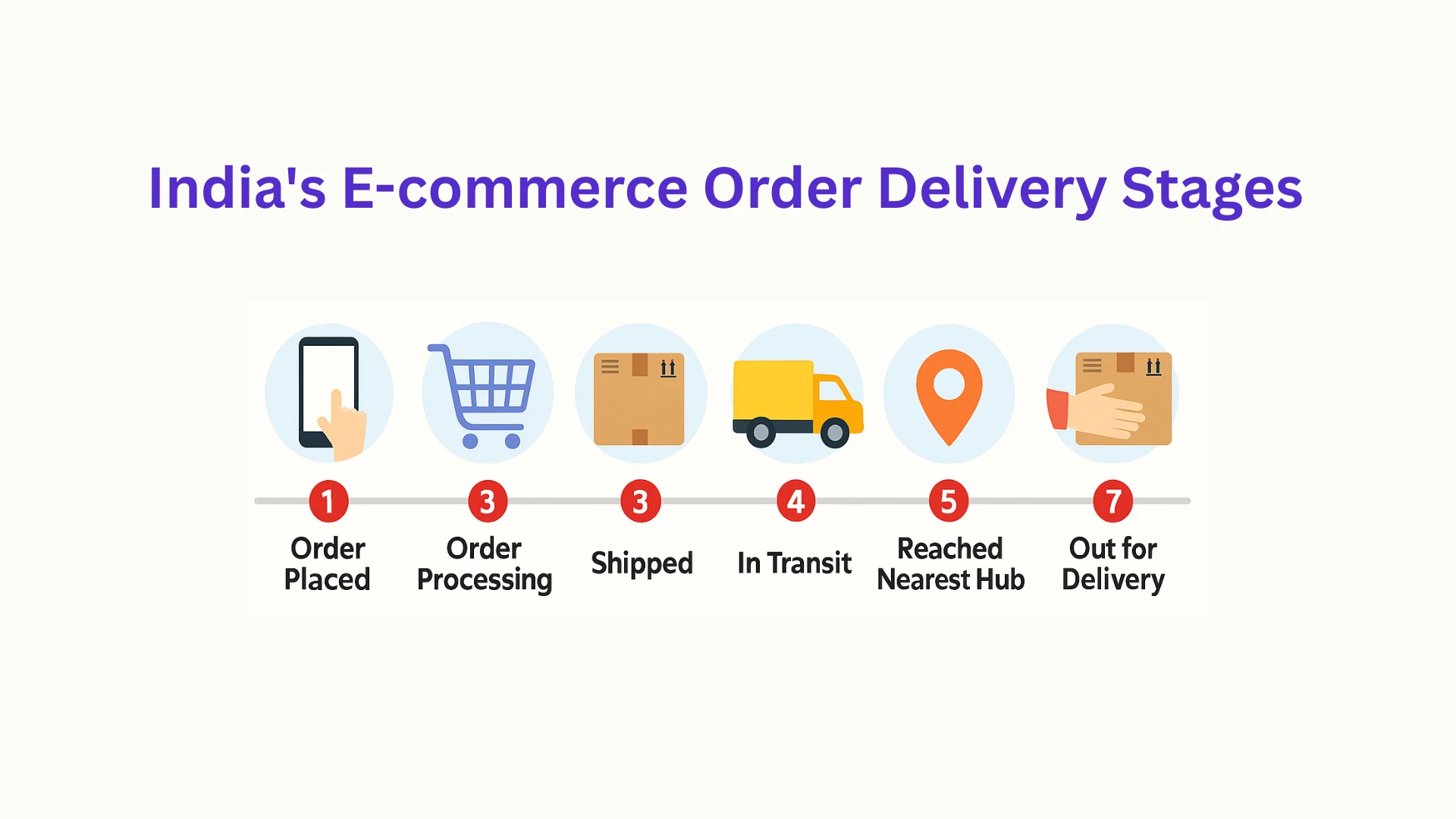
Simplified Ecommerce Checkout Process
Just imagine - You are delivering top-notch products and digital experience to potential customers, only to see them leave you during the checkout process? Sad, right?
Establishing a simplified checkout flow is essential for Ecommerce platforms as it poses to be one of the most vulnerable stages before conversions, where the users either make the purchase or abandon their carts. When the Ecommerce platform has complicated forms, slow page load speed, forced account creations and hidden charges, users can be easily distracted and frustrated, leading to abandonment.
That is why a seamless and transparent checkout experience is needed; by reducing unnecessary steps, offering helpful options and integrating digital wallets, businesses and Ecommerce website developers can offer a more streamlined experience with less friction and cart abandonment.
User-friendly checkout design should include:
- Guest checkout options
- Minimal required fields
- Autofill and validation for forms
- Clear shipping and return information
- A progress indicator for multi-step checkouts
- Multiple payment options, including digital wallets and BNPL (Buy Now, Pay Later)
Implement Visual Hierarchy for Guiding Users
Ecommerce web design is not just about making a web store look good, it is more importantly about guiding the users through relevant information and interactions with aim and purpose.
Establishing a strong visual hierarchy is a must-have for Ecommerce development companies, which ensures web components like product names, CTAs, navigation cues and pricing are upfront and visible.
Through thoughtful use of typography, color, spacing, and contrast, good design draws the eye naturally to what matters most. It helps users scan pages efficiently, focus on important content, and take the next step without confusion.
Design tips to achieve visual hierarchy for Ecommerce platforms include:
- Highlighted primary CTAs
- Usage of proper heading and subheading tags
- Emphasis on key selling points with icons or badges
- Place CTAs above the fold /at logical decision points
- Use whitespace strategically
Final Thoughts
Building a user-friendly e-commerce site is not about chasing Ecommerce development trends; it’s about creating an experience that’s smooth, intuitive, and conversion-focused. From clear navigation and mobile responsiveness to trust signals and fast performance, every element should work together to serve the end user.
Great UX isn’t an upgrade; it is the engine that powers online growth. By investing in usability from the start, e-commerce businesses create lasting impressions, stronger engagement, and measurable success.


Sign in to leave a comment.