
There is a particular kind of room that looks expensive without looking newly done. The walls may be ordinary. The flooring may have been there for years. There is no dramatic false ceiling, marble island or custom joinery in sight. Yet the room feels considered.
That effect usually comes from styling rather than construction.
The most convincing interiors today are moving away from obvious “luxury” markers and towards material depth, thoughtful colour, flattering light and objects that look collected over time. That is good news for renters, new homeowners and anyone who would rather not turn the house into a construction site. A few precise changes can alter how a room reads, without changing its bones.
Start With Fabric, Not Furniture
When a room feels flat, the instinct is often to buy another piece of furniture. Fabric can do more with less.
Long curtains create vertical rhythm, particularly when they are hung closer to the ceiling and allowed to fall generously. A throw folded over an armchair softens hard furniture. A tablecloth can make an everyday dining table feel more intentional, while a runner introduces pattern without taking over.
Avoid fabrics that are all equally smooth. Pair washed cotton with linen, velvet with a dry woven texture, or a crisp stripe with a softer block print. Expensive-looking rooms rarely rely on one finish. They gain richness from surfaces that respond differently to light.
Treat Cushions Like a Composition
Cushions are often bought as matching sets, which can make a sofa look more like a showroom display than a lived-in interior. A stronger approach is to build a small composition.
Start with two larger cushions in a quiet colour, then add one patterned piece and perhaps a smaller cushion with contrasting texture. Vary scale before varying colour. A broad stripe beside a delicate floral or hand-blocked motif feels more deliberate than several competing prints of similar size.
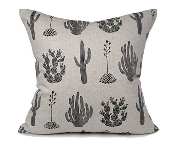
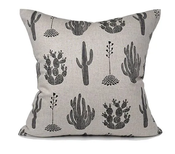
Material matters here. A linen cushion cover has the relaxed texture that works particularly well with wood, cane, cotton upholstery and neutral sofas. Its gentle creasing is part of the appeal, giving a room a softer, less manufactured character.
This is where Deodar fits naturally into the current décor mood. Its linen, block-printed textiles and craft-led details suit rooms that feel tactile and personal rather than polished to the point of anonymity.
Make Lighting Look Layered, Not Bright
One ceiling light in the centre of a room is functional. It is rarely atmospheric.
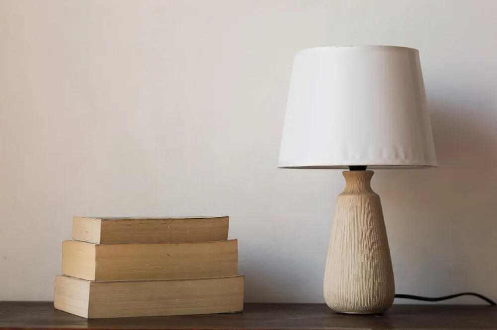
More considered interiors tend to feel comfortable because light comes from more than one height. A table lamp on a console, a floor lamp near a reading chair and a small lamp on a side table create separate pools of light. Together, they make the room feel deeper.
The lamp itself does not need to be expensive. Pay more attention to proportion and shade material. Pleated fabric, parchment-style shades, ceramic bases, aged metal and simple wood carry more visual warmth than shiny finishes.
Warm white bulbs, usually around 2700K to 3000K, are particularly flattering to timber, terracotta, cream, rust and natural textiles. They also avoid the clinical cast that can make attractive décor feel strangely unfinished.
Use Colour in Families, Not Exact Matches
A luxurious room is rarely built around one perfectly matched beige, green or blue. It is more often a family of related tones.
Think tobacco with caramel and sand. Olive with moss and faded sage. Chalk with oatmeal and stone. These combinations create movement without making the palette feel busy.
This is especially useful when permanent finishes are not ideal. If a floor is slightly too yellow, warm cream, muted brown and olive can make that undertone feel intentional. If a rental has cool grey tiles, smoky blue, off-white and dark timber can pull the room into a more coherent direction.
Colour becomes convincing when it connects what is already there rather than fighting it.
Layer the Room at Different Heights
A common reason a space looks unfinished is that all the visual interest sits at the same level. Sofa, coffee table, television unit, done.
Instead, spread attention around the room. Let curtains draw the eye upward. Place a tall branch on a console. Stack books beneath a sculptural object. Lean framed art on a shelf rather than hanging every piece. Add a low bowl to a coffee table and a taller lamp beside it.
This variation creates rhythm without structural work.
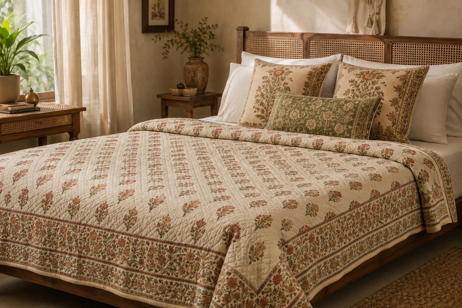
The same principle applies to a bed. Start with the largest pillows at the back, add sleeping pillows, then one or two decorative cushions at the front. A single linen cushion cover in a stripe or restrained print can interrupt plain bedding without turning the bed into a cushion exhibition.
Choose Accents With Patina, Texture and Imperfection
Small décor looks more expensive when it has visual weight. That does not necessarily mean heavy objects or costly materials. It means pieces that hold attention.
A slightly uneven ceramic bowl, a wooden box with visible grain, a brass candlestick with a softened finish, a handwoven basket or a block-printed textile usually brings more character than several glossy accessories bought at once.
Even inexpensive objects benefit from breathing space. Give a good vase an entire corner of a console instead of surrounding it with smaller items. Place one substantial bowl on a dining table rather than scattering multiple decorative pieces. Luxury is often as much about restraint as acquisition.
Let One Detail Be Slightly Unexpected
Rooms become memorable when something breaks the formula.
It might be a striped cushion on a floral chair, an antique-looking frame around modern art, a deep plum lampshade in an otherwise earthy room, or a rustic stool beside a clean-lined sofa. These small frictions prevent a space from feeling copied from a catalogue.
A home does not need renovation to feel more resolved. It needs better editing. Textiles can soften hard edges, layered lighting can change the evening mood, related colours can make imperfect finishes feel intentional, and a few well-chosen accents can give ordinary furniture a stronger setting.
The expensive look, in the end, is rarely about adding more. It comes from making each layer feel as though it belongs there, then knowing when the room has said enough.




























Sign in to leave a comment.