
Have you ever poured your heart and budget into a marketing campaign, only to feel like your message is just blending into the digital noise? I have been there. In a world where our attention is pulled in a dozen different directions at once, capturing a moment of genuine focus from your audience feels like a superpower. But what if you could command attention right where people are already present and engaged in their environment?
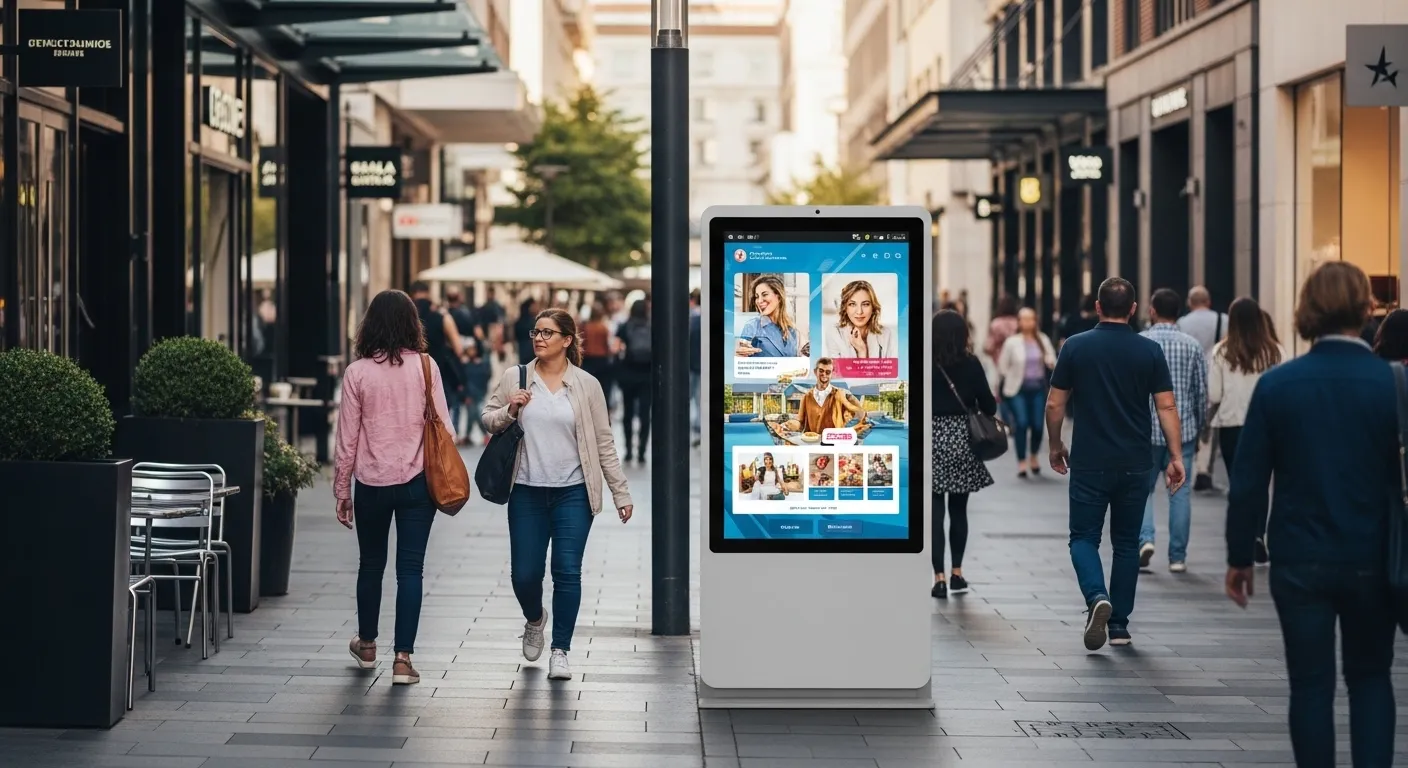
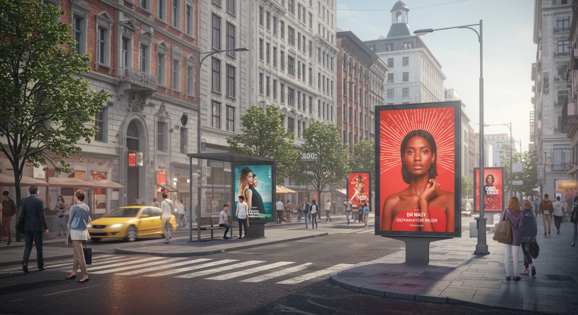
This is the unique power of High-Visibility Kiosk Screens. Unlike a fleeting online ad or a piece of direct mail that might be immediately discarded, these digital canvases are placed in the path of daily life. They are not an interruption but a part of the landscape. The challenge and the opportunity lie in designing for them effectively. It is a different ballgame from web or print design, and getting it right can transform your campaign from background static to the main event.
Understanding the High Visibility Kiosk Environment
Before we dive into design, we need to appreciate the unique context of High-Visibility Kiosk Screens. A person interacting with one of these kiosks is often on the move. They might be rushing to a flight, waiting for a coffee, or walking through a shopping mall. You have a precious few seconds to grab their attention and convey your core message.
This environment demands a different mindset. You are not designing for a seated user who is actively seeking information. You are designing for a passive audience that you need to activate. The screen is large, public, and shared, which means your content must be immediately accessible and universally understandable. Think of it as creating a visual handshake that is firm, friendly, and unforgettable in just a split second.
The Golden Rule of Kiosk Design Simplicity is King
If you take away only one piece of advice from this article, let it be this. Simplicity is not just an aesthetic choice for kiosk screens, it is a functional necessity. Cramming too much text, using complex graphics, or presenting multiple calls to action will only lead to cognitive overload. The result? People will simply look away.
Your goal is to communicate one central idea as powerfully as possible. Use ample negative space to let your message breathe. Focus on a single, compelling image and a concise headline. As the renowned designer Antoine de Saint Exupéry famously said, "A designer knows he has achieved perfection not when there is nothing left to add, but when there is nothing left to take away." This philosophy is your guiding star for impactful kiosk campaigns.
Crafting Your Visual Hierarchy for Maximum Impact
Since users will be scanning your content quickly, you must guide their eyes deliberately. This is where a strong visual hierarchy comes in. Think of your design in layers.
What is the very first thing you want someone to see from ten feet away? That is your primary element: a bold image or a large, contrasting keyword. Next, what is the supporting message they will read when they are a few feet closer? This is your headline. Finally, what is the essential detail or instruction for the user who has stopped to engage? This is your body text and call to action.
By structuring your content this way, you ensure that every person, regardless of their proximity or engagement level, receives a part of your message.
The Power of Color and Contrast
Color is one of your most potent tools. In a brightly lit lobby or a sun washed street, poor color choices can render your beautiful design completely invisible. The key is to use high contrast combinations. Think dark text on a light background, or better yet, vibrant, saturated colors that pop.
Avoid subtle gradients or similar tones that blend together. Your design needs to stand up to glare and ambient light. A quick test is to view your design in grayscale. If the elements still have clear definition and separation, you are on the right track.
Typography That Talks Loud and Clear
The font you choose can make or break your readability. This is not the place for delicate, ornate script fonts. You need strong, sans serif typefaces that are easy to read at a glance and from a distance.
Ensure your font sizes are generous. Your headline should be large and commanding, while your body text must be legible from an arm's length away. Also, be ruthless with your word count. Keep your text blocks short and use bullet points where possible to enhance scannability. Every word must earn its place on the screen.
Weaving in a Narrative and a Natural Call to Action
Even with a simple design, your campaign should tell a micro story. Who are you? What are you offering? Why should the user care? This narrative is what transforms a generic ad into a memorable brand experience.
And this is where your strategy comes to life. When you understand the power of these screens, you see them as more than just displays; they are interactive touchpoints. For instance, when designing a campaign around High Visibility Kiosk Screens, the ultimate goal is to create a seamless user journey from that initial glance to a meaningful action. The best campaigns I have seen use the screen's presence to provide immediate value, whether it is through wayfinding, an exclusive offer, or a captivating piece of content.
This approach to digital integration is something I have seen expertly executed by specialists like Street Media Group, who understand that the hardware and the content must work in perfect harmony to create a true impact. It is about creating a moment of connection that feels both spontaneous and intentional.
Motion and Video Capturing the Wandering Eye
A static image is powerful, but gentle motion can be irresistible. A short, looping video background or a subtle animation on a key graphic can instantly draw the eye in a busy environment. The human brain is hardwired to notice movement.
However, use motion with intention. It should be smooth, not jarring, and it should enhance the message, not distract from it. Avoid fast flashing or overly complex animations that can be disorienting. A little movement goes a very long way.
The Importance of Accessible and Inclusive Design
Your kiosk campaign will be seen by a diverse audience, including people with different visual abilities. Incorporating accessibility principles is not just a best practice it expands your campaign's reach and effectiveness.
This means ensuring high color contrast, using large, legible fonts, and considering the placement of the screen for wheelchair users. Resources like the Web Accessibility Initiative (WAI) from the World Wide Web Consortium (W3C) offer fantastic guidelines that can be adapted for digital signage, ensuring your message is for everyone. This commitment to inclusivity reflects well on your brand and creates a more positive public perception.
Testing and Iterating Your Way to Success
Finally, never assume your first design is the perfect one. The true test of a kiosk campaign is in the wild. If possible, observe how people interact with your screen from a distance. Do they stop? Do they look confused? Do they take a picture or engage with a QR code?
Use these real-world observations to refine your approach. This process of observation and iteration is a cornerstone of effective communication, much like the methods used in public health campaigns studied by institutions like the National Institute on Drug Abuse (NIDA), which often researches how message framing impacts public behavior. Perhaps your call to action needs to be clearer, or your headline needs a different hook. The cycle of designing, deploying, and iterating is what separates good campaigns from truly groundbreaking ones.
Final Thoughts
Designing for high visibility kiosk screens is a thrilling challenge that pushes us to be better, clearer, and more creative communicators. It forces us to strip away the non essential and focus on the core of our message. By embracing simplicity, mastering visual hierarchy, and always designing with the mobile user in mind, you can create campaigns that do not just get seen, they get remembered. In the end, it is about creating a brief but powerful moment of connection that leaves a lasting impression long after the user has walked away.


Sign in to leave a comment.