
How I would evaluate the tool for everyday content work, without confusing public documentation with hands-on results.
A request such as “make a professional image for my article” leaves a surprising amount undecided. It does not explain where the image will appear, what the reader should notice, or which details would make the result unusable.
That is why my GPT Image 2.5 review starts with the assignment rather than a collection of attractive examples. For creators and marketers, the useful question is whether a tool can help finish a particular piece of work without making its review harder than necessary.
This article is based on official documentation checked on September 10, 2026. I have not completed a controlled hands-on comparison of its API variants. The prompts are proposed starting points, not proven recipes, and the cover is an editorial illustration rather than a test result.
My provisional advice is to evaluate the tool on a small job with a clear destination and a manual fallback. Do not begin by migrating every image in a campaign.
Understand the two model names
OpenAI's API documentation positions GPT Image 2.5 Flare for fast everyday generation and GPT Image 2.5 Sunburst for work that prioritizes editing precision. These are useful selection cues, not scores from my own testing. Flare model page, Sunburst model page
I would consider Flare for an initial trial involving several visual directions. I would consider Sunburst when a nearly finished image needs a bounded change. In either case, I would judge the output against the brief rather than assume the model name determines the result.
If you work through an application rather than directly through the API, record what that application actually displays. Do not infer a particular variant from a screenshot or a response that looks unusually good. The application may also supply editing and export features that should not be attributed to the model alone.
If you are considering a third-party application, Wizstar’s GPT Image 2.5 page is one place to check before planning a trial. Confirm the model name and available controls in the interface, then record the settings used for each attempt. I have not tested Wizstar for this review, so this link is a supplementary reference, not evidence of image quality or editing performance.
Write a brief that can be checked
Here is a hypothetical assignment: create an illustration for an article about simplifying a morning routine. The image should show an unbranded ceramic mug on a quiet tabletop, leave room for a headline, and remain readable in a small social preview.
I would put the destination first. An article header needs a composition that survives its intended crop. A square thumbnail has a different shape problem. Decide which file is primary instead of assuming one image will fit every placement equally well.
Next, describe the subject and the details that matter. “A mug” is a broad category. A cream-colored mug with a rounded handle and a matte finish is more specific. If the image represents a real product, provide an approved reference and identify the characteristics that must not change.
Then describe the desired visual effect in practical terms. Rather than stacking adjectives such as premium, cinematic, elegant, and striking, say where the light should come from, how much background detail is appropriate, and what should remain empty.
Finally, list exclusions that are relevant to the job. For this example, I would exclude lettering, extra props, and visible branding. A brief does not improve merely by becoming longer; every added requirement should help decide whether the output is useful.
Generate the composition before polishing details
For the imagined article header, I would begin with this untested instruction:
Create a quiet editorial image for an article header. Show one unbranded cream ceramic mug on the right side of a simple tabletop. Use soft daylight from the left and a restrained, neutral background. Keep the left side visually calm so a headline can be added later in a layout editor. Do not include lettering, logos, extra cups, or decorative props. Prioritize a clear mug silhouette and a plausible contact shadow.
The first check would be composition. Does the mug occupy the intended area? Is there enough calm space for the headline? Does the image still communicate its subject when reduced?
I would not spend time repairing a small surface detail if the composition is fundamentally wrong. Returning to the brief or adjusting the reference could be more useful than continuing with an unsuitable image.
If several candidates are generated, keep the rejected ones until the evaluation is complete. They show whether the prompt produced a useful range or whether the accepted image was an isolated success. Record how many attempts were made; do not describe one good result as a repeatable method.
Revise one decision at a time
Once the composition is acceptable, save that version separately. Suppose the only remaining issue is that the background looks too warm. I would request that change without also asking for a more luxurious mood, a different viewpoint, and stronger lighting.
A bounded revision makes the next inspection easier to explain. The requested background must change, while the approved mug and its position must remain acceptable. If the output changes the handle or introduces a new object, it needs another decision rather than automatic approval.
I would compare the revision with its parent image, not only with my memory of it. A small difference can be difficult to notice when moving back and forth through a conversation.
If the revision fails, I would return to the saved accepted version before trying again. Continuing from a rejected result can make it difficult to separate the original defect from later changes.
Keep final copy editable when the job calls for it
For this workflow, I would add the final headline in a layout editor. That keeps the wording, font size, and line breaks available for ordinary editing.
This is not a claim that GPT Image 2.5 cannot generate text. It is a choice about the expected revisions. If the title is likely to change after an editor reads the article, maintaining it as editable text can make that change more direct.
The same principle applies to dates, prices, and small labels. Keep a separate approved text source, then compare the final visual against it. The image's overall polish should not distract from a wrong word or missing unit.
Review the file where it will be used
I would inspect the image at full size for object shape, edges, and unintended details. Then I would place it in a draft of the actual destination and inspect the crop, text clearance, and contrast.
These checks answer different questions. Full-size inspection reveals detail problems. A small preview shows whether the composition still works. Passing one does not imply passing the other.
I would also check the downloaded file rather than assume the editor preview is the deliverable. Confirm that the image opens, its dimensions fit the intended placement, and the chosen file is the accepted version. Keep the source and revision history separately so an accidental upload does not become the new reference.
For accessibility, write ALT text that describes the meaningful visual content. Avoid filling it with keywords or claiming that the illustration is a photograph of an actual event when it is not.
Decide whether the workflow was worth repeating
After the job, I would record the number of attempts, the rejected outputs, the checking time, and the repairs. If API usage is involved, I would add the measured charges rather than estimate from another model's results.
The conclusion could be mixed. The tool might be useful for composition ideas but unnecessary for exact color changes. It might fit an editorial illustration while being unsuitable for a product image whose small details must match a physical object. A useful review should retain those boundaries.
I would avoid it as the sole method when the assignment requires an exact change that is already easy in an editable source file, or when the team cannot verify the details that matter. For those jobs, an ordinary editor or a qualified human reviewer remains an important part of the process.
For exploratory content work, GPT Image 2.5 is a reasonable candidate to investigate on the basis of its documented positioning. I am not yet claiming it is the best choice, or that it has saved me a measured amount of time.
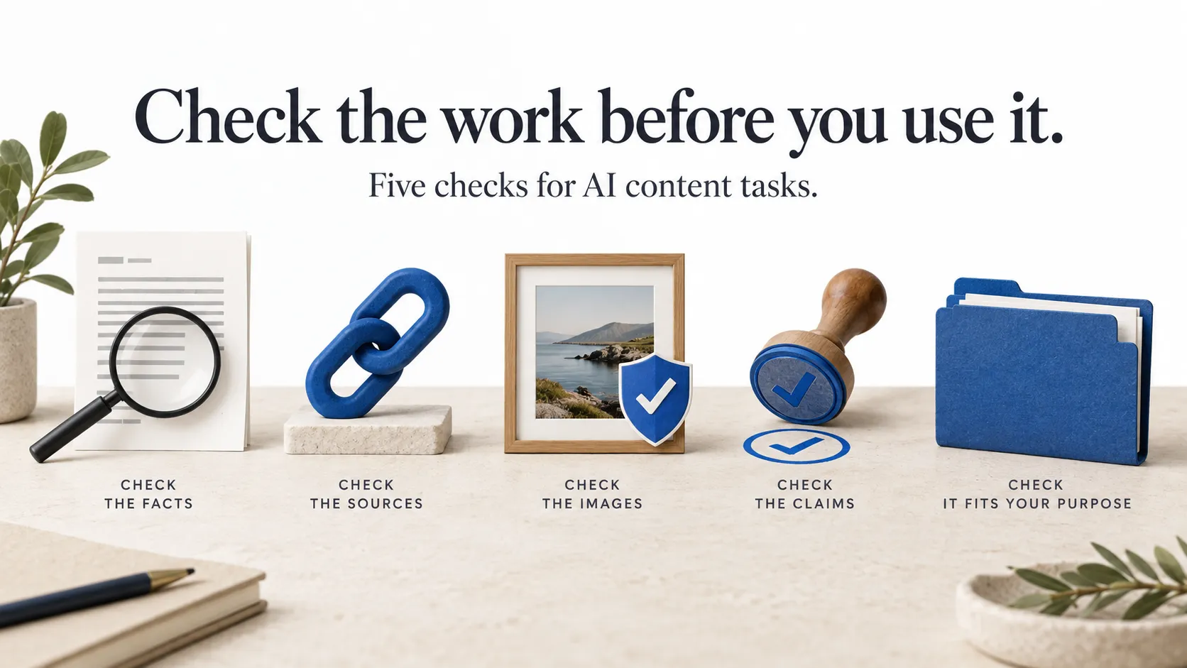
A good first trial should leave you with more than an image. It should leave you knowing which part of the job the tool helped with, which part still needed you, and what you would do differently next time.















Sign in to leave a comment.