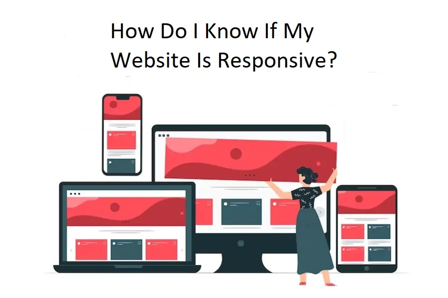
CIn today's digital era, a website must be responsive as people use various devices. A responsive website can easily adjust to different screen sizes and provide an ideal viewing and interaction experience.
Now that you understand the importance of website responsiveness, the next question is how do you know whether your website is responsive? No worries; here is the detailed answer.
Different Methods to Check Website Responsiveness
Let's explore simple ways to check if your website adapts well to your audience's diverse devices, including desktops, tablets, and smartphones.
Method: 1 Manual Testing
In manual testing for website responsiveness, several signs indicate that your website is responsive.
Firstly, visually; if your site layout adjusts smoothly to various devices without text or images appearing distorted, it's a positive sign. Additionally, your website is responsive if you can comfortably read the text without zooming in or encountering readability issues on different screens. Interactive elements, like buttons and forms, should function seamlessly across devices, contributing to a user-friendly experience.Consistency in design, where colours, fonts, and overall appearance remain uniform, is another key sign of responsiveness.If your website looks good, functions well, and provides a consistent experience on different devices, it's responsive.
Method: 2 Browser Tools
Using browser tools to test website responsiveness shows that your site adapts effectively to different devices.
Firstly, when you simulate your site on various screen sizes, look for a smooth and natural content adjustment without elements becoming cramped or distorted. Secondly, check if the text remains readable without requiring zooming in or causing horizontal scrolling. Another key sign is the ability to interact easily with your site, ensuring buttons and forms function well.Lastly, if your layout and functionality look great on several devices, it means your website is responsive and provides a user-friendly experience. You no longer need to physically test the responsiveness of your website.
Method: 3 Online Testing Tools
Online testing tools are valuable resources for checking the responsiveness of your website without the need for numerous devices. Tools such as Google's Mobile-Friendly Test and other responsive design checkers imitate various devices and screen sizes to show how your website looks and performs.
Here are the results from online testing tools that indicate your website is responsive:
"Mobile-Friendly" or "Responsive" Status: Tools might explicitly state that your site is mobile-friendly or responsive.Positive Device Testing: When you test on different devices, your site appears well-formatted without content issues or confusing designs.No Critical Errors Reported: Testing tools should not detect major issues that affect usability or readability on various screens.Consistent Performance Across Devices: Your site functions smoothly, ensuring a similar experience across different devices.
These results indicate that your website is responsive and provides a consistent, user-friendly experience across devices.
Consider consulting experts in responsive website design services For professional assistance in ensuring your website's responsiveness.
Here are a few questions to ask yourself If you're unsure if the site is responsive or not:
1. Does it change shape when you change the size of your browser from a desktop computer?
If your website is responsive, it will modify its layout and adjust elements as you resize the browser window on a desktop computer.
2. Can you find the term "responsive" or "@media" in the home page source code?
Open the source code of your website's homepage and look for '@media'. If you find it, your website is most likely using a responsive design to respond to multiple screen sizes.
3. Does the site display different content or a different layout on a mobile device?
In a responsive website, the content and layout adapt to fit the screen size of different devices. This means your site won't show an entirely different version for mobile; instead, it smartly rearranges elements for optimal viewing on smaller screens. A responsive site ensures a consistent and user-friendly experience across various devices.
Conclusion
In this blog post, we have introduced some methods and tools that you can use to check the responsiveness of your website.
By testing your website on different devices and resolutions, you can ensure that your website provides a consistent and optimal user experience across different devices. It can help you to improve the accessibility, usability, and engagement of your website and, ultimately, the satisfaction of your users.
Remember, if you need assistance optimizing your website's responsiveness, feel free to contact us.
If you liked this article and learned something from it, please comment, give it a like, and share it with others. And to get more interesting articles about web technology, don't forget to subscribe to WebyKing!


Sign in to leave a comment.