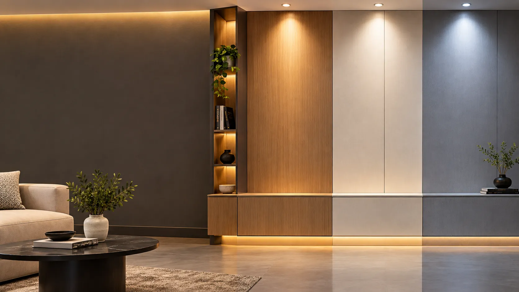

A laminate can look different in a showroom, catalogue, photograph, and finished room. One of the main reasons is lighting.
Light affects how we perceive colour, texture, contrast, and reflection. The same laminate may appear warmer under yellow-toned lighting, more neutral in daylight, or more reflective under strong artificial illumination.
Understanding this relationship can make it easier to choose the best laminate for kitchens, wardrobes, living rooms, offices, and other interior spaces.
Natural Light Can Change the Way a Laminate Looks
Natural daylight is not constant throughout the day. Its appearance changes depending on the time, weather, window direction, and amount of sunlight entering the room.
A laminate placed near a large window may therefore look different in the morning compared with the evening.
For example, warm sunlight can make beige, cream, brown, and wood-inspired surfaces appear richer. In a room with limited natural light, the same colours may appear more muted.
This is why the amount and direction of daylight should be considered before finalising a laminate for a large furniture surface.
Warm and Cool Artificial Light Create Different Effects
Artificial lighting also influences colour perception.
Warm white lighting can make interiors feel warmer and can enhance beige, brown, cream, and wood-inspired surfaces.
Cooler white lighting generally produces a crisper appearance and can make neutral, grey, white, and cooler colours appear more prominent.
Neither is automatically better. The right choice depends on the atmosphere and colour palette you want to create.
A laminate selected under one type of lighting may not look exactly the same after installation if the room uses a significantly different light source.
Matt Laminates Produce a Softer Visual Effect
Matt surfaces generally reflect less direct light than glossy surfaces.
This can make colours appear more understated and reduce strong reflections across large furniture panels. For bedrooms, wardrobes, living spaces, and other areas where a quieter visual effect is preferred, matt finishes can work particularly well.
Lighting still matters, however. Strong directional light can reveal subtle surface textures and variations that may not be noticeable under softer illumination.
High-Gloss Laminates Interact More Strongly With Light
High-gloss surfaces reflect more light, which can create a brighter and more reflective appearance.
In a well-lit room, this can add visual brightness to cabinets, wardrobes, and other furniture surfaces. However, direct lighting can also create noticeable reflections.
The position of windows, ceiling lights, pendant lights, and other sources should therefore be considered when using highly reflective finishes.
A high-gloss laminate may look completely different depending on whether light falls directly onto the surface or reaches it at an angle.
Texture Becomes More Visible Under Directional Light
Lighting does more than change colour. It can also reveal surface texture.
Light coming from the side can create subtle highlights and shadows across textured laminates. This can make wood-inspired patterns, suede-like finishes, and other textured surfaces appear more pronounced.
Diffuse lighting tends to create a more uniform appearance.
If texture is an important part of the design, the direction and intensity of lighting can therefore influence how noticeable it becomes.
Dark Laminates Need More Attention to Lighting
Dark surfaces can create a dramatic and sophisticated appearance, but the surrounding lighting can significantly affect how they are perceived.
In a poorly lit room, dark furniture may appear heavier or visually dominant. With balanced ambient and accent lighting, the same surface can show more of its colour and texture.
When selecting a dark laminate for wardrobes, cabinets, or wall furniture, consider the room's natural light as well as its artificial lighting plan.
Light Colours Can Also Look Different
Light-coloured laminates are not immune to lighting changes.
White, ivory, beige, light grey, and other pale shades can shift visually depending on the colour temperature of the light around them.
For example, a warm light can give a pale neutral a warmer appearance, while cooler lighting can make it look crisper.
This is particularly important when combining several light surfaces. Two colours that appear similar under one light source may show a noticeable difference under another.
Why Laminate Samples Can Be Misleading
A small laminate sample is useful for comparing colours and finishes, but it does not always represent how the material will look across a large installed surface.
The viewing environment matters.
A sample viewed:
- Under showroom lighting
- Near a window
- Under warm LED lighting
- Under cool LED lighting
- Against a particular wall colour
may appear slightly different in each situation.
The surrounding colours also influence perception. A grey laminate against a warm-toned wall may appear different from the same laminate placed beside a cool white wall.
For important projects, it is useful to evaluate the selected surface in lighting conditions that are reasonably close to the actual space.
The Surrounding Materials Matter Too
Lighting does not affect a laminate in isolation.
Walls, flooring, ceilings, countertops, curtains, furniture, and metal finishes all reflect and absorb light. Their colours can influence how the laminate is perceived.
For example, a warm wooden floor and warm wall colour can make a neutral laminate feel warmer. A cool grey environment can produce the opposite effect.
This is why laminate selection works best as part of the complete interior palette, rather than as an individual colour decision.
How to Check a Laminate Before Finalising It
Before selecting a laminate for a major furniture or interior surface, consider these simple steps:
1. View It in Different Lighting
Check the colour under daylight and the artificial lighting planned for the room.
2. Look at the Finish From Different Angles
This is particularly important for glossy and textured surfaces.
3. Compare It With Surrounding Materials
Place the laminate alongside flooring, wall colours, countertops, fabrics, and other major materials.
4. Consider the Size of the Application
A colour or pattern that looks balanced on a small sample may have a stronger visual impact across a full wardrobe or cabinet.
5. Check the Room's Natural Light
Think about the position and size of windows and how much daylight reaches the furniture.
A Simple Lighting Checklist
Before finalising a laminate, ask:
Does the room receive strong natural light?
What colour temperature will the artificial lighting have?
Will the surface receive direct light?
Is the laminate matt, textured, or highly reflective?
Does the colour work with the flooring and walls?
Will the pattern look balanced across the full furniture surface?
These questions can prevent unexpected differences between the selected design and the finished interior.
Final Thoughts
Lighting is an often-overlooked part of laminate selection, but it can have a significant effect on the final appearance.
The colour you see is influenced not only by the laminate itself but also by light source, direction, intensity, surface finish, surrounding colours, and viewing angle.
Instead of choosing a laminate based solely on how it looks in a catalogue or showroom, consider how it will interact with the actual room.
When the surface and lighting work together, even a simple laminate design can create a more balanced and visually cohesive interior.
























Sign in to leave a comment.