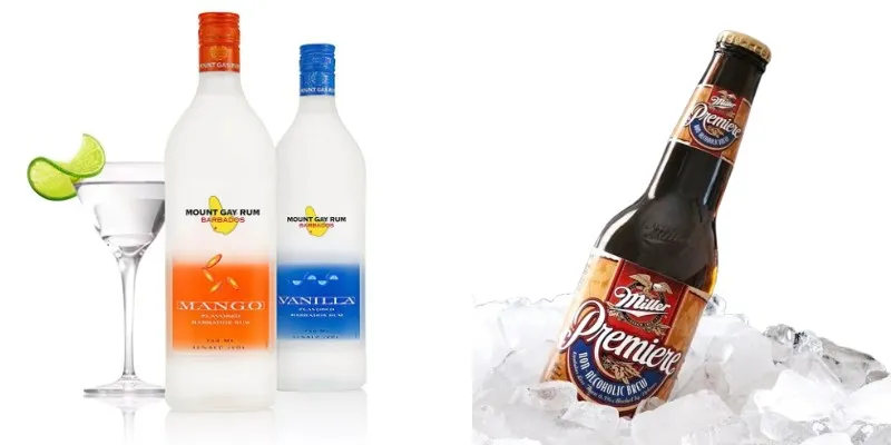
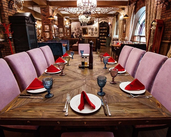
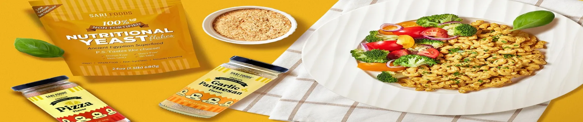
Have you ever walked down a busy grocery aisle where your eyes scan dozens of bottles and cans in seconds? The ones that stop you cold? They have labels that just pop. That's the charm of smart beverage label design; it turns a quick glance into a grab off the shelf.
As they say, "Good design is all about making other designers feel like idiots because that idea wasn't theirs." – Frank Chimero.

Labels do more than wrap a product and tell your brand's story right there in the store. The pop labels pull people in before they even read the fine print. So, let's get inside this blog piece and learn more about how your brand's label design can boost shelf appeal!
Crafting the Visual Impact of Beverage Label Design
Great beverage label design grabs attention fast. Think of it as your product's first handshake with a shopper hurrying by. Here are some tips that can help one craft a great visual impact:
- Use unique shapes or textures that feel good to touch. They make your bottle stand out from the crowd and invite someone to pick it up for a closer look.
- Pick bold fonts that anyone can read from a few feet away. Layer them smartly to spotlight flavors or what's special about your drink right up front.
- Go for colors that match your drink's vibe, like cool blues for refreshment. Keep it simple so it feels upscale without overwhelming the eye.
- Add crisp photos that look real, say fresh fruit for juices. They build trust and make folks crave that taste just by looking.
- Arrange everything cleanly so info flows naturally. Focus on your brand's big promise without stuffing too much into it.
Meeting Compliance Standards for Package Designs
Rules keep things honest, but they don't have to cramp your style. Package design legal requirements let you shine while staying safe and clear. Here is what you need to know:
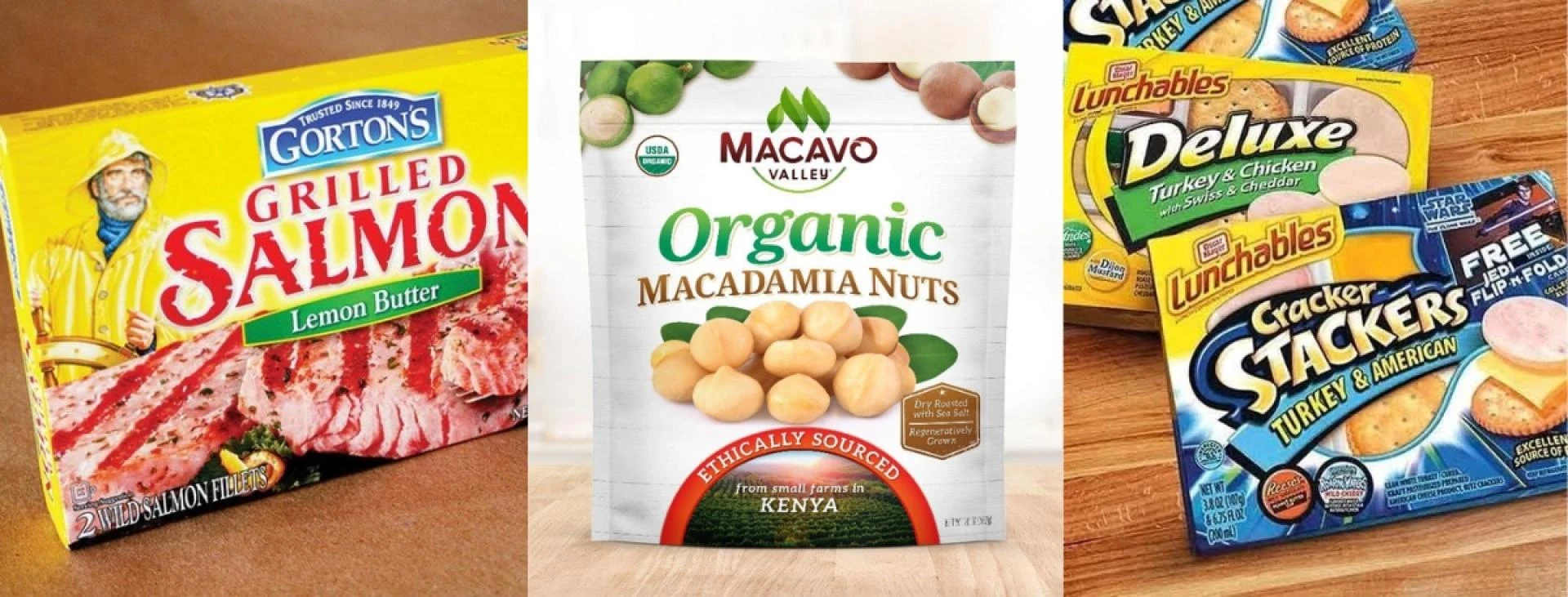
- Stick to true claims about ingredients or benefits. Clear lists build trust, so buyers know exactly what they're getting inside.
- Add recycle icons and material notes. Eco-friendly shoppers love seeing your commitment to the planet right on the label.
- Size fonts right for warnings, especially in alcohol packaging design. It keeps you legal and lets creativity breathe around it.
- Toss in QR codes for extra details. They clear up space on the label and let people dive deeper with their phones.
- Test prints early to match exact colors and sharpness. This way, what you design looks perfect in stores every time.
- Bring in legal checks from the start. It spots issues fast, freeing you to create without worry.
Integrating Sustainability Trends
Today's buyers care about the earth. Labels that nod to green practices win hearts alongside eyes.
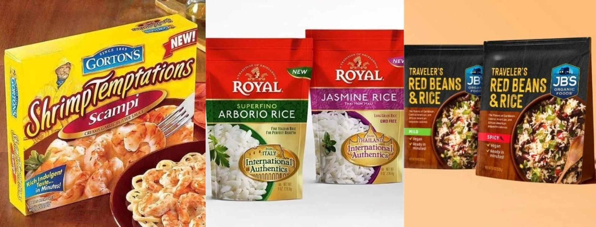
Slim designs with smart codes pack more story without waste. This fits right into food label design shifts toward less clutter.
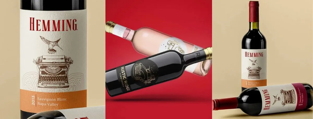
Promoting Brand Storytelling
Beer label design shines by sharing roots and flair. It pulls people into your world, turning browsers into fans.
FAQ Section
Q1. Why care about shelf appeal in labels?
Smart beverage label design stops shoppers in their tracks amid rivals. Visual tricks share your value quickly, sparking grabs and repeat buys.
Q2. How do rules shape design picks?
Laws demand plain ingredient info and alerts. Pros weave them in smoothly, keeping looks sharp while earning trust from the start.
Q3. What's sustainability's part here?
Green hints like recycle marks draw careful eyes. Lean looks plus phone links cut clutter, matching what mindful folks expect.
Wrapping up:
Strong beverage label design turns basic packaging into a sales powerhouse. It amps up notice, checks all boxes, and clicks with picky crowds. At Lien Design in San Diego, they help brands nail that edge quietly. Reach out to lift your spot on the shelf.


Sign in to leave a comment.