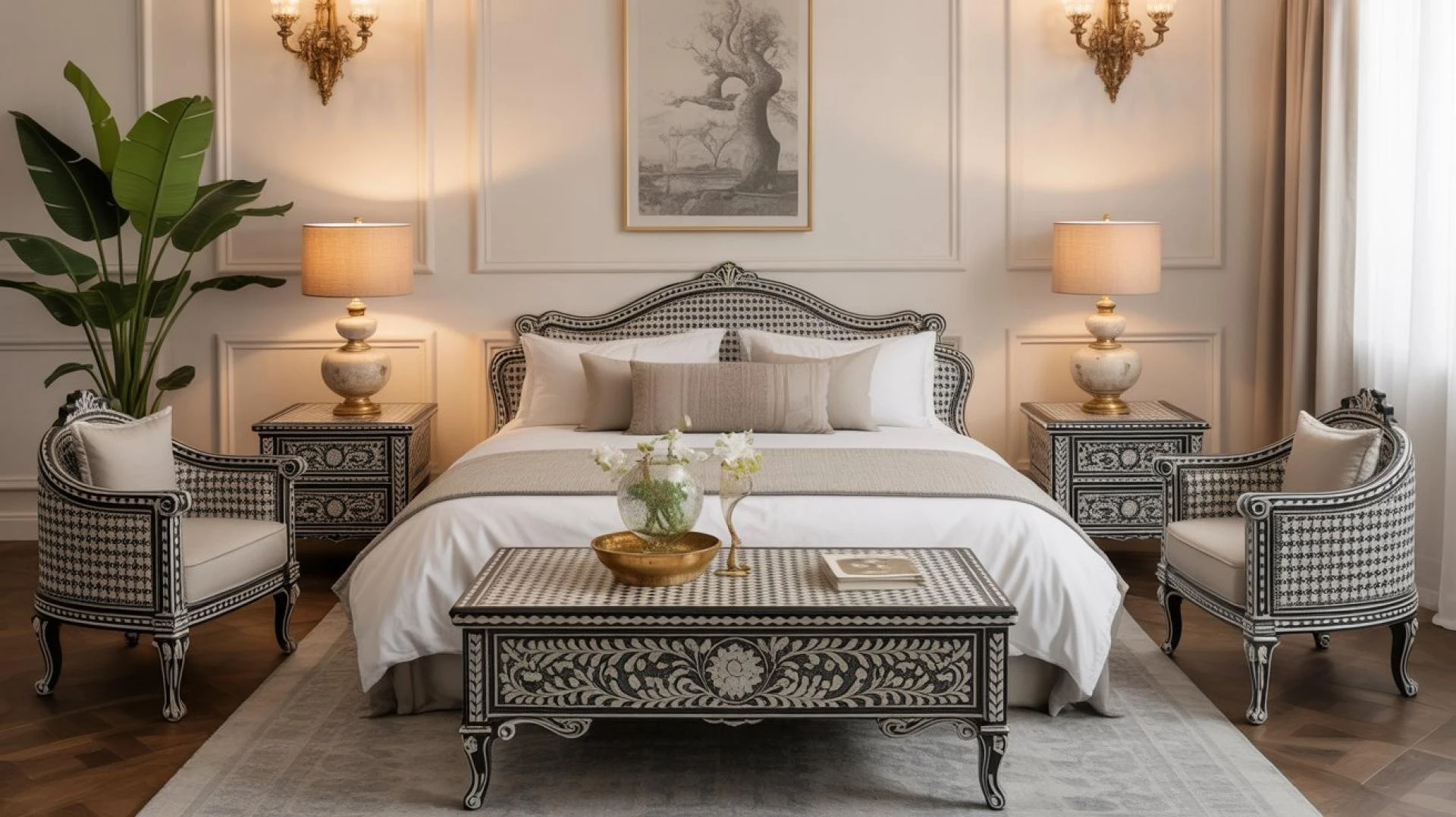
Choosing colours for your home sounds fun until you are standing in front of hundreds of shades wondering how life got this complicated. Modern homes look effortless, but behind that calm, stylish feel is a colour palette that’s been thought through properly. The trick is to start with your main surfaces and build everything else around them.
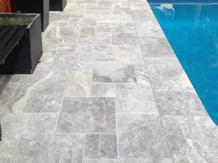
For example, you have laid Travertine outdoor pavers in your patio. The warm, earthy shades of these pavers set the vibe for the whole space. Instead of picking random paint or décor colours, you now have a base to guide your choices.
Once your foundation is right, the rest of the palette falls into place more easily and your home starts to feel connected rather than colour by colour decisions made on different days.
Yes! Your flooring plays a bigger role than you think in choosing the right colour palette for your home.
Read on to get more tips!
Start with What Stays the Longest
Paint can change. Cushions can change. Even furniture can go. But floor sticks around for years. That is why the space underneath should guide your colour choices, not the other way around.
For modern homes, where minimalism is the key to achieving the perfect look, choose materials that don’t overpower other design elements of your space.
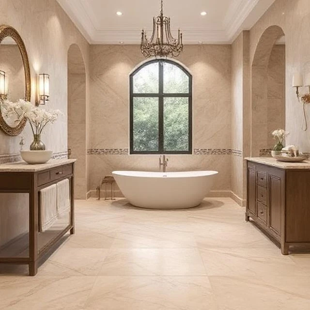
You can go for Travertine, Limestone, Marble or Sandstone. If you are unsure, you can even mix and match. For instance, Marble floor tiles in the living room, seamlessly leading into your backyard laid with Travertine outdoor pavers, look beautiful and connected.
These natural stones naturally come in soft, warm shades with raw patterns. These tones create a neutral base that works beautifully with modern design. Once you lock this in, everything else becomes easier.
Understand Warm vs Cool Tones
Modern homes usually lean one way, either warm and earthy or cool and crisp. Your colour palette should follow the undertones already present in your main surfaces.
If your home has warm tones, go with –
- Warm whites
- Beige and taupe shades
- Earthy greens
- Soft browns
If your home has cool tones, lean towards –
- Crisp whites
- Light and mid greys
- Charcoal
- Muted blues or cool greens
The key is to stay consistent with undertones. Mixing very warm and very cool shades without intention can make a space feel slightly off.
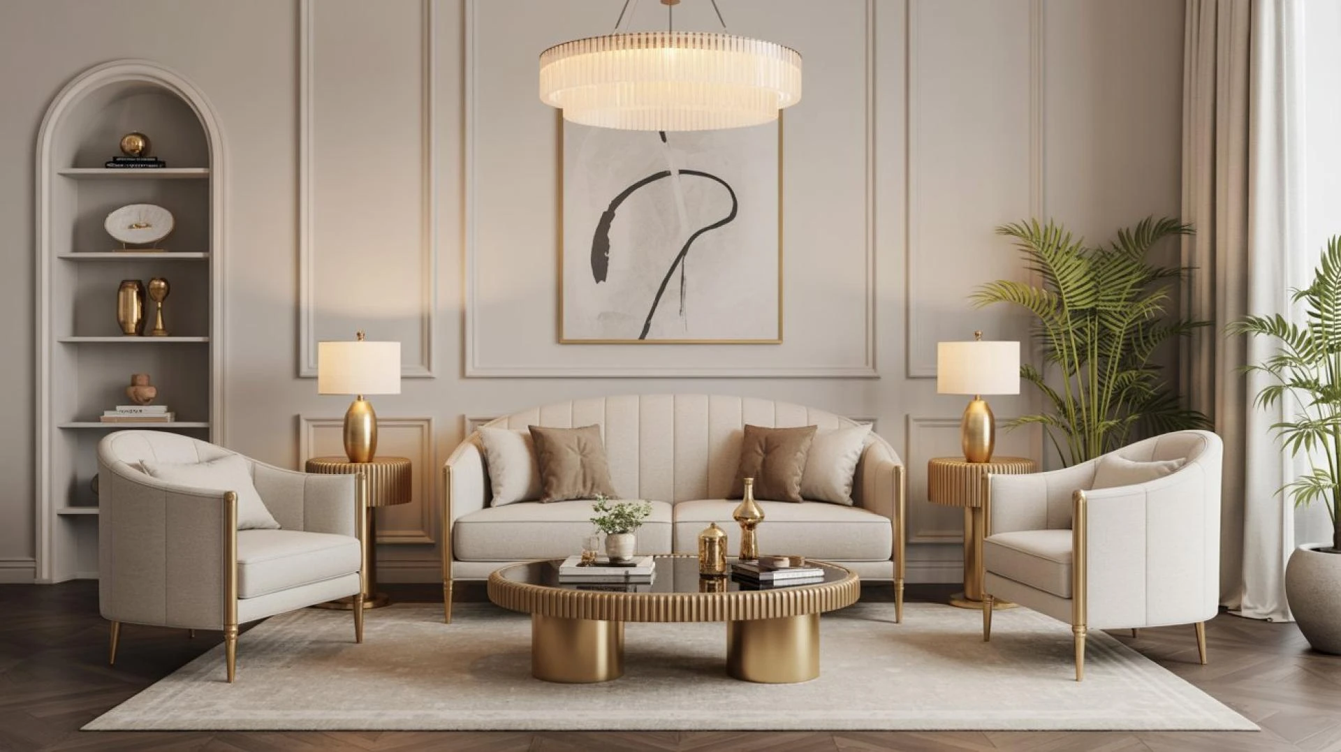
Keep the Palette Simple
Modern design works best when the colour scheme feels calm and consistent. A simple rule is to choose two to three main colours and repeat them throughout the home. This creates flow between rooms and stops the space from feeling busy or disconnected.
Start with a base neutral, add a secondary shade for depth and then one accent colour to bring character. When the same shades appear in walls, furniture, finishes or décor, the whole home feels more balanced and thoughtfully put together, without trying too hard.
Let’s consider you chose beige-shaded Travertine outdoor pavers as your main neutral. Then you can add –
- A secondary neutral like soft white or warm grey
- A darker anchor tone like charcoal, deep brown or muted black
- A natural accent with green plants or wooden work
That’s it. You don’t need a rainbow to make space interesting.
Let Natural Light Guide You
Australian homes get a lot of natural light and that changes how colours look. Natural stones glow beautifully in sunlight due to their earthy and soothing shades, which is why they are so popular for modern homes. Before committing to wall or furniture colours, look at samples outside during different times of day. A colour that looks perfect indoors might feel too cold once it is next to warm stone in daylight.
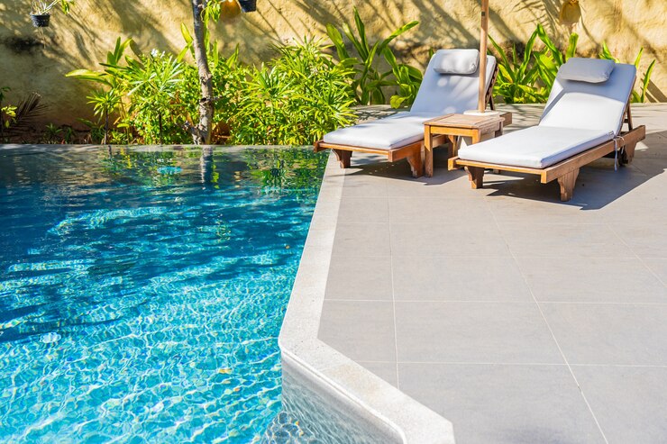
Connect Indoors and Outdoors
Modern design often blurs the line between inside and outside. If your alfresco or patio uses Travertine outdoor pavers, try to echo similar tones inside. This makes the home feel larger and more connected.
For example, subtle warm shades inside can pair nicely with surfaces like Marble floor tiles in entryways or living areas, creating a smooth transition between spaces without a harsh colour break.
Use Contrast Carefully
Contrast gives modern homes their sharp, clean feel, but too much can make things busy.
Instead of bright contrasts, go for tone differences –
- Light stone + medium wooden work
- Beige paving + charcoal accents
- Cream tones + deep green plants
This keeps things modern without feeling loud.
Think Long-Term, Not Trendy
Trends come and go, but natural tones stay relevant because they are inspired by nature, not fashion.
Choosing colours that work with your space means your home won’t look dated in a few years. You can always update styling, but the base palette stays timeless.
In Conclusion
A modern home colour palette should feel calm, connected and easy on the eyes. Starting with natural materials gives you a warm, flexible base that works with many shades. You can always add a few supporting shades, keep contrast controlled and let texture do some of the work. When everything relates back to your main surface, the home feels intentional instead of accidental.


Sign in to leave a comment.