Introduction
Let’s be honest — most brochures end up in the “ignore” pile.
Not because brochures don’t work… but because many of them are poorly designed. Too much text, random colors, confusing layout — and within seconds, the reader loses interest.
But a well-designed tri fold brochure is different.
It feels clean, easy to read, and quietly builds trust.
The good news? You don’t need to be a designer to create one. You just need to understand a few basics.
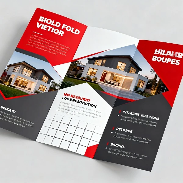
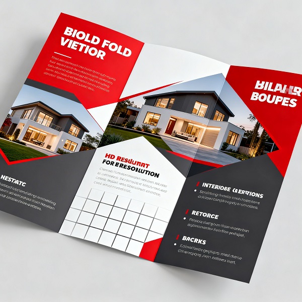
Start by Understanding the Layout
Before you open any design software, take a minute to understand how a 3 fold brochure actually works.
It’s divided into three parts on each side — which gives you six panels in total. Each panel plays a small role in telling your story.
Instead of placing content randomly, think of it like this:
- The front panel is your first impression
- Inside panels explain what you offer
- The back panel wraps things up with contact details
Once you see it this way, designing becomes much easier.
Pick the Right Size (It Matters More Than You Think)
A lot of people ignore size… until printing goes wrong.
The most common tri fold brochure size is an A4 sheet folded into three parts. It’s simple, practical, and widely used.
If you’re working in centimeters, the standard tri fold brochure size in cm is 21 × 29.7 cm before folding.
There’s also the letter size option (8.5 × 11 inches), which works just as well.
One small tip — always confirm the 3 fold brochure size with your printer first. It saves a lot of last-minute stress.
Don’t Try to Fit Everything In
This is probably the most common mistake.
You might feel like adding more content makes your brochure better… but it usually does the opposite.
A professional tri fold brochure feels light, not crowded.
So instead of filling every space:
- Leave some breathing room
- Keep margins clean
- Let the design feel open
When everything isn’t competing for attention, your message becomes clearer.
Use Images That Actually Add Value
Images can either make your brochure look premium… or completely ruin it.
If the image is blurry or irrelevant, people notice — even if they don’t say it.
Try to use visuals that:
- Are clear and high-quality
- Match your business or message
- Feel natural, not overly staged
Sometimes, one good image is enough. You don’t need ten average ones.
Keep Fonts Simple
It’s tempting to use stylish or fancy fonts — but in most cases, simple works better.
Stick to:
- One font for headings
- One font for body text
That’s it.
Your goal is readability, not decoration. If people struggle to read, they won’t stay.
Choose Colors That Feel Consistent
You don’t need a lot of colors to make a brochure look good.
In fact, too many colors can make it look unprofessional.
A better approach:
- Pick 2–3 colors
- Stay consistent across all panels
- Make sure text is easy to read
A clean color scheme can make even a simple tri fold brochure look well-designed.
Write Like You Speak
This part matters more than design.
Most brochures fail because the content feels stiff or too formal.
Instead, write like you’re talking to someone:
- Keep sentences short
- Avoid complicated words
- Focus on what actually matters
People don’t read brochures word by word — they scan. So make it easy for them.
Tell the Reader What to Do Next
After someone reads your brochure… what should they do?
Call you? Visit your website? Walk into your store?
Don’t leave them guessing.
Add a simple and clear call-to-action on the final panel. It doesn’t have to be fancy — just clear.
Take 5 Minutes to Review Everything
Before printing, slow down for a moment.
Check:
- Spelling mistakes
- Alignment issues
- Image quality
- Final tri fold brochure size
These small things can make a big difference in how your brochure feels.
Conclusion
At the end of the day, designing a good tri fold brochure isn’t about doing something complicated.
It’s about keeping things simple, clear, and thoughtful.
When your layout makes sense, your content feels natural, and your design isn’t overloaded — everything starts to come together.
And honestly, that’s what makes a brochure look professional.
Even a simple design, done right, can leave a strong impression.


Sign in to leave a comment.