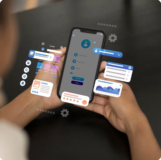
Think about the last time you opened a social media app. If it loaded fast, looked clean, and felt easy to navigate, you probably stayed a while. You scrolled, maybe liked a post, maybe commented.
Now think about the opposite experience. You open an app, the feed takes forever to load, the buttons are in weird places, and nothing feels natural. You probably closed it within minutes.
What's the difference? It comes down to User Experience (UX). Good UX quietly keeps us engaged. Bad UX drives us away — fast.
And if you’re building a new platform, working with a reliable social media website development company can help you avoid those common mistakes. They understand the small, invisible design choices that make people want to stay.
Why UX Matters More Than You Think
People don’t open social platforms because they have to. They do it because they want to connect, be entertained, or simply pass the time.
If the platform makes that hard — if you have to think too much about how to use it, you’re going to lose people. No one has the patience to “figure out” a feed or search for the right button.
Good UX makes things feel obvious without being boring. You don’t notice the structure because it just works. The signup feels quick, the feed flows naturally, and actions like posting or messaging are instinctive. That comfort leads to longer visits, more engagement, and users who keep coming back.
Design Isn’t Just About Looks
When most people hear “design,” they picture colors, fonts, and maybe some nice graphics. But in UX, design is more about function.
- Can users find what they need in a few clicks?
- Are important actions — like “Post” or “Send” — always easy to spot?
- Does the layout feel predictable without being repetitive?
A beautiful platform that’s confusing to use will fail faster than a plain-looking one that’s effortless to navigate. The design should serve the user, not the other way around.
Think about Instagram’s “double-tap to like” gesture. It’s simple, quick, and feels natural. That’s design doing its job.
Mobile Experience Comes First
Most of us don’t sit down at a desktop to browse social media. We scroll while commuting, waiting in line, or lying in bed.
If your platform doesn’t work beautifully on mobile, it’s already at a disadvantage. Buttons that are too small to tap, images that don’t fit the screen, or slow mobile loading speeds — all of these will make people leave.
A mobile-first UX means:
- Content adapts perfectly to smaller screens.
- Navigation is thumb-friendly.
- Pages and posts load almost instantly.
It’s not an extra feature anymore — it’s the baseline expectation.
Personalization Makes People Stay
The platforms we love don’t just show us everything. They show us what we care about most.
Think about how TikTok seems to know exactly what kind of videos you want, or how LinkedIn recommends connections that make sense for your industry. That’s personalization.
In UX, personalization creates a sense of belonging. When users feel like the platform “gets” them, they’re far more likely to keep using it.
It can be as simple as:
- Suggesting friends or groups based on interests.
- Recommending relevant content.
- Letting users customize their feed.
Small touches like these turn a generic platform into their platform.
Speed Is Part of UX
It doesn’t matter how good your features are if people have to wait to use them.
Every extra second a page takes to load increases the chance the user will close the app. Social media is about momentum — scroll, engage, repeat. If that rhythm breaks, so does engagement.
Optimizing speed isn’t just a technical job; it’s a UX priority. Compress images, streamline code, and avoid unnecessary steps that slow people down. The faster the experience, the more people will stay “in the zone.”
Easy Interaction Builds Communities
A platform can have millions of users, but without interaction, it’s just a static space. The way you design interaction directly affects how active your community becomes.
If it’s easy to like, comment, share, or start a conversation, people will do it more often. If those actions are buried or complicated, they’ll skip them.
That’s why successful platforms make engagement effortless. One tap to like. Simple comment boxes. Share buttons in the right places. Over time, these little actions create a living, breathing community.
Accessibility Opens the Doors Wider
A truly well-designed UX works for everyone — not just people without disabilities.
Accessibility features like:
- Alt text for images.
- Keyboard navigation.
- High-contrast modes for readability.
These don’t just help people who need them — they improve the experience for everyone.
And from a growth perspective, accessibility means you’re not excluding potential users. It’s one of the smartest and most respectful UX decisions you can make.
Consistency Builds Trust
Ever used an app where one section feels like it came from a completely different designer? It’s jarring.
Consistency isn’t just about aesthetics — it’s about trust. When users feel like every part of the platform works in the same way, they don’t have to relearn how to do things.
That trust keeps them exploring instead of leaving in frustration.
Final Thoughts
The impact of UX on social platforms is bigger than any single feature or trend. It’s the invisible force that makes people feel comfortable, keeps them engaged, and encourages them to come back.
Good UX isn’t flashy. It’s smooth, intuitive, and built around real people’s needs. If you can get that right, engagement won’t just happen — it will grow naturally.
And in a world full of competing platforms, that’s exactly what makes the difference between a user who tries your app once and one who stays for years.


Sign in to leave a comment.