
Most brands treat physical space and digital content as two separate problems solved by two separate teams. The interior designer handles the room. The digital team handles the screens. Rarely do the two get designed as one continuous system — which is exactly why so many "tech-enabled" showrooms still feel like a regular room with a TV bolted onto the wall. Genuine Experience Center Solutions start from a different premise: the physical layout and the digital content are the same design problem.
Godrej's Trilogy project in Worli is a clean example of what happens when that integration is taken seriously instead of treated as an afterthought.
The Problem With Bolting Digital Onto Physical
For years, Godrej's premium sales journeys leaned on a familiar formula — an AV theatre room, a looping MP4 video, printed collateral to take home. Functional, but static. The room didn't respond to the visitor, and the content didn't respond to the room. Two disconnected layers, sitting next to each other.
For Trilogy, the brief was different: build a space where the architecture itself guides the story, and the digital content only exists because of how the physical journey is shaped.
Designing One Continuous S-Shaped Journey
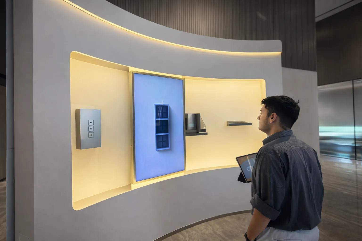
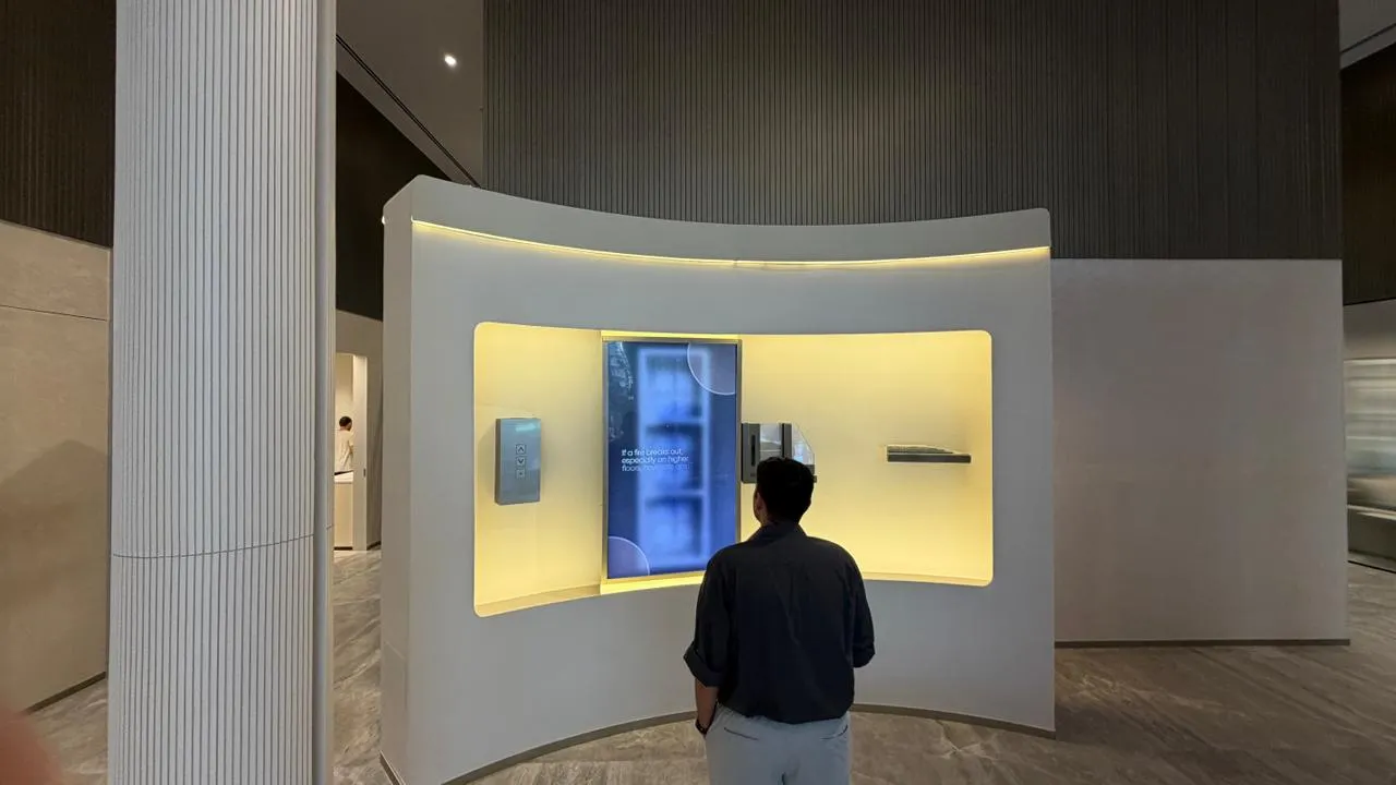
Rather than a series of disconnected stations, Ink In Caps designed the Fourth Dimension Experience Centre as a single continuous S-shaped path — one physical route, split into two connected zones that flow into each other without a break.
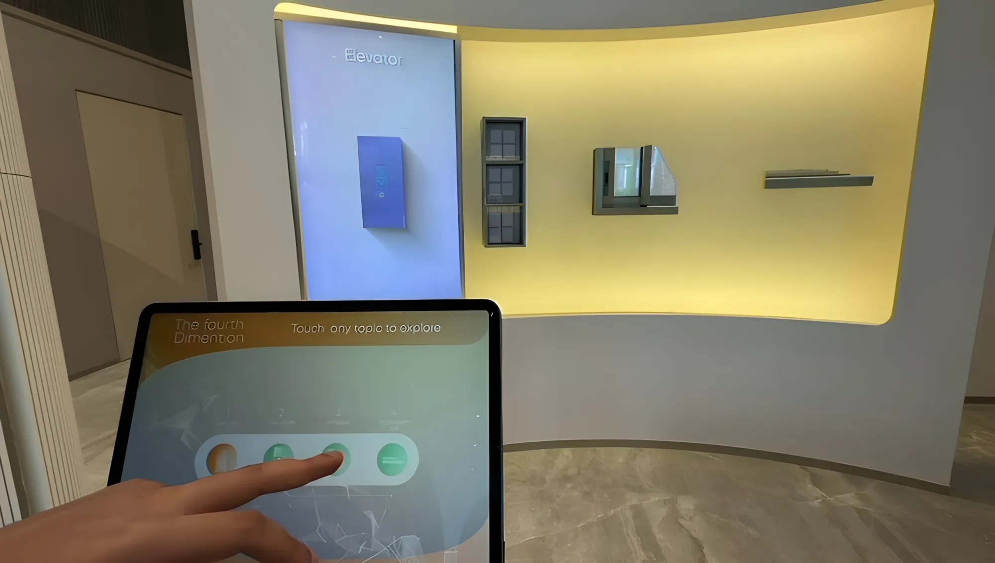
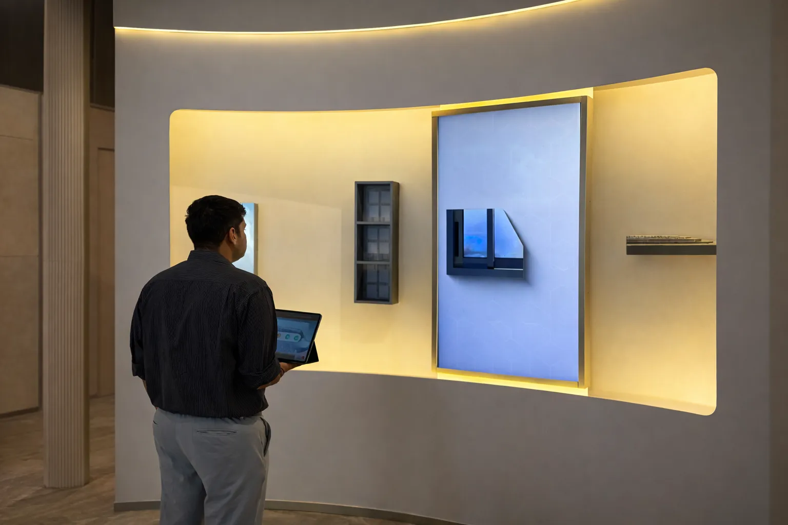
The physical form dictated the digital content, not the other way around. The Curved Rotoscopic Wall wasn't chosen because curves look modern — it was chosen because each physical arc could carry exactly one product USP, using the curvature itself to create natural content separation. Bathroom waterproofing lived on one curve. Fire safety lived on another. The physical geometry did the organisational work that a flat wall or a slide deck would have needed extra graphic design to achieve.
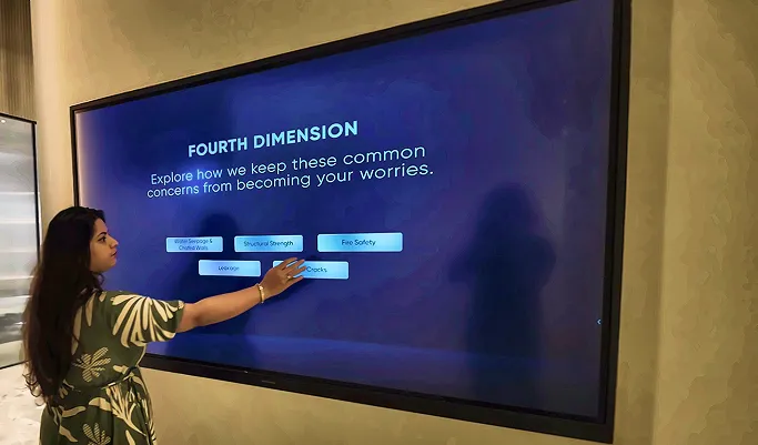
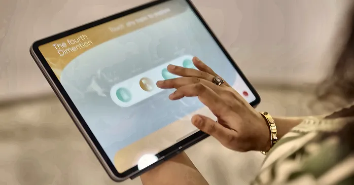
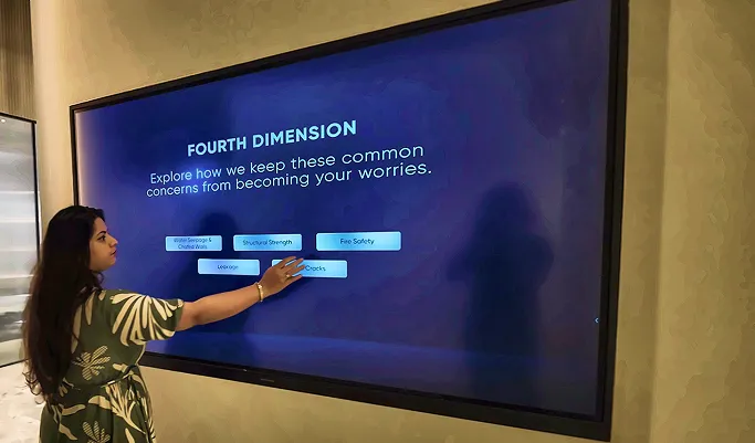
The second half of the journey introduced an 86-inch interactive touchscreen wall, positioned at the point in the physical path where visitors naturally paused — not as an add-on screen, but as the next logical step in a single guided walk.
Why the Integration Itself Is the Innovation
It would be easy to describe this project purely in terms of its technology — kinetic wall, touchscreen, sensor-driven animation. But the more interesting decision was spatial: designing the room's shape to control pacing, and letting that pacing determine when digital content should activate. Visitors moved through waterproofing, elevators, fire safety, and window engineering in a fixed sequence, not because a screen told them to, but because the physical curve of the wall guided their feet there naturally.
That's the real meaning of "integrating physical space and digital interaction" — not simply adding a screen to a room, but designing the room and the content as one system from day one.
What This Delivered
- A single continuous 20-minute guided journey, with the touchscreen portion contributing an additional 5 minutes of self-directed depth
- Zero backtracking in the visitor path, since the S-shaped layout physically prevented branching
- Godrej's first fully experiential sales format, replacing traditional MP4 theatre presentations entirely
- Buyer conversations shifting measurably from surface-level aesthetics toward verified engineering conviction
Tips for Integrating Your Own Physical and Digital Experience
- Let the room's shape do organisational work. A curve, a corridor, or a deliberate pause point can separate content topics more naturally than a menu ever could.
- Design pacing before content. Decide how long visitors should spend at each stage first, then build digital assets to fit that rhythm — not the reverse.
- Avoid branching paths. A single, forced route (like the S-shaped journey here) keeps every visitor exposed to every core message, in the intended order.
- Treat screens as a continuation of the walk, not an interruption of it. The touchscreen worked because it arrived exactly where visitors naturally slowed down.
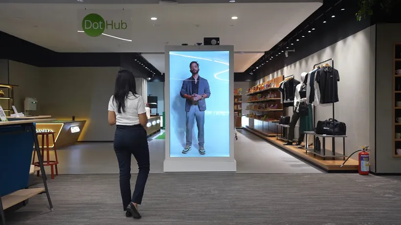
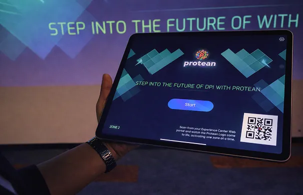
This same principle scales into far more technical B2B environments too. Protean's interactive infrastructure centre used a similar logic at national scale — moving visitors from a human-scale zone, to a geography-scale zone, to a capability zone, with the physical layout itself shaping how each idea built on the last. Retail environments benefit from the same thinking in miniature; Deloitte's experience centre paired a physical Object Recognition Table with a digital AI assistant so the two genuinely worked together, rather than existing as separate features in the same room.
The Bigger Shift This Represents
Physical space and digital interaction stop being two separate line items on a project budget once you start treating them as one design decision from the very first sketch. That's the real differentiator behind Godrej Trilogy's Fourth Dimension Experience Centre, and it's exactly why the results reflect a genuinely new sales format rather than a slightly upgraded old one. Read the complete build in the Godrej Properties experiential tech sales journey case study, and explore the technology in more depth in our piece on curved rotoscopic walls in premium real estate sales.
Ready to Design One Integrated Experience, Not Two Separate Ones?
If your brand's physical space and digital content are still being designed by two different teams working from two different briefs, Ink In Caps can help bring them together as one tech experience center built with intention. Talk to our team about designing a journey where the room and the screen finally agree with each other.


















Sign in to leave a comment.