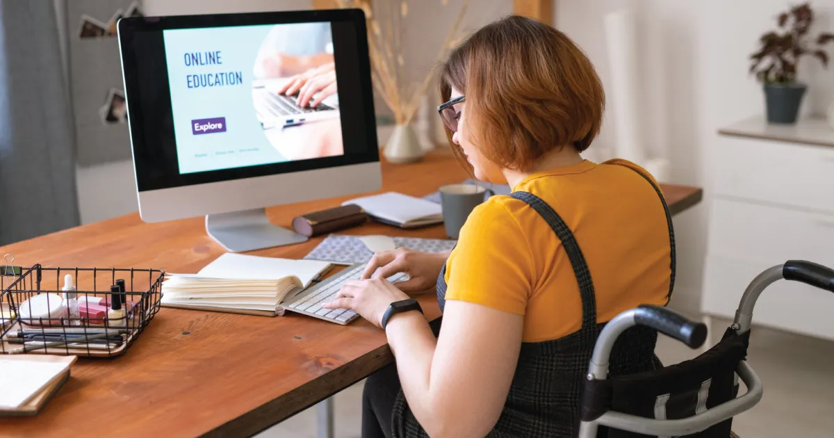

Your website is often the first stop for someone who wants to learn about your NDIS services. This could be a participant. It could be a family member. A support coordinator or carer may visit too.
First impressions matter a lot.
A confusing site can turn people away. A slow site can do the same. Clear NDIS Web Design helps visitors find information quickly. It helps them understand your services and know what to do next.
A good NDIS website should feel warm. It should feel simple and trustworthy too. It should also work well for visitors with different needs.
Start With Your Visitors
Do not start with colours or fonts. Start with the people who will use your site.
Think about the questions they may have before they reach out. A strong NDIS Web Design approach puts these needs first.
They may want to know:
- What NDIS services do you provide?
- Who can access your services?
- Where do you provide support?
- How can I make an enquiry?
- What happens after I contact you?
- Who will provide the support?
- What makes your organisation different?
- How can I learn more about a service?
Your website should answer these questions fast. Visitors should not have to dig through endless pages.
Keep key information easy to find. Use simple headings, short paragraphs and clear buttons too.
Keep the Homepage Simple
Your homepage should explain your organisation fast.
A visitor should get who you are in a few seconds. They should get what you do just as fast.
A useful homepage can include:
- A short intro
- Your main NDIS services
- The areas you support
- A clear call-to-action
- Info focused on participants
- Reviews where they fit
- Contact details
- Links to key pages
Don't fill the homepage with long text blocks.
Visitors should scan the page fast. They should grasp the main points too. Then they pick where to go next.
A button like "Get in Touch" or "Make an Enquiry" gives visitors a clear next step.
Use Simple and Respectful Language
NDIS info can feel complex at times.
Your website doesn't need to add to that.
Use everyday words where you can. Explain hard terms when needed. Keep sentences short. Focus on one idea at a time.
Instead of one long block about a service, break it into small parts:
What is the service?
Give a simple answer.
Who can it support?
Say who may benefit.
How does it work?
Describe what a typical service looks like.
How can I enquire?
Tell visitors exactly what to do next.
This structure makes info easy to follow.
Make Accessibility Part of the Design
Think about accessibility from day one.
Your site may reach visitors with different needs. Some may have physical needs. Some may have sensory needs. Some may have needs around thinking or communication. Good design helps everyone.
Useful accessibility features include:
- Clear, easy-to-read fonts
- Strong colour contrast
- Clear headings
- Alt text for key images
- Menus that work with a keyboard
- Captions for videos
- Clear buttons and links
- Simple page layouts
- No flashing content that isn't needed
Accessibility isn't just a tech checkbox.
It shows your team cares. It builds a welcoming online space.
Choose Colours Carefully
Colour can make a site feel warm. It should also help people read with ease.
Skip light text on a light background. Strong contrast helps visitors read fast.
Keep your colour set consistent.
For example, you might use:
- One main brand colour
- One second colour
- A neutral background
- A clear colour for buttons
Don't grab lots of bright colours just to look exciting.
A calm, steady design often feels more professional. It's easier to use too.
Make Navigation Easy
Visitors should never feel lost on your site. Your main menu should hold the pages that matter most.
A simple menu could include:
Home | About Us | Services | Areas We Support | FAQs | Contact
You may need more pages based on your org.
Keep the menu easy to follow. Skip odd wording. Skip too many dropdowns too.
A visitor should move from your homepage to a service page in just a few clicks.
Create Useful Service Pages
Each NDIS service should get its own clear page where it fits.
A service page should explain the service well. It shouldn't overwhelm the reader though.
You could include:
About the Service
Explain what the support involves.
Who It May Suit
Say what kind of needs it may fit.
What Support May Include
Use bullet points to help people scan:
- Daily living support
- Community participation
- Personal support
- Household assistance
- Transport support
Only list services you truly offer.
Areas Covered
Tell visitors where the service works.
How to Get Started
Explain the enquiry steps in plain terms.
This gives visitors what they need before they reach out.
Make Your Website Mobile-Friendly
A website should work well on phones. It should work on tablets too. It should work on computers as well.
Mobile users may check your site while out. They may check it at home too. They may check it mid-chat with family or a support coordinator.
Check that:
- Text stays easy to read
- Buttons are big enough to tap
- Images fit the screen
- Menus work right
- Forms stay simple to fill
- Key info shows without heavy scrolling
A site that looks great on a big screen but feels clunky on a phone will frustrate visitors fast.
Use Real Images Where Possible
Images help visitors understand your team.
Stock photos can work. But real images feel more true.
You could show:
- Your team
- Your offices
- Support settings
- Community events
- Accessible spaces
- Everyday service moments
Always think about privacy first. Get consent before you post photos.
Images should support your content. Don't just use them to fill space.
Build Trust Through Your Website
Choosing an NDIS provider is a big choice.
Visitors want to trust your organisation.
Your website can help with clear info about:
- Your organisation
- Your team
- Your services
- Your service areas
- Your contact details
- How you approach support
- Your registrations or credentials
- Feedback from participants where it fits
Keep your info correct. Keep it current too.
Broken links hurt trust. Old service info hurts trust too. Missing contact info hurts trust as well.
Make Contact Easy
Don't make visitors work hard to reach you.
Your contact page should sit right in the main menu.
You can offer:
- Phone
- Enquiry form
- Contact address
- Social media links where they fit
A short form beats a long one most times.
Ask only for what you truly need at first.
Make sure your contact info shows in the footer too.
Think About Website Speed
A slow website creates a bad first experience.
Big images slow things down. Extra features slow things down too. Old software and weak hosting do the same.
Good NDIS web work should plan for speed from day one.
Simple fixes include:
- Compressing big images
- Using the right image formats
- Removing plugins you don't need
- Keeping software updated
- Choosing solid hosting
- Cutting heavy animations
A fast site works better on mobile. It works better on slow internet too.
Consider Search Engine Optimisation
A useful website also needs to get found.
SEO helps search engines understand your pages. It helps match them to the right searches too.
Your website can gain from:
- Clear page titles
- Useful headings
- Relevant search terms
- Helpful service content
- Local details
- Clear image text
- Internal links
- Mobile-friendly pages
- Fast load times
Good SEO should never make your writing feel stiff.
Write for people first. Let search engines come second.
Keep the Design Professional but Warm
An NDIS site doesn't need to feel cold or too corporate.
A friendly design helps visitors feel at ease.
Use a mix of:
- Clear fonts
- Soft, fitting brand colours
- Real images
- Simple layouts
- Helpful content
- Comfy spacing
Your design should show your team's personality. But keep the visitor as your focus.
Review Your Website Regularly
A website isn't a "build once and forget" job.
Your services may shift. Your contact info may shift too. New info may need to go up.
Set time aside to check your site.
Check whether:
- All links work
- Contact forms work right
- Service info stays true
- Images still fit your team
- Pages load fast
- The site works on mobile
- Key info stays easy to find
Small updates keep your site useful. They keep it looking sharp too.
Final Thoughts
A strong NDIS website should feel clear from the first click.
Good NDIS web design brings together simple menus, easy-to-use layouts, useful content, fast mobile speed, and a warm look.
Think about the visitor at every step. Make info easy to grasp. Give clear answers. Show your services with honesty. Make it simple to reach you.
Most of all, don't design the site just to look nice.
Design it to help.
When your site is easy to use, visitors spend less time hunting. They spend more time learning how your team can support them. This builds a better online experience. It gives your NDIS business a stronger presence online too.
Good NDIS website design isn't about piling on more features. It's about making the right info easy to find. It's about making it easy to grasp. It's about making it easy to act on too.




















Sign in to leave a comment.