
Have you ever cleaned out a kitchen drawer, beach bag, or office cabinet and found a handful of promotional items you barely remembered receiving?
There is probably a branded water bottle, a faded tote bag, and maybe a pair of sunglasses with a logo printed so small you cannot read it anymore. Most of these items had the same goal when they were handed out. They were supposed to keep a business visible long after an event ended.
Yet many summer promotional products disappear from memory surprisingly fast.
The reason is not always the product itself.
Businesses spend a lot of time debating whether they should order tumblers, tote bags, cooling towels, or sunglasses. Those decisions matter, but they often overshadow something far more important. The design choices behind the product frequently determine whether people keep using it or forget about it after a few days.
When the artwork is treated as an afterthought, even a useful item can struggle to make an impression. When design is considered from the beginning, the same product can become something people actually want to keep around throughout the season.
Why Do Summer Promotional Products Depend on Design More Than Product Choice?
A common assumption is that useful products automatically create positive brand exposure. While usefulness certainly helps, people interact with design every time they use the item.
Think about a tote bag. If the design feels cluttered, the logo is difficult to recognize, or the colors look washed out in sunlight, the bag loses much of its impact. The same tote with clean artwork, strong contrast, and thoughtful placement may get used repeatedly.
Summer creates unique design challenges because promotional items spend more time outdoors. Bright sunlight affects how colors appear. Water exposure can influence print durability. Products are often viewed from a distance at festivals, outdoor markets, sporting events, and community gatherings.
A design that works perfectly on a computer screen does not always work on a beach towel or reusable tumbler.
That is why artwork should never be the final step in the process. It should be part of the planning conversation from the beginning.
Designing Summer Promotional Products for Outdoor Visibility
One of the most overlooked factors in promotional merchandise is visibility.
Summer environments are visually busy. People are surrounded by bright colors, event signage, vendor booths, and outdoor displays. A design that lacks contrast can disappear into the background.
Simple layouts often perform better than crowded ones. Large, readable graphics tend to be more effective than designs packed with information. If someone sees a promotional item from several feet away, they should be able to recognize the brand quickly.
Color selection also matters. Certain color combinations that look balanced on a monitor can become difficult to distinguish in direct sunlight. Strong contrast helps preserve readability and recognition.
The goal is not necessarily to make the loudest design. It is to create something that remains clear and recognizable wherever the product is used.
Small Surfaces Require Simpler Artwork
Many popular summer promotional products offer surprisingly little space for branding.
Consider the arm of a pair of sunglasses. Think about the wrap area on a beverage koozie. Even the side of a water bottle presents limitations.
When space becomes limited, complexity becomes the enemy.
Businesses often try to fit a logo, website address, slogan, phone number, and social media information onto a small promotional item. The result is usually difficult to read and easy to ignore.
Instead, focus on what people actually need to remember.
A clear logo and consistent visual identity often create more lasting recognition than trying to communicate every piece of information at once. People who are interested can always find additional details later through your website or social channels.
The most effective designs understand that promotional products are not miniature brochures. They are visual reminders.
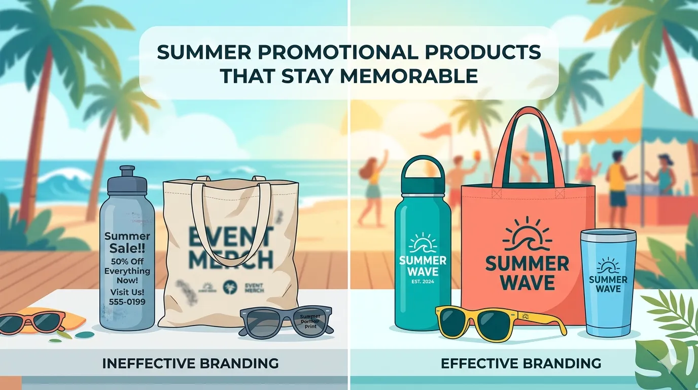
Example: Two Versions of the Same Summer Giveaway
Hypothetical example:
Imagine a small business participating in a local farmers' market. They decide to give away reusable water bottles.
The first version includes a detailed logo, several lines of text, a website URL, a slogan, and multiple design elements competing for attention. Everything technically fits, but the bottle feels crowded.
The second version uses a simplified logo, a clean color palette, and a single strong graphic element that reflects the brand's identity.
Both bottles cost roughly the same to distribute.
Months later, the second bottle is more likely to remain in regular use because it feels cleaner and easier to recognize. The product itself did not change. The design approach did.
That distinction is often what separates forgettable promotional merchandise from merchandise that stays visible throughout the season.
Consistency Makes Summer Promotional Products More Memorable
Many businesses think of promotional items as standalone marketing pieces. In reality, they work best when connected to everything else a customer sees.
When someone receives a branded item and later visits a website, sees an event display, or encounters a digital advertisement, consistent visual design reinforces recognition.
The logo, colors, typography, imagery, and overall style should feel connected across channels. Repetition creates familiarity.
This design-first approach is something many experienced branding and creative teams emphasize. For example, Grossman Marketing Group's design services include brand identity work, marketing collateral design, merchandise artwork and mockups, event branding, packaging design, and digital visual content. The common thread is maintaining alignment between creative assets so the brand feels recognizable wherever people encounter it.
That principle applies whether a business works with an outside design team or handles creative work internally.
Consistency helps promotional products contribute to a larger brand experience instead of functioning as isolated giveaways.
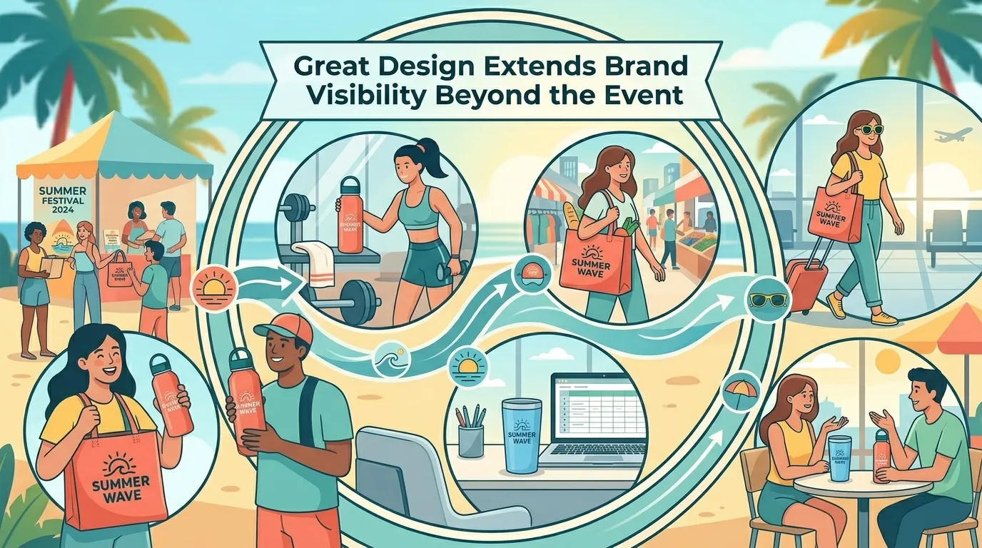
Think Beyond the Moment of Distribution
Many promotional product decisions focus entirely on the day of the event.
Will people pick it up?
Will visitors take one home?
Will the giveaway attract attention?
Those questions matter, but they only address the first interaction.
The more valuable question is what happens afterward.
Will the item still look appealing after several weeks?
Will someone feel comfortable carrying it in public?
Will the branding remain visible and recognizable throughout the summer?
Design influences all of those outcomes.
Products that remain useful and visually appealing tend to stay in circulation longer. Every additional use creates another opportunity for brand exposure.
That exposure is not driven solely by the object itself. It is driven by how thoughtfully the object was designed.
The Design Review Every Business Should Do Before Ordering
Before approving artwork for summer promotional products, take a step back and evaluate the design from a practical perspective.
Imagine viewing the item outdoors on a bright afternoon. Imagine seeing it from several feet away. Imagine using it repeatedly over the course of a summer.
If the logo becomes difficult to recognize, if important elements feel crowded, or if the design looks disconnected from the rest of the brand, those issues will likely become more noticeable after production.
Making adjustments before printing is far easier than trying to compensate afterward.
Summer promotional products can be powerful marketing tools, but their effectiveness often depends less on the item you choose and more on the design decisions behind it. The next time you plan a seasonal giveaway, spend as much attention on the artwork as you do on the product catalog. That simple shift can make the difference between something people toss aside and something they continue using long after summer ends.


Sign in to leave a comment.