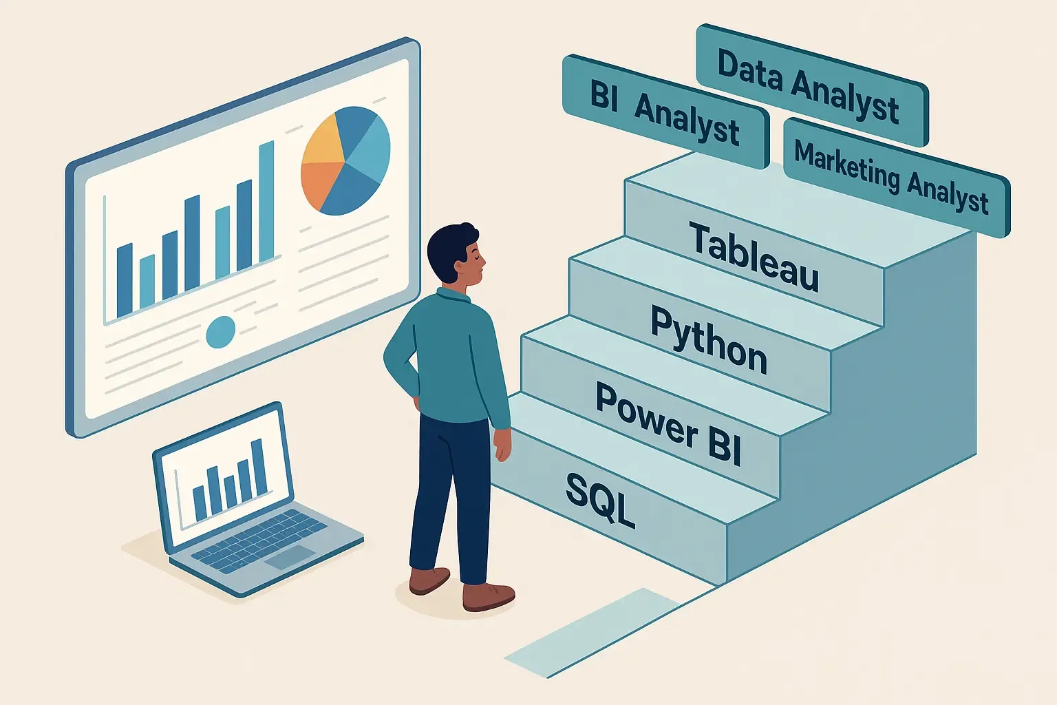

If you are currently scanning job boards, tweaking your resume for the fiftieth time, and sending out applications into what feels like a digital void, I know exactly how you feel. Not too long ago, I was stuck in the classic catch-22 of the modern job market: You need experience to get a job, but you need a job to get experience.
My inbox was a graveyard of automated rejection letters. I had completed the courses, memorized the basic syntax of Python and SQL, and could build a decent looking bar chart. Yet, nothing was clicking.
Everything changed when I stopped building projects to satisfy a curriculum and started building a project to solve a real business problem.
This is the step-by-step breakdown of the exact portfolio project that broke my streak of rejections, shifted my interviews from rigid interrogations to collaborative business discussions, and ultimately got me hired as a data analyst.
The Trap of the "Cookie-Cutter" Portfolio
Before diving into the project, let’s talk about what not to do. When I first started, my GitHub profile looked like every other aspiring analyst's profile. I had:
- The Titanic dataset (predicting who survives).
- The Iris flower dataset (basic classification).
- A generic house price prediction model.
Here is the harsh reality: Recruiters have seen these a thousand times.
When a hiring manager looks at a Titanic dataset project, they don’t see a resourceful problem-solver; they see someone who copied a tutorial. To stand out, you need to show that you can handle messy data, vague problem statements, and real commercial stakes.
Generic vs. Employment-Ready Portfolios
| Feature | The "Cookie-Cutter" Project | The Hired Project |
|---|---|---|
| Data Source | Cleaned Kaggle CSV | Raw API extraction / Web Scraping |
| Problem Definition | "Predict survival rate" | "Reduce customer churn by 12%" |
| Data Cleaning | Minimal (df.dropna()) | Complex joins, regex, datetime parsing |
| Stakeholder Value | A high accuracy score | An interactive dashboard with ROI metrics |
Step 1: Finding a High-Value Business Problem
I decided to build a project centered around E-commerce Customer Retention and Lifetime Value (LTV) Optimization.
Why? Because customer acquisition costs are skyrocketing, and every modern retail or Direct-to-Consumer (DTC) brand cares deeply about keeping the customers they already have. If I could prove to a hiring manager that I understood how to analyze revenue leakage, I knew I would get their attention.
Instead of downloading a perfectly pristine dataset, I went to an open-source database of raw transactional data spanning two years for an online retail brand. The data was ugly. It had missing customer IDs, duplicate transactions, negative quantities (returns), and messy timestamp formats. Perfect.
Step 2: The Messy Reality of Data Cleaning (SQL & Python)
Ninety percent of a data analyst's job is wrangling data, so I dedicated a huge portion of my project's documentation to showing how I cleaned it.
Using Python (Pandas) and SQL, I put myself through the paces:
- Handling Anomalies: I isolated transactions with negative quantities. Instead of just deleting them, I categorized them as "Returns" and analyzed whether specific product categories had abnormally high return rates.
- Time-Series Standardization: The timestamps were mixed up across different time zones. I standardized everything to UTC and engineered new features like Purchase_Hour, Day_of_Week, and Months_Since_Last_Purchase.
- Cohort Segmentation: I grouped customers by the month of their first purchase to track how cohorts behaved over a 12-month period.
Portfolio Tip: Don't hide your data-cleaning code. Write a detailed README file explaining why you made certain data decisions. Recruiters care far more about your logic than a flawless, bug-free first run.
Step 3: Exploratory Data Analysis (EDA) & Finding the "Aha!" Moment
Once the data was clean, I started hunting for insights. I didn't just want to create pretty charts; I wanted to answer specific business questions.
After running several SQL queries and visualizing trends using Seaborn, I uncovered three massive insights that a business owner would want to know immediately:
- The 60-Day Drop-off: If a customer did not make a second purchase within 60 days of their first, the probability of them ever returning dropped by $78\%$.
- The High-Value Outliers: The top $5\%$ of customers generated over $45\%$ of the total revenue, yet the company was spending the same amount of marketing dollars on them as they did on one-time buyers.
- Regional Friction: A major European market showed a $30\%$ drop in conversion rates on Fridays, which I traced back to a recurring payment gateway error in the raw logs.
These weren't just data points; they were actionable business strategies waiting to happen.
Step 4: Building the Interactive Dashboard (Power BI)
Data is useless if decision-makers can't understand it. I took my processed data and imported it into Power BI to create a dynamic executive dashboard.
I avoided the temptation to put every single chart on one page. Instead, I structured the dashboard into three logical views:
- Executive Summary: A high-level view of Total Revenue, Active Customer Count, and Average Order Value (AOV).
- Customer Cohort Analysis: A heat map showing retention rates over time, allowing managers to see exactly when cohorts started fading away.
- Product Performance: A scatter plot mapping product popularity against profit margins to identify which items should be pushed in marketing campaigns.
I made sure to use a clean, professional color palette (limit yourself to 3 main colors!) and included intuitive filters so users could drill down by region or product category.
Step 5: Packaging and Presenting (The Secret Sauce)
You can build the greatest project in the world, but if it lives quietly in a hidden repository on your computer, it won't get you a job. I treated the presentation of this project like a product launch.
- The GitHub README: I didn't just dump code. My README had a clear executive summary, a breakdown of the tech stack used, the core business insights found, and screenshots of the final dashboard.
- The 2-Minute Loom Video: I recorded a short video walking through the dashboard as if I were presenting to a CEO. I explained the business impact of the data, not just the technical steps. I linked this video right at the top of my resume.
The Turning Point in the Interview
When I applied for the role I eventually landed, the hiring manager explicitly mentioned the project during our initial screening call.
During the technical round, instead of giving me a generic whiteboard test, the lead analyst pulled up my GitHub repository on the screen. We spent 45 minutes talking about my cohort analysis, why I chose specific SQL joins over others, and how I handled the missing customer IDs.
"It felt less like an exam and more like a meeting between two working colleagues trying to solve a problem."
That project proved I could do the work on day one without needing my hand held through basic data pipelines.
Final Thoughts: Build Your Own Launchpad
If you are trying to break into the analytics field today, the competition is fierce. The difference between landing interviews and getting ignored comes down to your ability to demonstrate business acumen alongside technical proficiency.
While teaching yourself through open-source data is a phenomenal starting point, sometimes a structured environment can give you the edge and direction you need. If you are looking to build industry-ready skills under guided mentorship, enrolling in a structured data analytics course in Delhi can provide the foundational technical training, real-world case studies, and career support necessary to transition smoothly into the industry.
Stop waiting for a company to give you a chance to work on real data. Find a messy dataset, identify a commercial problem, solve it, package it beautifully, and go show the world what you can do. Your portfolio is your proof—make it count!





























Sign in to leave a comment.