Learn what makes thumbnail design work, how to improve clicks, and the best ways to create clear, strong thumbnails for videos and content.
Good thumbnail design helps people notice your content fast. Before they read your title, they often see your image first. On YouTube, thumbnails and titles work together, and creators are encouraged to review click-through rate in the first 24 hours to judge how well they attract viewers. YouTube also says your thumbnail should accurately reflect the video, because misleading visuals can hurt viewer satisfaction and discovery.
Why thumbnail design matters for clicks
Thumbnail design matters because people make fast choices. A small image has to catch the eye, explain the topic, and create interest in seconds. That is why strong contrast, clear text, and simple composition matter so much. Platforms and design guides consistently point to readable fonts, color contrast, and accurate visuals as core best practices. When your thumbnail is clean and easy to understand, viewers do not have to guess what they are about to watch.
Thumbnail design basics you should get right
Start with the right size. YouTube recommends 1280 x 720 pixels, a 16:9 ratio, a minimum width of 640 pixels, and supported image formats such as JPG, GIF, or PNG, with a file size limit of 2 MB. That gives your thumbnail design enough space to stay sharp on desktop and mobile. One important detail is that vertical videos may show an auto-generated 4:5 image on some mobile surfaces, so mobile visibility should always be checked before publishing.
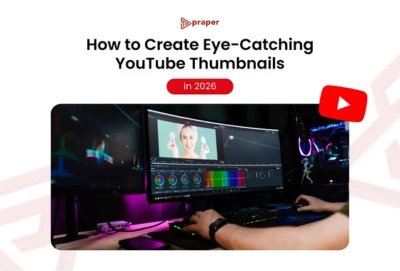
A strong thumbnail design also uses one clear subject. This could be a face, a product, a result, or one simple action. If the image tries to show too many ideas at once, it becomes hard to read. The best thumbnails usually make one promise. For example, a cooking video can show the finished dish up close. A tutorial can show the result before and after. A business video can show one strong expression and one short phrase. Simple images usually win because they are easier to understand at a glance.
Thumbnail design tips for text, color, and layout
Here are the most useful thumbnail design tips to follow:
- Use short text only when it adds meaning. Readable, clean fonts are recommended, and many creator-focused guides favor very few words because thumbnails are seen at a small size.
- Use high contrast so the main subject stands out from the background. Contrast is one of the clearest best practices repeated across design resources.
- Keep branding consistent. Using similar colors, fonts, or layout across videos can make your content easier to recognize.
- Match the thumbnail to the real content. YouTube specifically recommends accuracy because misleading packaging can reduce watch satisfaction.
Thumbnail design mistakes that reduce performance
A weak thumbnail design is often too busy, too dark, or too vague. Tiny text, dull colors, crowded layouts, and mixed messages make viewers scroll past. Another common problem is saying the same thing in both the title and image. Your title and thumbnail should support each other, not repeat word for word. Good thumbnail design creates curiosity, while the title adds context. That combination helps viewers understand the value of the video without feeling confused. YouTube now also offers built-in thumbnail and title testing, and it notes that some third-party tools focus only on click-through rate while its own testing considers watch time share.
Thumbnail design workflow that is easy to follow
A practical thumbnail design process is simple. First, decide the one idea you want the viewer to notice. Next, choose one image that shows that idea clearly. Then add short text only if the image alone is not enough. After that, increase contrast so the main subject pops. Finally, shrink the image down and check whether it still makes sense on a phone screen. This last step matters because most viewers will never see your thumbnail at full size. Good thumbnail design is not about adding more. It is about removing anything that distracts from the main message.
Frequently Asked Questions
What makes a good thumbnail?
A good thumbnail is clear, relevant, and easy to read at a small size. It usually has one main subject, strong contrast, and a visual that matches the content honestly.
What size should a YouTube thumbnail be?
The recommended size is 1280 x 720 pixels with a 16:9 aspect ratio, a minimum width of 640 pixels, and a maximum file size of 2 MB.
Should thumbnails have text?
They can, but only if the text adds clarity. Best practices favor short, readable wording instead of long sentences.
How many words should be on a thumbnail?
There is no official fixed number, but creator guidance commonly favors very few words so the thumbnail stays readable on mobile.
Do thumbnails affect click-through rate?
Yes. YouTube directly advises creators to review click-through rate when judging the performance of titles and thumbnails.
Can I test different thumbnails?
Yes. YouTube offers title and thumbnail testing, and it evaluates results using watch time share rather than only clicks.
Conclusion
Thumbnail design works best when it is simple, honest, and easy to understand in one second. A strong image, short text, clear contrast, and one focused message can make a big difference in clicks. If your content is good but people are not clicking, the problem is often not the video itself. It is the packaging. Better thumbnail design gives strong content a better chance to be seen.


Sign in to leave a comment.