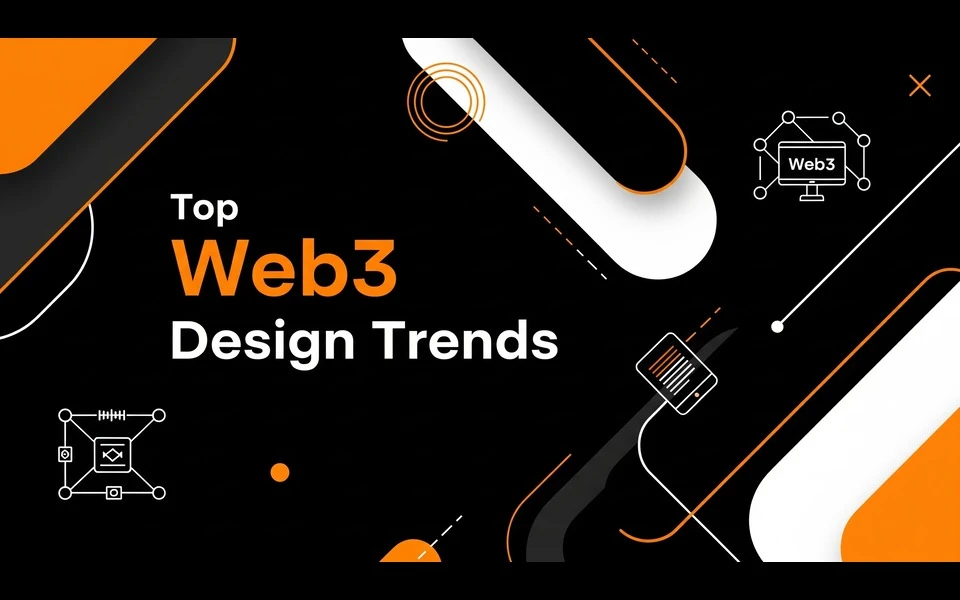
The Web3 landscape in 2026 is unrecognizable from the chaotic "Wild West" days of the early 2020s. We have moved past the era where clunky interfaces and confusing user journeys were accepted as the price of decentralization. Today, the focus has shifted entirely to "Invisible Tech"—where the blockchain backend is robust, but the frontend feels as smooth, intuitive, and engaging as the best consumer apps.
For a generation that grew up with iPads in hand—and for young founders who are rewriting the rules of the internet—design isn’t just about making things look pretty. It’s about trust, immersion, and identity. If you are launching a dApp, an NFT marketplace, or a DAO governance platform this year, you cannot afford to look outdated.
This guide explores the cutting-edge aesthetic and functional shifts defining the industry. Here is what you need to know about Web3 Website Design trends dominating 2026.
1. Spatial UI and "Pop-Out" 3D Elements
The line between "flat" web pages and immersive environments has dissolved. In 2026, we are seeing the mass adoption of Spatial UI. This isn't just about sticking a 3D model in the hero section; it is about treating the browser window as a space with depth.
Agencies are utilizing lightweight WebGL and WebGPU libraries to create interfaces where elements float, rotate, and react to cursor movement with realistic physics. Buttons don’t just change color; they depress like mechanical keys. Cards don't just slide; they tilt and catch the light.
This trend is crucial for the "Metaverse-lite" experience. Users don't always want to put on a headset, but they do want that sense of digital presence. A skilled Web3 Ui Designer is now part architect, building layouts that feel less like a document and more like a room you step into. The goal is to make digital assets—whether tokens or virtual real estate—feel tangible and weighty.
2. Code Brutalism and "Technical Mono"
While the mainstream web moves toward soft curves and organic shapes, a counter-culture movement is sweeping through DeFi and developer-focused Web3 platforms. Known as "Code Brutalism" or "Technical Mono," this aesthetic celebrates the raw, utilitarian roots of the blockchain.
Think of it as the digital equivalent of exposed brick and ductwork in a loft apartment. We are seeing:
- Monospaced Typography: Fonts like OCR-A or custom terminal-style typefaces used for headers, not just code snippets.
- Visible Grids and Lines: Layouts that show their skeleton, using thin 1px borders to separate content areas.
- High Contrast: Stark black-and-white palettes or "terminal green" accents.
This style signals transparency and technical competence. It tells the user, "We are builders. There is no fluff here." It connects deeply with the crypto-native audience who values code over marketing gloss.
3. Liquid Glass and Tactile Maximalism
Glassmorphism has evolved. We aren't just doing frosted glass anymore; we are doing "Liquid Glass." This trend involves hyper-realistic, refractive textures that look like water, chrome, or molten metal.
In 2026, Web3 Ui Ux Design is obsessed with texture. Because digital assets are intangible, designers are overcompensating by making the interface feel incredibly rich. You will see backgrounds that look like moving oil slicks, buttons that resemble polished gemstones, and panels that distort the content behind them like thick optical lenses.
These "squishy" or "liquid" visuals are often paired with maximalist layouts—dense, vibrant, and full of energy. It’s a rejection of corporate minimalism. It screams "future," "abundance," and "fluidity," which aligns perfectly with the liquid nature of crypto markets.
4. Intelligent Micro-Interactions as Trust Signals
In the high-stakes world of Web3, a split-second delay can cause panic. Did my transaction go through? Did I just lose my gas fees? In 2026, design is solving this anxiety through aggressive micro-interactions.
We are moving away from simple spinning loaders. Now, every action has a distinct, satisfying reaction.
- Hover States: Elements glow or magnetically snap to the cursor before you even click, confirming "this is interactive."
- Transaction States: instead of a static "Pending" text, users see a dynamic visualization of the block confirmation progress.
- Success Animations: A successful swap or mint triggers a dopamine-inducing burst of confetti, haptic visual shakes, or sound effects.
These aren't just decorations; they are vital communication tools. They reassure the user that the system is alive, listening, and working.
5. Generative UI (GenUI)
The integration of AI into design workflows has birthed "Generative UI." In advanced Web3 dashboards, the interface itself is no longer static. It adapts based on the user's wallet history and on-chain behavior.
For a high-frequency trader, the Web3 Web Design might automatically strip away illustrative elements and focus purely on dense data grids and charts. For a casual NFT collector, the same dApp might present a gallery-view layout with large imagery and simplified controls.
This "shapeshifting" capability means the frontend is personalized in real-time. The interface "reads" the user's intent and morphs to serve it best. It’s the ultimate form of user-centric design, made possible by the convergence of AI and on-chain identity data.
6. The "Bento Box" Grid Layout
Inspired by Apple’s promotional materials and Japanese lunch boxes, the "Bento Grid" has become the standard for organizing complex Web3 information.
Web3 apps are data-heavy. You have token prices, gas fees, governance votes, portfolio value, and recent activity—all competing for attention. The Bento Grid solves this by compartmentalizing these distinct data points into unified, rounded-rectangular modules.
It allows for "organized chaos." A large square might showcase a featured NFT, while smaller rectangles track live crypto prices, and a tall vertical bar handles the navigation. It is responsive, modular, and incredibly scannable. It works perfectly on mobile, where these blocks can stack vertically without losing their hierarchy.
7. Cyber-Gradients and "Deep" Dark Mode
Dark mode is the default for Web3—that’s nothing new. But the quality of darkness has changed. We are seeing a move away from "flat grey" to "Deep Dark" modes that utilize rich, pigmented blacks (like midnight blue-black or deep purple-black) to save energy on OLED screens and reduce eye strain.
These dark backgrounds are illuminated by "Cyber-Gradients." Unlike the soft pastel gradients of 2024, the 2026 palette is electric. We are talking acid green, neon violet, and laser blue. These colors are often used as glow effects behind cards or as borders, creating a "holographic" feel.
This aesthetic borrows heavily from Cyberpunk and Sci-Fi culture, reinforcing the narrative that Web3 is the infrastructure of the future. It’s edgy, mysterious, and high-tech.
8. Kinetic Typography and Scrollytelling
Web3 projects often struggle to explain complex protocols. Whitepapers are boring, and FAQs are ignored. The solution in 2026 is "Scrollytelling"—using the user’s scroll behavior to trigger text animations.
As you scroll down a landing page, the typography doesn't just sit there. It assembles itself, changes weight, or moves along a path. Giant headlines might scale down to become a sticky navigation bar.
A talented Web3 Ux Designer uses kinetic typography to control the pacing of information. They can force the user to slow down and read a critical value proposition by locking the scroll until the text animation completes. It turns the passive act of reading into an interactive journey, ensuring the project's narrative is actually consumed and understood.
9. Abstract Art and "Anti-Design"
Finally, we are seeing a surge in abstract, almost avant-garde art styles. To differentiate from the thousands of generic DeFi clones, top-tier projects are commissioning custom abstract 3D art—floating blobs, impossible geometries, and surreal landscapes.
This "Anti-Design" trend deliberately breaks standard rules of layout or composition to create something memorable. It might feel a bit disorienting at first, but that’s the point. It disrupts the user’s pattern recognition, forcing them to pay attention. It signals that the project is innovative, artistic, and not just another copy-paste fork.
Conclusion: Building for the Next Generation
The design trends of 2026 are a direct response to the maturing of the Web3 ecosystem. We are no longer just building for speculators; we are building for users who demand speed, beauty, and clarity.
The shift is clear: interfaces are becoming more immersive, more tactile, and more personalized. Whether it is through the raw honesty of Code Brutalism or the slick luxury of Liquid Glass, the goal is to create an emotional connection with the user.
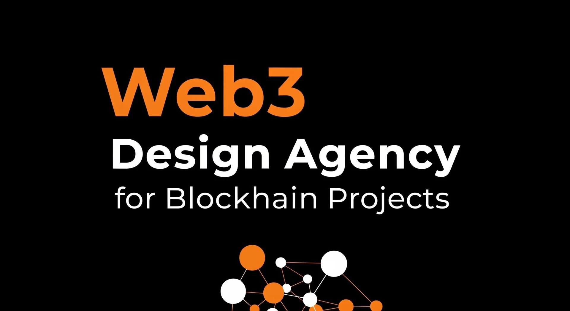
For any founder looking to make a mark this year, partnering with a forward-thinking web3 design agency is the first step toward relevancy. The technology behind your protocol might be revolutionary, but in 2026, it is the interface that tells the story. If you can master these trends, you won’t just build a product; you will build a brand that defines the future of the internet.


Sign in to leave a comment.