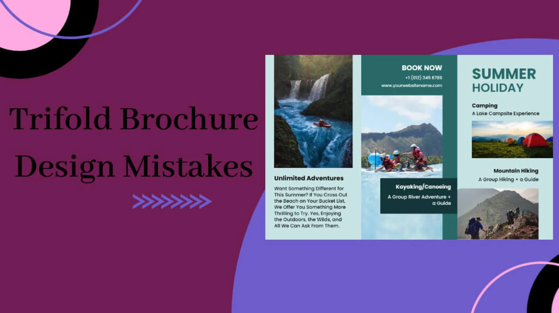
In a world filled with digital content, the power of a well-designed trifold brochure is often underestimated. These compact and visually appealing pieces of marketing collateral have the potential to leave a lasting impression on your audience. However, creating an effective trifold brochure requires careful attention to design elements and a keen eye for detail. The advantage of using a tri fold brochure template is the pre-defined layout that ensures your content is organized in an aesthetically pleasing manner. With sections for headlines, images, and text, you can easily highlight key information and guide your audience's attention. The template serves as a starting point, allowing you to unleash your creativity and customize the design to align with your brand's identity. In this study, we will explore common trifold brochure design mistakes and provide valuable insights on how to avoid them.
Trifold Brochure Design Mistakes
In the dynamic realm of marketing, the trifold brochure serves as a potent tool, but pitfalls in design can hinder its impact. Uncover the common blunders overcrowded layouts, typography troubles, image issues, and content cohesion that may compromise the brochure's effectiveness. To overcome these problems use brochure creator, which offers simplicity and convenience. With pre-designed templates, intuitive editing tools, and a wide range of customizable options, you can overcome design challenges and create brochures that truly shine.
Let's navigate these pitfalls and transform each fold into a compelling visual story that captivates the audience.
The Importance of First Impressions
Your trifold brochure's design is the first thing your audience will notice. It's crucial to make a positive and memorable first impression. Let's delve into the common mistakes that might jeopardize this critical aspect.
Overcrowded Layouts: The Clutter Conundrum
One of the most prevalent design mistakes is cramming too much information into a limited space. Avoid the temptation to include every detail about your product or service. An overcrowded layout can overwhelm your audience and dilute the impact of your message.
Tip: Prioritize essential information and embrace white space to create a balanced and visually appealing design.
Poor Color Choices: The Hue Hurdle
Colors evoke emotions and play a significant role in design. However, choosing the wrong color palette can lead to a disconnect with your audience. Common mistakes include using too many colors, clashing hues, or neglecting the psychological impact of colors.
Tip: Select a cohesive color scheme that aligns with your brand identity and resonates with your target audience.
Typography Troubles
The fonts you choose for your trifold brochure can either enhance readability or become a major obstacle. Let's explore the typography pitfalls to avoid.
Inconsistent Fonts: The Typeface Tango
Using a variety of fonts may seem creative, but it often results in a chaotic and unprofessional look. Consistency is key to maintaining a cohesive design.
Tip: Stick to a maximum of two complementary fonts—one for headings and another for body text.
Small Font Size: The Tiny Text Trap
In an attempt to fit more information, designers sometimes reduce font size to an unreadable level. This blunder defeats the purpose of the brochure.
Tip: Ensure that your text is legible by choosing an appropriate font size for both headings and body text.
Image Issues
Visual elements can significantly enhance the appeal of your trifold brochure, but misuse can have the opposite effect. Let's explore common image-related mistakes.
Low-Quality Images: The Pixel Predicament
Using pixelated or low-resolution images is a design faux pas that can undermine your brand's credibility. Blurry visuals convey unprofessionalism and lack of attention to detail.
Tip: Opt for high-quality images that are relevant to your message and enhance the overall aesthetics of your brochure.
Irrelevant Imagery: The Visual Vagueness
Images should align with your message and resonate with your target audience. Using unrelated or generic visuals can confuse and disengage your readers.
Tip: Choose images that directly support your content and evoke the desired emotions or reactions.
Content Cohesion
The content within your trifold brochure should flow seamlessly, guiding the reader through a logical progression. Let's uncover the mistakes related to content cohesion.
Lack of Hierarchy: The Information Abyss
Failing to establish a clear hierarchy in your content can leave readers feeling lost. Important details may get overlooked if they're not presented with the prominence they deserve.
Tip: Use a combination of font sizes, colors, and layout to create a visual hierarchy that guides readers through the content.
Absence of Call to Action (CTA): The Direction Dilemma
Every effective brochure should inspire action. Without a compelling call to action, your audience may appreciate your design but not know what steps to take next.
Tip: Clearly state the desired action, whether it's making a purchase, visiting a website, or contacting your business.
Printing Predicaments
Even the most impeccable design can be compromised if the printing process is not handled correctly. Let's delve into common mistakes related to the final output.
Inadequate Bleed: The Edge Erosion
Neglecting to include a sufficient bleed area in your design can result in unwanted white borders or text cutoffs during printing.
Tip: Extend your background or design elements beyond the trim area to ensure a clean and professional finish.
Poor Paper Choice: The Texture Turmoil
The choice of paper can significantly impact the look and feel of your trifold brochure. Opting for low-quality or inappropriate paper may diminish the overall perceived value.
Tip: Consider the message and audience when selecting paper—choose a texture and weight that align with your brand and purpose.
Conclusion
In the realm of marketing, trifold brochures remain powerful tools for conveying messages concisely and effectively. By steering clear of the common design mistakes outlined in this blog, you can elevate your trifold brochure from a mere piece of paper to a captivating visual story that leaves a lasting impression.
Remember, a well-designed trifold brochure is not just about aesthetics; it's a strategic blend of visual appeal, clear communication, and a call to action. Avoid these design blunders, and you'll be on your way to creating brochures that stand out and make a lasting impact on your audience.


Sign in to leave a comment.