
You built something. You hired people you believed in. You gave them the tools and trusted them to run with it.
And for a while, everything looked fine.
Work was getting done. Deadlines were mostly hit. But there was this quiet feeling that your team was capable of more, and something invisible was getting in the way.
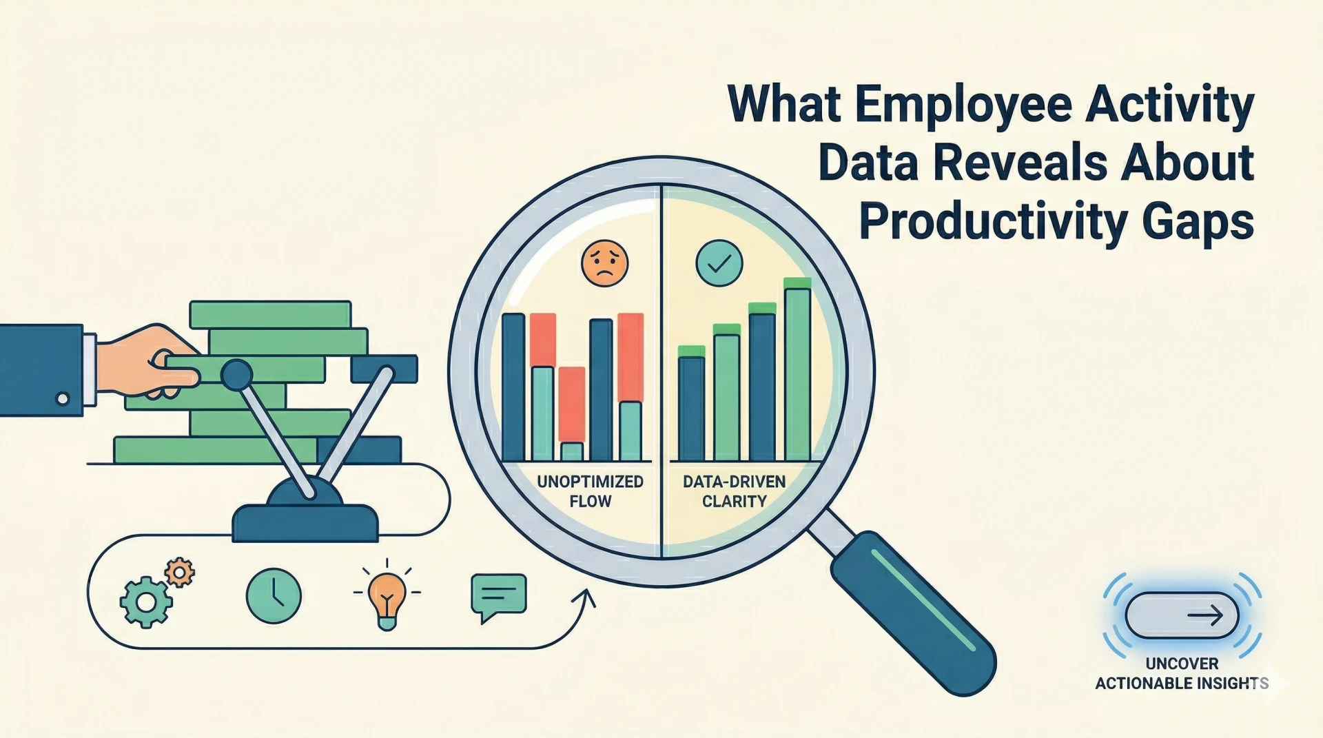
That feeling has a name. It is called a productivity gap. And the reason you cannot pin it down is simple. The information you have been looking at does not show the full picture.
Employee activity data fills that blind spot. Not to catch anyone out, but to finally answer the question you have been thinking about. What is actually happening during the hours you are paying for?
This is what that data is likely to reveal and why most people who look at it for the first time wish they had done it sooner.
What Is Employee Activity Data? And Why It Matters More Than Ever
Employee activity data is a record of how work time is actually spent. Not reported. Actually spent.
It captures three things most businesses never track properly:
- Active versus idle time
- Which apps and websites are open throughout the day
- How much of the day goes toward focused work versus wasted time
Traditional methods never reached this level. A timesheet tells you someone logged eight hours. It tells you nothing about what happened inside those eight hours.
That gap between logged time and real productive time is exactly where the insight lives.
How Do You Measure Productivity in the Workplace?
Counting hours made sense when work was physical and output was obvious. It does not hold up when your team spends the day thinking, writing, and solving problems.
Real measurement looks at four things together: productive time, idle time, task output, and focus time. No single number tells the full story. The pattern across all of them does.
Workforce analytics software and performance tracking tools are built for this. They do not replace your judgment as a manager. They give your judgment something solid to stand on.
Most businesses are still measuring employee productivity the old way, completely ignoring employee activity data.
The Hidden Truth: How Much Work Actually Happens in an 8-Hour Day
Here is the question most businesses never ask out loud.
Of the eight hours your team is logged in, how many are genuinely productive?
Across most workplaces, the honest answer is lower than the clock suggests. Not because people are lazy, but because work has friction. Interruptions, context switching, unclear priorities. They all add up quietly.
Employee time tracking software makes that invisible friction visible. You see real work time, where idle time clusters during the day, and which hours your team is actually most focused on.
The patterns are almost always surprising the first time you look.
Identifying and Understanding Productivity Gaps
A productivity gap is just a leak you have not found yet. Every business has them.
You need to know where yours are. Distractions pull people out of focus. Poor task alignment puts the wrong work in front of the wrong people. Inefficient processes eat time nobody notices disappearing.
None of this shows up in a weekly update. It shows up in the data.
Employee activity data does not point fingers. It points directions. Here is where time is going. Here is where it is not going where it should.
1. Where Time Gets Lost: App and Website Usage Insights
Pull up an app usage report for any team, and what you find is always more varied than expected.
Work tools, yes. But also social media open in a background tab, news sites visited mid-morning, and tools that are technically work-related but eat far more time than the output they produce justifies.
Employee activity data does not lie. People are often genuinely surprised when they see their own usage. They did not realize how often they toggled between tabs or drifted from the task they were supposed to finish.
That moment of recognition is where real change starts.
2. Discovering Peak Productivity Hours for Every Employee
Every person on your team has a window in the day when they are sharp, fast, and focused. And a window when they are running on empty.
Most businesses schedule completely blind to this. Meetings land wherever they fit. Deep work is squeezed into the remaining time.
If you want to know how to increase productivity without burning people out, activity data shows you when each person's best window actually is. Protect those hours. Stop placing thinking-heavy work at exactly the time when most of your team is at their lowest.
It costs nothing to restructure around peak hours. The output difference is usually immediate.
3. Team-Level Insights: Who's Thriving and Who Needs Support?
Put two people in the same role with the same tools. Their productivity numbers will not match. They never do.
Who is ahead is not the interesting question. It is why.
Sometimes the gap reveals a training need that was never addressed. Sometimes one person has quietly absorbed far more than their job description covers. Sometimes it is a workflow problem showing up in one person's numbers.
If you are figuring out how to measure team productivity fairly, tools like Monitor360 make this kind of comparison easy to run. You see the patterns, then you have a real conversation with actual data instead of impressions and gut feelings.
4. Project-Based Productivity Analysis
Some projects run cleanly. Focus is high, output is solid, and the team moves through the work without much drag.
Others quietly exhaust everyone. More confusion, more back and forth, more idle time between tasks.
Analyzing employee activity data at the project level shows you which category each project falls into and what is actually driving it. Poor planning? A tool that does not fit the workflow? Scope that was never clearly defined? Each cause has a different fix. Guessing the wrong one just adds to the problem.
5. Beyond Clicks: Advanced Monitoring with Screenshots and Live Tracking
Numbers tell you what happened. Context tells you what it meant.
Knowing that activity dropped sharply between 2pm and 4pm is a data point. Knowing what was on screen during that window is an explanation.
Screenshots and live tracking add that layer of context to the raw metrics. They also protect you from misreading the numbers.
Some work simply does not generate much digital activity. A writer thinking before typing. A designer working through a concept before touching the keyboard. Not all slow-looking time is wasted time, and context helps you tell the difference.
How to Find and Use Employee Activity Data
Not all monitoring tools are designed the same way. That difference matters more than most people think when choosing one.
Employee time tracking software captures when work starts and stops and how active those hours actually are. Workforce analytics software spots patterns across teams over weeks and months. Performance tracking tools connect behavior data to real deliverables and outcomes.
Here is what most people miss when choosing a tool. Tracking quality and reporting quality are not the same thing. A tool can collect everything and still leave you staring at numbers that tell you nothing useful.
What you actually need is a system where you open the dashboard and the picture is already clear. No decoding. No searching. Just the information you need, laid out simply.
Why Easy Analysis of Employee Activity Data Matters
Raw employee activity data is not insight. It is noise until a system makes it readable.
There is no version of this where a busy business owner opens a monitoring tool every single day. That is just not how running a business works. You have calls, decisions, and a hundred other things pulling at your attention.
A system must report productivity automatically. If measuring employee productivity only happens when you remember to log in and check, it will not happen consistently.
The standard is simple. The insight should come to you, not wait for you to go looking for it.
What a Good Employee Productivity Report Actually Looks Like
An employee productivity report takes everything the tool collected and turns it into a decision you can actually make.
Done well, it shows productive versus idle time, app and website usage, and key employee performance metrics relative to peers.
You are not hunting across five tabs. You are reading one clear story about where time went and what it produced.
This is also where email reports become genuinely useful. Getting a clean summary sent directly to your inbox means you stay informed without having to remember to check anything.
Visual layouts do more in five seconds than a table of numbers does in five minutes. Filters by team, project, or individual let you zoom into exactly what you need when you want to dig deeper.
If you find yourself explaining a report to someone instead of just showing it to them, it is not a good report. That is the simplest test worth applying.
How to Improve Employee Productivity Using Activity Data
The changes that actually move the needle and boost employee productivity are rarely dramatic. They are usually small and specific.
Reducing distractions means naming the exact apps and habits that fragment focus most, then having a direct conversation about them.
Optimizing schedules means moving meetings out of peak hours, not removing them entirely. Aligning tasks with strengths means putting the right work in front of the right people.
Accountability improves fastest when people can see their own numbers. Most employees are not trying to underperform. They just cannot see clearly where their time is going.
Companies that actively review employee activity data see productivity improvements of 20 to 25 percent on average. Showing people the data without judgment changes behavior faster than any policy ever will.
Common Mistakes When Measuring Employee Productivity
Four mistakes that quietly undermine the whole effort:
- Collecting data and never acting on it.
Many businesses have monitoring tools running for months without anyone using what those tools are surfacing. That wastes the tool and the trust your team placed in you by accepting it.
- Overcomplicating the analysis
Complicating the analysis data until nobody understands what they are looking at.
- Failing to be transparent
Be transparent with your team about what is being tracked and why.
All three kill the value of the data before it gets a chance to help anyone.
Conclusion: Visibility Plus Action Equals Productivity Growth
When business owners ask how to improve productivity in the workplace, the answer starts with visibility. Employee activity data gives you the questions worth asking.
Why does output drop every Tuesday afternoon? Why does this project always run longer than it should? Why are two people in identical roles performing so differently?
You probably had a hunch about some of these already. The data either confirms that hunch, challenges it, or points you somewhere completely unexpected. All three outcomes are useful.
A problem with a clear shape is a problem you can actually solve. The data gives it that shape.
If you have never looked closely at your team's activity data before, that first look tends to be the most interesting one you will have in a while. Go find out what yours is telling you.
























Sign in to leave a comment.