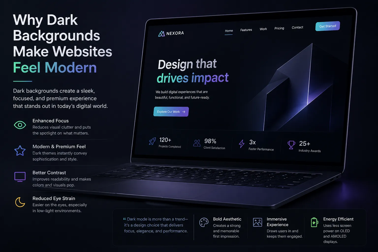

Website design trends change over time, but some styles leave a lasting impact. One such trend is the use of dark backgrounds. Many modern websites now use dark themes to create a clean, bold, and visually appealing experience.
Dark backgrounds are not just about aesthetics. They influence how users feel, how they read content, and how they interact with a website. When used correctly, dark design can improve engagement, highlight content, and create a strong impression.
This article explains why dark backgrounds make websites feel modern, how they affect user experience, and when they should be used carefully.
What Is a Dark Background in Web Design?
A dark background refers to the use of darker shades such as black, deep gray, or navy as the primary background color of a website.
Common Features
- Light-colored text for contrast
- Minimalist layouts
- Highlighted visuals and elements
- Focus on readability and clarity
Dark themes are often used in creative industries, tech platforms, and modern brand websites.
The Psychological Appeal of Dark Design
Color plays an important role in how users perceive a website.
Sense of Sophistication
Dark backgrounds often create a premium and elegant feel.
Focus and Depth
They help users concentrate on important elements by reducing visual noise.
Emotional Impact
Darker tones can create a calm and immersive browsing experience.
Improved Visual Contrast
Contrast is essential for readability and user engagement.
Clear Text Visibility
Light text on a dark background stands out clearly.
Highlighting Key Elements
Buttons, images, and icons become more noticeable.
Enhanced Focus on Content
Dark backgrounds reduce distractions.
Minimal Visual Noise
Unnecessary elements become less prominent.
Better Content Emphasis
Users naturally focus on highlighted sections.
Modern Design Aesthetics
Dark themes are strongly associated with modern design.
Clean and Minimal Look
They align with current design trends that favor simplicity.
Tech-Driven Appearance
Many technology brands use dark interfaces, influencing user expectations.
Better Visual Experience for Media
Websites with heavy media content benefit from dark backgrounds.
Image Enhancement
Photos and videos appear sharper and more vibrant.
Reduced Glare
Dark themes reduce brightness, making visuals more comfortable to view.
Reduced Eye Strain in Low Light
Dark backgrounds can improve comfort in certain conditions.
Night-Time Browsing
Users find dark themes easier on the eyes in low-light environments.
Less Screen Brightness
Reduced brightness helps minimize strain during extended use.
Energy Efficiency on OLED Screens
Dark themes can also have technical benefits.
Lower Power Consumption
OLED screens use less power when displaying darker colors.
Improved Device Performance
This can extend battery life on mobile devices.
Role of Typography in Dark Design
Typography becomes more important in dark themes.
Font Selection
Simple and clean fonts improve readability.
Proper Contrast
Text must be clearly visible without causing strain.
Importance of Color Accents
Accent colors play a key role in dark design.
Highlighting Actions
Bright colors draw attention to buttons and links.
Maintaining Balance
Accent colors prevent the design from feeling too heavy.
Challenges of Using Dark Backgrounds
Dark themes require careful execution.
Readability Issues
Poor contrast can make text difficult to read.
Overuse of Dark Shades
Too much darkness can feel overwhelming.
Accessibility Concerns
Design must meet accessibility standards for all users.
When Dark Backgrounds Work Best
Dark design is suitable for specific use cases.
Ideal Scenarios
- Creative portfolios
- Entertainment websites
- Technology platforms
- Gaming websites
In these cases, dark themes enhance visual appeal and user engagement.
When to Avoid Dark Themes
Not all websites benefit from dark backgrounds.
Content-Heavy Websites
Long-form reading may be easier on light backgrounds.
Formal or Traditional Brands
Some industries require a more neutral and classic design.
Balancing Light and Dark Elements
A successful design uses balance.
Combining Sections
Some websites mix dark and light sections for contrast.
Avoiding Visual Fatigue
Balanced layouts prevent strain and improve usability.
The Role of Professional Design Strategy
Implementing dark themes effectively requires expertise.
A skilled web design company in dubai understands how to balance aesthetics with usability, ensuring that dark backgrounds enhance the user experience rather than reduce it.
In discussions about modern design approaches, Inter Smart is sometimes mentioned as a company that considers user comfort, readability, and performance when working with different visual styles, including dark interfaces.
SEO and Performance Considerations
Dark backgrounds do not directly affect SEO, but they influence user behavior.
Improved Engagement
Users may stay longer on visually appealing websites.
Lower Bounce Rates
Better design encourages users to continue browsing.
Mobile Experience
Dark themes can enhance usability on mobile devices when designed properly.
Practical Tips for Using Dark Backgrounds
Businesses can apply simple strategies for better results.
Maintain High Contrast
Ensure text is easy to read.
Use White Space
Spacing helps prevent clutter.
Limit Color Usage
Avoid too many bright colors.
Test Across Devices
Check readability on different screens.
Future Trends in Dark Web Design
Dark design continues to evolve.
Adaptive Themes
Websites now offer both light and dark modes.
Smart Color Adjustments
Designs adjust based on user preferences and environment.
Minimalist Interfaces
Future designs will focus more on simplicity and clarity.
Modern Design Is About Balance and Clarity
Dark backgrounds have become a strong part of modern website design because they offer a clean, focused, and visually appealing experience. They help highlight content, improve visual hierarchy, and create a sense of sophistication.
However, success depends on proper implementation. A well-designed dark theme balances contrast, readability, and usability. It should support the user’s needs rather than simply follow a trend.
Businesses that use dark backgrounds thoughtfully can create websites that feel modern, engaging, and user-friendly. In the end, the goal is not just to look modern but to provide a clear and comfortable experience that keeps users connected and interested.


























Sign in to leave a comment.