I’ve worked with enough businesses in San Diego to know this:
Most websites look “fine.”
But they don’t work.
They don’t make people stay.
They don’t help customers take the next step.
And they definitely don’t make your brand feel different.
In a city packed with startups, boutique shops, agencies, and creatives—it’s easy to get lost. Everyone’s online now. Your website is basically your front door. If it creaks or confuses, people just bounce.
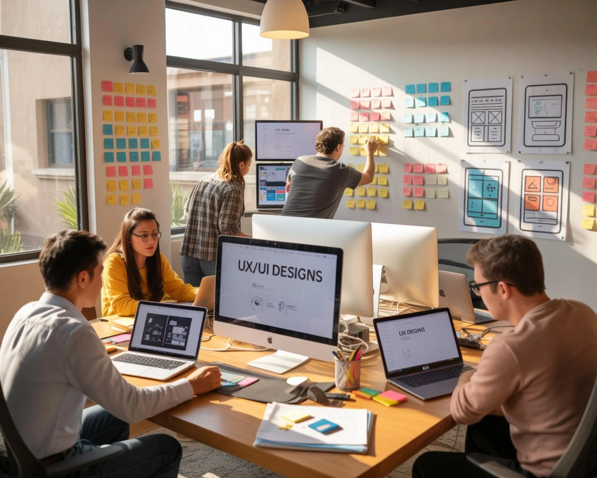
Let’s Talk UI and UX (But Not in a Boring Way)
So what is UI/UX?
I won’t hit you with textbook stuff.
UI is how your site looks—buttons, spacing, images.
UX is how people feel using it—frustrated or, hopefully, not.
It’s like a restaurant:
UI is the vibe.
UX is the service.
Both need to be good.
In San Diego, where style meets tech, your site should feel right. Clean. Quick. Easy.
If it doesn’t? You’re giving people a reason to leave.
You Don’t Need Fancy—You Need Functional
One client told me, “Our old site looked cool, but nobody used it.”
That’s way too common.
You don’t need flashing banners or slick animations.
You need clear navigation. Fast loading. Smart flow.
Something that works on a phone during lunch in North Park just as well as it does on a laptop in an office downtown.
Built by Locals, for Locals
We’re based here. In San Diego.
So we get what matters:
• Aesthetic matters (because... it’s San Diego).
• People use their phones a lot.
• Tourists, locals, and remote workers all use sites differently.
We design with that in mind.
Not with some cookie-cutter approach from a mega agency across the country.
Not Sure What’s Wrong With Your Site? That’s Normal.
Most clients don’t say, “We need better UX.”
They say things like:
“People aren’t clicking.”
“Nobody fills out our form.”
“It just feels… off.”
That’s where we come in. We audit your site, find the friction, and fix it.
Real Talk: Mobile First. Or Nothing.
You already know this, but it’s worth repeating: most people check your site from their phone.
And if they have to pinch, zoom, wait, or tap six times to get to a menu?
They’re gone.
We build mobile-first from the start. Because that’s where your customers are.
It’s Not Just “Design”—It’s User Psychology
Here’s a secret:
The way people use websites hasn’t changed much. They scan. They click what’s easy. They bail fast if they hit a dead end.
We map your site to what real humans do—not what designers think they’ll do.
We make it obvious. Intuitive. Fast.
Because if your website makes people think too much, they’ll leave.
Stuff We’ve Fixed Lately
- Local spa: Bookings doubled after we simplified their services page.
- Neighborhood restaurant: 3x more mobile orders after we redesigned their menu layout.
- Small law firm: Leads went up just by changing the homepage copy and buttons.
No magic. Just smart design, tested and tweaked.
Here’s How We Work
No buzzwords. No drawn-out timelines. Just:
- A conversation
- A few honest suggestions
- A design that fits your brand and your users
- A launch you’re proud of
We keep things human. Like your brand should.
Want to Chat? We’d Love That.
This isn’t a pitch. It’s an invitation.
If something about your site feels off—or you’re just curious what better could look like—reach out.
We’ll talk. Maybe it turns into something. Maybe not. Either way, you’ll walk away with more clarity.
You’ve worked hard to build your brand. Don’t let your website be the weak link.
We’re CreativeCircle We design for people.
Right here in San Diego.


Sign in to leave a comment.