
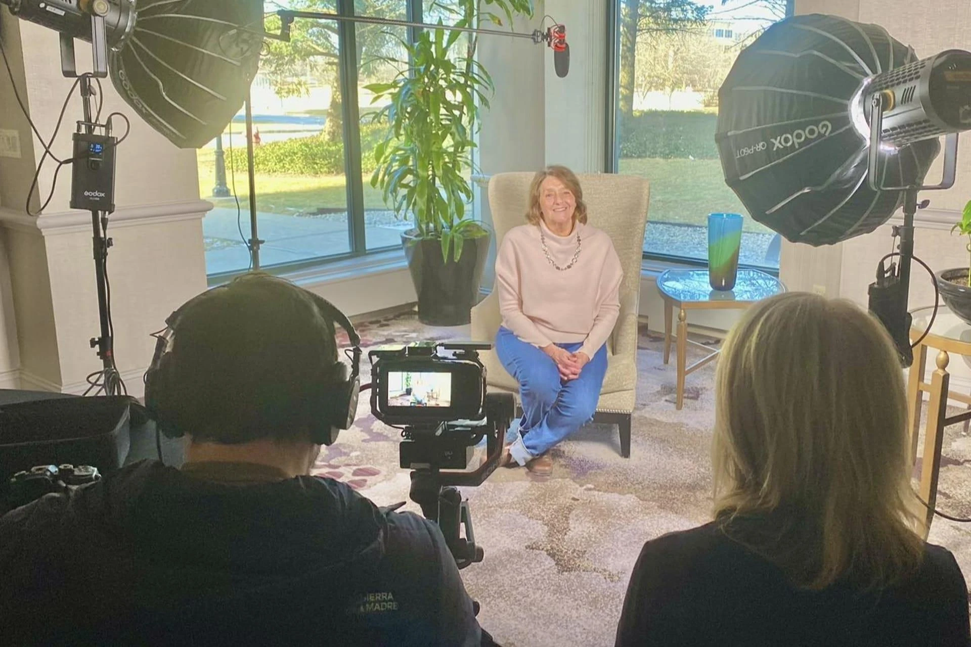
Customer perception is shaped by how a brand presents itself across digital spaces. Visual alignment, consistent tone, and repeatable design patterns allow people to recognize and trust a brand more quickly. Strong web design often acts as the starting point for building this kind of brand cohesion. When website elements remain consistent with other digital channels, everything from emails to social media begins to work together more smoothly.
1. Unified visuals anchor brand recognition
Consistent color usage, font choices, image styles, and layout structure help brands stand out and remain memorable. When visitors can visually connect a website to an ad, social post, or video without needing to read the name, it reinforces brand presence. A boutique skincare brand recently redesigned its website with updated color harmony and spacing rules, then extended those updates across email campaigns and influencer assets, improving recall and recognition.
- Repetition of design elements across channels boosts brand recall by nearly 30% (Source: Lucidpress).
- Visual templates reduce inconsistencies during multi-channel campaign rollouts.
- Keeping photography tone and layout style aligned helps maintain emotional impact.
2. Website-based style systems improve platform coordination
Design decisions documented on a website give teams a strong visual reference to pull from. A clear, well-documented style system helps writers, designers, and developers execute faster with fewer missteps. One tech company embedded a living brand guide within their site backend, giving external partners instant access to correct assets, logo usage rules, and component behavior.
- Centralized design systems cut down on revisions and miscommunication.
- Access to real-time style guidance ensures freelancers and teams stay visually aligned.
- Web-based systems make onboarding new collaborators faster and more effective.
3. Navigation patterns support consistent interaction
Users grow familiar with how a brand feels as they move through its content. Consistency in how menus function, what terms are used, and how elements respond to clicks or scrolls builds a sense of comfort. A university redesigned its primary navigation to match patterns used in its student portal, alumni email templates, and recruitment microsites, allowing users to interact with less friction.
- Clear navigation styles improve engagement rates and click depth.
- Predictable interaction patterns build confidence across platforms.
- Terms like “Explore Programs” or “Start Here” guide users when repeated across touchpoints.
4. Design tone supports verbal consistency
The look and structure of text affects how messages are understood. From large headlines to smaller buttons, the visual style of text helps reinforce the way a brand speaks. A consulting firm shifted from thin, ultra-modern fonts to well-balanced, professional typefaces, aligning with a voice of experience and dependability across its white papers, landing pages, and social posts.
- Font weight, spacing, and style contribute to emotional tone and clarity.
- Matching tone between web content and email subject lines builds credibility.
- Headlines that use a familiar cadence or phrasing pattern strengthen recognition.
5. Reusable components simplify cross-channel delivery
Design elements like product cards, testimonials, callout boxes, or buttons should look and feel consistent wherever they appear. By creating these components through a website’s design system, teams can reuse them in mobile apps, ad platforms, and newsletter templates. A nonprofit used its primary website’s donation component as the foundation for its text-to-give page, Instagram Story links, and embedded fundraising widgets.
- Component reuse reduces duplicated work and visual drift.
- Familiar elements lead to faster user action and fewer hesitations.
- Structuring layouts using modular pieces makes updates less risky.
6. Responsive layout supports visual balance across devices
Most users will see a website across different screen sizes throughout their journey. Whether they’re on a phone, tablet, or laptop, the experience should feel like it belongs to the same brand. A regional home service provider refined its mobile view to match the look and tone of its desktop ads, service pages, and lead capture forms.
- Over 65% of web users access brand content primarily on mobile (Source: Statista).
- Maintaining font legibility and spacing across screen sizes keeps messaging intact.
- Consistent responsive behavior improves how users feel about brand quality.

7. Design consistency increases audience trust
Disjointed visuals or clashing tones can quietly erode confidence. A site that looks polished and mirrors that polish across ad landing pages, invoices, and social headers signals organization. A legal practice rebuilt its web layout and reused colors, icons, and section breaks in its PDF reports and Google Business profile, helping clients see it as dependable and detail-oriented.
- Design consistency improves trustworthiness perception by up to 25% (Source: Stanford Web Credibility Study).
- Subtle design mismatches—like different button colors—can confuse users.
- Familiar layouts reduce mental effort when navigating between digital assets.
Key takeaways on web design’s role in brand cohesion
Web design does far more than manage aesthetics—it lays the groundwork for every other digital asset that follows. Whether it's tone, layout, spacing, or interaction, decisions made during web development ripple across the brand. Teams that view their websites as a guide for broader branding can create smoother, stronger experiences across platforms. The end result is a more cohesive identity that helps customers recognize, trust, and return.
- Web design serves as a consistent visual base across platforms.
- Navigation, text style, and layout create shared user expectations.
- Reusable elements save time and prevent fragmented branding.
- Responsive layouts maintain design quality across all devices.
- Cohesive presentation builds credibility and improves brand memory.
Frequently Asked Questions About Web Design and Brand Cohesion
Why does consistent design improve engagement?
Familiar layouts and visuals reduce cognitive load, helping users focus on content rather than reorienting themselves with each platform.
What makes web design the ideal place to start a style system?
Websites require the most variation in layout and interaction, making them a strong testing ground for patterns that scale elsewhere.
How can small brands create consistency without a full design system?
Using basic rules for color, fonts, and image cropping—even written in a simple doc—can be enough to stay visually aligned.
Is mobile-first design essential for brand consistency?
Mobile-first helps ensure that your brand is visible and effective where most users are—on their phones. It supports continuity across device types.
How do visual inconsistencies affect user trust?
Even minor design breaks—like inconsistent logos or off-tone imagery—can signal carelessness and make users second-guess credibility.


Sign in to leave a comment.