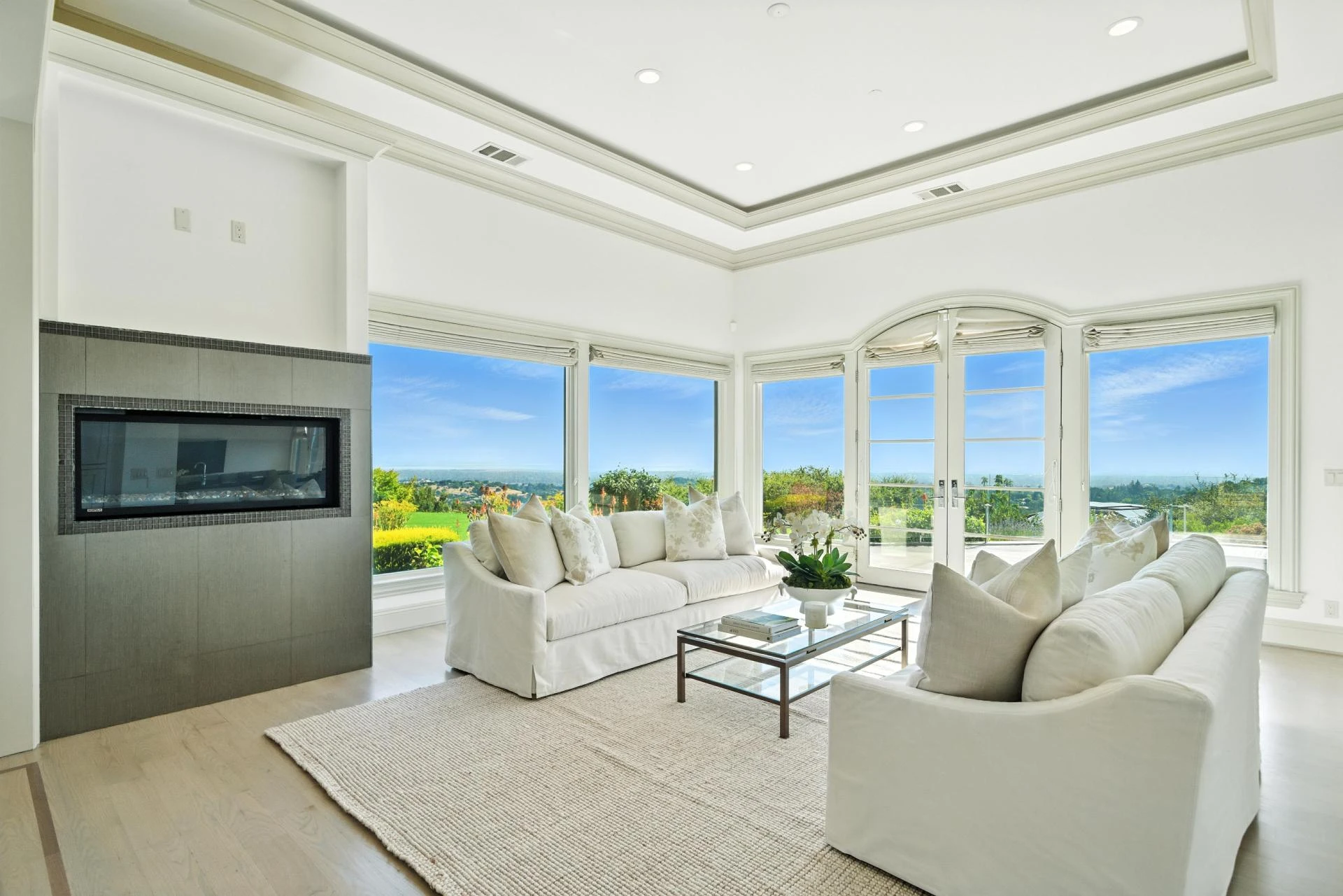
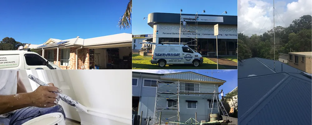
Color plays a quiet but powerful role in how buyers feel about a property. Even when lighting and composition are good, incorrect colors can make rooms feel dull, outdated, or different from reality. In 2026, real estate photo editing places strong emphasis on color correction because it directly affects buyer trust and decision-making.
This article shares clear, practical color correction tips that help real estate photos look natural, accurate, and appealing, without exaggeration or confusion.
Why Color Correction Matters in Real Estate Photos
Cameras do not see color the way the human eye does. Mixed lighting from windows, ceiling lights, and lamps often causes color shifts. Walls may look yellow, floors may appear grey, or whites may lose their clarity.
Real estate photo editing corrects these issues so photos match what buyers will see in person. Accurate color helps buyers judge materials, finishes, and overall condition more confidently. When colors feel right, listings feel more trustworthy.
Start With White Balance Correction
White balance is the foundation of color correction. If white balance is off, every color in the image looks wrong.
A key tip in real estate photo editing is to correct white balance before making any other color adjustments. This removes unwanted yellow, blue, or green tones caused by lighting conditions.
Proper white balance ensures:
- Walls appear neutral
- Ceilings look clean
- Natural light feels balanced
Once white balance is correct, the rest of the color work becomes much easier.
Avoid Over-Saturation
One common mistake is increasing saturation too much. While brighter colors may look attractive at first, they often feel unrealistic.
In real estate photo editing, saturation should be adjusted carefully. The goal is to restore natural color, not to intensify it. Over-saturated photos can make paint, wood, and fabrics look different from reality, leading to disappointment during visits.
A good rule is subtlety. Colors should feel clean and natural, not bold or dramatic
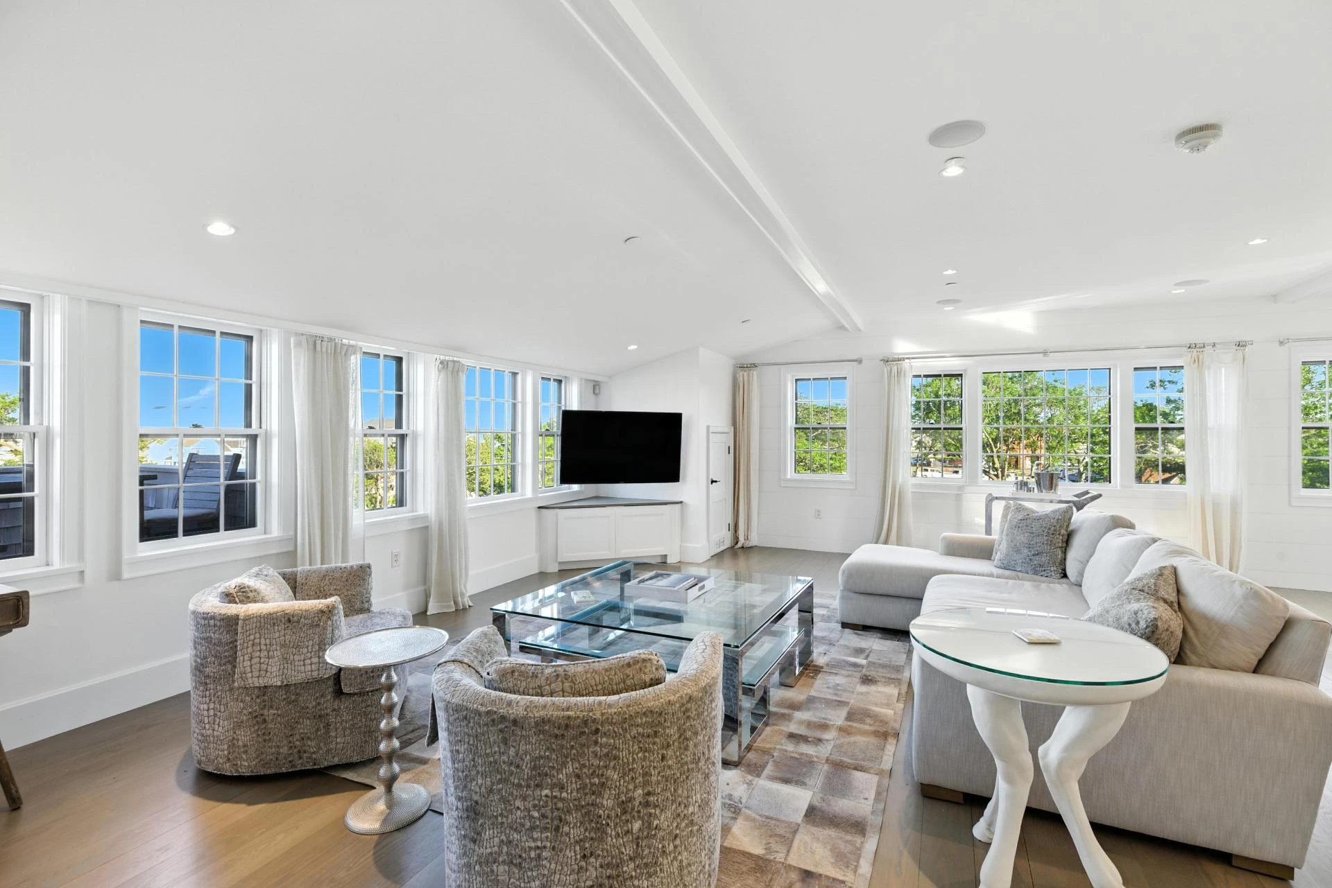
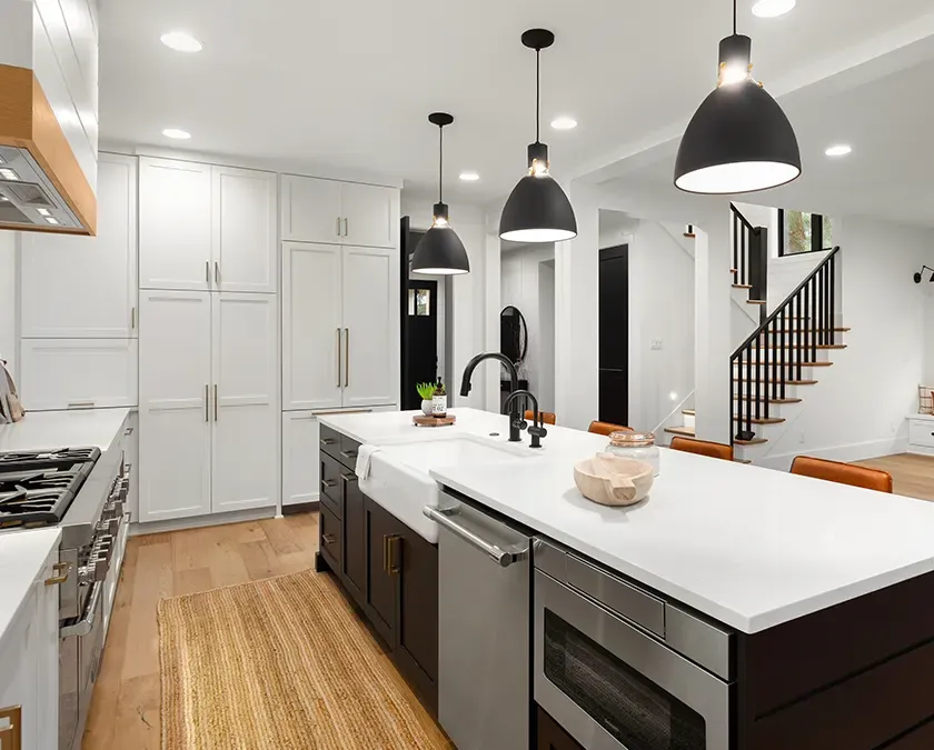
Keep Neutral Colors Truly Neutral
Most interiors rely on neutral colors such as white, beige, grey, or soft earth tones. These colors help buyers imagine their furniture and style.
During real estate photo editing, neutral tones should stay neutral. Avoid pushing them too warm or too cool. When neutral colors shift, rooms may feel smaller, colder, or less inviting than they actually are.
Accurate neutral colors:
- Improve buyer comfort
- Make spaces feel flexible
- Support realistic expectations
Neutral accuracy is especially important for walls and large surfaces.
Balance Warm and Cool Tones Carefully
Different rooms may contain both warm and cool light sources. Kitchens often mix daylight with overhead lighting, while bedrooms may use warmer lamps.
A helpful real estate photo editing tip is to balance warm and cool tones so neither dominates. The image should feel evenly lit, not overly warm or cold.
Balanced tones help rooms feel comfortable and lived-in. Buyers respond better when lighting feels natural and familiar.
Adjust Shadows Without Changing Color
Shadows can carry unwanted color tints. Dark areas may look blue or muddy, especially in corners.
During real estate photo editing, shadows should be lifted carefully while keeping colors accurate. Avoid adding brightness that changes the color tone of the room.
Clean shadows:
- Reveal details without flattening depth
- Keep textures visible
- Maintain realistic contrast
This helps buyers understand space without distorting color.
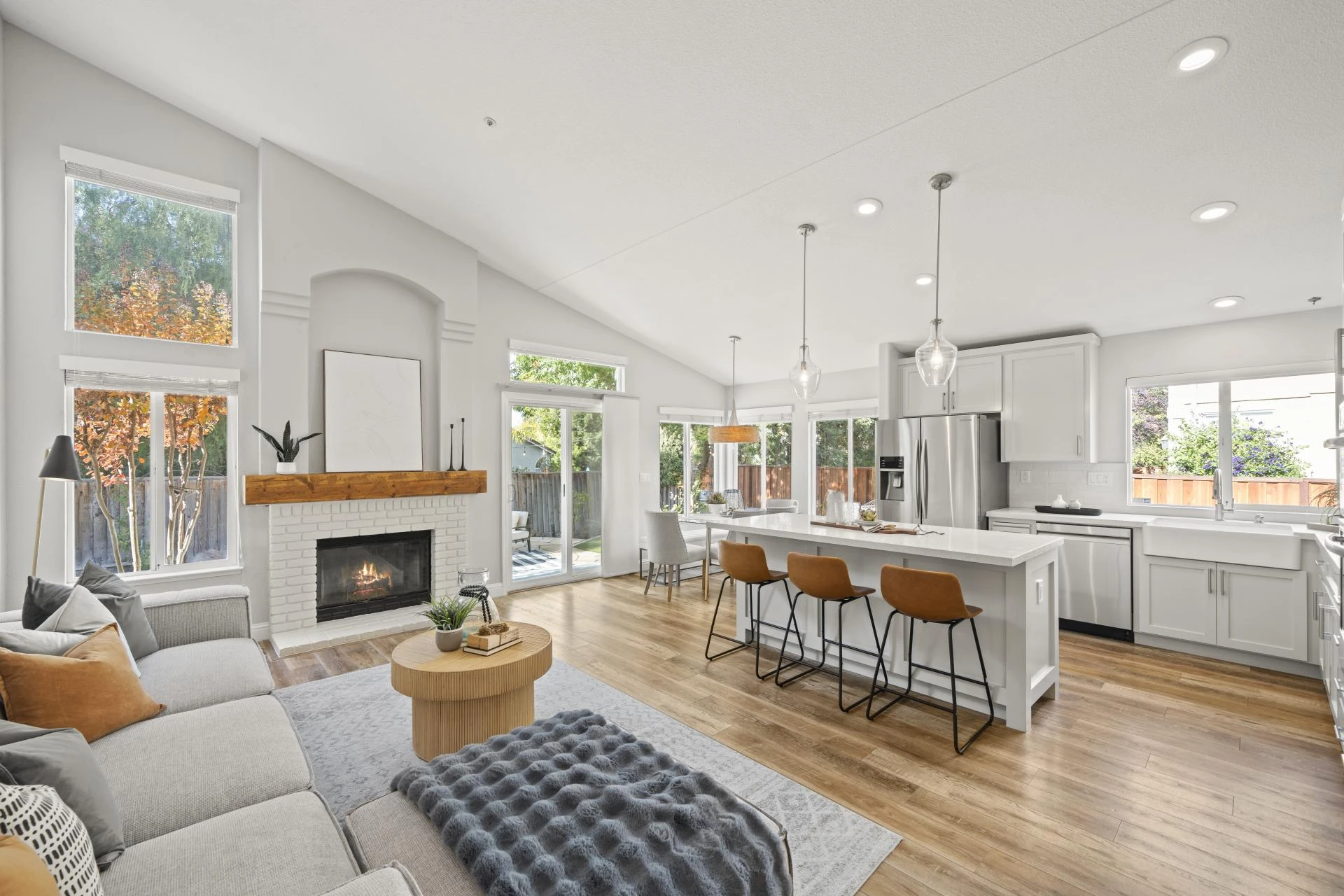
Treat Each Room With Context
Not all rooms should be edited exactly the same way. A bathroom, kitchen, and living room each have different materials and lighting needs.
An important real estate photo editing tip is to consider room context. For example:
- Bathrooms often benefit from cooler, clean tones
- Living rooms usually feel better with balanced, neutral warmth
- Kitchens need accurate color for cabinets and countertops
Context-aware editing improves realism and avoids a one-size-fits-all look.
Match Colors Across the Whole Listing
Consistency matters. If one room looks warm and another looks cool, buyers may feel something is off.
In real estate photo editing, color correction should be consistent across all photos in a listing. This creates a smooth viewing experience and helps buyers move from room to room without visual confusion.
Consistent color also supports a stronger brand presentation for agents and brokerages.
Be Careful With Exterior Color Correction
Outdoor photos need color correction, too, but the approach should be gentle. Grass, sky, and building exteriors should look natural for the season and location.
In real estate photo editing, avoid pushing outdoor colors too far. Green lawns should not look artificial, and skies should not overpower the property.
Natural exterior colors create a stronger and more believable first impression.
Always Review on Different Screens
Colors can look different on various devices. A useful habit in real estate photo editing is to review images on both desktop and mobile screens.
This helps ensure:
- Colors are not too dark on phones
- Whites do not look grey on smaller screens
- Overall tone remains balanced
Mobile-friendly color correction is essential as many buyers browse listings on phones.
Avoid Filters That Change Reality
Filters may seem like a quick fix, but they often distort color accuracy. In real estate, filters can reduce trust.
Professional real estate photo editing avoids heavy filters and relies on controlled color correction instead. Clean, accurate color builds confidence and reduces surprises during in-person visits.
Human Review Still Matters
Even with advanced tools, human judgment is important. Always review edited photos to ensure colors match reality.
Ask simple questions:
- Do wall colors look true?
- Do floors match their real tone?
- Would a buyer feel misled by this image?
This final review step protects credibility.
Final Thoughts
Color correction is one of the most important parts of real estate photo editing. When done well, it helps buyers see spaces clearly, trust what they view online, and make confident decisions.
The best color correction is subtle, consistent, and honest. By focusing on white balance, neutral accuracy, controlled saturation, and careful review, real estate photos become clearer and more reliable.
In 2026, accurate color is not just a technical detail, it is a key part of building trust and presenting properties in a way that truly reflects reality.


Sign in to leave a comment.