

A company vehicle can do more than transport employees, equipment, or products. With the right graphics, it can become a highly visible marketing asset that introduces your brand to potential customers wherever it travels. However, creating an effective fleet wrap requires more than placing a logo and contact information on a vehicle. Poor design decisions can make the graphics difficult to read, weaken brand recognition, and reduce the overall impact of the wrap.
Whether you operate one service vehicle or manage a large commercial fleet, avoiding common design mistakes can help you create vehicle graphics that look professional and communicate your message clearly.
1. Using Too Much Information
One of the most common mistakes is trying to include every detail about the business on the vehicle. Businesses may add long lists of services, multiple phone numbers, social media handles, extensive descriptions, and promotional messages.
The problem is that people often see a moving vehicle for only a few seconds. A complicated design can be difficult to understand at a glance.
Instead, focus on the most important information. Your company name, logo, primary service, website or phone number, and a simple call to action are usually enough. Keep supporting information limited so the main message remains easy to recognize.
2. Choosing Fonts That Are Difficult to Read
Creative typography can make a design look distinctive, but overly decorative fonts can become difficult to read when viewed from a distance.
Fleet graphics should prioritize readability. Choose fonts with clear letter shapes and appropriate spacing. Make sure important information such as phone numbers and website addresses is large enough to remain readable from nearby traffic.
It is also important to consider how the lettering interacts with the vehicle's curves, doors, handles, windows, and body lines.
3. Ignoring the Vehicle's Shape
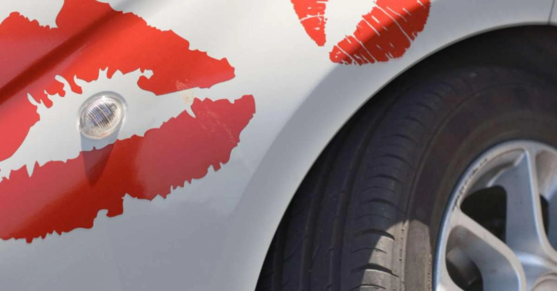
A vehicle is not a flat billboard. It has curves, seams, doors, windows, handles, wheel arches, and other features that can affect how graphics appear.
A design that looks excellent on a computer screen may not look the same once installed.
Professional fleet wrap designs are created around the specific vehicle model and its physical dimensions. Important elements should be positioned away from areas where seams, handles, or body contours could distort the design.
4. Poor Color and Contrast Choices
Color plays an important role in brand recognition, but using too many colors can make a fleet wrap appear cluttered. Low contrast can also make text disappear against the background.
For example, dark lettering on a dark vehicle may be difficult to see, especially at a distance. Businesses should select colors that reflect their existing brand identity while maintaining strong contrast between the background and important information.
A consistent color palette can also help multiple vehicles look like part of the same professional fleet.
5. Making the Logo Too Small
Your logo is often one of the first things people should notice. Making it too small can reduce brand recognition, particularly when the vehicle is moving.
The logo should have enough visual space around it to remain distinct from other design elements. However, increasing its size does not mean covering the entire vehicle with branding. Good design balances logo visibility with the rest of the message.
6. Forgetting About Visibility at Different Distances
Fleet wraps need to work from different viewing distances. Someone parked next to the vehicle may see detailed information, while another driver may only have a few seconds to identify the company.
Think about the design in layers. The company name and primary service should be recognizable from a distance, while secondary information can be understood when someone is closer.
This approach helps ensure the wrap functions as both branding and advertising.
7. Using Low-Quality Images
Images and graphics are another area where businesses can make costly mistakes. Low-resolution photographs or improperly prepared logos may appear blurry or pixelated when enlarged for a vehicle.
High-resolution artwork and properly formatted logos help produce a cleaner finished appearance. Images should also be selected carefully so they support the company's message rather than making the design unnecessarily busy.
8. Inconsistent Branding Across Vehicles
When several vehicles are part of the same fleet, using completely different designs can make the business appear less consistent.
Fleet branding does not necessarily mean every vehicle must be identical. Different vehicle sizes may require different layouts, but key elements such as colors, logos, typography, and messaging should remain consistent.
A coordinated fleet creates repeated brand exposure and makes individual vehicles easier for customers to recognize.
9. Overlooking Installation Considerations
Even a well-designed wrap can produce disappointing results if installation requirements are ignored during the design stage.
Doors, handles, mirrors, windows, sensors, trim pieces, and other vehicle components can influence where graphics should be positioned. The design should account for these practical details before production begins.
Working with an experienced wrap professional can help businesses identify potential problems before the graphics are printed and installed.
Create Fleet Wraps That Work for Your Brand
A successful fleet wrap combines attractive design with clear communication and practical planning. Avoiding excessive information, unreadable fonts, weak contrast, poor-quality artwork, and inconsistent branding can make a significant difference in how your vehicles represent the company.
Before production begins, review the design from different distances and consider how it will look on the actual vehicle rather than only on a computer screen. A well-planned fleet wrap can turn everyday business vehicles into recognizable mobile marketing tools while maintaining a professional brand image.
























Sign in to leave a comment.