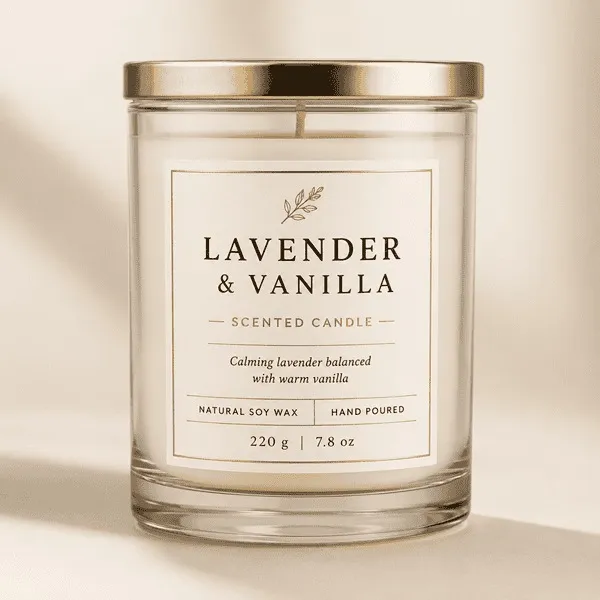

When someone picks up a candle, they do not see the fragrance first. They see the jar.
They notice the color, the lid, the shape and, of course, the label sitting on the front. That small detail can change the way the whole product feels.
A simple candle in a plain glass jar may look ordinary on its own. Add a well-designed label, though, and suddenly it feels like part of a proper brand. This is one reason candle labels matter so much for small and handmade candle businesses.
They are not only there to display a logo. A good label helps tell people what the candle is, what kind of scent they can expect and, just as importantly, who made it.
A Label Often Creates the First Impression
Think about how candles are usually discovered.
Sometimes they are sitting on a store shelf. Sometimes a customer sees them in an Instagram post or on an online marketplace. In both cases, people are making a quick visual judgement before they ever get close enough to smell the candle.
That is where the label does a lot of quiet work.
A clean label can make the product feel thoughtful and finished. A crowded one can make even a nice candle look less polished.
For a small candle maker, this is especially useful because good presentation does not always require complicated packaging. Even a basic jar can look distinctive when the branding is consistent.
Take an amber glass candle, for example. A soft cream label with simple black type might give it a warm, natural feel. Put the same candle in a bright glossy label with bold illustrations and it creates a completely different mood.
Neither approach is automatically better. What matters is whether the label suits the brand.
What Should Go on a Candle Label?
It is easy to keep adding information because there always seems to be something else customers might want to know.
But the front of a candle jar has limited space.
Usually, the most important details should be the easiest to see: the brand name, the candle or fragrance name, and any short description that helps the customer understand the scent.
For example, a fragrance called “Slow Sunday” may sound nice, but it does not immediately tell someone what it smells like. Adding a small line such as “vanilla, sandalwood and warm amber” makes the product much easier to understand.
Other details, such as wax type, net weight, burn information or care instructions, can be added where they make sense. They do not all have to compete for space on the front.
That is why many brands use a separate bottom or back label for additional information.
The Jar Matters Just as Much as the Design
One mistake candle businesses sometimes make is designing the label first and thinking about the container later.
A design may look perfect on a laptop screen but behave very differently once it is placed on a small curved jar.
Before ordering a large quantity, it helps to check a few basic things.
Is the jar completely straight or does it taper slightly? Is the surface smooth? Is it glass, tin or ceramic? How much flat space is actually available for the label?
These questions sound simple, but they can save a lot of trouble.
A label that is too wide may wrinkle around the edges. One that is too small can look lost on a large jar. And if the material or adhesive is not suitable for the surface, the corners may start lifting after a short time.
For labels for candle jars, fit is just as important as appearance.
Choose a Finish That Fits the Brand
There is no single finish that works for every candle.
Matte labels often look good on products with a soft, minimal or handmade feel. They can work particularly well with amber jars, neutral packaging and understated branding.
Glossy labels have a different effect. Colors usually look brighter and the overall appearance can feel more energetic or modern.
There are other options too.
Kraft-style labels can suit rustic or botanical candle ranges. Transparent labels are useful when the brand wants the glass jar itself to remain visible. A clean transparent label on clear glass, for instance, can look very different from a heavy paper label covering most of the container.
The easiest way to decide is not to ask, “Which finish looks most premium?”
Ask, “Which one actually feels like my brand?”
Good Candle Label Design Is Usually Simple
Small labels do not give you much room to hide bad design choices.
If you use three decorative fonts, five colors, a large logo, a fragrance description and several lines of text, the label can become difficult to read very quickly.
Keeping things simple usually works better.
The fragrance name should be clear. The brand name should be easy to find. Supporting details should sit underneath without fighting for attention.
White space helps too.
You do not have to fill every empty area simply because it is there. A little breathing room can make a label look cleaner and, in many cases, more expensive.
Color contrast also matters. Light text on a pale background may look elegant on screen but become difficult to read once printed. The same is true when the label color is too close to the color of the wax or jar.
A printed sample often reveals things that a digital preview does not.
A Few Candle Label Mistakes Worth Avoiding
Some problems only become obvious after the labels are already printed.
The label may be too large for the jar. The fragrance name may be hard to read. The adhesive may not hold properly. Or every scent in the range may end up looking like it belongs to a different company.
None of these are huge mistakes on their own, but together they can make the product feel less consistent.
Another common issue is trying to include everything on one label.
If you need to show product details, care information and other supporting text, it is often better to use the front, back and bottom of the jar more intelligently rather than shrinking everything to fit one small space.
It is also worth keeping some design elements consistent across fragrances.
Your lavender candle does not need to look exactly like your sandalwood candle. Different colors and illustrations are perfectly fine. But using the same logo style, typography and general layout helps customers see that both products come from the same brand.
Custom Candle Labels Can Make a Collection Feel More Complete
This becomes more noticeable when a business starts selling several scents.
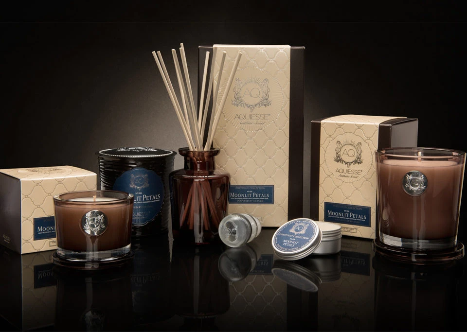
One candle on its own may look attractive, but put six different fragrances together and you quickly see whether the branding works as a collection.
Well-planned custom candle labels can tie those products together without making every jar look identical.
A floral candle may use softer colors. A coffee candle might use deeper brown tones. A festive scent could have a seasonal accent. As long as the basic design language stays familiar, the range can still feel connected.
That consistency also helps with online presentation.
When customers see several products together on a website, social media page or gift set, coordinated labels make the brand easier to recognize.
Final Thoughts
A candle label does not need to be clever or complicated.
It needs to suit the jar, stay attached, be easy to read and feel like it belongs to the product.
For handmade candle businesses, that small piece of packaging can do more than simply identify a scent. It can make the whole candle feel more considered.
And often, that is what good branding comes down to—not adding more, but paying attention to the details customers notice first.
























Sign in to leave a comment.