Introduction
I remember walking into a friend’s newly renovated bathroom last year. She had spent a small
fortune on high-end fixtures, but something felt... off. The walls were covered in a very specific,
clinical shade of stark white tile.
Despite the expensive gold faucets, the room felt cold, almost like a hospital waiting room. It wasn’t a place where you’d want to soak in a tub after a long day; it was a place where you’d want to scrub your hands and leave as quickly as possible.
That was a lightbulb moment for me. We often choose tiles based on what’s "timeless" or "easy to clean," but we rarely stop to think about how those colors actually make us feel.
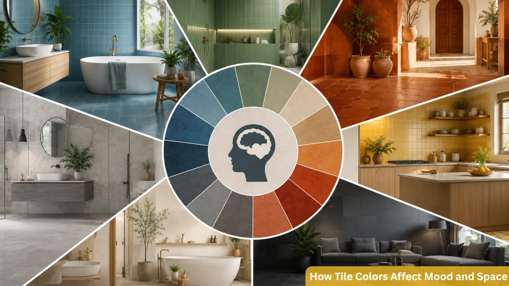
Tile Color psychology plays an important role in making our home feel like home; it’s a living, breathing part of our homes. The tiles we pick for our floors and walls are the largest permanent color blocks in a room.
They set the emotional thermostat. If you get the color right, the room hugs you. Get it wrong, and you might find yourself avoiding a perfectly functional space without ever knowing why.
The Emotional Language of Cool Tones
When most people think of a "relaxing" space, their minds go straight to the cooler end of the
Spectrum, blues, greens, and soft greys. There’s a biological reason for this. These colors mimic the sky and the sea, elements that our brains associate with vastness and calm.
Soft Blues and Seafoams
If you’re tiling a bathroom or a small laundry room, light blue full body tiles can do wonders. Blue is known to lower the heart rate and evoke a sense of serenity.
In a small space, a pale blue tile doesn't just look pretty; it creates an "airy" feeling. Because blue is a receding color, it makes the walls feel further away than they actually are.
It’s a great trick for making a cramped guest bath feel like a boutique spa. Just be careful with darker navy tiles, while sophisticated, they can make a room feel heavy if there isn't enough natural light to balance them out.
The Rejuvenation of Green
Green has seen a massive resurgence lately, and for good reason. It’s the color of growth and
vitality. Sage or olive floor tiles in a kitchen can ground the space, making it feel organic and
fresh. I’ve noticed that when people use green shades of green tiles for wall cladding , they tend to feel more creative and "connected" to their environment.
It’s a bridge between the indoors and the outside world. If you find your kitchen feels a bit sterile with all those stainless steel appliances, a soft green backsplash can instantly soften the mood.
The Power of Warmth: Energy and Intimacy
On the flip side, we have the warm tones, reds, oranges, yellows, and the ever-popular
terracottas. These colors are high-energy. They stimulate the senses, encourage conversation, and can even stimulate appetite. This makes them a bit of a double-edged sword in home design.
Terracotta and Earthy Oranges
There is a reason why Mediterranean and Southwestern homes feel so welcoming. Earth-toned
tiles, like terracotta, radiate a sense of security and history. These colors make a space feel "lived- in" and warm. If you have a large, open-concept kitchen that feels a bit echoing and empty, a warm-toned floor can "shrink" the space visually, making it feel more intimate and cozy. It’s like a visual fireplace that stays on all year round.
The Boldness of Red and Deep Yellow
I usually tell people to be cautious with bright red or yellow tiles. Red increases the pulse and can actually make people feel more hurried. It’s great for a high-traffic entryway where you want people move through quickly, but it’s probably a nightmare for a bedroom floor.
However, a deep, muted burgundy or a mustard yellow in a small mosaic pattern can add a "pop" of personality that feels sophisticated rather than overwhelming.
The Neutral Trap: White, Grey, and Beige
Neutrals are the "safe" choice, but "safe" can often lead to "soul-less" if we aren't careful. Most of us choose neutral tiles because we’re worried about resale value, but we forget that we have to live in the house in the meantime.
Expert Tip: When using neutral tiles, texture is your best friend. A matte, textured grey tile feels modern and grounded, while a high-gloss grey tile can feel icy and corporate. If you’re going neutral, let the finish do the emotional heavy lifting.
The Stark White Dilemma
White tiles are iconic for their cleanliness. They reflect the most light, which is fantastic for dark hallways or basement bathrooms. But as I mentioned earlier, too much white can feel clinical. If you love the look of white, try an "off-white" or a "bone" shade. These have just enough warmth to prevent that "operating room" vibe while still keeping the space bright and open.
The Rise and Fall of "Millennial Grey"
Grey was the king of the 2010s. It’s sophisticated and hides dirt well. But psychologically, too
much grey can be a bit of a downer—it’s the color of overcast skies. If you go for grey tiles, try to
pair them with warm wood accents or plenty of indoor plants. This balances the "coolness" of the grey with the "life" of natural materials.
Practical Magic: Space Perception and Layout
It’s not just the color itself, but how that color interacts with the size of your room. There’s a
common myth that small rooms must have light tiles. While light colors do open things up, a dark tile with matching dark grout can actually create a seamless "infinity" effect that hides the
boundaries of the floor, making a small room feel surprisingly expansive.
Another thing to consider is the grout color. If you have a white tile and use a dark grey grout,
you’re creating a high-contrast grid. This draws the eye to the floor and makes the room feel
"busy." If you want a calm, serene mood, try to match your grout as closely as possible to the tile color. This creates a monolithic look that lets the eyes rest, which is essential for relaxation areas like bedrooms or en-suites.
Common Mistakes to Avoid
One of the biggest mistakes you can make when buying tiles is choosing your tiles in the middle of a brightly lit showroom. Those fluorescent lights are nothing like the soft, warm glow of your living room lamps at 8 PM.
A tile that looks like a beautiful "warm sand" in the store might turn into a "muddy peach" once it’s in your home. Always, always take samples home and see how they look at different times of the day.
Another oversight is ignoring the "temperature" of the light. If your room gets a lot of northern
light (which is naturally cooler and bluer), a cool grey tile will look even colder. In that case, you
might actually need a "warm" neutral to balance the natural light and keep the room from feeling
chilly.
Final Thoughts
At the end of the day, your home should be a reflection of how you want to live. If you’re
someone who thrives on energy and morning sunlight, don't be afraid of those golden-hued tiles in the kitchen. If you need your home to be a sanctuary from a stressful job, lean into the soft
sages and muted blues.
Tiles are permanent, yes, but that doesn't mean they have to be boring. They are the canvas upon which the rest of your life is painted. Next time you’re standing in a tile aisle, don't just look at the price tag or the durability rating.
Close your eyes for a second, look at the color, and ask
yourself: "How would I feel waking up to this every morning?" Usually, your gut will give you the
answer long before your brain does.


Sign in to leave a comment.