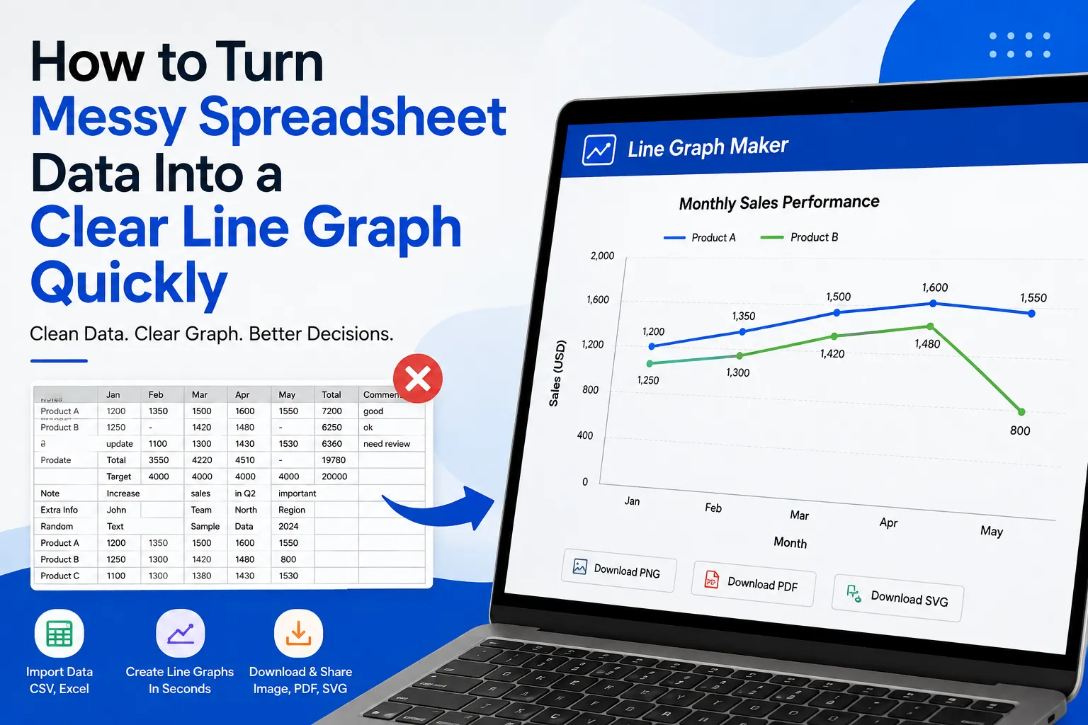

Working with spreadsheet data can become frustrating when information is scattered across rows, columns, and inconsistent formats. Whether you are preparing a school project, business report, research presentation, or performance analysis, turning that raw information into something easy to understand is often the hardest part. A double line graph generator can make this process much easier when you need to compare two changing data series, but the quality of the final graph still depends on how well the original spreadsheet is prepared.
A line graph is especially useful when your data shows change over time. Monthly sales, yearly revenue, website traffic, temperatures, attendance, test scores, and production figures can all be easier to understand when represented visually. Instead of forcing someone to read dozens of spreadsheet cells, a well-designed line graph allows them to see the overall direction of the data almost immediately.
Why Spreadsheet Data Often Becomes Difficult to Graph
Spreadsheets are excellent for storing information, but they are not always designed for visual communication. A worksheet may contain headings, notes, empty cells, duplicate entries, formulas, dates, and several unrelated data sets in the same area.
For example, imagine a sales spreadsheet containing monthly figures. One column may contain months, another may contain product sales, and several other columns may contain comments, employee names, targets, or other information. If you select everything and create a graph without cleaning the data first, the resulting chart may be confusing.
The first step is therefore not creating the graph. The first step is understanding and organizing the data.
Step 1: Identify the Data You Actually Need
Before creating a line graph, decide exactly what you want the graph to communicate.
Ask yourself:
- What variable belongs on the horizontal axis?
- What value should appear on the vertical axis?
- Are you showing change over time?
- Are you comparing one data series or several?
- Which columns are relevant?
- Are there unnecessary values that should be removed?
Suppose you have monthly website visitors for an entire year. Your basic data might look like this:
| Month | Visitors |
|---|---|
| January | 1,200 |
| February | 1,450 |
| March | 1,700 |
| April | 1,620 |
In this example, the month belongs on the horizontal axis and visitors belong on the vertical axis.
Keeping the data simple at this stage makes the graph much easier to build.
Step 2: Remove Unnecessary Information
Messy spreadsheets often contain information that does not belong in the graph.
You might have:
- Empty rows
- Blank columns
- Notes inside the data range
- Duplicate records
- Unrelated calculations
- Decorative headings
- Merged cells
- Text inside numerical columns
Remove anything that does not contribute to the specific comparison you want to show.
This does not mean deleting information permanently. You can create a separate clean section or duplicate the spreadsheet before preparing the graph. The goal is simply to create a focused data range that a graphing tool can interpret correctly.
Step 3: Make Your Headings Clear
Good column headings are important because they help you identify what each data series represents.
Instead of using headings such as:
| A | B | C |
|---|---|---|
| Data 1 | Data 2 | Data 3 |
use meaningful labels such as:
| Month | Product A Sales | Product B Sales |
|---|---|---|
| January | 420 | 350 |
| February | 460 | 390 |
| March | 510 | 430 |
Now the purpose of each column is immediately clear.
Clear headings also make it easier to create a graph with a meaningful legend. Someone looking at the finished graph should not have to guess what each line represents.
Step 4: Check Your Numbers Carefully
One of the most common reasons a line graph looks wrong is inconsistent numerical data.
For example, one cell might contain:
1,500
while another contains:
1.5k
and another contains:
1500 visitors
Although these values may mean the same thing to a person, a graphing tool may interpret them differently.
Try to keep numerical columns consistent. If a column represents sales, use numerical values throughout that column rather than mixing numbers with descriptive text.
Also check for accidental spaces, unusual symbols, missing decimal points, and incorrect values.
A graph cannot correct bad source data. If the spreadsheet contains an error, the graph will usually visualize that error rather than identify it for you.
Step 5: Organize Dates in the Correct Order
Line graphs are commonly used for time-based information, so date order matters.
Consider this sequence:
- January
- February
- March
- April
- May
That makes sense visually.
But if your spreadsheet sorts months alphabetically, you could end up with:
- April
- August
- December
- February
- January
- July
The graph may technically be correct according to the spreadsheet, but it will not represent the timeline properly.
Always check that dates, months, years, or other sequential categories are arranged logically before generating the graph.
Step 6: Decide Whether You Need One or Multiple Lines
A single line is useful when you want to show the movement of one variable.
For example, you could track:
Monthly revenue
A second line becomes useful when you want to compare two related data sets.
For example:
Actual revenue vs revenue target
or:
Product A sales vs Product B sales
This is where a double line graph can be particularly helpful. Instead of creating two separate graphs and asking readers to compare them manually, both data series can appear on the same set of axes.
However, adding more lines is not always better. If a graph contains too many series, it can become difficult to read. Use multiple lines only when the comparison provides useful information.
Step 7: Choose an Appropriate Scale
The vertical axis needs a scale that makes the changes visible without exaggerating them.
Imagine your values range from 1,000 to 10,000. A vertical axis that increases by 1 may create unnecessary detail. A scale using 1,000-unit intervals could make the graph much easier to understand.
At the same time, be careful about extremely narrow scales. Starting the axis at an unusual value can make small changes appear much larger than they really are.
The best scale depends on the data and the purpose of the graph. The goal should be clarity and accurate interpretation.
Understanding Graph vs Plot vs Chart
People often use the terms graph, plot, and chart interchangeably, but there can be subtle differences depending on the context.
A graph vs plot vs chart commonly represents relationships or changes between variables. A plot often refers to placing data points or mathematical relationships on a coordinate system. A chart is a broader visual representation of information and can include bar charts, pie charts, line charts, and other formats.
In everyday data visualization, these terms can overlap. What matters most is choosing a visual format that communicates your information clearly.
For changing values across time or another ordered sequence, a line graph is often an effective choice because connected points allow the reader to see movement and direction.
Step 8: Create the Line Graph From Your Clean Data
Once your spreadsheet is organized, you can move the relevant information into a graph-making tool.
A typical line graph requires:
- A category or time column
- One or more numerical columns
- Clear labels
- A suitable title
- Appropriate axis settings
If your data is already organized in a simple table, the graph creation process becomes much faster.
Instead of manually drawing points and calculating positions, a graph maker can use your data to produce the visual automatically. This saves time and reduces the possibility of manual plotting mistakes.
Step 9: Give the Graph a Useful Title
A title should explain what the reader is looking at.
Compare:
Sales
with:
Monthly Sales of Product A in 2026
The second title provides much more context.
A useful title should answer the basic question: What does this graph show?
You can also use subtitles or supporting labels when additional context is important.
Step 10: Label Both Axes
Axis labels help prevent confusion.
If the horizontal axis represents months, label it accordingly. If the vertical axis represents revenue, visitors, temperature, or another measurement, make that clear as well.
For example:
X-axis: Month
Y-axis: Revenue ($)
This small addition can make a graph significantly easier to understand.
Step 11: Review the Graph Before Sharing It
Never assume the graph is correct simply because it looks attractive.
Check:
- Are all data points present?
- Are the values correct?
- Are the dates in the correct order?
- Do the lines represent the intended columns?
- Is the scale appropriate?
- Are the labels readable?
- Does the title describe the information accurately?
- Is the legend understandable?
This final review is especially important for reports and presentations where other people may make decisions based on the graph.
Common Problems to Avoid
Too Much Data
A graph containing dozens of unrelated data series can become overwhelming. Focus on the comparison that matters.
Inconsistent Values
Mixing units or formats can lead to incorrect or confusing results. Keep each data series consistent.
Missing Labels
Without axis labels and a meaningful title, readers may struggle to understand the graph.
Poor Scaling
An unsuitable axis scale can hide meaningful changes or make minor differences appear dramatic.
Unsorted Data
If time-based data is out of order, the line may move backward and forward in a misleading way.
Unnecessary Design Elements
A professional graph does not need excessive decoration. Keep the focus on the data.
When a Line Graph Is the Right Choice
Line graphs work particularly well when you want to show trends, movement, or changes across an ordered sequence.
Good examples include:
- Monthly sales
- Annual revenue
- Daily temperatures
- Website traffic
- Student performance
- Production output
- Company expenses
- Customer growth
- Stock-related historical data
- Survey results collected over time
If you are comparing individual categories without an important sequence, another chart type may be more suitable.
The purpose of visualization should always come first. Choose the format that makes the underlying information easiest to understand.
How a Line Graph Maker Simplifies the Process
Once your data is cleaned, a dedicated line graph maker can reduce the amount of manual work required to create a visual.
Instead of calculating coordinates, drawing axes, positioning points, and manually connecting them, you can focus on preparing the information correctly and customizing the final result.
This is especially useful for people who frequently work with spreadsheets but do not have advanced graphic design or data visualization skills.
The biggest time-saving benefit comes from separating the process into two simple stages:
Prepare the data → Generate the graph
When the source data is organized properly, the second stage becomes much easier.
Tips for Creating Better Graphs Faster
If you regularly create graphs from spreadsheet data, develop a simple workflow.
First, keep your original spreadsheet untouched. Then create a clean copy containing only the information needed for visualization.
Second, standardize your headings and numerical formats before importing the data.
Third, decide what comparison you want the graph to communicate before selecting the graph type.
Finally, review the finished graph as if you were seeing the information for the first time. If someone unfamiliar with the spreadsheet can understand the graph quickly, your visualization is probably doing its job.
Read More:
https://ext-6937858.livejournal.com/6872.html
Final Thoughts
Turning messy spreadsheet information into a clear line graph does not have to be complicated. The most important work happens before the graph is generated. By removing unnecessary information, organizing dates, checking numerical values, creating clear headings, selecting the right data series, and choosing an appropriate scale, you can turn an overwhelming spreadsheet into an easy-to-understand visual.
A line graph maker can then handle much of the technical work involved in turning those organized values into a finished graph. Whether you are comparing business performance, tracking school data, analyzing research results, or presenting a trend, starting with clean and structured information will always produce better results.
The key is simple: clean data creates clearer graphs. Take a few minutes to organize your spreadsheet first, and the graph creation process becomes faster, easier, and far more reliable.
Frequently Asked Questions
1. What is the easiest way to turn spreadsheet data into a line graph?
Start by organizing your spreadsheet into clear columns. Put the ordered category or date in the first column and numerical values in the following columns. Remove unrelated information and make sure all values use consistent formats before importing or entering the data into a line graph maker.
2. Can I create a line graph with two data sets?
Yes. Two related data sets can be displayed as separate lines on the same graph. This is useful for comparisons such as actual sales versus targets or one product versus another.
3. Why does my line graph look incorrect?
An incorrect-looking graph can result from several issues, including unsorted dates, incorrect numerical values, blank cells, inconsistent units, or selecting the wrong data range. Check the source spreadsheet before changing the graph's design.
4. Should I include every column from my spreadsheet?
No. Include only the columns that are relevant to the comparison you want to communicate. Extra information can make the graph unnecessarily complicated.
5. How many lines should a line graph have?
There is no universal limit, but fewer lines are generally easier to read. Use multiple lines when each series has a meaningful relationship to the others. If the graph becomes difficult to interpret, consider separating the information into multiple graphs.
6. What should I put on the X-axis?
The X-axis usually contains time periods or another ordered category, such as months, years, days, stages, or measurements taken in sequence.
7. What should I put on the Y-axis?
The Y-axis should contain the numerical measurement you want to analyze, such as sales, revenue, temperature, visitors, scores, or production quantity.
8. Is a line graph good for comparing trends?
Yes. Line graphs are particularly useful for showing how values change across an ordered sequence. Multiple lines can also make it easier to compare the direction and movement of related data sets.
9. How can I make my graph easier to understand?
Use a descriptive title, clear axis labels, consistent data, an appropriate scale, and only the necessary data series. Avoid adding unnecessary visual elements that distract from the information.
10. Can a graph maker save time compared with creating a graph manually?
Yes. A graph-making tool can automate much of the process involved in plotting and connecting data points. Once your spreadsheet information is properly organized, generating a clear line graph can be considerably faster than creating one manually.


























Sign in to leave a comment.