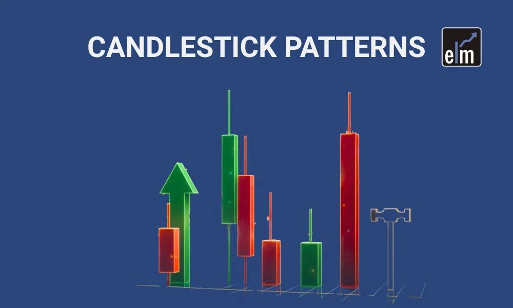
Trading charts used to confuse the hell out of me. All those bars going up and down looked like random noise until someone showed me how to actually read them. Turns out, candlestick chart patterns are probably the easiest way to figure out what's happening in the market.
The Basics You Need to Know
A candlestick shows you four prices from a trading session: where it opened, where it closed, the highest point it reached, and the lowest point. The fat part in the middle is the "body" and shows the range between opening and closing. Those thin lines poking out? They're called wicks or shadows, and they show how far the price moved before settling down.
Green (or white) means the price went up during that session. Red (or black) means it dropped. Simple enough. What gets interesting is when you start noticing patterns in how these candles form.
Why This Stuff Actually Works
Japanese rice traders figured this out back in the 1700s. They realized that prices don't just move randomly; there's human emotion behind every trade. Fear, greed, uncertainty, confidence. All of it shows up in these chart patterns.
When you see a long red candle with barely any wicks, sellers are aggressive and in full control. A candle with a tiny body but huge wicks on both ends? Nobody knew what they wanted to do. The market was stuck.
Plenty of traders download a chart patterns pdf to keep as a reference. Nothing wrong with that. Having a cheat sheet nearby helps when you're trying to remember what a specific candlestick pattern means.
Patterns Worth Paying Attention To
Doji candles happen when the opening and closing prices are basically the same. It looks like a cross or plus sign. This screams indecision. If you see one after prices have been climbing for a while, it might mean the rally is running out of gas.
Hammers look like their name: a small body up top with a long tail hanging down. When this shows up after prices have been falling, it suggests buyers might be stepping in. Same shape at the top of a rally? That's called a hanging man, and it's often a warning sign.
Engulfing patterns are pretty dramatic. Picture a small red candle followed by a much bigger green one that completely covers it. That's buyers overwhelming the sellers. Flip it around – a big red candle swallowing a small green one – and you've got the bearish version.
Morning stars and evening stars take three candles to form. Morning star: a long red candle, then a small uncertain candle, then a strong green candle. It usually means a downtrend is reversing. Evening stars are the opposite and appear at market tops.
Context Changes Everything
Here's what trips people up. You can't just spot a pattern and immediately trade on it. Where does it appear? Is it near a price level where the stock has bounced before? What's the volume like?
I've made this mistake. I saw a perfect bullish pattern once and jumped in, only to watch it fail because I ignored that it formed right where sellers had stepped in three times before. The pattern was real, but the context killed it.
What Not to Do
Your brain will start seeing these patterns everywhere once you know what to look for. That's normal but dangerous. Not every hammer leads to a bounce. Not every Doji signals a reversal. You need confirmation from the next candle or two.
Also, don't make decisions based purely on candlestick chart patterns. Check the news. Know what's happening with the company or the broader market. A pretty chart pattern won't save you if terrible earnings just dropped.
Some people treat their chart patterns as a holy text. It's a reference tool, not a guarantee. The patterns work often enough to be useful, but they're not magic.
Getting Better at This
The only way to really learn is by looking at charts. Go back through historical data and spot patterns after they've already played out. See which ones led to big moves and which ones fizzled. Most trading platforms let you practice with fake money; use that feature.
Write down your observations. When you act on a pattern, note what happened. You'll eventually learn which patterns to ignore and which ones are most effective for the markets you monitor.
Concluding Remarks
You won't become an expert trader overnight by using candlestick patterns. They are only one of several tools. But they're a good tool because they help you see what other traders are thinking and feeling. Markets move on sentiment as much as fundamentals, and these patterns capture that sentiment visually.
Start with the basic patterns. Get comfortable recognizing them. Then slowly add them to your trading toolkit along with everything else you're learning. The goal isn't to master every obscure candlestick pattern out there.
It's to understand market behaviour well enough to make smarter decisions more often than not. And remember, even professional traders who've been doing this for decades still refer back to their notes and references. There's no shame in keeping a chart patterns pdf handy or double-checking what a particular pattern typically means. Better to be sure than sorry when real money's on the line.


Sign in to leave a comment.