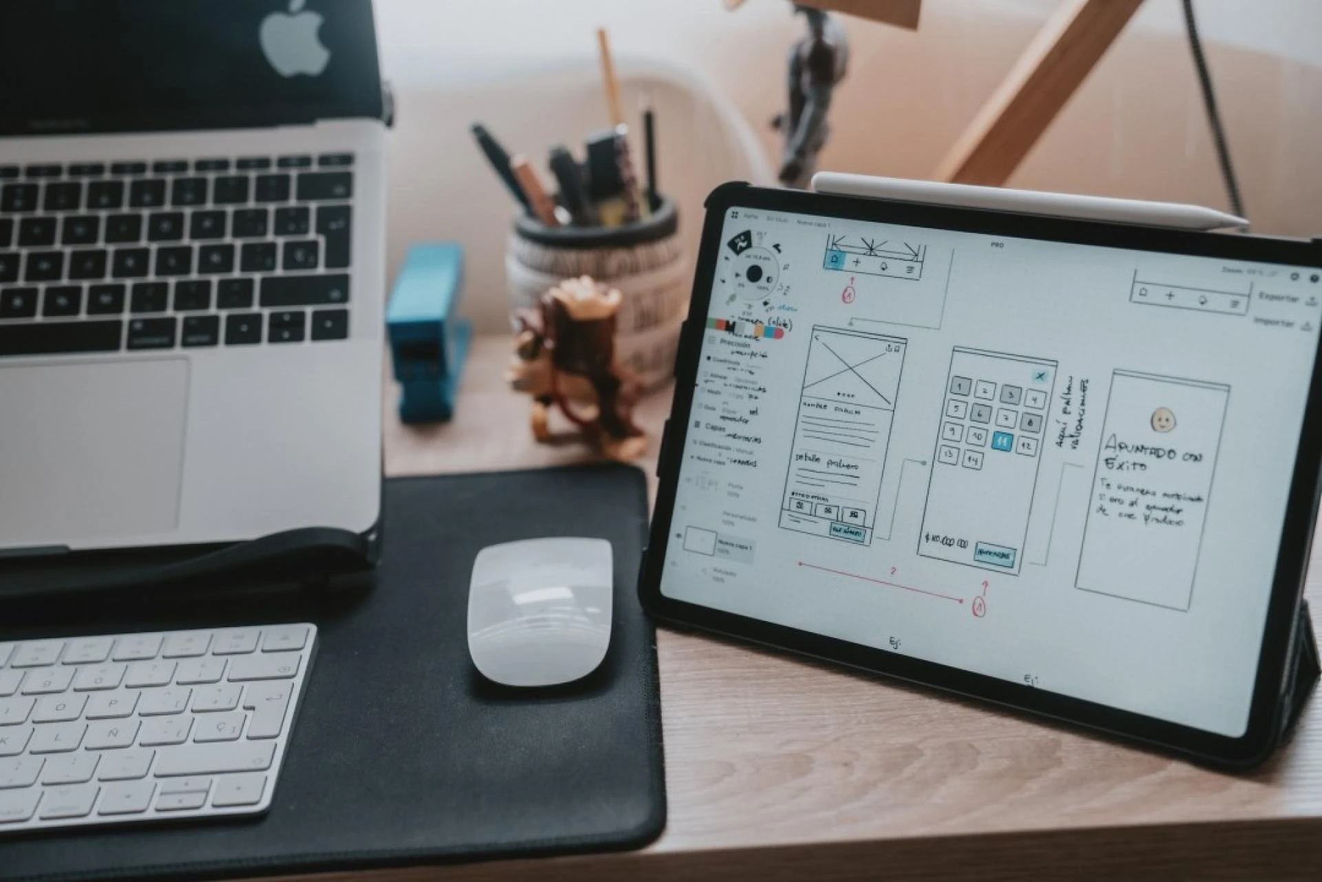
In the modern digital world of eCommerce stores, a responsive design is not an option but rather a requirement. With the increasing use of mobile devices for online shopping, ensuring your BigCommerce store is accessible and user-friendly across all devices can significantly impact your business's success. The significance of responsive design in BigCommerce, its advantages, and its practical implementation will all be covered in this article.
What is Responsive Design?
A website's layout, graphics, and functionalities should all flow naturally to various screen sizes and devices thanks to the web development technique known as responsive design. Whether a customer is accessing your store on a desktop, tablet, or smartphone, a responsive design ensures a seamless and optimized browsing experience.
The Growing Importance of Mobile Commerce
In recent years, there has been exponential growth in mobile commerce, or m-commerce. According to various studies, mobile devices account for a significant portion of eCommerce traffic and sales. A responsive BigCommerce store is essential as more and more customers browse and buy products on their phones. Here's why:
User Experience (UX): A responsive design brings to the user experience an interface that is consistent and easy to use on all devices. By lowering bounce rates and lengthening visitors' stays on your website, you can increase the likelihood that they will convert.Search Engine Optimization (SEO): Search engines such as Google give preference to mobile-friendly webpages in search results. A responsive BigCommerce store and better search engine rankings will make it easier for prospective customers to find your company.Increased Conversion Rates: Increased conversion rates may result from a flawless shopping experience across all platforms. Customers who can easily navigate and make purchases on your site, regardless of their device, are more likely to complete their transactions.Cost-Effectiveness: Maintaining separate website versions for desktop and mobile audiences can be expensive and time-consuming. With a responsive design, you can concentrate your resources on a single, flexible website, eliminating the need for multiple versions.Future-Proofing: A responsive design guarantees that your BigCommerce store is usable and accessible no matter how quickly technology advances, even as new devices with different screen sizes keep appearing.Key Elements of Responsive Design in BigCommerce
A seamless and intuitive user experience is achieved by combining several essential components when implementing a responsive design in BigCommerce. These are a few of the most essential elements:
Flexible Layouts: Use flexible grid layouts that can adjust to different screen sizes. By doing this, you can be sure that your content will look good on any screen size—a large desktop monitor or a small smartphone screen.Responsive Images: Optimize images to scale and resize based on the device. This prevents slow loading times and ensures images look crisp and clear on all screens.Media Queries: CSS media queries can be used to apply different styles based on the device's width, height, and resolution. This allows for precise control over the appearance of your site on various devices.Touch-Friendly Navigation: Ensure that navigation elements, buttons, and links are easily tappable on touchscreens. This improves usability for mobile users and enhances their overall experience.Optimized Content: Prioritize and organize content to fit smaller screens without overwhelming the user. Use concise text, large fonts, and ample spacing to improve readability.Fast Loading Times: Optimize your BigCommerce store for fast loading times on all devices. This includes compressing images, minimizing code, and leveraging browser caching.Implementing Responsive Design in BigCommerce
Now that we understand its significance and essential components, let's discuss how to integrate responsive design successfully into your BigCommerce store.
Choose a Responsive Theme: A variety of responsive themes with stunning visuals across all platforms are available from BigCommerce. Opt for a theme that enhances user experience and performance while also being aesthetically pleasing when setting up your store.Customize with Stencil: You can fully customize the look and feel of your store with BigCommerce's Stencil framework. You can use Stencil to make responsive layouts, integrate media queries, and optimize images so that the user experience is consistent across all platforms.Use Built-in Features: BigCommerce provides several built-in features to enhance responsiveness, such as mobile-optimized checkout and responsive product images. Take advantage of these features to improve the mobile shopping experience.Test Across Devices: To ensure it works properly and looks good everywhere, test your BigCommerce store frequently across various devices and screen sizes. To find and address any problems, make use of resources like BrowserStack and Google's Mobile-Friendly Test.Monitor Performance: Monitoring your store's performance metrics, such as bounce rates and page load times, will help you assess how well your responsive design is working. To monitor these indicators and make data-driven decisions, use programs like Google Analytics.Stay Updated: As web design trends and technologies evolve, keep your BigCommerce store updated with the latest best practices for responsive design. This includes regular theme updates, plugin enhancements, and adopting new design techniques.Conclusion
In the rapidly evolving world of eCommerce, having a responsive BigCommerce design for your store is no longer optional. This crucial element can significantly impact conversion rates, SEO, user experience, and general business success. By comprehending the significance of responsive design and successfully implementing it, you can guarantee that your store stays competitive and accessible to customers on all devices. Embrace the flexibility and adaptability of responsive design, and watch your BigCommerce store thrive in the mobile-first digital landscape.


Sign in to leave a comment.