
You’ve launched your website, it looks great, and you’re proud of it, yet your leads or sales aren’t improving. Sound familiar?
The problem might not be your product or service, but your design.
Web design mistakes are silent killers of conversion and credibility. Even the smallest issue — like a misplaced button or slow page — can drive visitors away. Let’s explore some common design errors that may be costing you clients and how you can fix them today.
Mistake #1: Cluttered Layouts
One of the biggest issues with many websites is too much information packed into one page.
When users are overwhelmed with text, banners, and popups, they get frustrated and leave.
A clean layout helps your message stand out. White space, concise copy, and a structured layout improve readability and keep visitors engaged.
Mistake #2: Ignoring Mobile Users
If your website doesn’t perform perfectly on mobile, you’re losing more than half of your audience.
Responsive design is no longer optional. Buttons, forms, and menus must scale smoothly on every device.
Businesses that focus on mobile-first design not only improve usability but also see higher search rankings.
That’s why Digital Nova, a web design company in Hong Kong, develops websites with a “mobile-first, user-first” approach to ensure accessibility for all users.
Mistake #3: Slow Loading Pages
Users expect websites to load in under three seconds. Anything slower feels outdated.
Large image files, unnecessary scripts, and poor hosting are common culprits.
Compress your images, use caching, and choose a reliable hosting provider to keep things fast. Remember, a slow site hurts both SEO and conversions.
Mistake #4: Weak Calls to Action (CTAs)
Your CTAs are like signposts guiding visitors to their next step — but too many websites use vague ones like “Click Here” or “Submit.”
Instead, use action-driven CTAs such as “Get a Free Quote,” “Book a Consultation,” or “Let’s Build Together.”
Position them where users naturally pause — after benefits or service explanations.
Mistake #5: Inconsistent Branding
Your website should reflect your brand identity — colors, typography, and imagery all tell your story.
If every page looks different, it creates confusion and damages trust.
A consistent visual identity makes your brand feel cohesive and professional.
Digital Nova’s UI/UX Design Services help businesses align design elements with brand personality to create a unified experience.
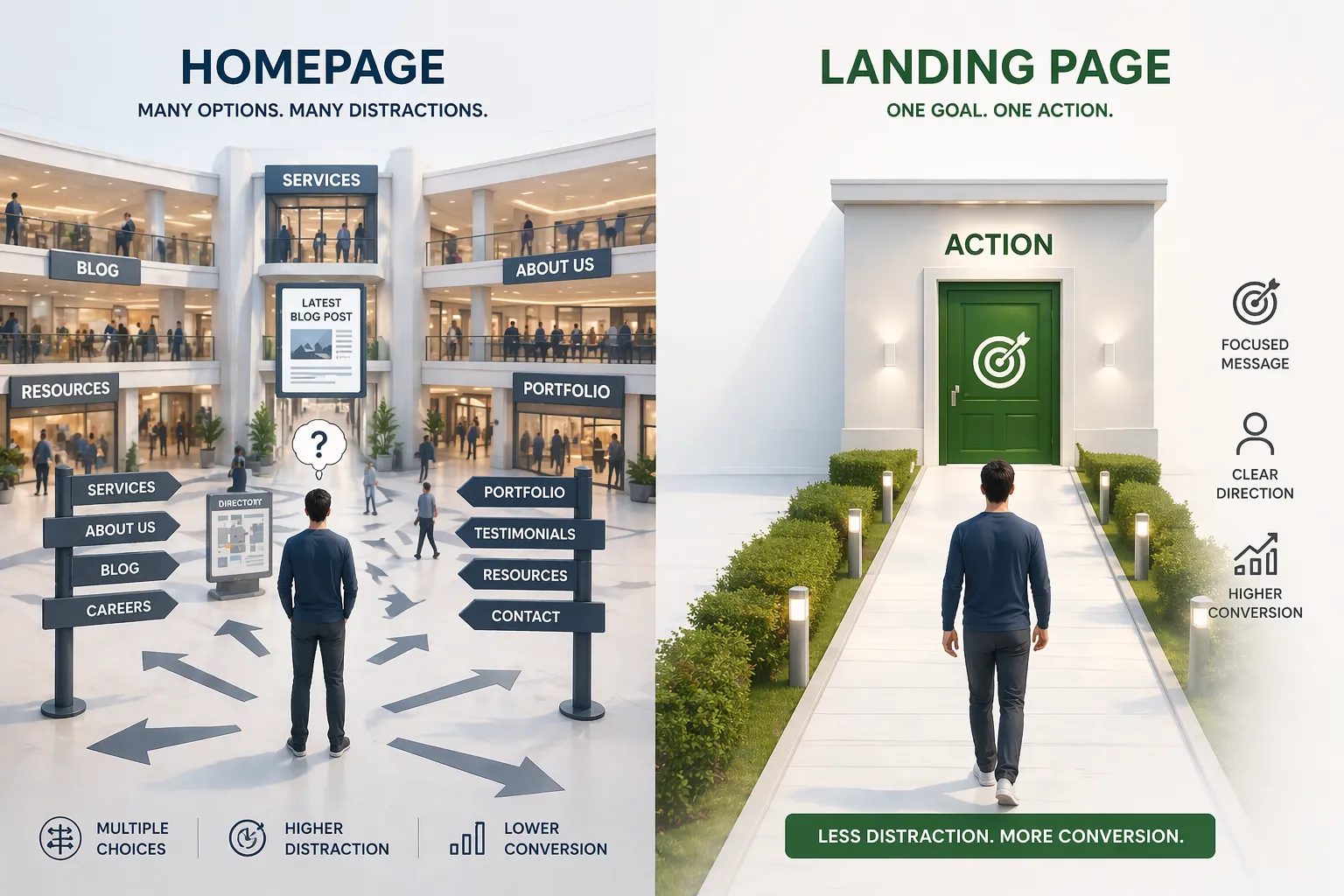
Mistake #6: Ignoring User Flow
Your website should feel like a conversation.
From homepage to contact page, users should move smoothly without hesitation.
Avoid dead ends — every page should lead to another logical step. This keeps users engaged longer and increases conversions.
Fixing These Mistakes
Start small. Audit your website with real users or analytics tools. Identify where visitors drop off or spend less time.
Even minor changes — such as better navigation or optimized visuals — can drastically improve engagement and leads.
Final Thoughts
Your website is more than digital decoration — it’s a conversion engine.
By fixing these common design mistakes, you’ll improve user experience, SEO, and trust all at once.
Remember, users don’t leave because of bad luck — they leave because of bad design.
Fix that, and everything else falls into place.


Sign in to leave a comment.