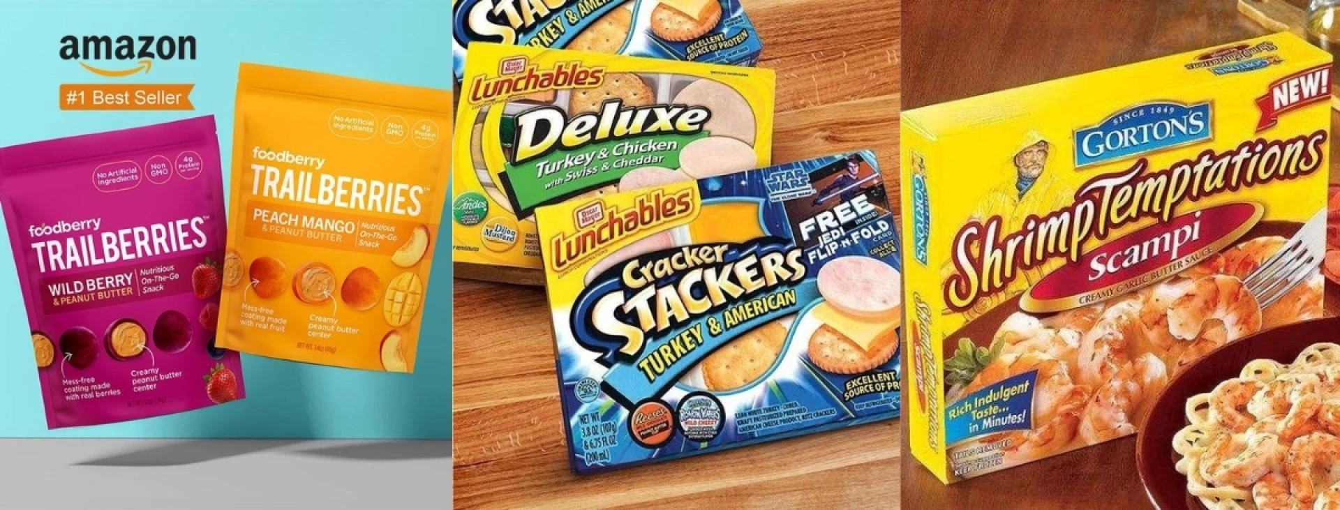
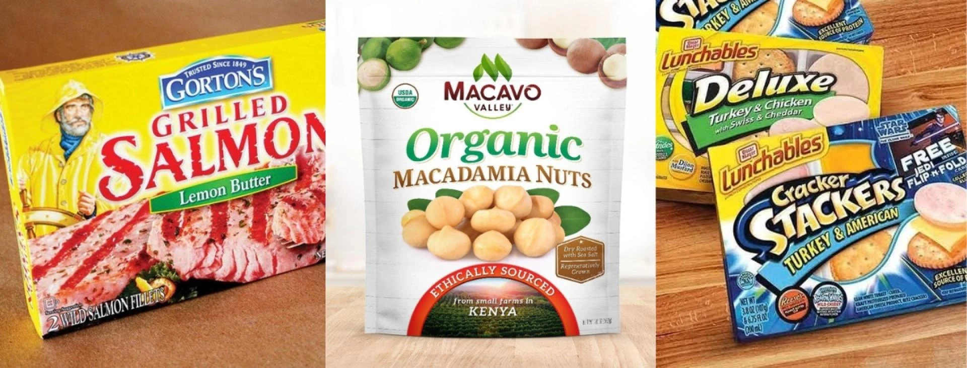
Walk into any grocery store, and the snack aisle hits you like a wave of colors and shapes. You see a pack of chips or a box of cookies, the very first moment, and the second moment, it's suddenly in your cart. Why does that happen? It's all thanks to the tricks in snacks packaging design. These are not mere pretty wrappers, but are designed to draw your eye in a few seconds and make you grab it without a second thought. We are going to break down the actual purposes behind the packaging, whether it is the colours or the tricks, and find out what makes creative packaging design so powerful today.
How Colors Pull You in and Stir Up Hunger
Color is the first thing that jumps out in snack package design. It's like a secret code for our brains. Bright reds and oranges? They make you think of heat and flavor, like spicy chips or tangy fruit snacks. Those warm tones speed up your heart a bit and make everything look more exciting.
Then there are the calmer colors, like greens and blues. Green says fresh and healthy, perfect for those veggie sticks. Blue keeps things cool and reliable, maybe for a nut mix that feels steady. Designers pick these based on how we naturally react—it's color psychology in action. In the middle of a bright store, the right shade makes your pack glow and say, "Hey, I'm the one you want."
Fonts and Pictures That Tell a Quick Story
In snack package design, the words and images do the heavy lifting. A fun, bubbly font screams playtime for gummy bears. Clean, straight letters work for something upscale, like artisanal popcorn. They set the mood fast.
Add in pictures-think steam rising from nachos or berries bursting with juice-and it pulls you right into the moment. You can almost taste it. This setup plays on how we love a good story. It skips the boring details and goes straight to what matters: the joy of that first bite.
Core Tricks That Make Snack Packs Pop
Here are some key ways modern packaging design hooks us, broken down simply:
· High Contrast: Light on dark, or a splash of color against plain- it makes things leap out, like your eye's favorite spot in a crowd.
· Keep It Simple: No mess of info. Clean space lets the fun part breathe and respects your quick glance.
· Hit the Feels: Little nods to happy memories or cool vibes build a bond, like an old friend on the shelf.
· Wake the Senses: Hints of crunch in the crinkles or freshness in the pics get your mouth watering early.
These draw from old-school ideas like how our eyes group things together, making the pack feel whole and exciting at once.
What's Next for Snack Wrappers
Creative packaging design keeps changing to match how we shop now. Eco touches, like patterns from recycled looks, make packs feel good for the planet. Some even add fun scans that pop up recipes on your phone.
Customization is big, too-designs that shift with seasons or trends keep things lively. At its core, though, it's still about that gut pull: see it, want it, take it home.
Wrapping Up:
So, there you have it-the sneaky smarts behind why some snacks just win the shelf war. Next time you're shopping, give those wrappers a closer look. You might spot these tricks everywhere.
If you're tweaking your own snack line with a modern snack packaging design, folks at Lien Design have some great tips to make it shine. After all, the wrappers that last are the ones that feel real.


Sign in to leave a comment.