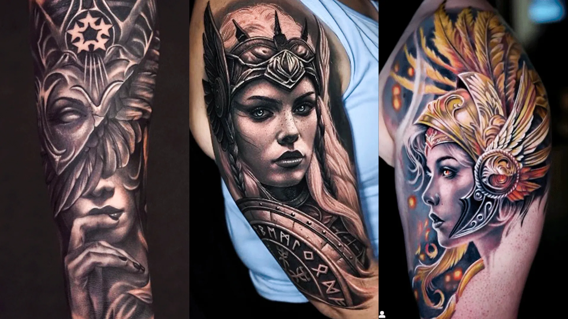
Scroll through any tattoo page long enough and you'll notice it: two realism tattoos of roughly the same subject — a lion, a rose, a face — but one looks like a photograph pressed into skin, while the other looks flat and unconvincing. What accounts for that difference?
The answer is layered, and understanding it will help you choose the right artist, ask the right questions, and end up with a piece you're genuinely proud of.
1. Contrast Is the Foundation of Everything
Before shading, before detail, before anything else — contrast is what makes a realism tattoo read as realistic.
The human eye perceives depth through the relationship between light and dark. A realism tattoo with compressed tonal range (everything sitting in the mid-greys) will always look flat, no matter how technically accomplished the linework is.
Outstanding realism tattoos push contrast deliberately:
- Deep blacks in the shadow areas
- Crisp whites or skin breaks for highlights
- Smooth gradients between them
An artist who is timid with their darks — worried about going too heavy — will almost always produce underwhelming realism work.
2. Reference Quality Matters More Than You Think
The image you bring your artist directly affects the quality of the tattoo. A pixelated screenshot taken from a tiny social post doesn't give the artist enough information to work from. They're essentially guessing at details they can't see.
What makes a good reference:
- High resolution (larger is always better)
- Strong natural lighting with visible shadows
- A single clear focal point rather than busy backgrounds
- Multiple angles if possible (especially for portraits)
If your reference photo is poor, even the best artist in the world is working with incomplete information.
3. Skin Tone Compatibility
Black and grey realism sits differently on different skin tones. On lighter skin, the contrast range is wider — artists can push tones further toward white without the skin tone interfering. On darker skin, the approach needs to adapt: ink selection, contrast mapping, and highlight placement all shift.
The mistake many artists (and clients) make is applying the same technical approach regardless of skin tone. Great realism artists adjust their methodology to the canvas they're working on, not the other way around.
4. Needle Selection and Technique
Inside any realism tattoo, there's a toolkit of needle configurations being used to achieve different effects:
| Needle Type | Common Use in Realism |
|---|---|
| Round liners (RL) | Fine detail, texture work |
| Curved/round magnums (RM) | Smooth blending and shading |
| Soft magnums | Gradient transitions |
| Singles | Micro-detail, eyelashes, fur texture |
An artist who only uses one or two needle types for realism will hit ceiling quickly. The best realism artists switch frequently throughout a piece, treating each section differently based on what the subject requires.
5. Design Composition — Not Just Copying
Realism is often misunderstood as "copying a photo onto skin." But skin isn't paper and tattoo ink isn't printer ink — what works in a photograph doesn't automatically work as a tattoo.
Skilled realism artists interpret rather than copy. This means:
- Simplifying busy backgrounds so they don't compete with the subject
- Enhancing contrast beyond what the photo shows, to compensate for ink spreading over time
- Repositioning light sources for better readability on the body
- Removing distracting elements that would muddy the tattoo years down the line
This compositional intelligence is what separates an artist from a technician.
6. Skin Preparation and Stretching
This is rarely discussed but critically important. During the session, the skin needs to be kept taut — either by the artist or an assistant. Loose skin causes ink to spread unevenly, producing blurry edges and patchy shading.
An experienced realism artist:
- Stretches the skin consistently throughout the session
- Adjusts technique for areas that are naturally difficult (inside elbow, behind knee, neck)
- Works efficiently enough that the skin doesn't over-swell before the piece is complete
7. Patience Over Speed
Realism takes time. Rushing a session — whether due to an impatient client or an artist trying to finish too quickly — shows in the result. The blending isn't as smooth, the transitions feel abrupt, and fine details get skipped.
If an artist quotes a piece and the time estimate feels surprisingly short, that's worth questioning.
8. Healing and Long-Term Aging
Even a technically perfect realism tattoo can look poor if the client doesn't follow aftercare guidance properly. Peeling incorrectly, sun exposure, and poor moisturising during healing can all compromise the final result — destroying fine details and flattening contrast.
And over the years, realism ages faster than bold traditional styles. Deep blacks hold well; fine highlights can fade or spread. A good realism artist accounts for this, building their tattoos to age gracefully rather than just look perfect on day one.
Choosing a Realism Artist in Bournemouth
If you're looking for realism work locally, the most important thing is portfolio scrutiny. Ask yourself:
- Are the healed photos as impressive as the fresh ones?
- Does the work show strong contrast, not just soft shading?
- Do portraits actually look like the person?
Bournemouth Ink specialises in realism tattooing and offers a dedicated realism tattoo service with resident artists whose portfolios demonstrate exactly the depth and contrast control that separates good realism from great realism.
For further technical reading on how skin interacts with tattoo pigment over time, the Journal of Cosmetic Dermatology has published several studies on tattoo pigment retention and skin response worth exploring.
Summary
The gap between good and great realism tattoos comes down to a handful of consistent factors:
- Contrast — without it, realism falls flat
- Reference quality — garbage in, garbage out
- Artist adaptability — skin tone, body placement, needle selection
- Compositional intelligence — interpreting rather than copying
- Patience — in the session and through the heal
Find an artist who takes all of these seriously, and the result will speak for itself.


Sign in to leave a comment.