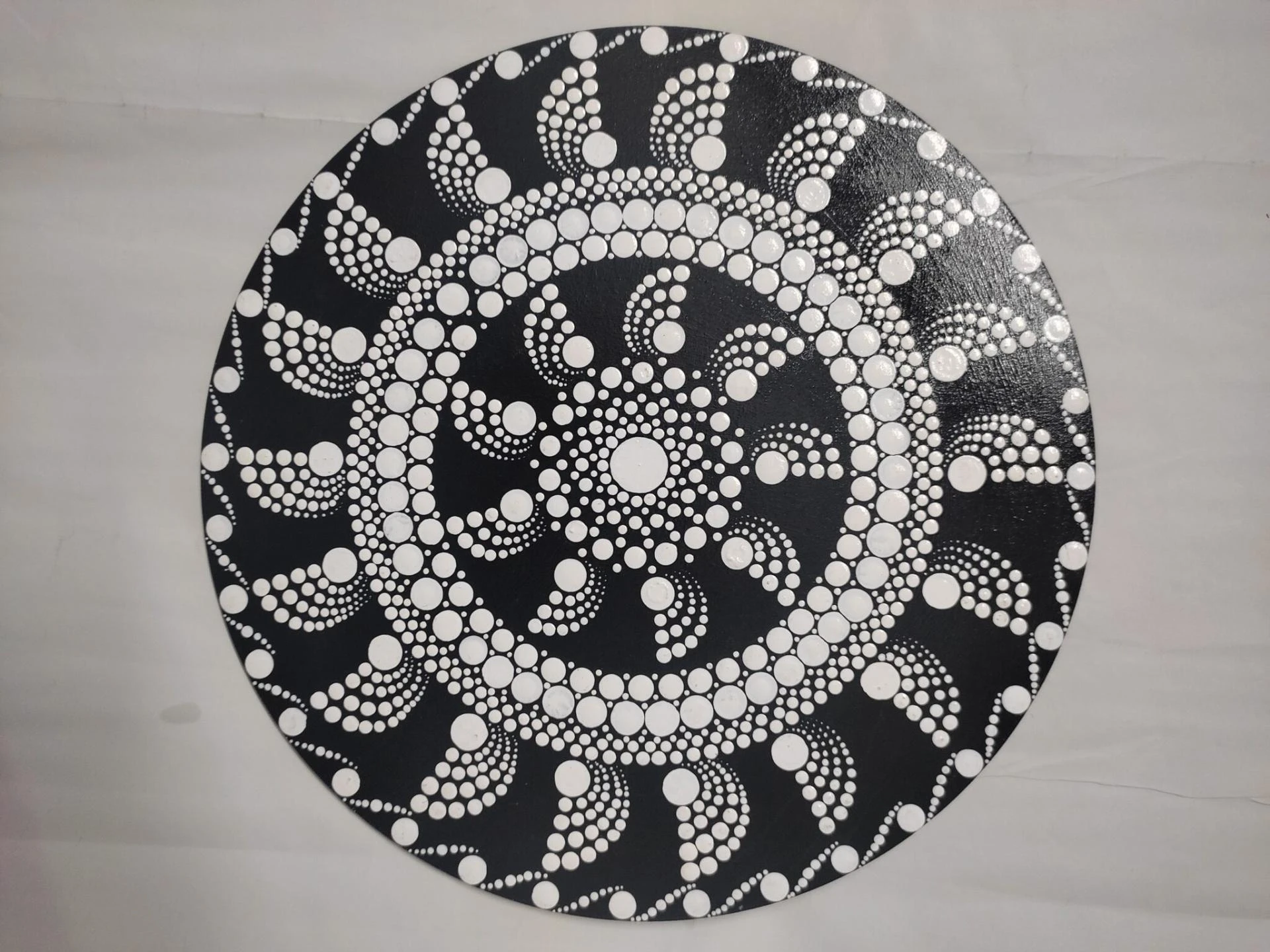
Contrast plays a critical role in mandala and intricate art, making patterns stand out and capturing viewers’ attention. Artists often explore mandala black designs and dark tones to emphasize detail, structure, and symmetry. Proper contrast ensures that every line and motif is readable, striking, and visually engaging. Applying techniques that balance light and dark areas, spacing, and highlights creates a dynamic composition that draws the viewer’s eye naturally across the artwork. Mastering contrast is essential to elevate the impact of detailed patterns effectively.
Line Weight
Line weight variation adds depth and hierarchy to intricate designs. Thicker lines define boundaries and frame motifs, while thinner lines provide subtle detail and texture. Adjusting line thickness strategically guides the viewer’s focus, ensuring patterns remain legible and structured. Combining bold and fine strokes prevents visual monotony and emphasizes symmetry in mandala artwork. Artists can experiment with different tools to achieve precise line control, enhancing contrast and improving the overall aesthetic of complex compositions while keeping motifs distinct and visually captivating.
Color Pairing
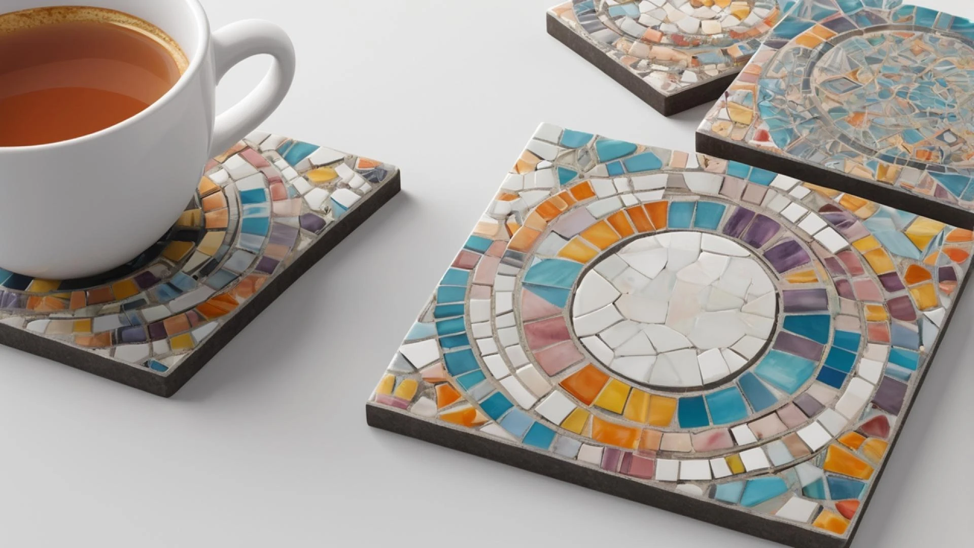
Selecting the right colors intensifies contrast and visual appeal in detailed artwork. Dark shades like black, navy, or deep green stand out against lighter backgrounds, providing clarity. Complementary accent colors or muted tones highlight key areas without overwhelming the design. Thoughtful color pairing ensures that overlapping patterns remain distinguishable, while subtle gradients can add depth and dimension. Proper color selection brings harmony to complex compositions, making each element visually prominent. Understanding the relationship between hues allows artists to maintain balance while drawing attention to intricate details effectively.
Shading Techniques
Shading introduces depth and dimension to intricate mandala patterns. Techniques such as cross-hatching, stippling, or smooth gradients separate overlapping elements and define layers. Gradual transitions in tone create three-dimensional effects, enhancing realism and adding richness to the design. Shading also guides the viewer’s eye along specific paths, emphasizing motifs and supporting the overall composition. Applied consistently, shading balances contrast, making patterns more readable and visually appealing. Artists can combine digital or traditional methods to refine tonal variations and achieve precise control over highlights and shadows within the artwork.
Negative Space
Negative space enhances readability and strengthens visual impact in complex patterns. Empty areas or lightly detailed zones prevent overcrowding, allowing surrounding motifs to stand out naturally. Thoughtful spacing emphasizes focal points, reinforces symmetry, and adds balance to intricate designs. Negative space creates rhythm and movement, guiding the viewer’s eye through the artwork without distraction. Integrating open spaces strategically helps maintain harmony between detailed and simple areas, ensuring that every element retains its clarity. Proper use of negative space elevates the sophistication and elegance of mandala compositions.
Highlight Accents
Applying highlights adds depth and contrast within specific sections of artwork. Light tones, metallic inks, or white accents stand out against dark backgrounds, emphasizing intricate motifs. Highlights create visual hierarchy, guiding attention toward key elements while maintaining overall balance. Subtle accentuation enriches texture and enhances the perception of dimensionality. Artists can combine highlights with shading to reinforce form and structure, making designs appear more dynamic. Thoughtful placement of highlights transforms flat patterns into visually engaging compositions, amplifying their appeal and ensuring each motif captures attention effectively.
Tool Selection
Choosing the right tools directly affects clarity and contrast in detailed artwork. Fine liners, brushes, and digital pens allow precise line execution, while different mediums influence texture and tonal variation. Certain tools create crisp edges, while others enable smooth shading or gradients. Matching the tool to the desired effect ensures better control over motif definition and visual hierarchy. Artists can experiment with multiple instruments to enhance depth, refine details, and improve overall readability. Proper tool selection plays a key role in achieving clean, professional, and visually striking mandala designs.
Contrast Tips
- Vary line weights for depth and emphasis
- Pair dark and light tones strategically
- Apply shading or gradients for dimension
- Use negative space to reduce clutter
- Add subtle highlights to accent motifs
- Select tools suitable for detailed work
These techniques collectively enhance clarity and ensure patterns are visually captivating. Implementing them consistently allows artists to achieve balanced compositions where every element stands out while maintaining harmony.
Layering Patterns
Layering different elements with varied tones or opacity creates dimensional contrast. Foreground motifs can be darker and bolder, while background patterns remain lighter or more subdued. This separation ensures key shapes are clearly visible, preserving readability. Layering also allows subtle details to emerge gradually, adding richness and complexity. Combining multiple layers strategically reinforces pattern hierarchy, balance, and flow. Proper layering transforms intricate designs from flat illustrations into engaging compositions that captivate the viewer’s attention and showcase the depth and sophistication of mandala and detailed artwork.
Texture Variation
Introducing texture enhances contrast and distinguishes areas within a composition. Smooth regions contrasted with patterned or textured zones guide the eye naturally and create visual interest. Texture adds dimension and perceived tactile quality, amplifying complexity in detailed designs. Different surfaces, brush strokes, or digital effects can emphasize particular motifs, making them pop. Combining varied textures prevents monotony, highlights intricate sections, and adds depth. Artists can experiment with tactile or digital techniques to create dynamic, layered compositions that maintain balance while elevating the overall aesthetic.
Digital Enhancements
Digital tools provide precision in adjusting contrast and clarity in intricate artwork. Brightness, saturation, opacity, and layer blending allow fine-tuned separation of elements. Digital manipulation preserves line quality and highlights subtle variations without altering the original composition. Artists can correct uneven tones, enhance readability, and emphasize focal points efficiently. Combining traditional and digital techniques maximizes control over contrast while retaining the texture and richness of hand-drawn patterns. Digital adjustments ensure that complex motifs remain legible, visually appealing, and consistent across different display mediums.
Composition Planning
Strategic composition ensures high contrast throughout artwork. Placing dark and light areas intentionally maintains readability and emphasizes key motifs. Balanced distribution of detailed and simple sections prevents visual fatigue and creates natural flow. Planning also allows the integration of highlights, shading, and negative space effectively. Artists can map layers and focal points to maintain symmetry while guiding the viewer’s attention seamlessly. Well-planned compositions improve overall harmony, ensuring that intricate mandala designs are both aesthetically pleasing and easy to interpret, even in complex, detailed arrangements.
Final Thoughts
Achieving strong contrast in mandala and intricate art requires thoughtful use of line weight, color pairing, shading, highlights, and negative space. Each element contributes to clarity, depth, and visual appeal. Layering, texture variation, and proper tool selection further enhance readability and artistic impact. By mastering these techniques, artists can transform detailed patterns into captivating, professional-quality compositions. Consistent application ensures that each motif is visually prominent while maintaining overall harmony, creating artwork that is both intricate and accessible to viewers.
FAQs:
- How can I improve contrast in mandala art?
Use line weight, shading, color pairing, highlights, and negative space to emphasize patterns and improve readability. - Which tools are best for intricate designs?
Fine liners, brushes, and digital pens provide control and precision for clean lines and clear details. - How does negative space enhance mandala artwork?
It reduces clutter, highlights motifs, and creates visual balance while maintaining pattern clarity. - What color combinations enhance contrast?
Dark shades against light backgrounds and complementary accents improve readability without overwhelming the design. - Can digital techniques help with contrast?
Yes, adjusting brightness, opacity, and saturation preserves detail while enhancing clarity and dimension.


Sign in to leave a comment.