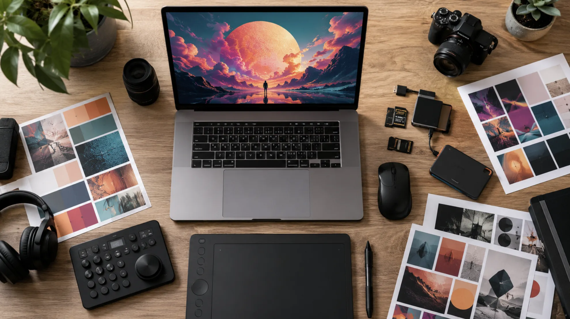
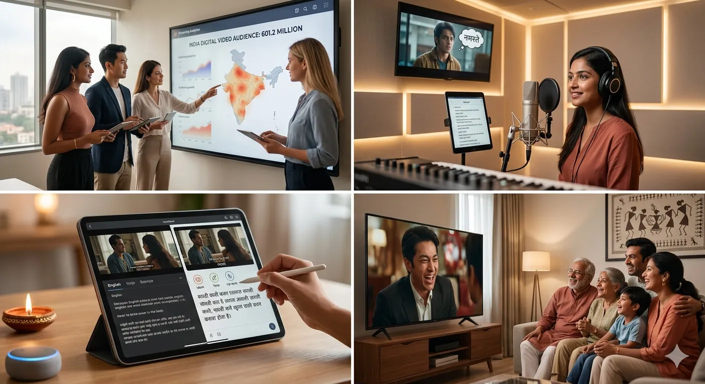
AI-generated imagery has gone from a novelty to a genuine production tool in less than two years. For video creators—especially those working in short-form content—the ability to produce custom thumbnails, overlays, title cards, and b-roll stills on demand changes the math on what a small team (or a solo creator) can publish in a week.
GPT Image 2, OpenAI's latest image generation model, is built with this kind of applied creative work in mind. But getting from "cool demo" to "asset I can actually drop into Premiere or CapCut" takes a bit of know-how. If you're not sure where to start, this guide on how to access GPT Image 2 walks through every available entry point—from ChatGPT Plus to the developer API.
Below, we'll break down the practical workflows that make GPT Image 2 worth adding to your creative toolkit.
What Makes GPT Image 2 Stand Out for Video Creators
Most image generators produce beautiful standalone art. The problem is that "beautiful standalone art" rarely fits the constraints of a video project. You need images that match a specific aspect ratio, hold a consistent color palette across a series, and leave room for text overlays or lower thirds.
GPT Image 2 handles these requirements better than its predecessors for a few reasons. First, it follows complex, multi-part prompts with noticeably higher accuracy. You can specify "16:9 composition, subject on the left third, dark moody background with warm rim lighting, no text" and get something usable on the first or second try. Second, it renders text inside images—logos, captions, stylized titles—with far fewer artifacts than earlier models.
For a closer look at what's actually possible, this collection of GPT Image 2 examples for short-form creators shows real outputs across thumbnails, story frames, and social cards. It's a useful reference before you start building your own prompts.
Dialing In the Right Settings for Video-Ready Output
The default output from any AI image model is rarely production-ready. Resolution might be off. The style might drift between generations. Colors can look washed out or oversaturated depending on the prompt.
The fix isn't to hope for better luck—it's to learn how the settings interact and lock in a reliable configuration for your content style.
A few things worth paying attention to:
Resolution and aspect ratio. If you're generating thumbnails for YouTube, you want 1280×720 at minimum. For vertical content on TikTok or Reels, 1080×1920 is the target. Getting this right from the start saves you from awkward crops later.
Style consistency. When you're producing a series—say, five episode thumbnails for a weekly show—you need each image to feel like it belongs to the same visual family. This means reusing specific style descriptors, color references, and composition rules across prompts rather than relying on vague terms like "cinematic" or "professional."
Quality parameters. Higher quality settings increase generation time but reduce noise and improve fine detail, which matters if you're working at 4K or placing images on large display areas.
For a deeper walkthrough of each parameter and how to configure them for different video formats, check out this guide on the best GPT Image 2 settings for video-ready images.
Fixing Common Issues: Text Warp and Visual Glitches
One of the most frustrating problems with AI-generated images is text rendering. You ask for "SUBSCRIBE" on a bold banner and get something that reads "SUBCRIBE" in a font that looks like it's melting. GPT Image 2 is significantly better at text than earlier models, but it's not perfect—especially with longer strings, curved text, or small font sizes.
The most common issue video creators hit is text warp: letters that bend, stretch, or overlap in ways that make the text unusable as a video asset. This is particularly annoying for creators who need clean title cards, branded intro frames, or text-heavy thumbnail designs.
There are a few prompt-level techniques that reduce warp significantly. Keeping text strings short (under five words) helps. Specifying "flat, straight, centered text on a solid background" tends to produce cleaner results than burying text instructions inside a complex scene description. And generating text elements separately, then compositing them in your editor, is often the most reliable path.
For a full breakdown of workarounds and prompt strategies, this guide on how to fix GPT Image 2 text warp for video assets covers the most reliable fixes creators have found so far.
Scaling Up with the GPT Image 2 API
If you're a solo creator producing a handful of images per week, the ChatGPT interface is probably enough. But once you're managing multiple channels, producing content for clients, or running a small creative team, the manual process becomes a bottleneck.
That's where the API comes in. With programmatic access, you can build workflows that generate batches of images from templates—swap out the episode title and number, keep everything else the same. You can integrate image generation into your existing content pipeline so that publishing a new video automatically triggers thumbnail and social card creation. And you can version-control your prompts, which means your team can iterate on visual style without losing track of what worked.
The learning curve is real if you're not a developer, but it's more accessible than most creators expect. Most integrations are a single API call wrapped in a simple script. For teams considering this route, this breakdown of the GPT Image 2 API for creator teams covers setup, pricing, and practical integration patterns.
Making It Part of Your Workflow
The creators getting the most out of GPT Image 2 aren't the ones generating random images for fun. They're the ones who've built it into a repeatable system: standardized prompts for each content format, saved settings that match their brand, and a clear division between what they generate with AI and what they handle manually.
Start small. Pick one visual asset you produce regularly—a thumbnail template, a series of social cards, a recurring intro frame—and build a GPT Image 2 workflow around it. Once that's dialed in, expand to the next one.
The goal isn't to replace your creative judgment. It's to remove the production friction that sits between an idea and a finished visual, so you can spend more time on the work that actually needs a human touch.


Sign in to leave a comment.