When it comes to designing user interfaces (UI), color plays a crucial role in shaping the overall user experience. Colors have the power to evoke emotions, influence perceptions, and guide user behavior. By understanding the psychology behind colors, UI designers can create interfaces that are not only aesthetically pleasing but also intuitive and engaging.
The Science Behind Color Psychology
Color psychology is a field of study that examines the effects of colors on human behavior, emotions, and decision-making processes. It is rooted in the idea that colors are not just visual stimuli but also carry psychological associations and meanings.
Our perception of colors is influenced by various factors, including cultural associations, personal experiences, and biological responses. For instance, certain colors are universally associated with particular emotions or concepts. Red, for example, is often associated with energy, passion, and danger, while blue is commonly linked to calmness, trust, and stability.
The Impact of Color on User Experience
In the context of UI design, color psychology plays a vital role in creating an engaging and intuitive user experience. By carefully selecting and combining colors, designers can influence how users perceive and interact with an interface.
1. Enhancing Brand Recognition and Consistency
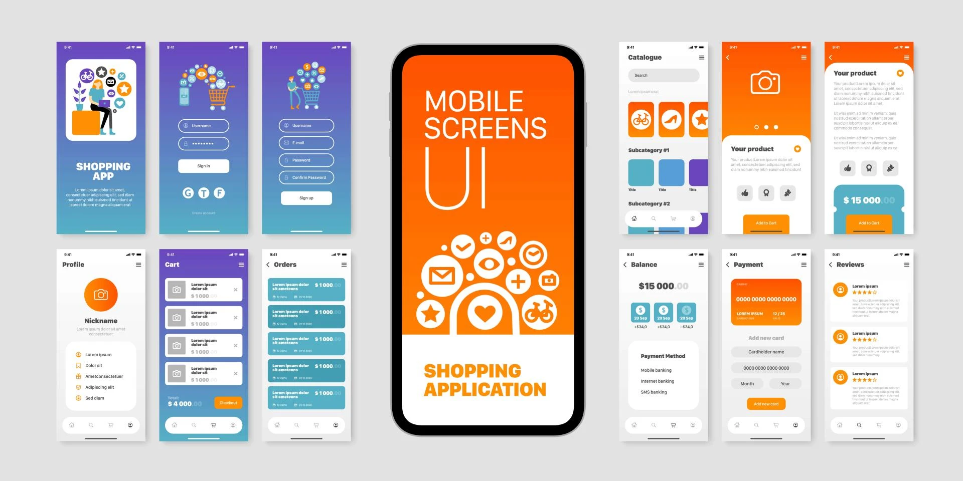
Colors are a powerful tool for establishing brand identity and recognition. By consistently using specific color schemes across various touchpoints, such as websites, mobile apps, and marketing materials, brands can reinforce their visual identity and create a cohesive user experience.
2. Guiding User Attention and Navigation
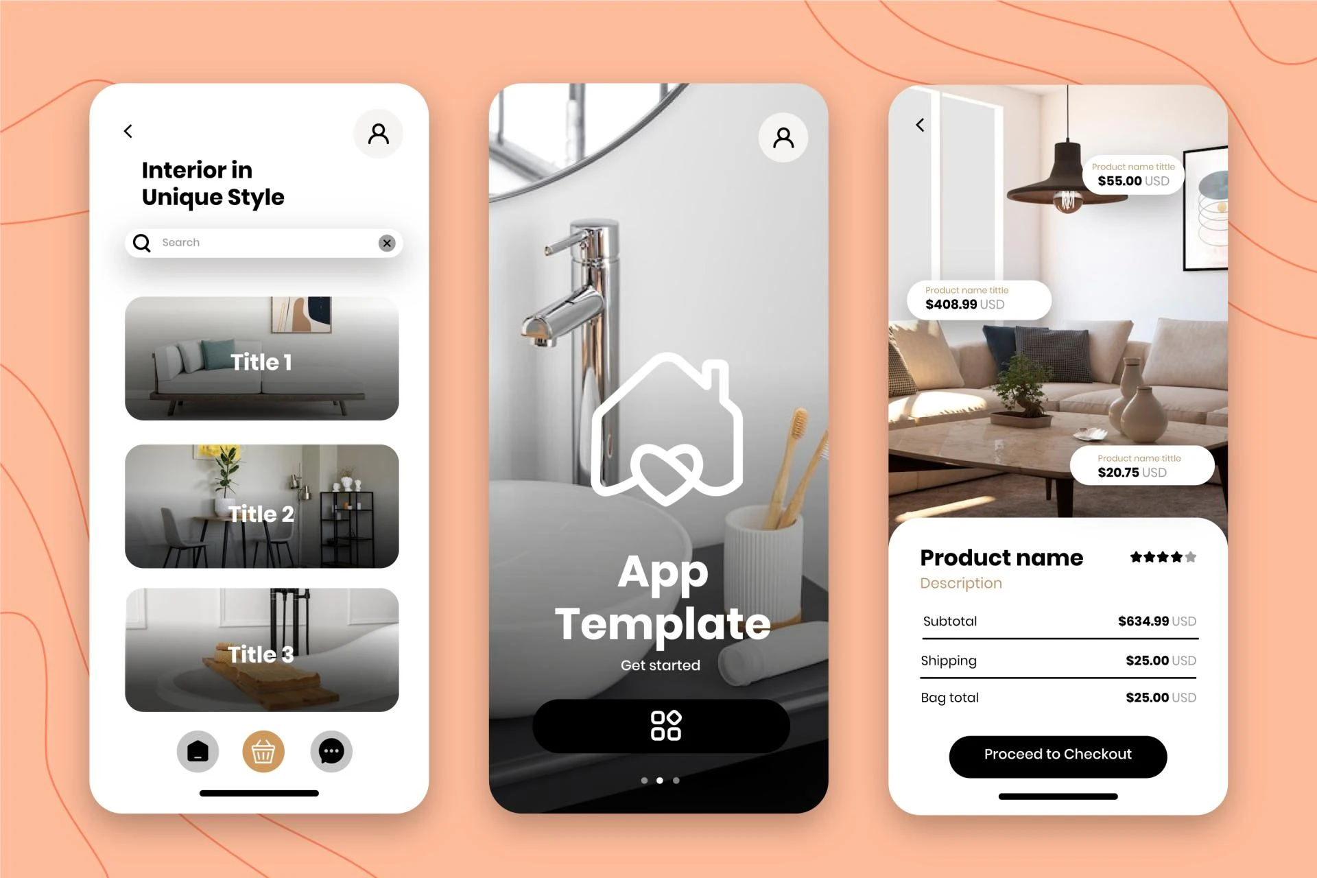
Colors can be leveraged to guide users' attention and facilitate navigation within an interface. By using contrasting colors for key elements such as buttons, links, or menu items, designers can ensure that these components stand out and are easily identifiable. Additionally, complementary color schemes can be used to create visual hierarchies, helping users understand the relationships between different interface elements.
3. Evoking Emotions and Setting the Tone
The emotional impact of colors cannot be overlooked in UI design. Warm colors like red, orange, and yellow can create a sense of energy, excitement, and enthusiasm, making them suitable for call-to-action buttons or promotional materials. Cool colors like blue and green, on the other hand, can convey a sense of calmness and trustworthiness, making them ideal for financial or healthcare applications.
4. Improving Readability and Accessibility
Color choices can significantly impact the readability and accessibility of an interface. High-contrast color combinations, such as black text on a white background or white text on a dark background, can make content easier to read, especially for users with visual impairments. Additionally, careful consideration should be given to color blindness and other vision-related conditions when selecting color schemes.
Color Palettes and Combinations
Effective UI design often involves the strategic use of color palettes and combinations. Here are some common approaches and considerations:
Monochromatic Palettes: These palettes use variations of a single hue, creating a cohesive and harmonious look. They are often used for minimalist designs or to convey a sense of sophistication and elegance. Complementary Palettes: These palettes combine colors that are opposite on the color wheel, such as red and green or blue and orange. They create a strong visual contrast and can be used to highlight specific interface elements or create a bold and eye-catching design. Analogous Palettes: These palettes consist of colors that are adjacent on the color wheel, such as yellow, orange, and red. They create a sense of harmony and can be used to create a warm and inviting atmosphere. Triadic Palettes: These palettes use three colors that are evenly spaced on the color wheel, such as red, blue, and yellow. They can create a vibrant and dynamic design but should be used cautiously to avoid overwhelming the user. Accessibility and Contrast: When selecting color combinations, it is crucial to consider accessibility standards and ensure sufficient contrast between text and background colors. This ensures that the interface is readable and usable for all users, including those with visual impairments.Applying Color Psychology in UI Design
Implementing color psychology in UI design requires a thoughtful and strategic approach. Here are some best practices to consider:
Conduct User Research: Understanding your target audience's preferences, cultural background, and emotional associations with colors can help you make informed decisions about color choices. Establish a Color System: Develop a comprehensive color system that includes primary and secondary colors, as well as guidelines for their usage across different interface elements and scenarios. Test and Iterate: Continuously test and gather feedback from users to evaluate the effectiveness of your color choices. Be prepared to iterate and refine your color scheme based on user insights and analytics data. Consider Accessibility: Ensure that your color choices meet accessibility standards and guidelines, such as those outlined in the Web Content Accessibility Guidelines (WCAG). Stay Consistent: Maintain color consistency throughout the user journey to reinforce brand recognition and create a cohesive experience across multiple platforms and devices.Conclusion
Color psychology plays a vital role in UI design, influencing user perception, emotions, and behavior. By understanding the psychological associations and meanings behind colors, designers can create interfaces that are not only visually appealing but also intuitive, engaging, and aligned with their brand's identity. However, it is essential to approach color choices with a strategic mindset, considering factors such as user research, accessibility, and consistency. By carefully crafting color palettes and combinations, UI designers can elevate the user experience and create interfaces that resonate with their target audience.
Devoq is a leading UI/UX design agency that has made a name for itself in the realm of exceptional user experience design. With a strong presence in both Warrnambool and Brisbane, the company offers comprehensive UI/UX design services to clients across Australia. Their team of talented designers and developers leverage the latest design thinking methodologies and cutting-edge technologies to create intuitive and visually stunning user interfaces that seamlessly blend form and function. Whether it's a startup seeking to establish a strong digital presence or an established enterprise looking to revamp its online offerings, devoq's UI/UX design agency in Warrnambool and UI/UX design agency in Brisbane are well-equipped to transform ideas into captivating and user-centric digital experiences. With a deep understanding of user behavior and a commitment to excellence, devoq continues to push the boundaries of UI/UX design, delivering solutions that not only enhance usability but also leave a lasting impression on users.


Sign in to leave a comment.