Elementor has revolutionized the way WordPress websites are built, offering an intuitive drag-and-drop interface that empowers designers and developers alike. However, creating truly stunning designs goes beyond simply arranging elements on a page. It requires a deep understanding of user interface (UI) and user experience (UX) principles. In this guide, we'll explore essential UI/UX tips to help you master Elementor and create visually appealing, user-friendly websites that stand out from the crowd.
1. Embrace White Space
One of the most crucial aspects of good design is the effective use of white space, also known as negative space. White space isn't just empty areas on your page; it's a powerful design element that can dramatically improve readability, focus attention, and create a sense of elegance.
When using Elementor, resist the temptation to fill every pixel of your layout. Instead, use the spacing options generously to give your content room to breathe. Adjust margins and paddings to create a balanced, uncluttered look. Remember, a well-spaced design not only looks more professional but also helps users navigate and absorb information more easily.
2. Maintain Consistency in Design Elements
Consistency is key to creating a cohesive and professional-looking website. With Elementor's Global Colors and Typography features, you can easily maintain a consistent look across your entire site. Set up a color palette that aligns with your brand and stick to it throughout your design. Similarly, establish a clear typography hierarchy using no more than 2-3 font families.
Use Elementor's Global Widgets to create reusable elements like headers, footers, and call-to-action buttons. This ensures that these elements remain consistent across different pages, reinforcing your brand identity and improving user experience through familiarity.
3. Optimize for Mobile First
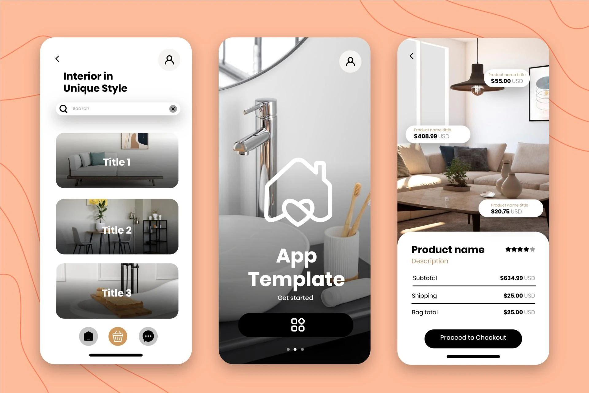
In today's mobile-first world, it's crucial to design with smaller screens in mind. Elementor's responsive design features make it easy to create mobile-friendly layouts, but it's up to you to use them effectively.
Start by designing for mobile devices and then scale up to larger screens. This approach ensures that your core content and functionality work well on smaller devices. Use Elementor's responsive controls to adjust font sizes, spacing, and layout for different screen sizes. Don't forget to preview your design on various devices to ensure a seamless experience across all platforms.
4. Create Clear Visual Hierarchy
Visual hierarchy guides users through your content, highlighting what's most important and creating a logical flow of information. Elementor offers various tools to establish a strong visual hierarchy in your designs.
Use headings (H1, H2, H3, etc.) consistently to structure your content. Leverage Elementor's typography controls to differentiate between headings, body text, and other elements. Employ color, size, and positioning to draw attention to key elements like call-to-action buttons or important messages.
Remember, the goal is to guide the user's eye through the page in a way that feels natural and intuitive.
5. Implement Micro-interactions
Micro-interactions are small, subtle animations that provide feedback to users as they interact with your website. These can significantly enhance the user experience by making your site feel more responsive and engaging.
Elementor Pro offers a range of animation options that you can use to create micro-interactions. For example, you can add hover effects to buttons, implement scroll animations, or create subtle transitions between sections. However, use these animations judiciously – too many can be distracting and slow down your site.
6. Focus on Page Load Speed
A beautiful design is pointless if users don't stick around long enough to see it. Page load speed is a critical factor in both user experience and search engine optimization. Elementor provides several features to help optimize your site's performance.
Use the built-in asset optimization features to minimize CSS and JavaScript files. Optimize your images before uploading them, and consider using Elementor's dynamic image feature to serve appropriately sized images for different devices. Implement lazy loading for images and videos to improve initial load times.
7. Use Color Psychology Effectively
Colors evoke emotions and can significantly influence user behavior. When designing with Elementor, choose your color scheme thoughtfully. Use Elementor's color picker to select hues that align with your brand identity and the emotional response you want to elicit from your users.
For example, blue often conveys trust and professionalism, making it a popular choice for corporate websites. Green can represent growth and eco-friendliness, while red can signify excitement or urgency. Use your primary brand color for key elements like headers and call-to-action buttons, and select complementary colors for secondary elements.
8. Implement Accessibility Best Practices
Designing for accessibility ensures that your website can be used by as many people as possible, including those with disabilities. Elementor provides several features to help you create more accessible designs.
Use sufficient color contrast between text and background to ensure readability. Add alt text to images using Elementor's image widget settings. Structure your content with proper heading levels to aid screen readers. Ensure that all interactive elements are keyboard-accessible.
9. Leverage Elementor's Form Widget for Better UX
Forms are often a critical point of interaction on websites. Elementor Pro's Form widget allows you to create user-friendly forms that enhance the overall user experience.
Design forms with clear labels and placeholders. Use appropriate input types (e.g., email for email addresses, tel for phone numbers) to trigger the correct mobile keyboard. Implement form validation to provide immediate feedback to users. Consider using multi-step forms for longer forms to reduce cognitive load.
10. Test and Iterate
Finally, remember that great design is an iterative process. After implementing these UI/UX tips in your Elementor designs, it's crucial to test your website with real users and gather feedback.
Use Elementor's Theme Builder to create multiple versions of key pages and conduct A/B tests. Analyze user behavior using heat mapping tools to understand how users interact with your design. Be open to making changes based on user feedback and data.
Conclusion
Mastering Elementor for stunning UI/UX design is about more than just using the tool effectively – it's about understanding and applying fundamental design principles. By embracing white space, maintaining consistency, optimizing for mobile, creating clear visual hierarchies, and implementing thoughtful micro-interactions, you can elevate your Elementor designs from good to great.
Remember to focus on performance, use color psychology effectively, prioritize accessibility, and create user-friendly forms. Most importantly, never stop testing and iterating on your designs. With these tips and a commitment to continuous improvement, you'll be well on your way to creating stunning, user-centered designs with Elementor that truly stand out in the crowded digital landscape.
Visit my Upwork project catalog : Elementor Developer


Sign in to leave a comment.