In today's digital landscape, mobile devices have become the primary gateway to the internet for millions of users worldwide. With smartphones and tablets accounting for over half of all web traffic, it's crucial for businesses and web designers to prioritize mobile-first landing page design. This approach not only caters to the growing mobile user base but also enhances overall user experience and boosts conversion rates. Let's dive into the world of mobile-first landing page design and explore how to optimize user experience for the small screen revolution.
Understanding Mobile-First Design
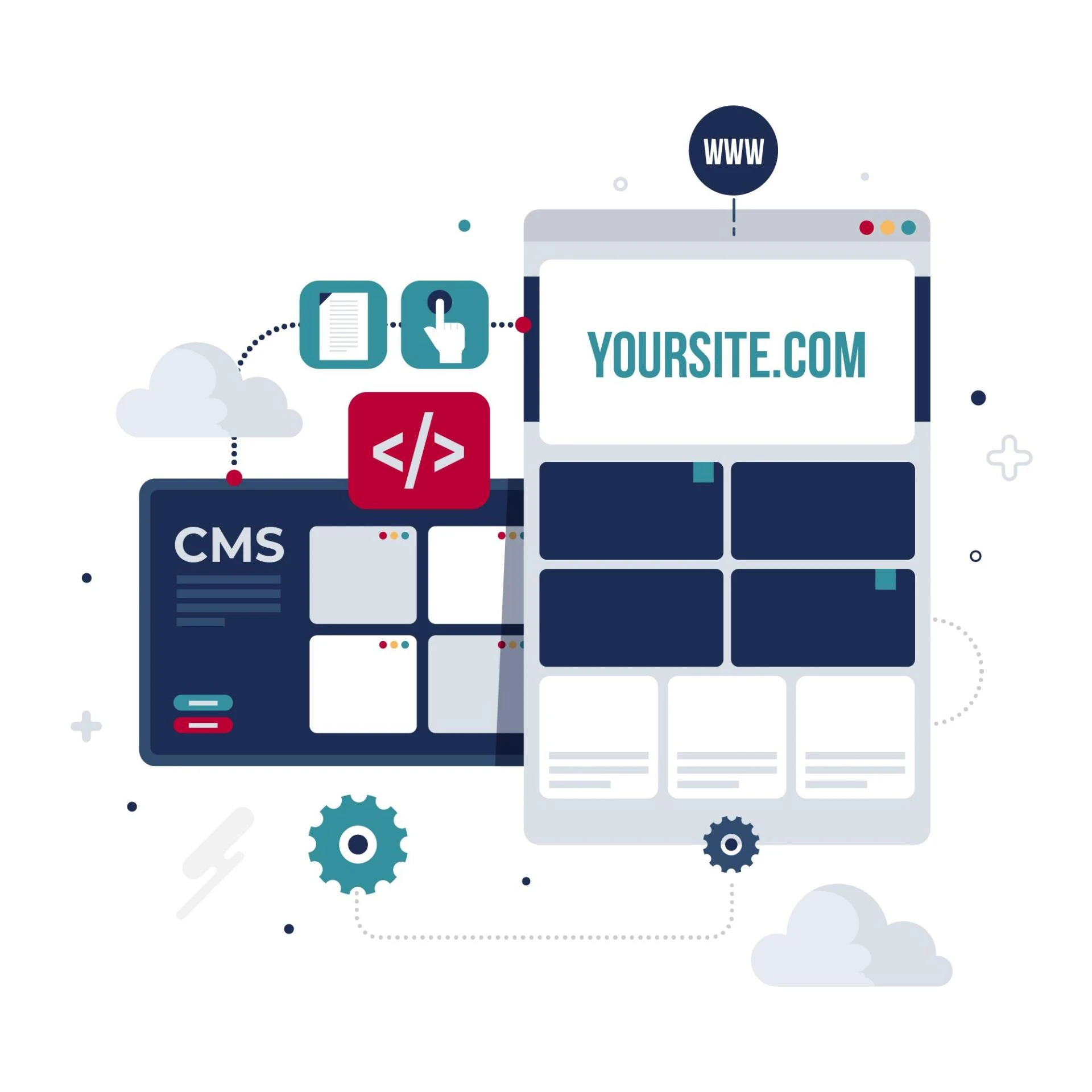
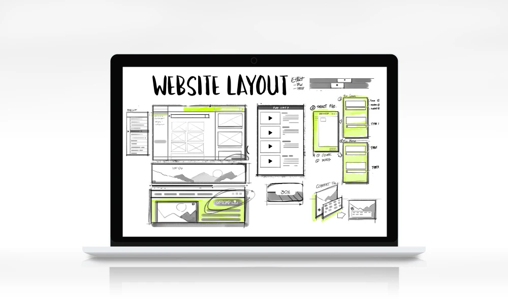
Mobile-first design is an approach that prioritizes designing for mobile devices before scaling up to larger screens. This methodology ensures that the core content and functionality are optimized for smaller screens, creating a solid foundation for a responsive design that adapts seamlessly to various device sizes.
The benefits of mobile-first design include:
Improved user experience on mobile devices Faster loading times Better search engine rankings (due to Google's mobile-first indexing) Increased conversion rates Future-proofing your websiteKey Elements of Mobile-First Landing Page Design
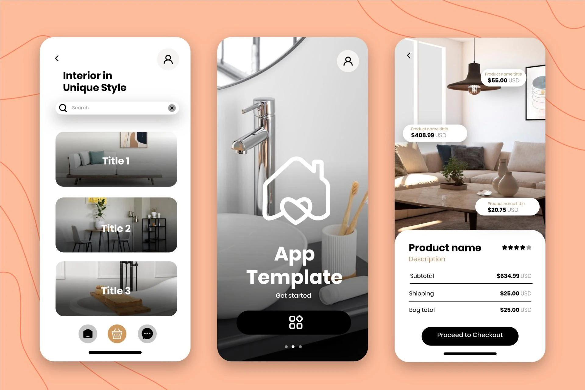
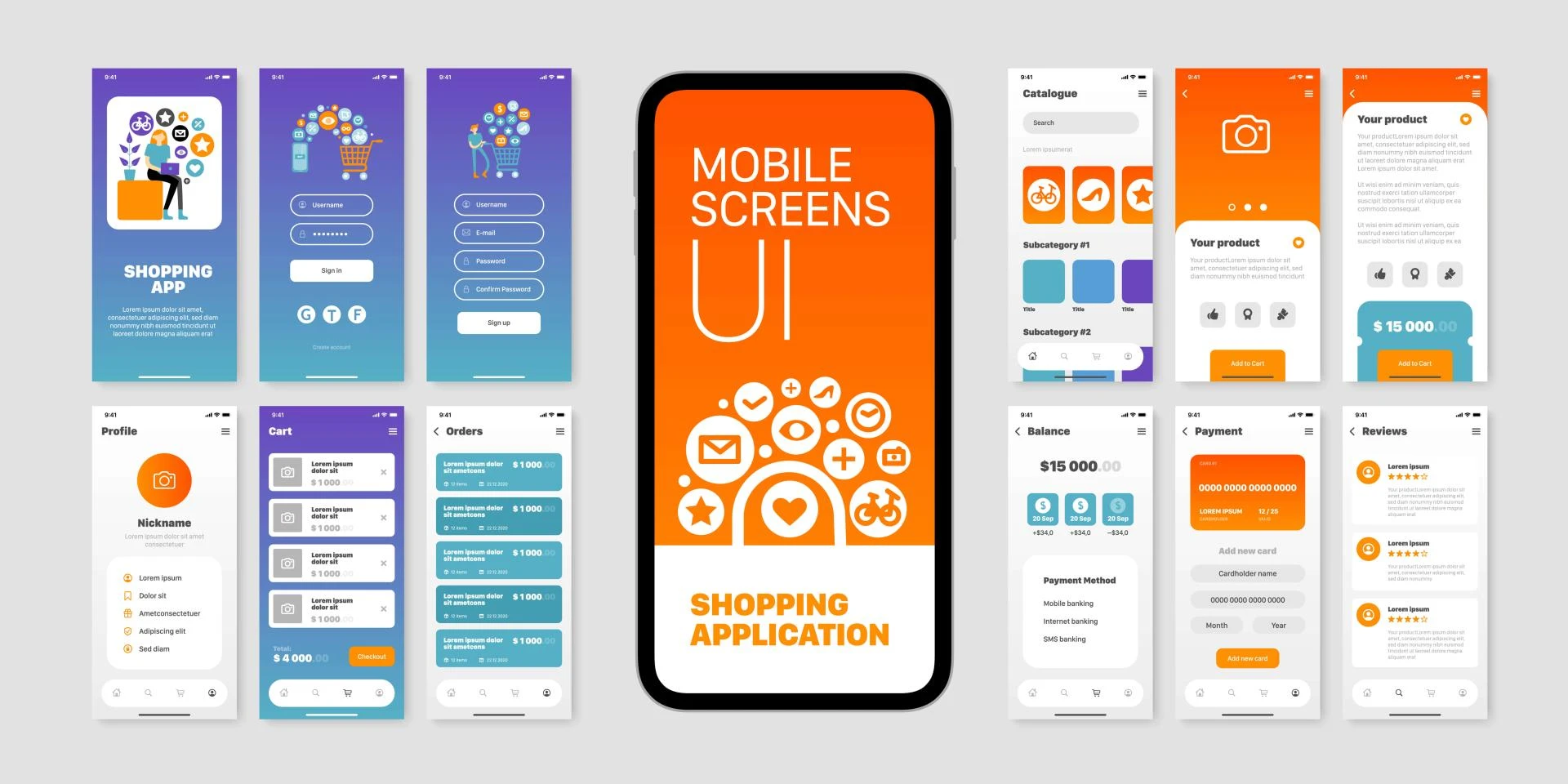
1. Simplified Navigation
On mobile devices, screen real estate is limited, making it crucial to simplify navigation. Consider implementing a hamburger menu or a streamlined navigation bar that focuses on the most important pages or sections. Ensure that menu items are easily tappable with sufficient spacing between them.
2. Concise and Compelling Content
Mobile users often have shorter attention spans and are looking for quick, easily digestible information. Keep your content concise and to the point, using short paragraphs, bullet points, and subheadings to improve readability. Place the most important information at the top of the page to capture users' attention immediately.
3. Clear and Prominent Call-to-Action (CTA)
Your CTA should be impossible to miss on a mobile screen. Use contrasting colors, larger fonts, and ample white space around the button to make it stand out. Position the CTA strategically, ensuring it's visible without requiring excessive scrolling.
4. Optimized Forms
Long, complex forms can be a major turnoff for mobile users. Simplify your forms by:
- Reducing the number of fields to the essentials
- Using input types that trigger appropriate mobile keyboards (e.g., numeric keypad for phone numbers)
- Implementing auto-fill functionality where possible
- Providing clear error messages and validation in real-time
5. Fast Loading Times
Mobile users expect quick loading times, and slow-loading pages can lead to high bounce rates. Optimize your landing page for speed by:
- Compressing images and using appropriate file formats
- Minifying CSS, JavaScript, and HTML
- Leveraging browser caching
- Using a content delivery network (CDN)
Best Practices for Mobile-First Landing Page Design
1. Prioritize Content Hierarchy
Establish a clear content hierarchy that guides users through your landing page. Use headings, subheadings, and visual cues to create a logical flow of information. Ensure that the most critical elements, such as your value proposition and CTA, are prominently displayed above the fold.
2. Implement a Responsive Grid System
Utilize a responsive grid system that adapts to different screen sizes. This approach ensures that your layout remains consistent and visually appealing across devices while maintaining proper alignment and spacing of elements.
3. Optimize Typography for Readability
Choose fonts that are legible on small screens and set appropriate font sizes for different elements. Use a minimum font size of 16 pixels for body text to ensure readability. Maintain sufficient contrast between text and background colors to enhance visibility.
4. Leverage White Space
Don't be afraid of white space (or negative space) in your mobile design. Proper use of white space can improve readability, highlight important elements, and create a sense of visual hierarchy. It also helps prevent a cluttered appearance on small screens.
5. Use Mobile-Friendly Interactive Elements
Implement mobile-friendly interactive elements such as accordions, tabs, or carousels to present information in a compact, easily navigable format. Ensure that these elements are touch-optimized and provide clear visual feedback when interacted with.
Conclusion
The small screen revolution has fundamentally changed how users interact with websites and landing pages. By adopting a mobile-first approach to landing page design, businesses can create compelling, user-friendly experiences that cater to the growing mobile audience.
Remember that mobile-first design is not about sacrificing functionality or content for larger screens. Instead, it's about creating a solid foundation that can be enhanced and expanded for desktop users. By focusing on simplified navigation, concise content, clear CTAs, and optimized performance, you can create landing pages that not only look great on mobile devices but also drive conversions and engagement across all platforms.
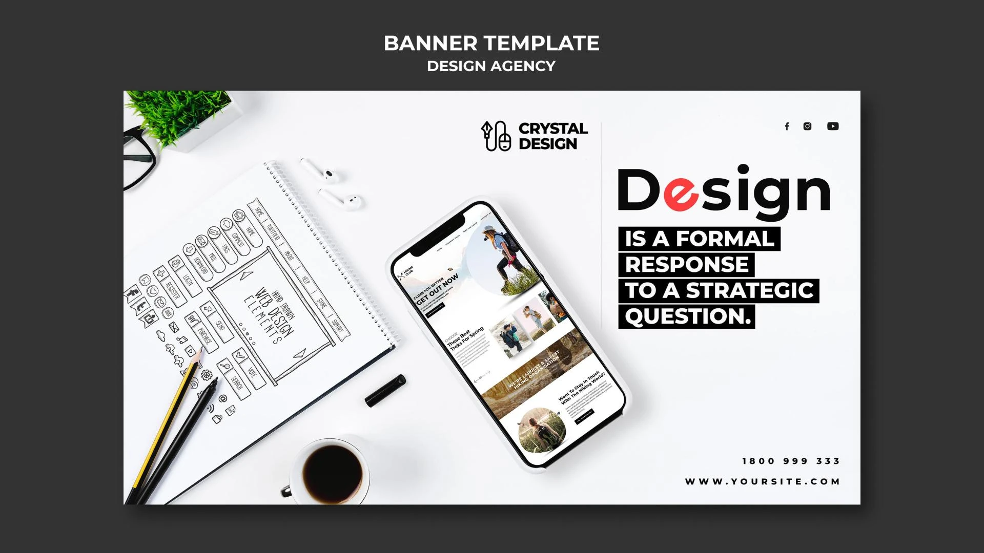
My Fiver link for : Figma Landing Page Design Service


Sign in to leave a comment.