In today's digital landscape, mobile devices have become the primary means of accessing the internet for most users. With smartphone usage continuing to rise, it's crucial for businesses to prioritize mobile-friendly design in their online presence. This is especially true for landing pages, which are often the first point of contact between a potential customer and a brand. A mobile-first approach to landing page design ensures that your message is effectively communicated and your conversion goals are met, regardless of the device used to access your site.
Understanding Mobile-First Design
Mobile-first design is an approach that prioritizes the mobile user experience from the outset of the design process. Rather than creating a desktop version of a website and then scaling it down for mobile devices, designers start with the mobile version and progressively enhance it for larger screens. This approach ensures that the core content and functionality are optimized for the constraints of mobile devices, resulting in a better user experience across all platforms.
Key Benefits of Mobile-First Landing Pages
Improved User Experience: By designing for mobile first, you create a streamlined and intuitive experience for users on smaller screens. This leads to higher engagement and lower bounce rates.Faster Load Times: Mobile-first design often results in leaner, more efficient code, which translates to faster loading times. This is crucial for mobile users who may be on slower connections.
Better Search Engine Rankings: Google uses mobile-first indexing, meaning it predominantly uses the mobile version of a site for ranking and indexing. A well-designed mobile landing page can improve your search engine visibility.
Higher Conversion Rates: When users can easily navigate and interact with your landing page on their mobile devices, they're more likely to take the desired action, whether it's making a purchase, signing up for a newsletter, or contacting your business.
Best Practices for Mobile-First Landing Pages
1. Simplify Your Design
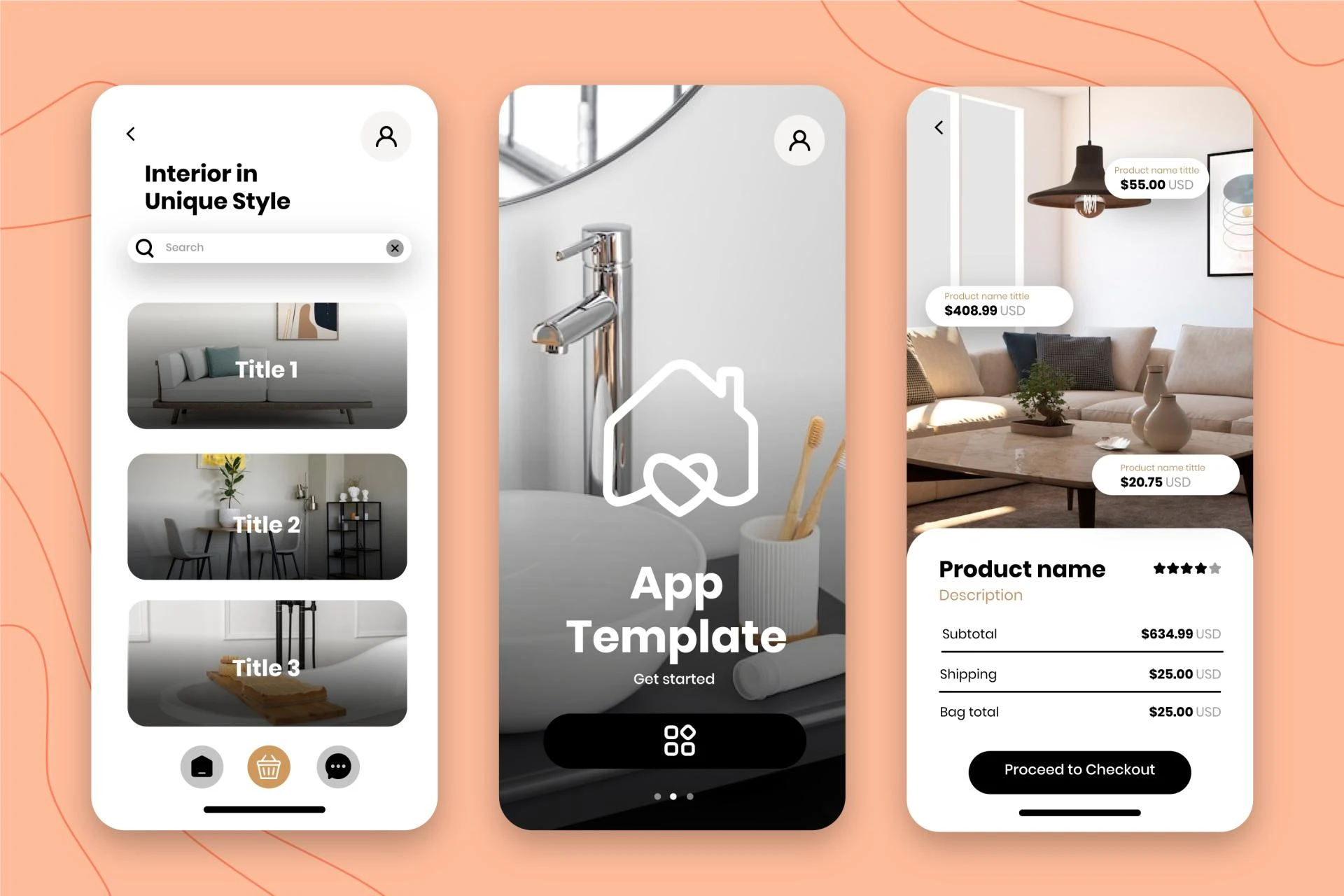
On mobile devices, screen real estate is at a premium. Keep your design clean and focused, removing any unnecessary elements that could distract from your main message or call-to-action (CTA). Use a single-column layout to make scrolling and reading easier on smaller screens.
2. Prioritize Content
Identify the most critical information your users need and present it prominently. Use a clear hierarchy to guide users through your content, with the most important elements appearing first. Consider using expandable sections or accordions to organize secondary information without cluttering the main view.
3. Optimize Typography
Choose legible fonts and ensure your text is large enough to read comfortably on small screens. A general rule of thumb is to use a minimum font size of 16 pixels for body text. Maintain sufficient contrast between text and background colors to enhance readability.
4. Use Touch-Friendly Elements
Design buttons, forms, and interactive elements with touch in mind. Make clickable areas large enough to be easily tapped with a finger (at least 44x44 pixels). Provide ample spacing between interactive elements to prevent accidental taps.
5. Streamline Navigation
Keep navigation simple and intuitive. Consider using a hamburger menu to hide less essential navigation items, but make sure critical links are always visible. Use clear, descriptive labels for menu items and buttons.
6. Optimize Images and Media
Use responsive images that adjust to different screen sizes and resolutions. Compress images to reduce file sizes without sacrificing quality. Consider using lazy loading techniques to improve page load times by loading images only as they become visible on the screen.
7. Create Compelling CTAs
Make your call-to-action buttons prominent and easily clickable. Use contrasting colors to make them stand out, and place them strategically throughout the page. Consider using sticky CTAs that remain visible as users scroll.
8. Simplify Forms
Keep forms as short as possible, asking only for essential information. Use appropriate input types (e.g., number pad for phone numbers) to make form filling easier on mobile devices. Consider breaking longer forms into multiple steps to reduce cognitive load.
9. Implement Fast-Loading Design
Optimize your code and assets to ensure quick loading times. Minimize the use of large JavaScript libraries and consider using AMP (Accelerated Mobile Pages) for even faster performance.
10. Provide Clear Contact Options
Make it easy for mobile users to contact you. Include click-to-call buttons for phone numbers and easily accessible contact forms or chat options.
Testing and Optimization
Once you've implemented your mobile-first landing page, it's crucial to test it thoroughly across various devices and screen sizes. Use tools like Google's Mobile-Friendly Test to identify any issues. Additionally, conduct user testing to gather real-world feedback on the usability of your page.
Continuously monitor your landing page's performance using analytics tools. Pay attention to metrics such as bounce rate, time on page, and conversion rate. Use this data to inform iterative improvements to your design and content.
A/B testing can be particularly valuable for mobile landing pages. Test different layouts, CTAs, and content arrangements to find what resonates best with your mobile audience.
Future Trends in Mobile-First Design
As mobile technology continues to evolve, so too will best practices for mobile-first landing pages. Keep an eye on emerging trends such as:
Progressive Web Apps (PWAs): These offer app-like experiences within a browser, potentially blurring the line between web and native apps.Voice User Interfaces: With the rise of voice assistants, consider how your landing page content can be optimized for voice search and interaction.
Augmented Reality (AR): As AR becomes more mainstream, think about how you can incorporate immersive experiences into your mobile landing pages.
5G Technology: The rollout of 5G networks will enable faster loading times and more complex, media-rich experiences on mobile devices.
Conclusion
Adopting a mobile-first approach to landing page design is no longer optional—it's essential for businesses looking to succeed in the digital age. By prioritizing the mobile user experience, you can create landing pages that not only look great on smaller screens but also drive engagement and conversions across all devices.
Remember that mobile-first design is an ongoing process. Stay informed about the latest trends and best practices, and be prepared to adapt your approach as technology and user behaviors evolve. By putting mobile users at the forefront of your design strategy, you'll be well-positioned to capture and retain the attention of your target audience, regardless of how they choose to interact with your brand online.
Visit my Upwork project catalog : Elementor Developer


Sign in to leave a comment.