
In the dynamic landscape of digital technology, where smartphones have become ubiquitous extensions of our lives, responsive UI/UX design has emerged as a critical factor in shaping user experiences. The mobile-first era, characterized by the prevalence of smartphones and mobile devices, demands a fundamental shift in the way designers approach user interfaces and experiences. Let's explore the essence of responsive UI/UX design and how it navigates the intricacies of the mobile-first era.
Understanding the Mobile-First Philosophy
The mobile-first philosophy revolves around prioritizing the design and functionality of a website or application for mobile devices before adapting it to larger screens. With the majority of internet users accessing content via smartphones, this approach ensures that users on mobile devices have a seamless and optimized experience. It compels designers to focus on essential features, simplified navigation, and faster loading times, enhancing user satisfaction and engagement.
Adaptive and Fluid Layouts
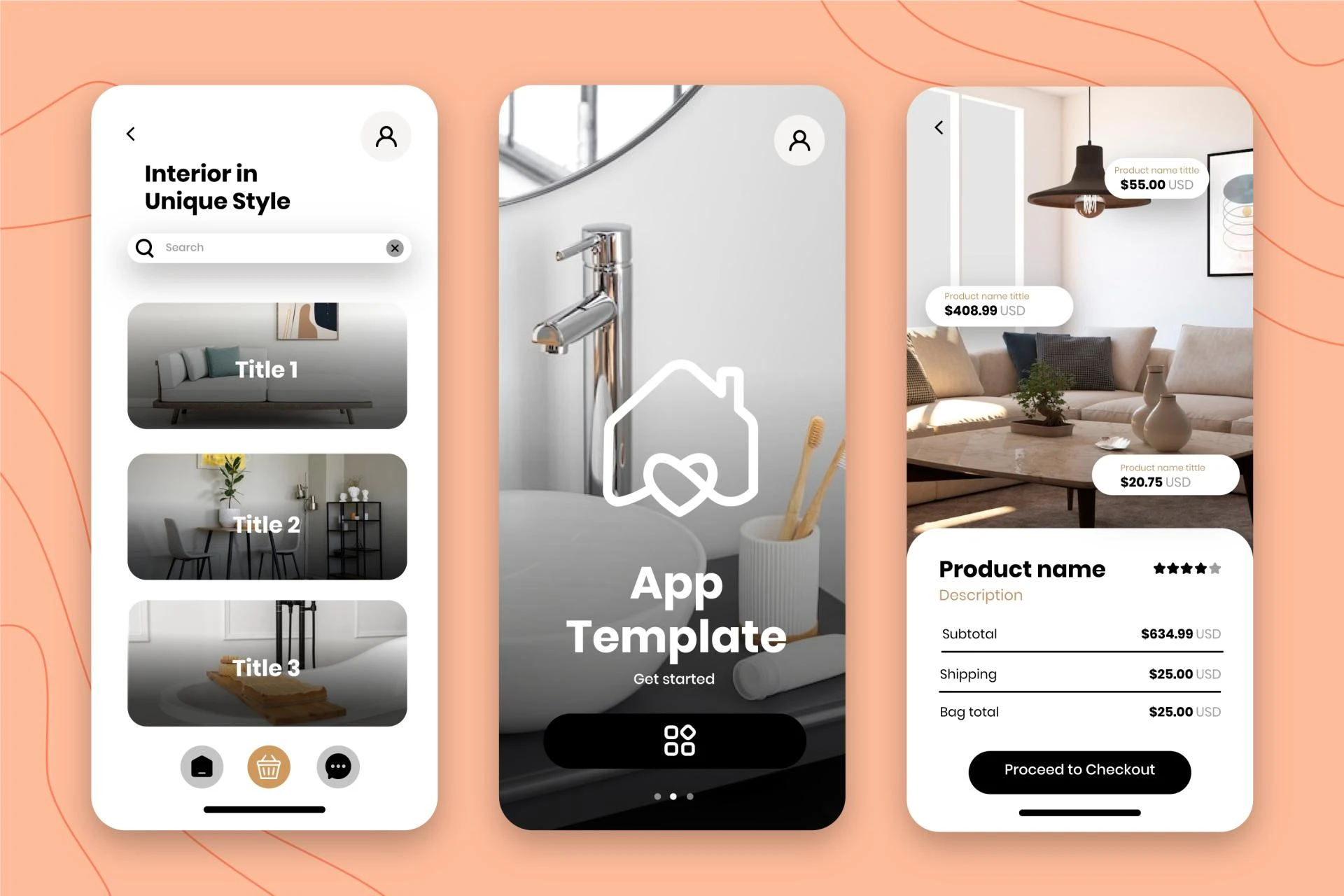
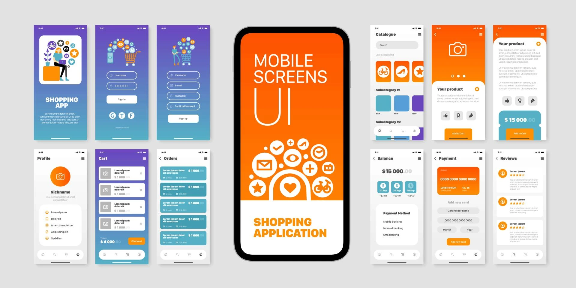
Responsive UI/UX design involves creating adaptive layouts that adjust gracefully to various screen sizes and orientations. Designers use fluid grids and flexible elements to ensure that content rearranges intuitively, optimizing the available space on screens of all dimensions. This fluidity enables users to access the same content and functionality regardless of whether they are using a smartphone, tablet, laptop, or desktop computer.
Performance Optimization for Mobile Networks
In the mobile-first era, internet connectivity can be unreliable, especially in emerging markets. Responsive design involves optimizing images, videos, and other media to reduce data usage and loading times. Designers employ techniques such as lazy loading, which loads images only as users scroll down, conserving bandwidth and ensuring a smooth browsing experience even on slower networks.
Touch-Friendly Interactions
Mobile devices rely heavily on touch interactions. Responsive UI/UX design prioritizes touch-friendly elements, ensuring that buttons, links, and other interactive elements are appropriately sized and spaced to accommodate touch gestures accurately. Designers also consider the placement of interactive elements to prevent accidental taps, enhancing the overall usability of the interface.
Progressive Web Apps (PWAs) and Offline Functionality
The mobile-first era has seen the rise of Progressive Web Apps (PWAs) — web applications that offer app-like experiences on mobile devices. PWAs leverage responsive design principles and provide offline functionality, allowing users to access certain features and content even without an internet connection. This capability enhances user engagement, particularly in regions with intermittent connectivity.
Voice User Interfaces (VUIs) and Mobile Devices
With the proliferation of virtual assistants like Siri, Google Assistant, and Alexa, designing for Voice User Interfaces has become integral to responsive UI/UX design. Mobile-first approaches now incorporate voice commands and responses, enabling users to interact with applications and websites using natural language. Designers optimize interfaces to seamlessly transition between touch interactions and voice commands, offering users a choice in how they engage with the platform.
Ensuring Consistent Branding and User Experience
Consistency is key in responsive UI/UX design. Brands must maintain a consistent look and feel across all devices to reinforce their identity. Responsive design ensures that branding elements, typography, color schemes, and interactive patterns remain uniform, creating a cohesive and recognizable user experience regardless of the device being used. This consistency builds trust and fosters user loyalty.
User-Centric Content Strategy
Responsive UI/UX design necessitates a user-centric content strategy. Designers must prioritize content based on its relevance and importance to users on various devices. Mobile-first content strategies emphasize concise, scannable content that delivers key messages efficiently. By tailoring content to fit different screen sizes and user contexts, designers enhance user engagement and ensure that users find the information they need quickly and effortlessly.
Conclusion: Navigating the Mobile-First Future
Responsive UI/UX design is not a trend; it's a fundamental approach that aligns digital experiences with the way users engage with technology today. In the mobile-first era, where smartphones are the gateway to the digital world, responsive design is not just a strategy; it's a necessity. By embracing adaptive layouts, touch-friendly interactions, offline functionality, and consistent branding, designers navigate the complexities of the mobile-first landscape, delivering seamless and delightful experiences to users, regardless of the device they choose. As technology continues to evolve, responsive UI/UX design remains the compass guiding digital interactions toward a user-centric and mobile-first future.
Visit my Upwork profile for — UI/UX design, Web Design & Mobile design
Check out my amazing project catalog — iOS or Android Mobile APP UX/UI Design, Responsive website design & Crypto & NFT Mobile App UI Design


Sign in to leave a comment.