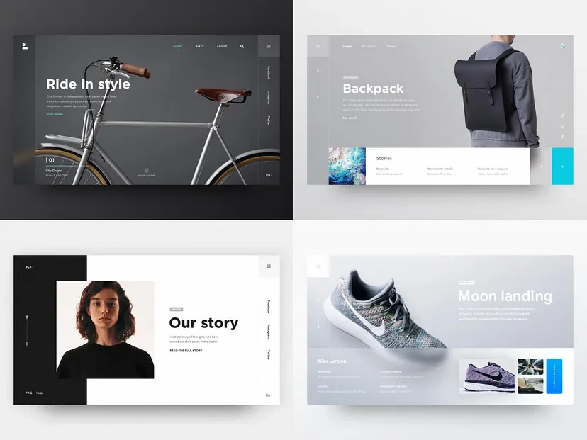
Responsive web design allows a website to look and function well on a variety of screensizes and devices.
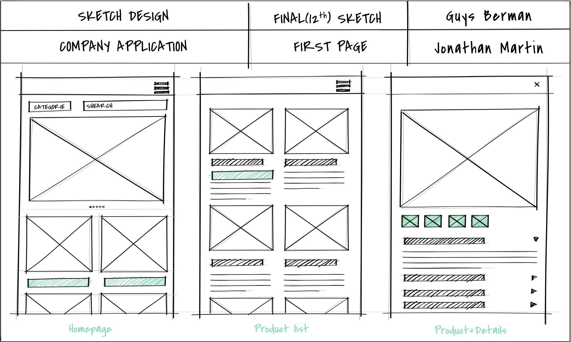
Here are some best practices for creating a responsive website:
- Use a fluid grid: A fluid grid layout adjusts proportionally to the screen size, ensuring a consistent layout across devices.
- Use media queries: Media queries in CSS can customize styles for different screen sizes.
- Optimize images: Use responsive image techniques to load the right size image for each device.
- Use scalable fonts: Use scalable units like em or rem for font sizes so text adjusts to different screen sizes.
- Simplify navigation: Use dropdowns or hamburger menus to make navigation easier for mobile users.
- Test on multiple devices: Use tools like BrowserStack to test your site on various devices and screen sizes.
- Consider your target audience: Define your target audience and their device preferences.
- Use a minimalist design: Reducing content can make it easier for users to read and digest.
- Use a responsive website template: Google recommends using a responsive website template.
- Optimize for load speed: Optimize images, code, and resources to improve loading speed on different devices.
What is the best screen size to design for?
There’s no one best screen size to design for. Websites should transform responsively and fast at all screen resolutions on different browsers and platforms. Accessible. Mobile-friendly. Design for your audience, first. Design from 360×640 through 1920×1080.
Also:
- Design for desktop displays from 1280×720 through 1920×1080
- Design for mobile displays from 360×640 through 414×896
- Design for tablet displays from 601×962 through 1280×800
- Check Google Analytics and optimise for your target audience’s most common resolution sizes
- Do not design for one monitor size or screen resolution. Screen sizes and browser window states vary among visitors.
- Design should be responsive and fast. Use a liquid or responsive layout that transforms to the current user’s window size.
- Monitor Google Search Console mobile-friendly and usability alerts
Your website should look good and work well on all screen sizes. The accepted best practice is to have a responsive website template. Google recommends this explicitly in its guidelines and if you do not follow these guidelines, your website will not rank optimally in Google Search.
Why Responsive Web Design Matters
Responsive web design ensures your website performs seamlessly across all devices. Whether viewed on a smartphone, tablet, or desktop, a responsive design enhances user experience and accessibility. With mobile traffic increasing yearly, optimizing for every screen size is no longer optional — it’s essential for staying competitive.
Key Features of Responsive Web Design
Flexible Layouts
Responsive web design uses fluid grids to adapt to various screen sizes. These grids ensure content resizes proportionally, maintaining a visually appealing layout on any device.
Media Queries
Media queries enable your website to apply different CSS styles based on device specifications, such as screen width, height, and resolution. This feature guarantees a customized experience for users across devices.
Optimized Images
Images play a critical role in web design. Responsive images adjust automatically to fit different screen sizes, reducing load times and improving performance. Tools like srcset and sizes attributes in HTML help achieve this seamlessly.
Benefits of Responsive Web Design
Improved User Experience
A responsive website ensures a smooth and engaging browsing experience. Users no longer need to zoom or scroll excessively, making navigation intuitive.
Higher Search Engine Rankings
Search engines like Google prioritize mobile-friendly websites. A responsive design boosts your site’s SEO, improving its visibility and driving organic traffic.
Cost and Time Efficiency
Instead of creating separate sites for different devices, a single responsive design saves time and development costs. Maintenance also becomes simpler, as updates apply universally.
Best Practices for Responsive Web Design
Prioritize Mobile-First Design
Start your design process with mobile devices in mind. A mobile-first approach ensures your website meets the needs of on-the-go users while remaining scalable for larger screens.
Test Across Devices
Regularly test your website on various devices and browsers. Tools like BrowserStack or Google’s Mobile-Friendly Test help identify and fix issues efficiently.
Minimize Load Times
Speed is crucial for user satisfaction. Optimize images, leverage caching, and minimize CSS and JavaScript to ensure fast load times across devices.
Use Scalable Typography
Responsive typography adjusts text size based on screen dimensions, ensuring readability on all devices. Techniques like relative units (em or rem) make this possible.
Conclusion
Responsive web design is more than a trend; it’s a necessity for modern businesses. By focusing on flexible layouts, media queries, and optimized images, you can build websites that perform exceptionally across all screen sizes. Embrace responsive design today to enhance user experience, boost SEO, and future-proof your online presence.
I'm professional ui ux designer, Contact me via my upwork profile
Thank you


Sign in to leave a comment.