The Power of Cereal Box Design
In the crowded cereal aisle, where countless boxes vie for attention, eye-catching packaging can be the make-or-break factor that drives sales. As Ipsos research reveals, a staggering 83% of Americans agree that innovative paper and cardboard packaging influences their purchase decisions. With so many options to choose from, an attractive cereal box design can be the crucial element that catches a customer\'s eye and prompts them to pick it up off the shelf.
Cereal brands are engaged in a constant battle for shelf prominence, making visually appealing packaging a powerful weapon in their marketing arsenal. Vibrant colors, engaging graphics, and distinctive shapes all play a role in capturing consumer interest amidst the clutter. An enticing cereal box can be the deciding factor that sways a shopper\'s choice, translating directly into increased sales and brand loyalty.
Visual Appeal on the Shelf
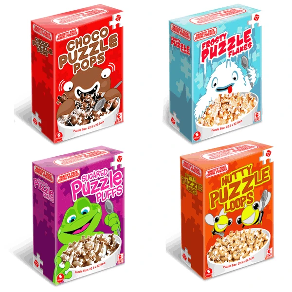
In the crowded cereal aisle, eye-catching packaging is essential for grabbing shoppers\' attention. Vibrant colors, unique shapes, and beloved characters instantly draw the eye. Brands like General Mills and Kellogg\'s have mastered the art of bold, vivid packaging that pops off the shelf. Lucky Charms\' bright red box and whimsical leprechaun mascot are iconic. Froot Loops\' concentric rainbow cereal pieces create an irresistible burst of color. Fun fonts and clever wordplay also entice customers to take a closer look.
Beyond standard rectangular boxes, distinctive shapes and premium finishes elevate cereal packaging. Trix\'s classic fruit shape stands out, while Oreo O\'s shiny black packaging exudes sophistication. Embossing, foil stamping, and unique textures add an upscale, sensory element. When done well, creative packaging transcends the product itself, becoming a memorable brand experience.
The Psychology of Cereal Box Design
Cereal box designs play on deep psychological principles to attract customers of all ages. For children, vibrant colors, fun characters, and whimsical fonts create an instant sense of excitement and joy. These elements tap into kids\' imaginations and make the cereal boxes feel like portals to magical worlds. Brands like Lucky Charms and Froot Loops have mastered this technique, with their iconic mascots becoming beloved childhood friends.
Adults, on the other hand, are often drawn to cereal boxes that evoke a sense of nostalgia. Retro designs with vintage logos and color schemes can remind consumers of their favorite cereals from childhood, prompting an emotional connection and brand loyalty. Brands like Oreo O\'s and Cinnamon Toast Crunch have capitalized on this nostalgia factor, refreshing their classic designs with modern twists. Research shows that this combination of familiarity and novelty can be highly effective in driving purchase decisions.
Iconic Cereal Boxes That Get It Right
Some of the most iconic and successful cereal box designs come from major brands like General Mills, Kellogg\'s, and Post. These companies have mastered the art of creating packaging that not only catches the eye on crowded shelves but also establishes strong brand recognition and loyalty.
General Mills\' Lucky Charms, with its whimsical leprechaun mascot and a bright rainbow of colors, has been a beloved cereal box design for generations. The instantly recognizable Lucky the Leprechaun mascot and playful imagery appeal to children while the bold graphics and distinctive style resonate with adults.
Kellogg\'s Frosted Flakes has achieved iconic status with its famous Tony the Tiger mascot. Tony the Tiger, with his friendly grin and catchy "They\'re gr-r-reat!" slogan, has become one of the most widely recognized cereal mascots in the world, helping the bright red box stand out on any shelf.
Post\'s Oreo O\'s cereal capitalized on the immense popularity of the Oreo cookie brand, featuring the familiar black and white cookie design on its box. This smart packaging strategy leveraged existing brand equity to create an instantly appealing and recognizable cereal box design.
Retro & Vintage-Inspired Cereal Packaging
In an effort to boost sales and reignite customer interest, many cereal brands are embracing retro and vintage packaging designs that leverage nostalgia. According to Mintel, while household penetration of cold cereal remains high, the category has struggled to increase sales in recent years as consumer tastes evolve. Throwback packaging aims to remind shoppers of the classic cereal brands they loved as kids.
Retro designs often feature vintage logos, classic character mascots, and graphic styles reminiscent of the mid-20th century. These nostalgic elements can make new products feel familiar and appeal to customers\' sense of nostalgia. As Packaging Dive reports, even new and better-for-you brands are adopting retro aesthetics to connect with consumers craving an old-school vibe.
For established cereal brands with decades of history, reissuing vintage packaging is an easy way to refresh their image and stand out on crowded shelves. Combining nostalgic design elements with modern twists allows brands to simultaneously capitalize on brand heritage while keeping their packaging feeling current and relevant.
Standing Out With Unique Shapes & Finishes
While rectangular cereal boxes are the norm, brands can make a splash with packaging that breaks the mold. Unique shapes like pouches, cylinders, or even spheres instantly grab attention on crowded shelves. As an example, the Canva packaging design guide highlights Reese\'s Peanut Butter Cups pouch as an eye-catching non-rectangular option.
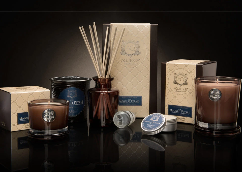
Premium finishing touches like foil stamping, embossing, or spot varnishes also elevate cereal boxes from ordinary to extraordinary. These high-end finishes lend a premium, luxurious feel that subconsciously signals quality to shoppers. Creative examples from Ask a Test include Rose Pops cereal with a rose gold foil accent and the raised embossed lettering on Plum Bites granola.
Refreshing & Modernizing Cereal Box Designs
As consumer tastes and trends evolve, cereal brands must periodically refresh their packaging to stay modern and relevant. According to a Kellogg\'s rebranding effort, updating stale visuals can make iconic products instantly more recognizable on shelves. Successful redesigns strike a balance between preserving brand equity while injecting new life into the look.
A key strategy is leveraging consumer data and testing to inform packaging updates. Brands can analyze sales data, survey customers, and conduct focus groups to understand which design elements resonate. Rolling out new box designs in test markets allows brands to iterate based on real-world feedback before a full launch.
While complete overhauls are rare, incremental changes can significantly boost a brand\'s shelf appeal. Adding modern illustrations, brighter color palettes, premium finishes, and cleaner typography are all potential enhancement areas. The goal is to achieve a design that still expresses the brand\'s identity but in a more eye-catching, contemporary style.
Interactive & Multisensory Packaging
In the quest to captivate consumers, cereal brands are pushing the boundaries of packaging design by incorporating interactive and multisensory elements. As research shows, engaging multiple senses can create a more memorable and impactful experience with a product.
One innovative approach is the use of QR codes and augmented reality (AR) experiences. By scanning a code on the cereal box, consumers can unlock exclusive content, games, or even AR characters that seemingly come to life. This technology allows brands to extend their storytelling and forge deeper connections with customers, especially younger generations.
Texture is another sensory element being leveraged in cereal packaging. Embossed patterns, raised graphics, and unique materials like soft-touch coatings or textured papers can create an irresistible tactile experience that beckons shoppers to pick up the box. Brands may also experiment with scented inks or coatings that release the aroma of the cereal itself, whetting the appetite before the first bite.
As packaging design evolves, cereal boxes are becoming multisensory canvases that stimulate sight, sound, smell, and touch. These immersive experiences not only attract attention on crowded shelves but also foster lasting brand memories and emotional connections with consumers.
Pitfalls to Avoid in Cereal Box Redesigns
While refreshing cereal box designs can attract new customers, brands must be cautious to avoid major missteps that could alienate existing fans or increase costs excessively. One pitfall is overhauling the packaging so drastically that it loses the core brand identity built over decades. Another is hopping on short-lived design fads or gimmicky trends that will quickly feel dated.
Cluttering the cereal box with too many colors, images, and visual elements can also backfire by overwhelming consumers. Simplicity and a clean aesthetic are often more effective at catching the eye on crowded shelves. Brands should avoid adding excessive premium finishes or embellishments that substantially drive up manufacturing costs and retail prices.
The Future of Cereal Box Branding
As consumer preferences shift towards sustainability and convenience, the cereal industry is adapting its packaging strategies. According to BoxPrint, reverse material substitution will continue to grow, with brands exploring more eco-friendly alternatives to traditional cereal box liners and protective e-commerce packaging.
Direct-to-consumer (DTC) and subscription models are also gaining traction, prompting cereal brands to rethink their packaging for online sales and delivery. Expect to see more innovative designs optimized for e-commerce, ensuring both product protection and a memorable unboxing experience.
Moreover, as highlighted in a study by Bauer et al., sustainable packaging development will be a key focus area for the cereal and confectionery industries. Brands will likely explore biodegradable materials, minimalist designs, and packaging that aligns with their commitment to environmental responsibility.


Sign in to leave a comment.