In the world of web app design, typography often takes a backseat to other elements such as layout, color schemes, and user experience (UX). However, the importance of good typography cannot be overstated. It plays a crucial role in enhancing the overall look and feel of a web app, as well as improving readability and accessibility.
What is Typography?
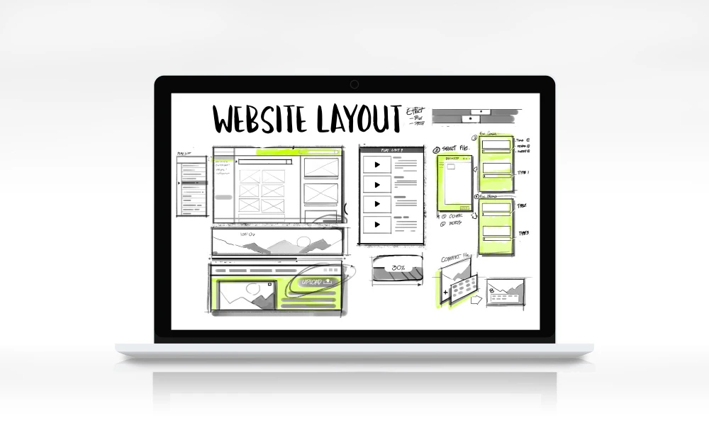
Typography is the art and technique of arranging type to make written language legible, readable, and appealing when displayed. It involves selecting typefaces, point sizes, line lengths, line-spacing, and letter-spacing, as well as adjusting the space between pairs of letters.
Why is Typography Important in Web App Design?
Readability: The primary goal of typography in web app design is to ensure readability. Well-chosen typefaces and proper text formatting make it easier for users to read and comprehend the content on the screen, leading to better user engagement and satisfaction.Accessibility: Good typography practices contribute to the overall accessibility of a web app. By using appropriate font sizes, line heights, and color contrasts, users with visual impairments or reading disabilities can better understand and navigate the content.
Branding: Typography is an essential part of a brand's visual identity. Consistent use of specific typefaces, styles, and treatments across a web app reinforces the brand's personality and helps users recognize and remember the brand more easily.
User Experience: Typography plays a significant role in enhancing the overall user experience (UX) of a web app. Well-designed typography guides users through the content, establishes a clear hierarchy, and creates visual cues that aid navigation and comprehension.
Emotional Impact: Typography has the power to evoke emotions and set the tone for a web app. Certain typefaces and typographic treatments can convey a sense of professionalism, playfulness, or elegance, thereby shaping the user's perception of the app.
Typography Best Practices for Web App Design
Typeface Selection: Choose typefaces that are legible, especially at smaller sizes, and suitable for on-screen reading. Sans-serif fonts (e.g., Arial, Helvetica, Roboto) are often preferred for body text, while serif fonts (e.g., Times New Roman, Georgia) can be used for headings or larger text blocks.Font Size: Use appropriate font sizes to ensure readability. Body text should typically be between 16 and 18 pixels, while headings and subheadings should be larger and proportional to their hierarchy.
Line Height: Adequate line spacing, or line height, improves readability by preventing text from appearing too cramped or spaced apart. A line height of 1.5 to 2 times the font size is generally recommended.
Letter Spacing: Proper letter spacing, or tracking, enhances readability by preventing letters from appearing too close or too far apart. Adjust letter spacing based on the typeface and text size.
Contrast: Ensure sufficient contrast between text and background colors. Dark text on a light background or light text on a dark background is typically preferred for optimal readability. Avoid low-contrast color combinations that can strain the user's eyes.
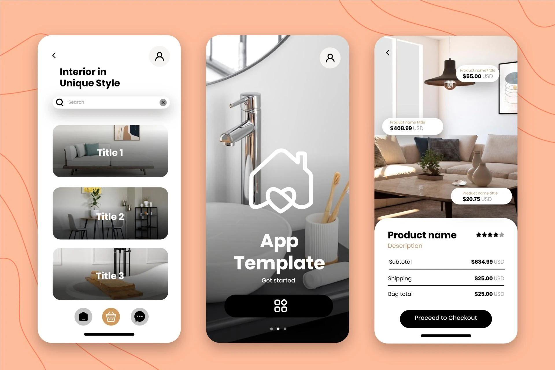
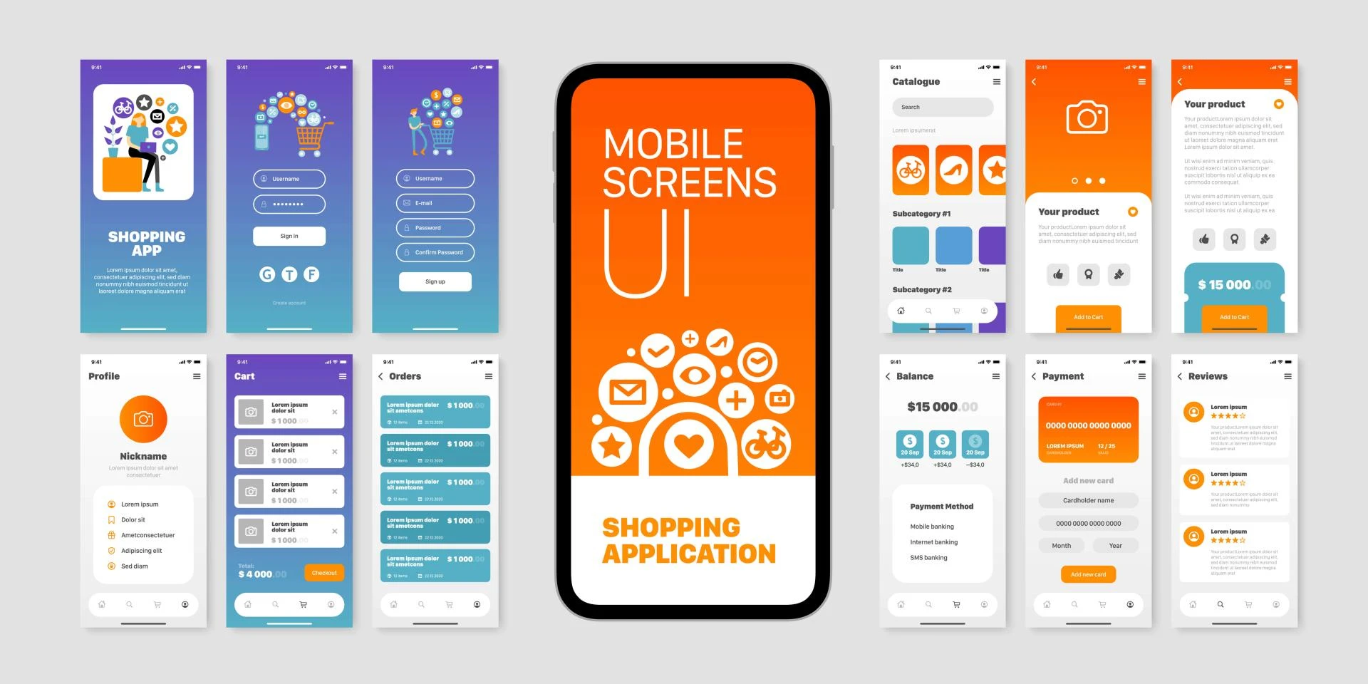
Hierarchy: Establish a clear typographic hierarchy by using different font sizes, weights, and styles for headings, subheadings, body text, and other elements. This hierarchy helps users quickly scan and understand the content structure.
Consistency: Maintain consistency in typography throughout the web app. Use the same typefaces, sizes, and styles for similar elements to create a cohesive and predictable experience for users.
Responsive Typography: In today's multi-device world, it's crucial to ensure that typography remains legible and visually appealing across different screen sizes and resolutions. Use responsive typography techniques, such as fluid typography or responsive font sizing, to adapt text to various viewports.
Accessibility Considerations: Follow accessibility guidelines when designing typography for web apps. This includes using appropriate color contrasts, providing alternative text for images and icons, and ensuring content is structured and organized in a logical manner.
Testing and Refinement: Test typography on various devices, browsers, and with different user groups to identify and address any readability or usability issues. Continuously refine and optimize typography based on user feedback and data-driven insights.
Conclusion
Typography is a powerful tool in web app design that should not be overlooked. By carefully considering typeface choices, font sizes, spacing, and hierarchy, designers can create visually appealing and highly readable interfaces that enhance the overall user experience. Effective typography not only improves readability and accessibility but also contributes to a stronger brand identity and emotional connection with users. As web apps continue to evolve, the role of typography will remain crucial in ensuring a seamless and engaging digital experience.
Devoq Design is a premier UI/UX design agency with a significant presence in Bhiwadi and Udaipur, renowned for its exceptional design services. As a top UI/UX design agency in Bhiwadi, Devoq Design is committed to crafting user-friendly and visually appealing digital solutions that cater to the specific needs of its clients. Similarly, as a leading UI/UX design agency in Udaipur, the company utilizes its extensive expertise to deliver superior design services that enhance user experience and drive business growth. With a focus on innovation and quality, Devoq Design helps businesses in both Bhiwadi and Udaipur excel in the competitive digital market.


Sign in to leave a comment.