In the early days of web design, the concept of "above the fold" reigned supreme. Borrowed from newspaper layout terminology, it referred to the content visible without scrolling on a web page. Designers and marketers alike obsessed over cramming as much vital information as possible into this prime real estate, fearing that users wouldn't venture further down the page.
Fast forward to today, and the digital landscape has dramatically shifted. With the proliferation of mobile devices, varying screen sizes, and evolving user behaviors, it's time to rethink our approach to landing page design. The fold still matters, but its importance has diminished in favor of a more holistic, scroll-friendly approach that prioritizes user engagement and conversion throughout the entire page.
The Myth of the Fold
The idea that users don't scroll is a persistent myth that has been debunked time and time again. Numerous studies have shown that modern web users are not only willing to scroll but expect to do so. The ubiquity of social media feeds and infinite scrolling has trained us to explore content beyond what's immediately visible.
This doesn't mean we should abandon all considerations for above-the-fold content. The initial viewport still plays a crucial role in capturing attention and setting expectations. However, we need to shift our focus from cramming everything important above the fold to creating a compelling narrative that encourages further exploration.
Embracing the Scroll
Instead of fighting against scrolling behavior, smart designers are now leveraging it to create more engaging and effective landing pages. Here are some key strategies for embracing the scroll:
Use the fold as a teaser: Treat the above-the-fold area as a hook that entices users to explore further. Include a strong headline, a clear value proposition, and visual cues that hint at more content below.Create a visual hierarchy: Design your page with a clear visual hierarchy that guides the user's eye through the content. Use whitespace, typography, and imagery to create a natural flow that encourages scrolling.
Implement progressive disclosure: Reveal information gradually as the user scrolls, maintaining their interest and preventing overwhelm. This technique can be particularly effective for complex products or services.
Utilize sticky elements: Keep key calls-to-action (CTAs) or navigation menus visible as users scroll, ensuring that conversion opportunities are always within reach.
Incorporate interactive elements: Use animations, parallax scrolling, or other interactive features that respond to user scrolling, creating a more engaging and memorable experience.
The Mobile-First Mindset
The rise of mobile browsing has fundamentally changed how we approach web design. With smaller screens and touch-based interactions, the concept of the fold becomes even more fluid on mobile devices. A mobile-first design approach forces us to prioritize content and focus on the core message, which often leads to stronger designs across all devices.
When designing for mobile, consider the following:
Prioritize content ruthlessly: Determine what's truly essential and present it in a clear, concise manner.Optimize for thumb-friendly interactions: Place important elements within easy reach of the user's thumb, especially on larger mobile devices.
Use expandable sections: Implement accordions or expandable sections to allow users to access detailed information without overwhelming the initial view.
Leverage native mobile behaviors: Design with gestures like swiping and pinch-to-zoom in mind to create a more intuitive mobile experience.
The Psychology of Scrolling
Understanding the psychology behind user scrolling behavior can help us create more effective landing pages. Some key insights include:
The serial position effect: Users tend to remember items at the beginning and end of a list better than those in the middle. Apply this principle to your page layout by placing key information at the top and bottom of the page.Curiosity gap: Create intrigue by hinting at valuable information further down the page, encouraging users to keep scrolling to satisfy their curiosity.
Endowed progress effect: Show users how far they've scrolled or how much of the content they've consumed to motivate them to complete their journey through the page.
Cognitive load: Break up long pages into digestible sections to reduce cognitive load and maintain user engagement.
Measuring and Optimizing Scroll Depth
To truly understand how users interact with your landing page, it's essential to measure scroll depth and other engagement metrics. Tools like Google Analytics and heatmap software can provide valuable insights into how far users are scrolling and where they're spending the most time.
Use this data to optimize your page layout:
Identify drop-off points: Look for areas where users tend to abandon the page and consider ways to improve engagement in those sections.Analyze time spent: Determine which parts of your page are holding users' attention the longest and consider emphasizing or expanding on that content.
Test different layouts: Experiment with various content arrangements and measure their impact on scroll depth and conversion rates.
Optimize for different devices: Analyze scroll behavior across devices and tailor your layout accordingly.
The Future of Landing Page Design
As we move beyond the fold, the future of landing page design lies in creating immersive, narrative experiences that guide users through a compelling story. Some emerging trends to watch include:
Micro-interactions: Small, delightful animations that respond to user actions can create a more engaging scrolling experience.AI-powered personalization: Dynamically adjust page content based on user behavior and preferences to create more relevant, engaging experiences.
Horizontal scrolling: While not suitable for all contexts, horizontal scrolling can offer a unique and memorable user experience when done well.
Virtual and augmented reality: As these technologies become more mainstream, they may open up new possibilities for creating truly immersive landing page experiences.
Conclusion
The concept of the fold is not dead, but its importance has evolved. Modern landing page design requires a more nuanced approach that considers the entire user journey, from the initial viewport to the final call-to-action. By embracing scrolling behavior, prioritizing content effectively, and creating engaging, narrative experiences, we can design landing pages that not only capture attention but also drive meaningful engagement and conversions.
As we continue to push the boundaries of web design, let's remember that the ultimate goal is to create experiences that resonate with users and effectively communicate our message. By looking beyond the fold and considering the entire page as a canvas for storytelling, we can create landing pages that are not just visually appealing but truly effective in achieving our goals.
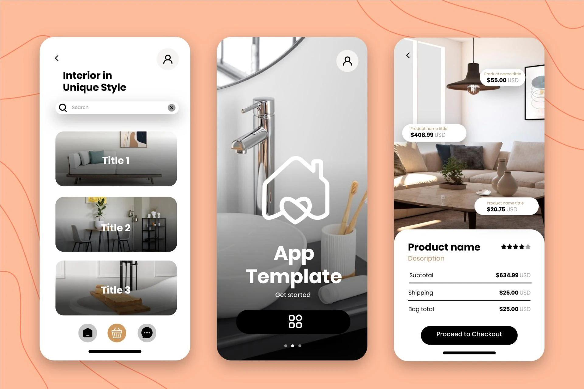
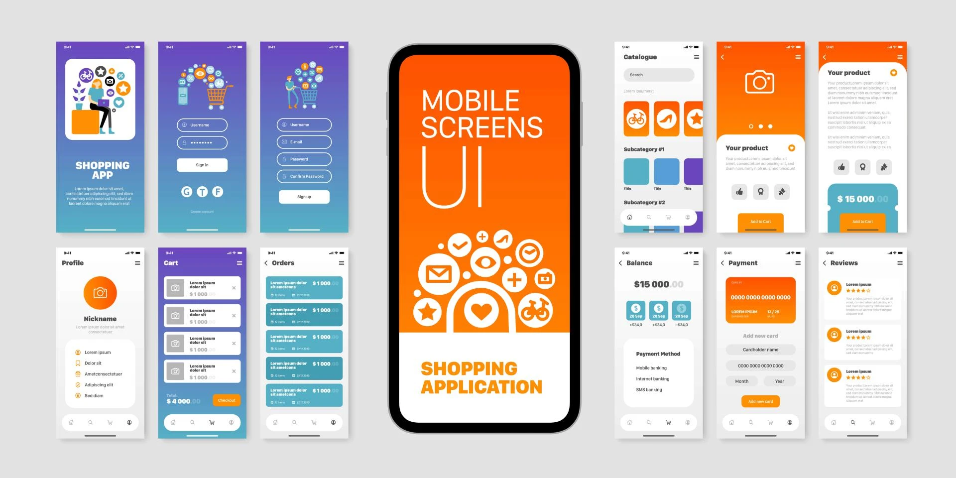
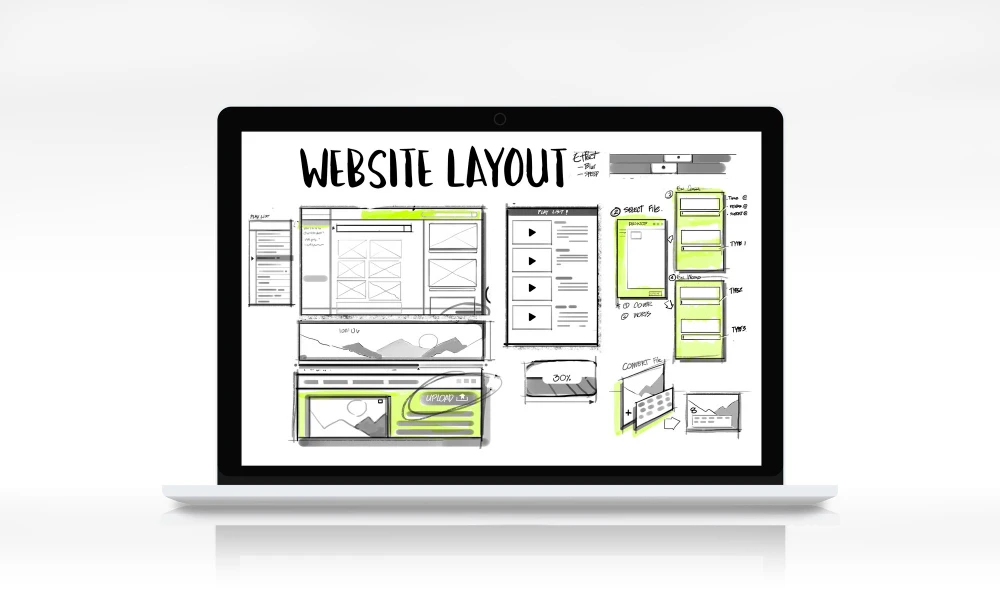
My Fiver link for : Figma Landing Page Design Service


Sign in to leave a comment.