Colored QR codes often look better than the traditional black-and-white version. They blend into branding, feel more intentional, and don’t scream “technical.”
Still, the same concern comes up again and again:
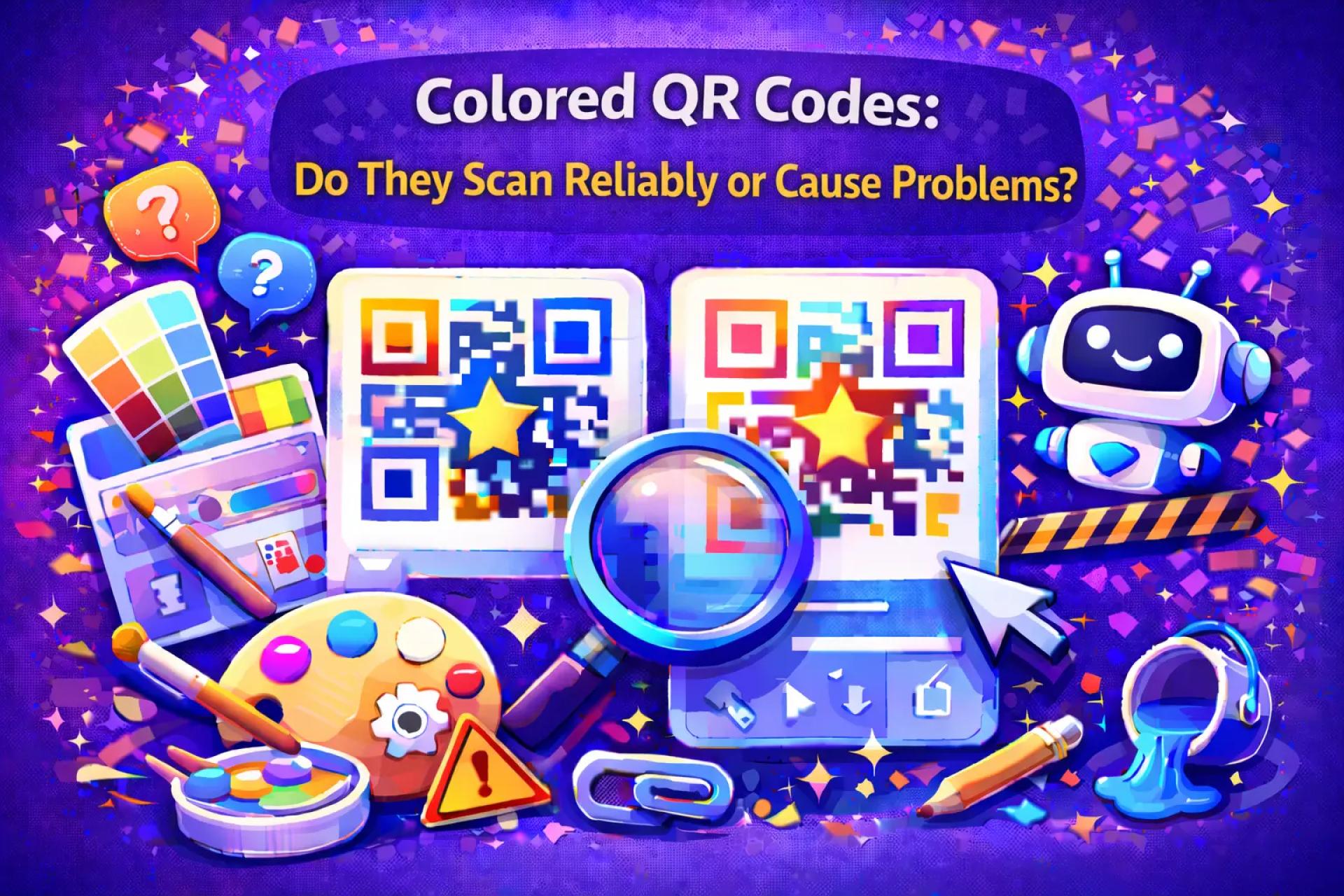
Do colored QR codes actually work?
The answer is yes — but only when a few non-obvious rules are respected. Most failures blamed on color are really failures of contrast, environment, or design restraint.
QR Scanners Don’t Care About Color
QR scanners don’t interpret color the way people do. They aren’t looking for “black” and “white” — they’re looking for clear differences between dark and light areas.
That’s why:
- A colored QR code can scan perfectly
- A black-and-white QR code can fail
Color is allowed. Ambiguity is not.
Contrast Is the Real Requirement
If there’s one rule that matters more than anything else, it’s contrast.
Designs that usually scan well
- Dark QR patterns on light backgrounds
- Solid colors with clean edges
- Simple, uncluttered placement
Designs that often fail
- Light or pastel QR codes
- Low-contrast brand palettes
- QR codes placed on photos or textured backgrounds
If the QR code blends into its surroundings, scanners have less information to work with.
Real-World Conditions Expose Weak Designs
QR codes aren’t scanned in ideal environments.
They’re scanned:
- In bright sunlight
- Under uneven indoor lighting
- On glossy posters
- From awkward angles and distances
Low-contrast colored QR codes are far more sensitive to these conditions. High-contrast designs tend to survive them.
Printed Colored QR Codes Need Extra Margin
Print makes everything harder.
Ink absorption, paper texture, and color variation all reduce clarity. A QR code that looks “fine” on screen can become unreliable once printed.
For printed colored QR codes:
- Use darker colors than you think you need
- Increase the size slightly
- Avoid subtle or decorative designs
If it’s borderline on screen, it will likely fail on paper.
Color Plus Logos Shrinks the Safety Net
Using color alone is usually safe when contrast is strong. Adding a logo on top of that reduces the margin for error.
If you combine both:
- Keep the logo small
- Avoid light colors near the center
- Use higher error correction
- Test in real conditions
Each extra design choice removes some of the QR code’s built-in tolerance.
Safe Customization Practices
Colored QR codes work best when customization supports clarity, not aesthetics alone.
Good habits include:
- Choosing contrast before brand accuracy
- Avoiding gradients and transparency
- Keeping backgrounds clean
- Testing before publishing or printing
Tools like QRColor are designed to support safe color customization while preserving scan reliability.
You can explore practical customization options at 👉 https://qrcolor.com
Testing Is the Final Authority
No guideline replaces real testing.
Always scan colored QR codes:
- On multiple phones
- With different camera apps
- In bright and low light
- At the final size and distance
If scanning feels slow or unreliable, simplify the design. People won’t retry.
When Black-and-White Is Still the Better Choice
There are cases where color adds more risk than value:
- Very small QR codes
- Long-distance scanning
- Outdoor placement with unpredictable lighting
- High-stakes or critical use cases
In those situations, classic black-and-white QR codes remain the safest option.
Final Takeaway
Colored QR codes do work — reliably — when contrast, environment, and restraint come first. Most scan failures aren’t caused by color itself, but by designs that try to be subtle instead of clear.
If clarity leads and branding follows carefully, colored QR codes can scan just as fast as traditional ones — without sacrificing visual identity.


Sign in to leave a comment.