Introduction
In today's digital age, where smartphones and tablets have become ubiquitous, designing for mobile-first has become imperative. Mobile-first design is a strategy that prioritizes the mobile user experience (UX) over the desktop experience. This approach ensures that websites and applications are optimized for mobile devices, providing users with a seamless and enjoyable experience regardless of the device they use.
Understanding Mobile Users
Statistics on Mobile Usage
Mobile devices account for a significant portion of internet traffic, with more users accessing the internet through mobile devices than desktops. According to Statista, mobile devices accounted for over 50% of global website traffic in 2021.
Behavior Patterns of Mobile Users
Mobile users exhibit distinct behavior patterns compared to desktop users. They tend to have shorter attention spans and expect quick access to information. Mobile users also prefer apps and websites that are easy to navigate and interact with on smaller screens.
Key Principles of Mobile-First Design
Content Prioritization
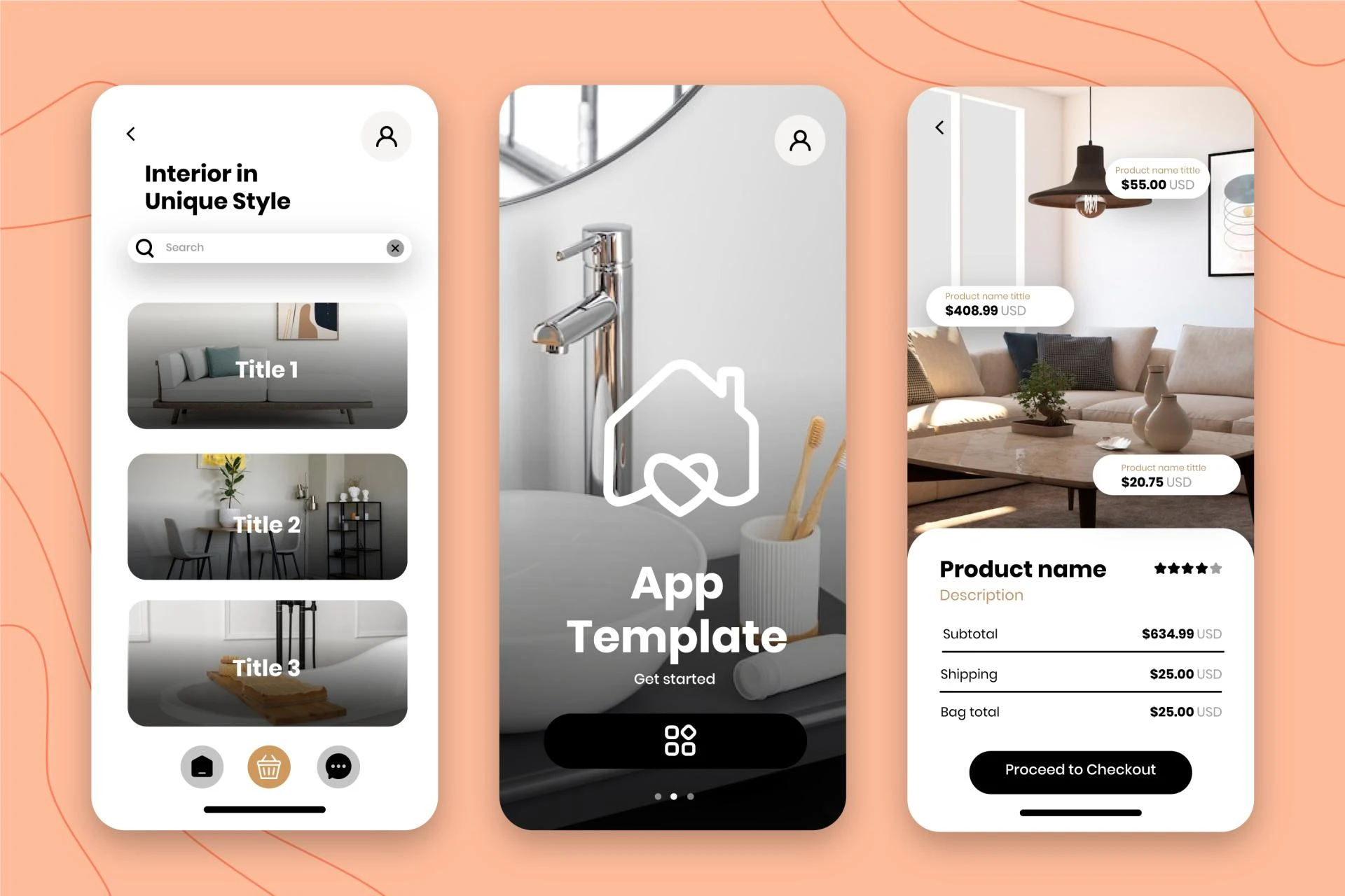
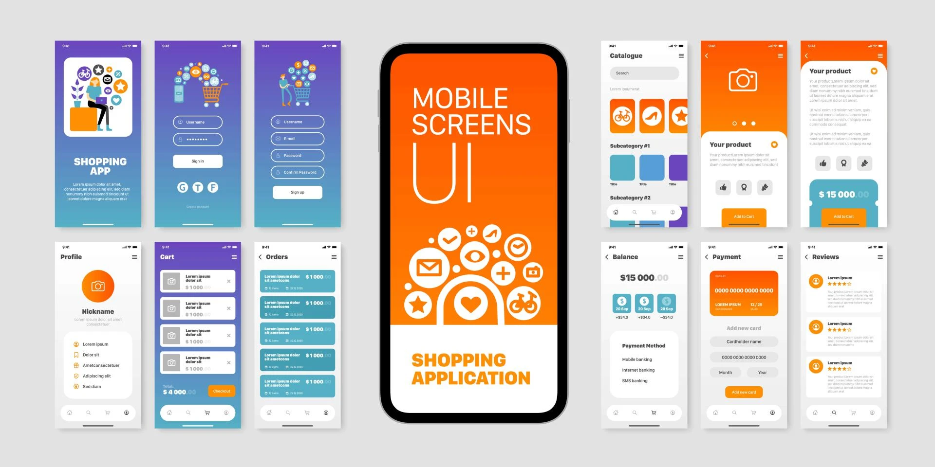
Mobile-first design prioritizes essential content and features, ensuring that they are easily accessible on mobile devices. This involves simplifying content and focusing on what is most important to the user.
Simplified Navigation
Mobile-first design emphasizes simple and intuitive navigation menus, making it easy for users to find what they are looking for quickly. This includes using clear labels and minimizing the number of menu items.
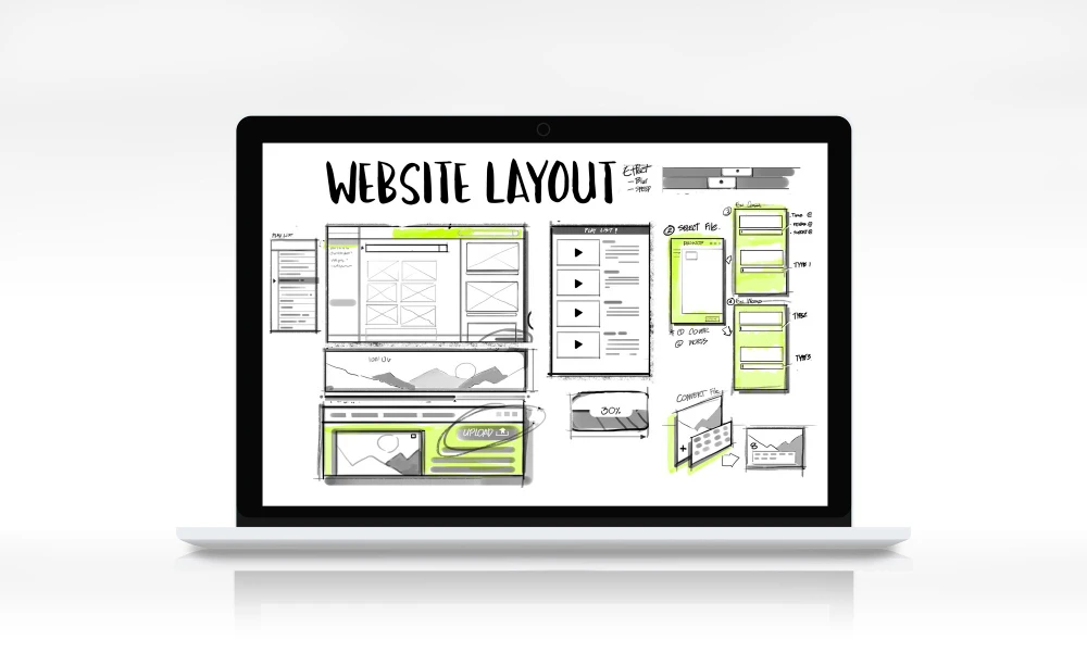
Responsive Layouts
Responsive design ensures that websites and applications adapt to different screen sizes and orientations. This is achieved through the use of flexible grids and layouts that adjust based on the device's screen size.
Optimizing User Experience (UX)
Fast Loading Times
Mobile users expect websites and applications to load quickly. To optimize loading times, designers should minimize file sizes, use caching techniques, and prioritize content that is above the fold.
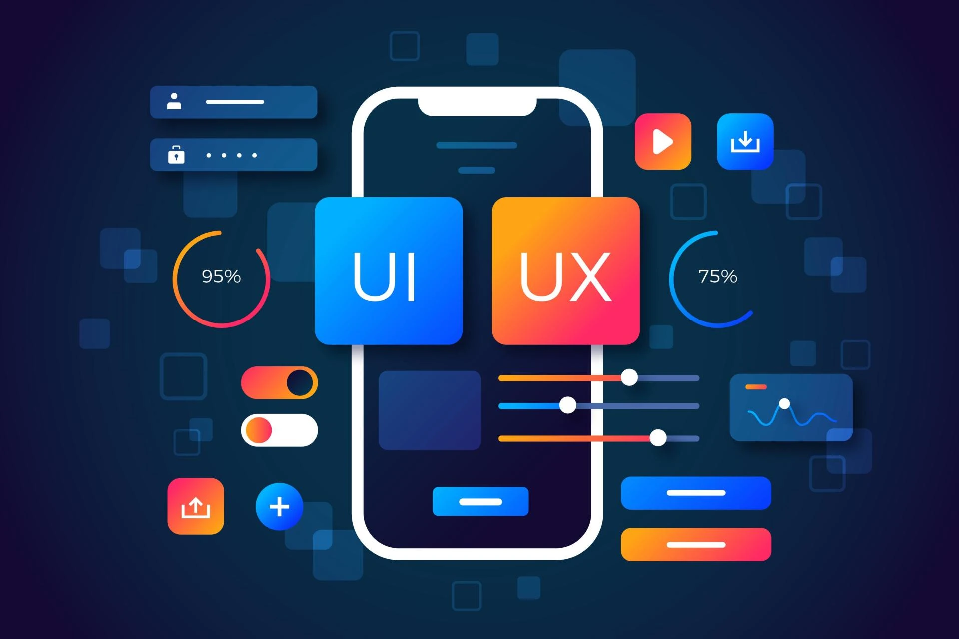
Intuitive User Interface (UI)
A well-designed UI is crucial for a positive user experience. Mobile-first design focuses on creating interfaces that are intuitive and easy to use, with clear calls to action and minimal distractions.
Touch-Friendly Design Elements
Mobile devices rely on touchscreens for user interaction, so it's essential to design with touch in mind. This includes using large, tappable buttons and ensuring that interactive elements are easy to access.
Designing for Different Screen Sizes
Adaptable Layouts
Mobile-first design requires layouts that can adapt to different screen sizes and orientations. This ensures that content is displayed correctly and that users can access all features regardless of their device.
Scalable Images and Fonts
Images and fonts should be scalable to ensure they look crisp and clear on all devices. Using vector graphics and responsive font sizes can help achieve this.
Tools and Resources for Mobile Design
Design Frameworks
Frameworks like Bootstrap and Foundation offer pre-built templates and components that are optimized for mobile devices, making it easier to create mobile-friendly designs.
Testing Tools for Mobile Responsiveness
Tools like Google's Mobile-Friendly Test and BrowserStack allow designers to test their websites across different devices and screen sizes, ensuring that they are responsive and user-friendly.
Future Trends in Mobile Design
Augmented Reality (AR) Integration
AR technology is becoming more prevalent in mobile applications, offering immersive experiences that blend the physical and digital worlds.
Voice User Interface (VUI) Advancements
With the rise of voice assistants like Siri and Alexa, VUIs are becoming increasingly important in mobile design. Designers should consider integrating VUIs into their designs to provide a more seamless user experience.
Conclusion
Designing for mobile-first is no longer a choice but a necessity in today's digital landscape. By following the principles outlined in this article and staying abreast of emerging trends, designers can create mobile experiences that are both effective and enjoyable for users.
Visit my Upwork profile for - UI/UX design, Web design & Mobile design


Sign in to leave a comment.