Why paper decisions affect behaviour long before content does
The physical experience starts before the first page
Readers form an opinion of a magazine before they read a single word. That judgement is not based on headlines or imagery. It happens the moment the magazine is picked up.
Weight, surface texture, stiffness, and even temperature all register immediately. These cues tell the reader what kind of experience to expect. Whether the magazine feels relaxed or formal. Disposable or deliberate. Temporary or worth keeping.
This reaction is automatic. Readers rarely articulate it, but it shapes how they engage with what follows.
Paper choice quietly sets expectations. Once those expectations are formed, content is read through that lens.
Why paper is not a neutral background
Paper is often treated as a backdrop for design, something that simply holds ink. In practice, it behaves more like an active participant.
Certain papers invite slower reading. Others encourage skimming. Some support long-form text comfortably, while others push readers toward visuals and captions.
These effects are not abstract. They show up in how long readers spend with an issue, which sections they linger on, and whether the magazine is revisited or forgotten.
Ignoring this relationship doesn’t make it disappear. It just hands control to chance.
Glossy paper and how it changes reading behaviour
Why gloss encourages scanning over immersion
Gloss-coated paper is chosen for impact. It delivers sharp imagery, high colour contrast, and immediate visual clarity.
But that same surface changes how people read.
Gloss reflects light. In many environments, especially offices and public spaces, this creates glare. Readers instinctively tilt pages, shift position, or shorten reading sessions to avoid discomfort.
As a result, text-heavy sections on glossy paper are often skimmed rather than absorbed. Headlines, pull quotes, and images perform well. Long paragraphs less so.
This doesn’t make gloss a mistake. It simply means it suits certain editorial priorities better than others.
When gloss works as intended
Glossy paper performs best when the magazine is designed to be browsed, not studied.
Lifestyle publications, fashion magazines, product-led titles, and photo-driven editorials all benefit from gloss because the reading behaviour aligns with the content. Readers expect to move quickly. Visual impact matters more than sustained attention.
Problems arise when gloss is paired with dense editorial writing. The paper encourages one type of engagement while the content demands another.
That mismatch is often mistaken for weak writing, when it’s actually a material decision at work.
Matt and silk papers and their effect on attention
Why reduced glare changes reading pace
Matt and silk stocks absorb light instead of reflecting it. This small physical difference has a large behavioural impact.
Readers spend longer on pages that don’t fight back visually. Eyes move more comfortably across text. Posture relaxes. Distractions reduce.
This makes matt and silk papers better suited to essays, interviews, long-form features, and technical content. The paper supports the act of reading instead of competing with it.
Many readers can’t explain why they prefer these magazines. They just describe them as “easier” to read.
How surface texture influences trust
Surface texture also affects perception of seriousness.
Matt and silk papers tend to feel calmer and more deliberate. They signal restraint. That signal carries into how content is received.
A long article printed on uncoated or lightly coated stock often feels more credible, even if the words are identical to those printed on gloss.
This effect is subtle but consistent. It’s one reason why professional, academic, and trade publications rarely rely on high-gloss interiors.
Paper weight and its psychological signals
How weight affects perceived value
Paper weight sends signals immediately.
Heavier stocks suggest permanence and care. Lighter stocks suggest flexibility or disposability. Neither is inherently good or bad, but they communicate intent.
A magazine printed on very light paper may feel easy to handle, but it can also feel temporary. Readers may flick through it once and move on.
A heavier magazine slows handling. Pages turn more deliberately. The publication feels like something to keep nearby rather than discard quickly.
The key is alignment. The weight should match the role the magazine plays in the reader’s life.
When heavier paper backfires
More weight is not always better.
Heavy paper increases fatigue during longer reading sessions. It makes magazines harder to hold casually. It can also create resistance when turning pages, especially in thicker issues.
In some cases, readers engage less because the magazine feels physically demanding.
This is particularly noticeable in commuter settings or shared environments where magazines are read in short bursts.
Choosing weight without considering context often leads to unintended consequences.
How paper affects the way pages are navigated
Page turning and flow
Paper stiffness influences how pages turn and settle. Some stocks spring back slightly, making it harder to keep a magazine open. Others lie flatter and stay put.
These physical behaviours affect reading flow.
Magazines that resist staying open discourage deep reading. Readers subconsciously shorten sessions or abandon articles earlier.
Paper that supports easy page turning encourages continuity. The reader moves forward without interruption.
These effects are rarely discussed, but they are noticed every time someone reads.
Margins, gutters, and readability
Paper choice also affects how forgiving layouts are.
Thicker papers exaggerate binding tension. Text placed too close to the gutter becomes harder to read. Lighter papers are more flexible but may show shadowing if ink density is high.
Designers often compensate for these issues visually, but paper behaviour ultimately decides whether those adjustments succeed.
This is why paper selection should happen before layouts are finalised, not after.
A comparison of paper types and reading behaviour
| Paper type | Common effect on reading | Best suited for |
| Gloss | Encourages scanning and visual browsing | Lifestyle, fashion, photo-led magazines |
| Silk | Balanced reading pace with visual clarity | Mixed editorial and imagery |
| Matt | Slower, more focused reading | Long-form, professional, editorial-heavy titles |
| Uncoated | Intimate, tactile reading experience | Literary, independent, niche publications |
Environmental context matters more than people expect
Where magazines are actually read
Many paper decisions are made assuming ideal reading conditions. In reality, magazines are read under imperfect circumstances.
Cafés with overhead lighting. Offices with reflective surfaces. Waiting rooms with mixed light sources. Homes with lamps placed for comfort, not readability.
Paper that performs well in a studio can struggle in these environments.
Publishers who understand this test paper choices under real conditions, not controlled ones.
Shared spaces change behaviour
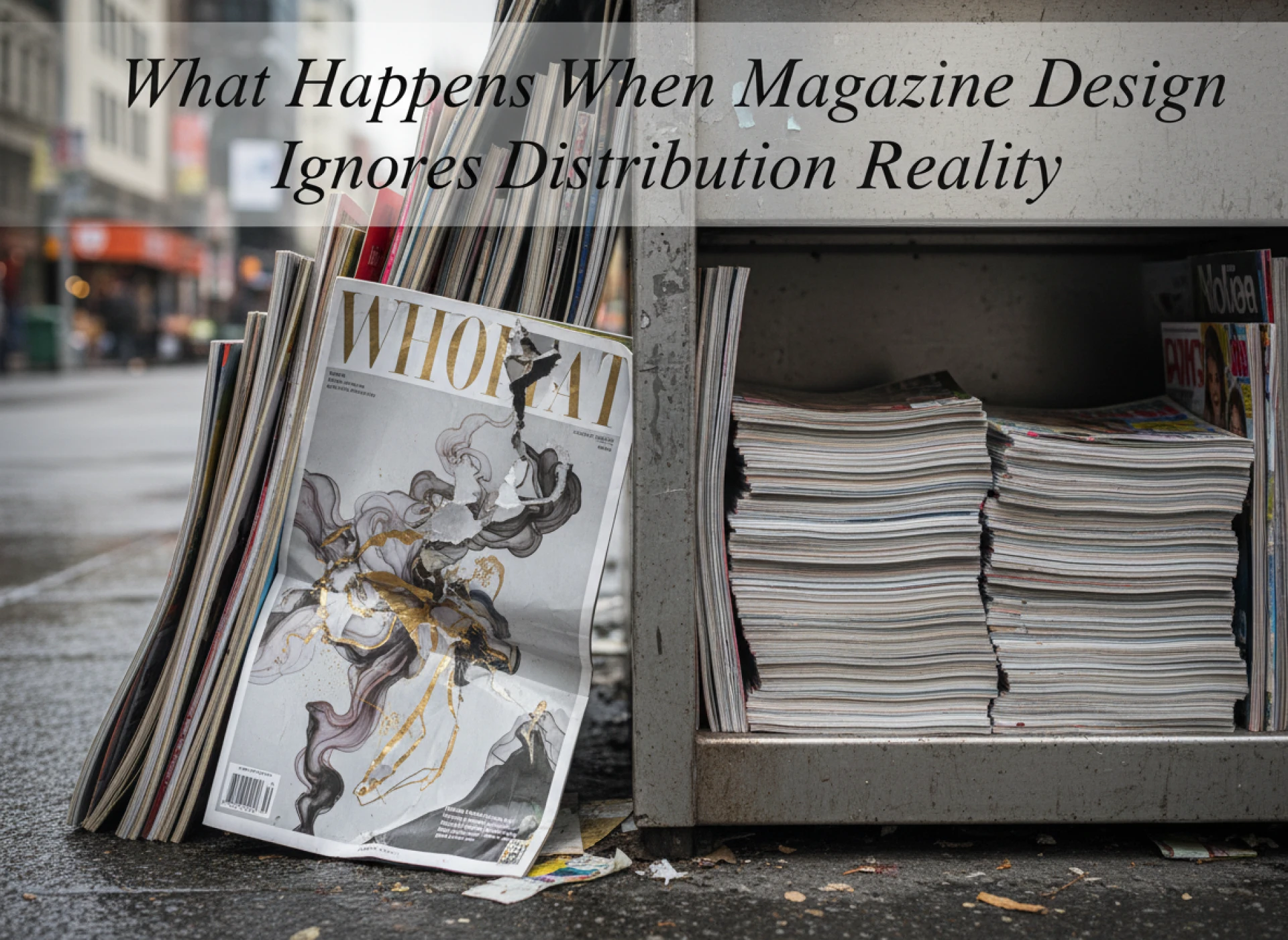
In shared spaces, readers are less patient. They skim more. They handle magazines roughly. They leave them open on tables.
Paper that shows wear quickly reduces perceived quality fast. Paper that hides scuffs and fingerprints maintains credibility longer.
These factors influence not just reading, but whether a magazine is picked up again at all.
Why paper choice should follow editorial intent
Matching material to message
The most effective magazines choose paper that supports their editorial voice.
Quiet writing benefits from quiet materials. Bold visuals benefit from surfaces that amplify them.
When material and message align, readers don’t notice the paper. They notice the content.
When they don’t align, something feels off, even if readers can’t explain why.
Paper as part of editorial discipline
Experienced publishers treat paper as part of editing.
They ask what kind of reading they want to encourage. How long they want readers to stay. Whether the magazine should feel light or grounded.
Those questions lead to material choices that support behaviour, not just aesthetics.
Why this matters more now than before
Attention is shorter, not weaker
Readers aren’t less capable of focus. They’re more selective about where they give it.
Paper choice can either support that focus or undermine it.
In a crowded media environment, small physical decisions carry more weight than they used to.
Print still offers something digital cannot
Print controls pace. It shapes interaction physically.
Paper choice is one of the few tools publishers have to influence how content is experienced without adding noise.
Used well, it becomes an advantage rather than a cost.
Final perspective
Paper choice is not a finishing decision. It is a behavioural one.
It determines how magazines are handled, how long they are read, and whether they are returned to or forgotten.
Publishers who understand this treat paper as part of communication, not decoration. They choose materials that support the way they want their magazines to be read, not just the way they want them to look.
That understanding is often what separates magazines that merely exist from those that are genuinely engaged with — a distinction that experienced print partners such as I YOU PRINT recognise when guiding publishers through material decisions that go beyond surface appeal.


Sign in to leave a comment.