Why distribution problems rarely look like design mistakes at first
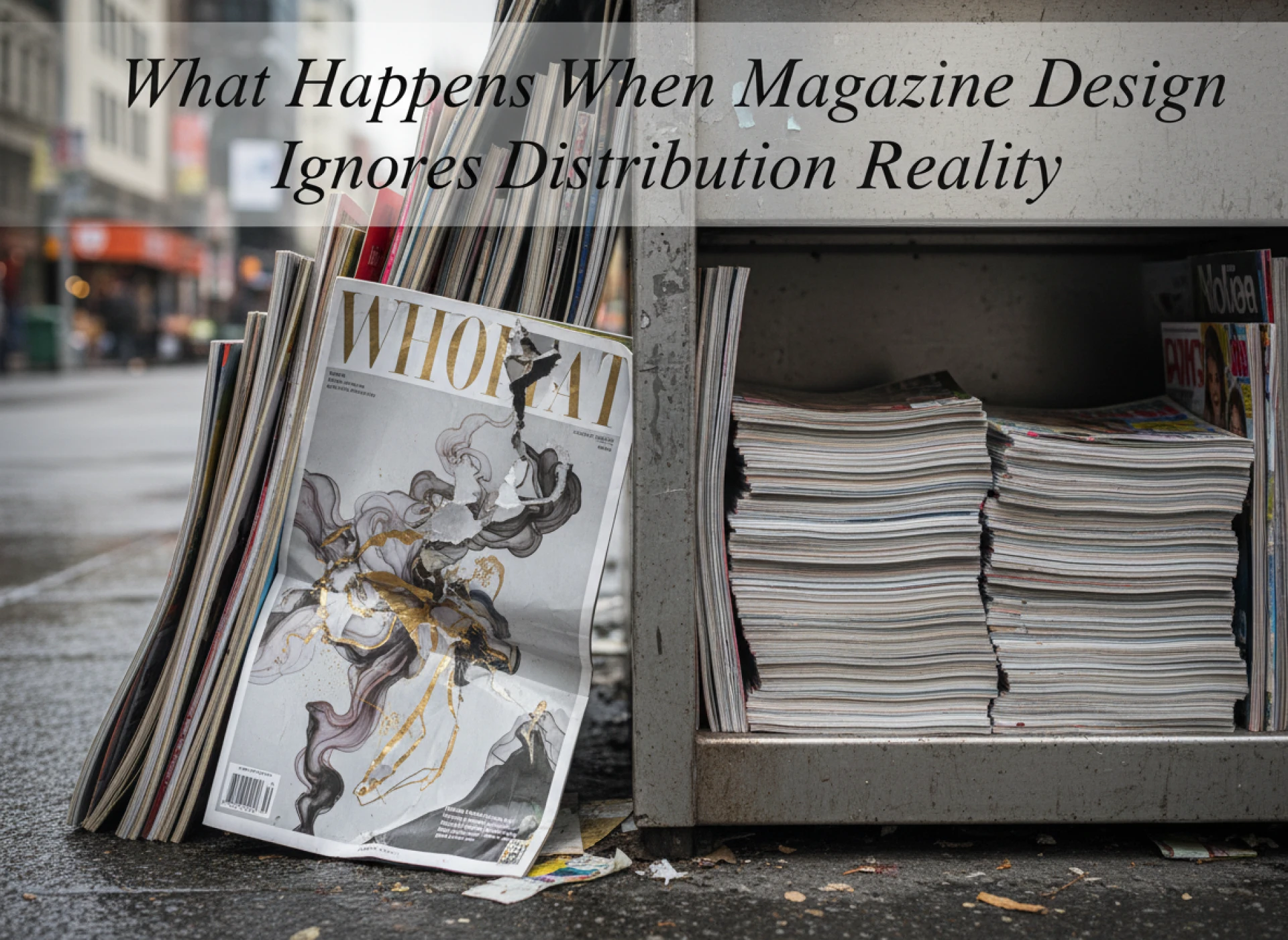
The magazine usually looks fine when it leaves the printer
Most magazines that struggle in the real world don’t fail immediately. They arrive stacked, shrink-wrapped, and neat. Covers look sharp. Pages sit square. Nothing appears wrong.
The problems start later. After the boxes are opened. After copies are handled. After the magazine begins doing what it was actually printed to do — move.
Design decisions that made sense on screen or on a proof table start behaving differently once the magazine enters circulation. Corners soften. Spines stress. Covers curl. Pages no longer sit flat.
At that point, the issue is rarely described as a design problem. It’s framed as a distribution issue, a mailing issue, or a handling issue. In reality, it started much earlier.
Why distribution exposes weaknesses design can hide
Design can disguise fragility. Distribution removes that disguise.
A magazine only reveals its real construction once it’s picked up repeatedly, posted, stacked, and moved through imperfect environments. That’s when materials, binding, margins, and finishes show whether they were chosen with movement in mind.
Design that ignores distribution often looks impressive in controlled conditions. It just doesn’t survive contact with reality.
How size decisions quietly affect circulation
When non-standard formats create logistical friction
Custom sizes are often chosen for distinction. They stand out visually. They feel intentional.
But once distribution begins, those same sizes create resistance.
Non-standard magazines don’t fit envelopes cleanly. They slide inside boxes. They overhang shelves. They bend under weight that standard formats absorb easily.
Each of these issues seems small on its own. Together, they slow distribution and increase damage.
For modern publications sent by post, a few millimetres can push a magazine into a different pricing band. For hand distribution, awkward sizes discourage casual pickup.
Design rarely accounts for this. Distribution has to.
Why standard sizes persist for a reason
A4 and A5 didn’t become dominant by accident. They survive because they behave predictably.
They stack evenly. They bind consistently. They fit packaging systems already in place.
Designers sometimes treat these formats as limitations. Distributors treat them as stability.
When magazines change size without a clear distribution reason, problems tend to follow.
Paper choice and its impact beyond aesthetics
How paper behaves once magazines leave controlled spaces
Paper performs differently once magazines are out in the world.
Gloss stocks show fingerprints quickly. Light papers crease easily. Heavy stocks scuff at corners during stacking.
In a studio, these issues are invisible. In cafés, offices, and waiting rooms, they appear fast.
Magazines designed without considering how paper reacts to repeated handling often look tired long before their content does.
Readers may not articulate why they stop picking them up. They just do.
Distribution wear changes perception, not just appearance
A magazine that looks worn loses authority.
Soft corners, curling covers, and visible scuffs send a message that the publication is temporary or disposable, even if the content is strong.
This is especially damaging for trade, society, and professional magazines, where credibility matters more than novelty.
Paper choice directly influences how long a magazine maintains its presence during circulation.
Binding decisions and how they affect movement
When binding resists handling
Some magazines fight being opened. Others fight being closed.
Perfect binding with insufficient margin allowance creates resistance. Pages pull toward the spine. Readers stop holding the magazine comfortably.
Saddle-stitched magazines with high page counts bow outward, making stacking unstable.
These are not printing faults. They are design decisions colliding with distribution behaviour.
Binding determines how a magazine moves, not just how it looks.
How spine behaviour affects storage and display
Spines matter once magazines are stored or displayed.
A spine that cracks early discourages shelving. A spine that collapses under weight makes magazines look disordered quickly.
Publications intended for reception areas or retail spaces often fail here. They weren’t designed to be stored visibly.
Distribution reality includes where magazines sit when they’re not being read.
Why margins and bleed matter more after printing
What happens when pages are handled repeatedly
Margins that look generous on screen can disappear after binding and handling.
When readers grip pages, content near edges suffers first. Text feels cramped. Images feel crowded.
Designers often optimise layouts for visual balance rather than physical interaction. Distribution exposes that mismatch.
Pages that survive handling without visual tension feel calmer to read, even after weeks in circulation.
Bleed decisions and edge damage
Full-bleed designs look striking. They also show damage immediately.
Any nick, bend, or scuff breaks the image edge. Over time, this accumulates visually.
Magazines designed with forgiving margins age better during distribution. They hide wear rather than advertising it.
This isn’t a creative compromise. It’s an understanding of how magazines live.
A practical look at design choices versus distribution outcomes
| Design choice | Distribution outcome | Long-term effect |
| Non-standard size | Difficult packaging and stacking | Higher damage rate |
| High-gloss interior | Visible wear and fingerprints | Reduced pickup over time |
| Tight inner margins | Reading discomfort | Shorter engagement |
| Heavy cover stock | Increased postage cost | Budget pressure |
| Full-bleed imagery | Edge damage visible | Faster perceived ageing |
How distribution timelines expose planning gaps
When urgency meets reality
Fast distribution schedules magnify design weaknesses.
Magazines rushed into circulation don’t get recovery time. There’s no opportunity to repackage, reinforce, or correct handling issues.
Designs that require ideal handling fail quickly under time pressure.
This is why next-day or rapid distribution works best with conservative, distribution-aware design choices.
Why testing matters more than assumptions
Many distribution problems could be avoided with simple testing.
Posting one copy. Leaving a magazine on a table for a week. Carrying it in a bag. Stacking it under weight.
These tests reveal issues that proofs never will.
Design that survives testing survives distribution.
Why ignoring distribution costs more than fixing it early
Hidden costs accumulate quietly
Distribution problems don’t appear as a single failure. They accumulate.
Higher postage. Reprints. Replacements. Reduced pickup rates. Shorter shelf life.
By the time the impact is noticed, the budget has already absorbed the damage.
Early distribution-aware design costs less than late-stage correction.
Reputation damage is harder to measure
Magazines that look compromised reflect poorly on the organisations behind them.
Readers may not complain. They simply disengage.
That disengagement is rarely traced back to design, but that’s often where it began.
Final perspective
Magazine design doesn’t end at the trim line. It ends when the magazine has moved, been handled, and still feels intact.
Publications that ignore distribution reality often look good briefly and then disappear quietly. Those that respect how magazines travel last longer, read better, and retain credibility under real conditions.
This understanding usually comes from experience — from watching magazines move through the world rather than just across a screen — which is why print partners such as I YOU PRINT emphasise distribution behaviour early, long before design decisions become difficult to reverse.


Sign in to leave a comment.