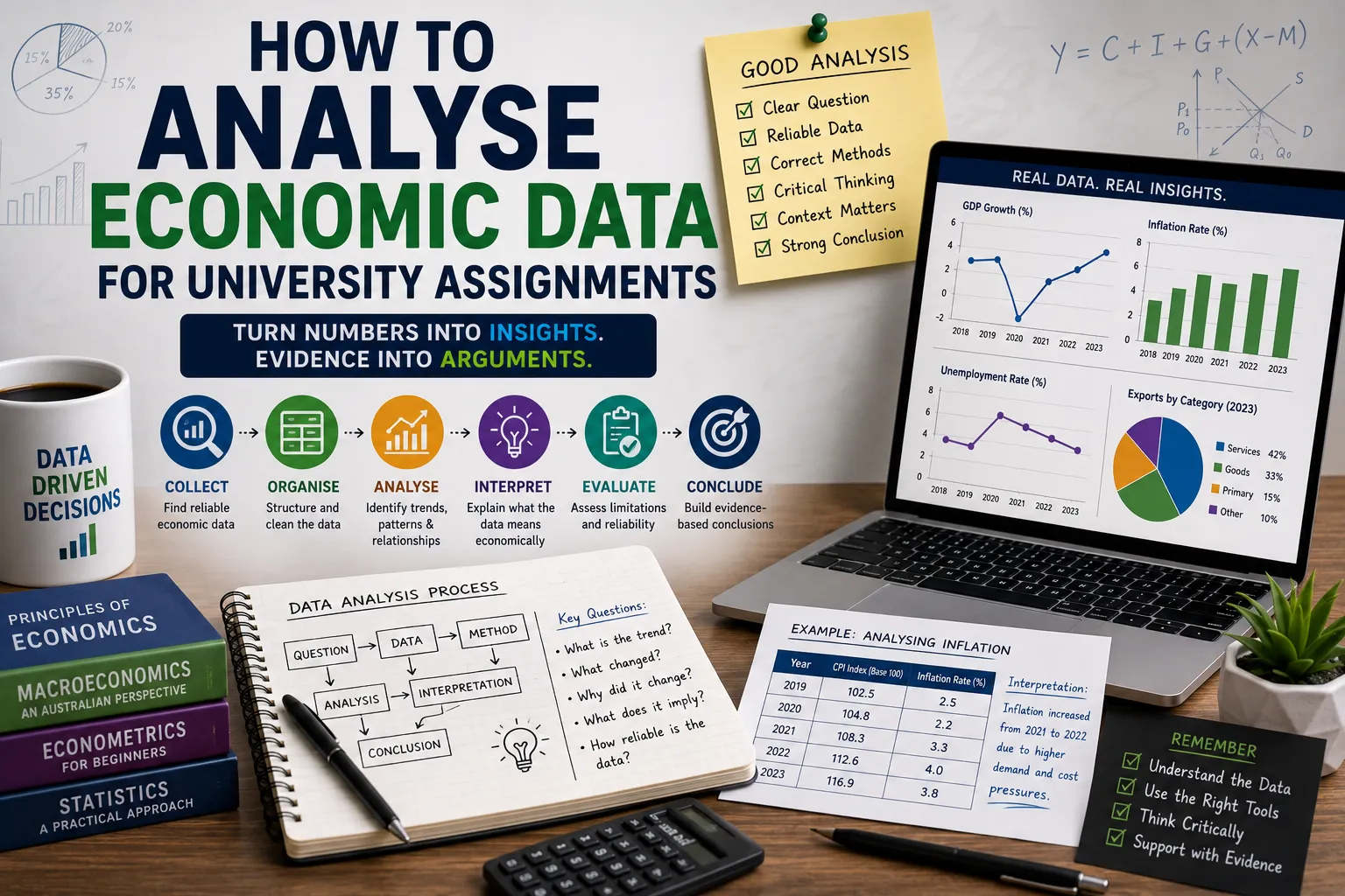

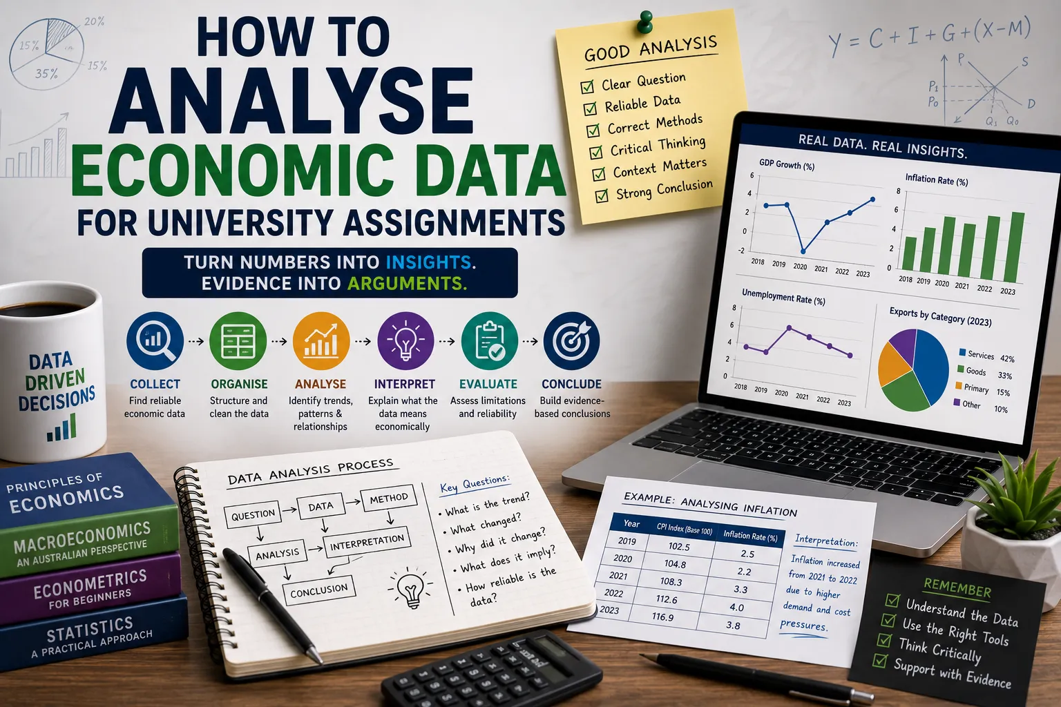
A student opens an assignment brief and finds a table of economic figures, a couple of graphs, or a dataset attached as a spreadsheet. The numbers are all there, GDP growth, unemployment rates, inflation figures, yet it is not obvious what to actually do with them. Simply restating that a number went up or down does not feel like enough, and it is not enough, because that is description rather than analysis.
Analysing economic data properly means identifying patterns, explaining possible causes, comparing relevant variables, interpreting economic relationships, and evaluating what the evidence genuinely shows. It is a skill that sits at the heart of most economics coursework, and it becomes far more manageable once broken into a clear process.
The core process this guide follows looks like this, understand, organise, analyse, interpret, evaluate, conclude. Strong economic data analysis always connects evidence with sound economic reasoning, rather than treating numbers as facts that speak entirely for themselves.
1. Understand What the Assignment Is Asking
Before touching any data, it pays to read the assignment question carefully. Instruction words carry real meaning in economics assignments, and each one implies a slightly different task. Common examples include analyse, compare, evaluate, explain, discuss, examine, assess and interpret.
There is a genuine difference between describing data and analysing it. A purely descriptive statement might say unemployment increased from one period to another. An analytical statement goes further, noting that an increase in unemployment may indicate weaker labour market conditions, although the change should be considered alongside factors such as economic growth, participation and the specific time period examined.
It is worth resisting the temptation to analyse every single figure provided. A strong assignment answers the actual question being asked, using only the evidence that genuinely supports that argument.
2. Identify the Type of Economic Data You Are Working With
Economic data comes in several different forms, and recognising which type you are working with shapes how it should be interpreted.
Time series data is collected over multiple periods, such as inflation tracked across several years, GDP growth measured across quarters, or unemployment recorded over time.
Cross sectional data compares different individuals, firms, regions or countries at a single point in time, for example comparing unemployment rates across several states in the same quarter.
Panel data combines both dimensions, tracking multiple entities across multiple time periods.
Common quantitative indicators used in university assignments include GDP, inflation, unemployment, interest rates, wages, productivity, trade figures and consumer spending. Understanding which category a dataset falls into affects the kinds of comparisons and conclusions that are actually appropriate.
3. Check the Source and Quality of the Data
Data credibility genuinely matters in university work, and it is worth checking a few things before relying on any figures. Who actually produced the data? When was it published? What period does it cover? What methodology was used to collect it? Are the figures based on estimates or actual observations? Are the definitions used consistent across the whole dataset? Are there any missing observations? Has the data been revised since its original release?
Credible sources typically include government statistical agencies, central banks, recognised international organisations, academic publications and reputable research institutions. Students should never invent specific datasets or statistics that were not actually provided or sourced, since doing so undermines the entire analysis regardless of how well argued the surrounding paragraphs might be.
4. Understand the Units, Definitions and Time Period
A number means very little until its context is properly understood. It is worth checking the units involved, whether figures are expressed as percentages or percentage points, whether values are in local currency or another currency, whether an index number is being used, whether a measure is expressed per person, whether figures are annual or quarterly, whether values are nominal or real, and whether data has been seasonally adjusted.
One distinction trips up a lot of students, the difference between a percentage change and a percentage point change. As a hypothetical example, if an unemployment rate moves from five per cent to seven per cent, that is a change of two percentage points, but expressed as a percentage change relative to the original figure, it actually represents a forty per cent increase. Mixing these two measures up can completely distort an economic argument.
5. Organise the Data Before Analysing It
Patterns are far easier to spot once data has been properly organised. Useful steps include cleaning inconsistent entries, sorting observations chronologically, grouping comparable categories together, building clear tables, labelling every variable, checking for missing values and recording the correct units alongside each figure.
Consider a simple hypothetical table showing quarterly inflation figures.
| Quarter | Inflation Rate |
|---|---|
| Quarter 1 | 3.2% |
| Quarter 2 | 3.8% |
| Quarter 3 | 4.1% |
| Quarter 4 | 3.6% |
Once information is organised this clearly, a student can immediately see the overall shape of the data rather than trying to hold scattered numbers in their head. It is also worth being cautious about removing or altering observations without genuinely understanding why they appear unusual or missing in the first place.
6. Look for Trends and Patterns
With the data organised, it becomes much easier to identify upward trends, downward trends, stable periods, sudden changes, turning points, cyclical patterns, seasonal patterns and unusual observations that stand apart from the rest.
Spotting a pattern is only the first half of the job. The more important question that follows is, what might explain this pattern? As a hypothetical example, if GDP growth slows steadily across four consecutive quarters while unemployment rises in the same period, a student might reasonably note that this pattern is consistent with weakening economic activity, while still being careful to describe this as a possible explanation rather than an established fact drawn from a single dataset.
It helps to clearly separate the observed pattern itself from any explanation offered for it, since these are two distinct steps in the analytical process.
7. Compare Economic Variables
Comparing related variables often reveals genuinely useful relationships. Common comparisons include inflation and interest rates, GDP growth and unemployment, wages and productivity, imports and exports, and household income and consumption.
It is essential to remember that correlation does not automatically prove causation. As a hypothetical example, if consumer spending and GDP growth both rise together over several quarters, this pattern alone does not prove that spending caused the growth, since both variables could be responding to a third factor entirely, such as improved consumer confidence or lower interest rates. The relationship is worth noting, but the causal claim needs far more careful support before it can be stated with confidence.
8. Use Economic Graphs Effectively
Graphs can make relationships between economic variables far easier to interpret than tables of raw numbers alone.
A line graph works well for showing trends over time, such as inflation tracked across several years. A bar chart suits comparisons across categories, such as unemployment rates across different regions. A scatter plot is useful for examining the relationship between two variables, such as interest rates against investment levels. A pie chart should only be used when the proportions of a genuine whole are relevant, which is relatively rare in most economics assignments.
Before relying on any graph, it is worth checking a few basics, the title, the axis labels, the units used, the time period covered, the scale chosen, any legend included and the original data source. A misleading scale or a poorly labelled axis can quietly distort how a graph appears to be interpreted, even when the underlying data itself is entirely accurate.
9. Calculate Useful Economic Measures
Some assignments require students to calculate specific measures rather than relying purely on the raw figures provided. Common calculations include percentage change, growth rate, average values, simple differences, ratios, per capita values and index changes.
A commonly used formula looks like this.
Percentage change equals new value minus old value, divided by old value, multiplied by one hundred.
As a short hypothetical example, if GDP rises from 500 billion to 520 billion over a year, the percentage change equals 520 minus 500, divided by 500, multiplied by one hundred, which comes to four per cent. In plain language, this means the economy grew by four per cent over that particular year. Every calculation included in an assignment should support the broader economic argument being made, rather than appearing on its own without any accompanying interpretation.
10. Connect the Data to Economic Theory
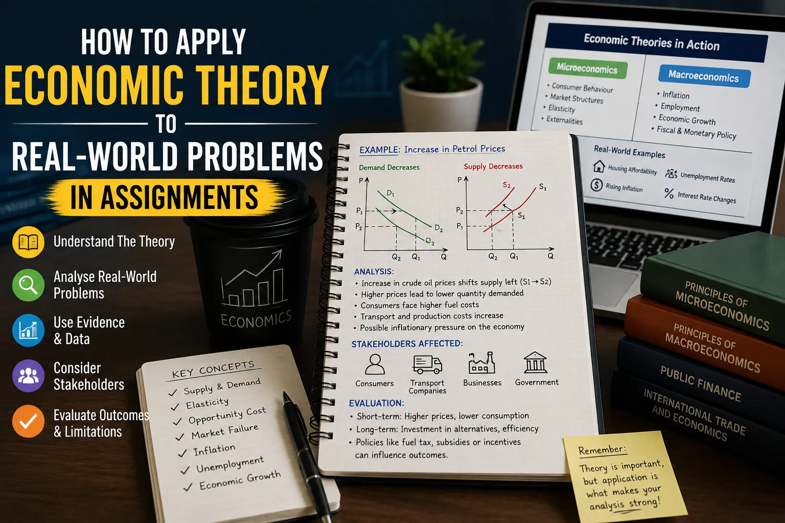
Economic data becomes far more meaningful once it is connected to relevant theoretical concepts rather than treated as isolated numbers.
Inflation may be linked to aggregate demand, supply conditions, expectations and monetary policy decisions. Unemployment may be linked to overall economic activity, labour demand, structural change within industries and the broader business cycle. Interest rates may be linked to borrowing behaviour, investment decisions, consumption patterns and inflation itself. GDP may be linked to economic growth, productivity, employment levels and living standards more broadly.
It is worth being careful not to force a theoretical explanation onto a dataset simply because the concepts sound related. A genuinely strong analysis chooses theory that actually fits the evidence observed, rather than working backwards from a favourite concept toward whatever numbers happen to be available.
11. Distinguish Correlation From Causation
This distinction causes more trouble in student work than almost any other analytical mistake, so it deserves careful attention.
Correlation simply means two variables change in a related way. Causation requires much stronger evidence that a change in one variable genuinely contributes to a change in another.
As a hypothetical example, a student might observe that ice cream sales and drowning incidents both rise during the same months. Clearly one does not cause the other, since both are actually driven by a third factor, warmer weather. The same logical caution applies to genuine economic variables. Students should consider other relevant variables, the possibility of reverse causality, confounding factors, time lags between cause and effect, and the wider economic context, before making any causal claim.
Cautious language is genuinely useful here, phrases such as may be associated with, is consistent with, could suggest, or may have contributed to, allow a student to describe a relationship honestly without overstating what limited data can actually prove.
12. Consider the Economic Context
Numbers rarely mean the same thing in every situation, so context matters enormously. Relevant contextual factors include business cycle conditions, government policy, monetary policy decisions, global economic conditions, supply shocks, labour market conditions, consumer behaviour, exchange rate movements and changes in regulation.
As a hypothetical example, a two per cent rise in inflation might be interpreted quite differently depending on the surrounding circumstances. During a period of strong economic growth, it might reflect healthy demand. During a period following a significant supply disruption, the very same numerical rise might instead reflect temporary cost pressures rather than genuine overheating in the economy. The number itself stays the same, yet the appropriate interpretation shifts considerably depending on context.
13. Identify Outliers and Unusual Results
An outlier is an observation that sits noticeably apart from the general pattern shown by the rest of the dataset. Possible explanations include data entry errors, changes in how a measurement was collected, a genuine and significant economic event, a one off shock, or a change in the underlying methodology used to calculate the figure.
As a hypothetical example, if quarterly GDP growth sits steadily around two per cent for several years and then suddenly drops to negative six per cent in a single quarter, this deserves investigation rather than automatic removal from the dataset. It might reflect a genuine major economic event worth discussing directly, or it might reflect a measurement issue that needs to be acknowledged. Either way, unusual observations should be examined thoughtfully rather than deleted purely for convenience.
14. Evaluate the Limitations of the Data
Strong university level analysis openly acknowledges the limitations of the evidence being used. Worth considering are small sample sizes, missing data points, measurement issues, short time periods that may not capture longer term patterns, inconsistent definitions across sources, data revisions, a limited number of variables available, a genuine lack of causal evidence, and any potential bias in how the data was collected.
Recognising these limitations openly actually strengthens an argument rather than weakening it, since it demonstrates that a student understands exactly how confidently their conclusions can reasonably be stated given the evidence available.
15. Turn Data Into an Economic Argument
There is a meaningful difference between simply presenting numbers and building a genuine economic argument around them. A useful structure to follow looks like this, claim, evidence, economic explanation, evaluation.
As a hypothetical example, a student might claim that a particular economic indicator changed significantly over the period studied. The evidence would then refer directly to the hypothetical data supporting that claim. The explanation would connect the observed change to a relevant economic mechanism, such as shifting demand conditions. Finally, the evaluation would consider alternative explanations or acknowledge relevant limitations in the underlying data. Following this structure consistently transforms a list of observations into a genuinely persuasive piece of economic writing.
16. Common Mistakes Students Make When Analysing Economic Data
Simply describing the numbers without offering any explanation falls short of genuine analysis.
Ignoring units can lead to serious misinterpretation, particularly when percentages and percentage points get confused with one another.
Using unreliable sources undermines the credibility of an entire assignment, regardless of how well the surrounding argument is written.
Confusing correlation with causation is one of the most common and most damaging mistakes in student economic writing.
Ignoring the time period covered by the data can lead to conclusions that do not actually hold once the full context is considered.
Overloading the assignment with graphs dilutes the analysis, since every graph included should serve a genuinely clear analytical purpose.
Giving numbers without explanation leaves the reader to do the interpretive work that the student was actually meant to do.
Making strong claims from limited evidence overstates what a small or narrow dataset can genuinely support.
Ignoring data limitations suggests a lack of critical awareness that markers typically notice quickly.
17. A Step by Step Method for Analysing Economic Data
Step 1 Read the Assignment Question
Identify exactly what needs to be analysed before looking at any figures.
Step 2 Understand the Dataset
Check the variables, units, definitions and time periods involved.
Step 3 Check the Source
Assess the credibility and methodology behind the data.
Step 4 Organise the Data
Clean and structure the information clearly before analysis begins.
Step 5 Identify Key Patterns
Look for trends, changes, relationships and unusual observations.
Step 6 Calculate Relevant Measures
Apply appropriate calculations wherever they support the argument.
Step 7 Visualise the Data
Choose graphs that communicate the evidence clearly and honestly.
Step 8 Connect Findings to Economic Theory
Explain the possible economic mechanisms behind observed patterns.
Step 9 Evaluate Alternative Explanations
Consider other contributing factors and acknowledge limitations.
Step 10 Build the Argument
Connect claim, evidence, explanation and evaluation into a coherent whole.
Step 11 Draw a Balanced Conclusion
Answer the assignment question directly using the strongest available evidence.
18. Worked Hypothetical Example
Consider the following hypothetical dataset for a small economy over four years.
| Year | GDP Growth | Unemployment Rate |
|---|---|---|
| Year 1 | 2.1% | 5.2% |
| Year 2 | 1.5% | 5.6% |
| Year 3 | 0.8% | 6.1% |
| Year 4 | 1.9% | 5.7% |
Identifying the trend. GDP growth declines steadily from Year 1 through Year 3, before recovering somewhat in Year 4. Unemployment rises across the same three years before easing slightly in Year 4.
Comparing the variables. The two variables move in broadly opposite directions across the period, with unemployment rising as growth slows and both figures improving together in Year 4.
Describing the relationship carefully. This pattern is consistent with a slowing economy placing pressure on the labour market, though the dataset alone cannot confirm this relationship with certainty.
Connecting the pattern to economic theory. Weaker economic growth often reduces labour demand, which can contribute to rising unemployment, consistent with typical business cycle relationships discussed in most introductory economics courses.
Considering alternative explanations. Other factors, such as changes in labour force participation, industry specific shocks or policy changes, could also help explain the pattern observed here.
Identifying limitations. Four years of data represents a fairly short time period, and the dataset does not include other relevant variables, such as inflation or interest rates, that might help explain the underlying pattern more fully.
Writing the analytical paragraph. Over the period examined, GDP growth slowed considerably between Year 1 and Year 3, alongside a corresponding rise in unemployment, before both indicators showed some improvement in Year 4. This pattern is broadly consistent with weaker economic activity placing pressure on the labour market. However, given the limited time period and the absence of other relevant variables, this hypothetical dataset should be treated as illustrative of methodology rather than as evidence supporting any real world economic conclusion.
19. How to Present Economic Data in an Assignment
A clear structure helps markers follow the analysis easily. The introduction should set out the economic issue being examined and the analytical focus of the assignment. The data and method section should briefly explain where the data came from and what type it represents. The analysis section should present the most important patterns and relationships identified. The economic interpretation section should connect these findings to relevant theory. The evaluation section should discuss limitations and alternative explanations honestly. The conclusion should directly answer the assignment question using the evidence gathered throughout.
Students juggling several assignments across different subjects sometimes turn to structured support resources such as Assignmentdude when trying to plan this kind of report format alongside their other coursework commitments. Regardless of the support used, students should always follow their own university's specific assignment structure and referencing requirements, since these can vary considerably between institutions and individual units.
Economic Data Analysis Checklist
- I understand the assignment question.
- I know what each variable represents.
- I checked the units and definitions.
- I checked the time period.
- I used a credible data source.
- I organised the dataset correctly.
- I identified important trends and changes.
- I checked for unusual observations.
- I used appropriate calculations.
- I selected suitable graphs.
- I connected the evidence to economic theory.
- I distinguished correlation from causation.
- I considered alternative explanations.
- I acknowledged data limitations.
- My conclusion directly answers the assignment question.
Frequently Asked Questions
What does it mean to analyse economic data?
Analysing economic data means identifying patterns within the figures, interpreting relationships between variables, connecting the evidence to relevant economic theory, evaluating any limitations in the data, and drawing conclusions that are genuinely supported by what the evidence shows, rather than simply restating whether numbers went up or down.
How do I start analysing economic data for an assignment?
Begin by carefully understanding exactly what the assignment question is asking, then check the dataset itself, including the relevant variables, units and time period, before looking for patterns or relationships that directly relate to the question being asked.
What economic indicators are commonly used in university assignments?
Common indicators include GDP, inflation, unemployment, interest rates, wages, trade figures, productivity and consumer spending. The most appropriate indicator to focus on depends entirely on the specific research question the assignment is asking students to address.
How do I know which graph to use?
Line graphs work well for showing trends over time, bar charts suit comparisons across different categories, and scatter plots are useful for examining the relationship between two separate variables. The right choice depends on what the graph is actually meant to demonstrate.
What is the difference between correlation and causation?
Correlation describes two variables that appear to change together, while causation requires much stronger evidence that a change in one variable genuinely contributes to a change in another. Assuming causation from correlation alone is one of the most common mistakes in economic writing.
Why is the source of economic data important?
Credible sources improve the reliability of an assignment and allow students to understand exactly how the data was collected, defined and measured, which is essential for interpreting the figures accurately and avoiding misleading conclusions.
Should I include every piece of data in my assignment?
No, students should focus on the data that directly supports their research question or economic argument, rather than including every available figure, since unnecessary data can dilute the overall clarity and strength of the analysis.
How can I connect economic data to theory?
Identify the relevant economic concepts that relate to the pattern observed, then use those concepts to explain the possible mechanisms behind the data, while remaining careful not to force a theory onto evidence that does not genuinely support it.
Why should I discuss limitations in economic data?
Discussing limitations demonstrates genuine critical awareness and helps the reader understand exactly how confidently the findings should be interpreted, which is a key expectation of strong university level economic analysis.
How can I improve my economic data analysis skills?
Regular practice interpreting data, reading real economic reports, working consistently with graphs and tables, reviewing core economic theory, and comparing evidence against alternative explanations all contribute to steady improvement over time.
Conclusion
Analysing economic data properly involves far more than simply noting whether a number went up or down. Strong analysis follows a clear pattern, identify, compare, explain, evaluate, conclude.
Throughout any economics assignment, it helps to understand the data fully, check its quality and source, identify genuinely meaningful patterns, apply appropriate calculations and graphs, connect the evidence to relevant economic theory, avoid unsupported causal claims, and consider both limitations and alternative explanations honestly.
The strongest economics assignments do not simply tell the reader what the numbers say. They explain what the numbers might mean, why the pattern actually matters, and how confidently the available evidence supports the conclusion being drawn.






























Sign in to leave a comment.